Tikkurila Granulite K484
Contentsshow +hide -
| Code: | K484 |
| Name: | Granulite |
| Brand: | Tikkurila |
What color is Tikkurila Granulite?
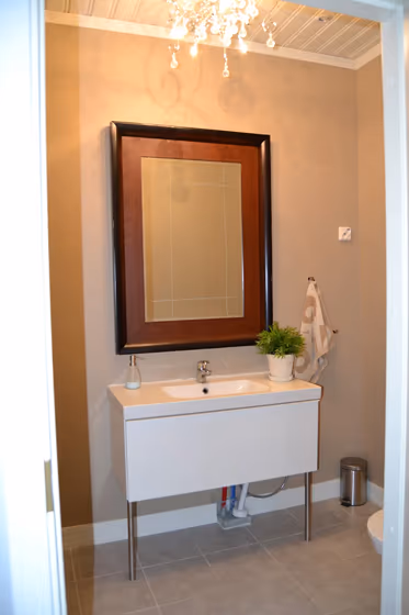
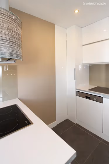
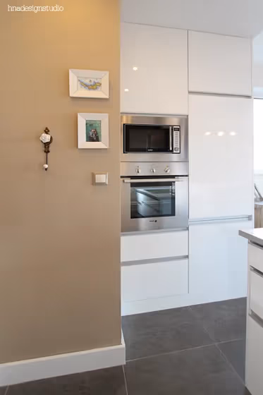
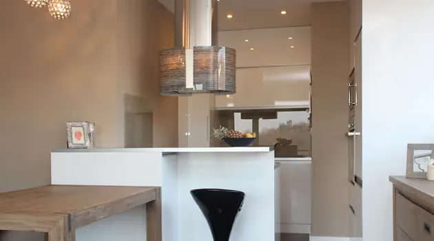
Tikkurila K484 Granulite is a versatile and sophisticated color that effortlessly blends warmth and elegance. This hue pairs wonderfully with warm neutrals like beige and taupe, creating a cozy yet chic atmosphere. For a bolder look, consider combining K484 Granulite with deep blues or rich greens to add a touch of drama to any space. This color with its unique depth and character will bring a sense of modern sophistication to any room.
Loading...
LRV of Granulite
Granulite has an LRV of 38.72% and refers to Medium colors that reflect a lot of light. Why LRV is important?

Light Reflectance Value measures the amount of visible and usable light that reflects from a painted surface.
Simply put, the higher the LRV of a paint color, the brighter the room you will get.
The scale goes from 0% (absolute black, absorbing all light) to 100% (pure white, reflecting all light).
Act like a pro: When choosing paint with an LRV of 38.72%, pay attention to your bulbs' brightness. Light brightness is measured in lumens. The lower the paint's LRV, the higher lumen level you need. Every square foot of room needs at least 40 lumens. That means for a 200 ft2 living room you'll need about 8000 lumens of light – e.g., eight 1000 lm bulbs.
Color codes
We have collected almost every possible color code you could ever need.
Not sure what the difference between HEX and RGB is? We break down color models in plain language. Understanding color models
| Format | Code |
|---|---|
| HEX | #B5A491 |
| RGB Decimal | 181, 164, 145 |
| RGB Percent | 70.98%, 64.31%, 56.86% |
| HSV | Hue: 32° Saturation: 19.89% Value: 70.98% |
| HSL | hsl(32, 20, 64) |
| CMYK | Cyan: 0.0 Magenta: 9.39 Yellow: 19.89 Key: 29.02 |
| YIQ | Y: 166.917 I: 16.236 Q: -2.317 |
| XYZ | X: 37.442 Y: 38.42 Z: 32.224 |
| CIE Lab | L:68.329 a:3.043 b:12.114 |
| CIE Luv | L:68.329 u:11.528 v:16.339 |
| Decimal | 11904145 |
| Hunter Lab | 61.984, -0.647, 12.565 |