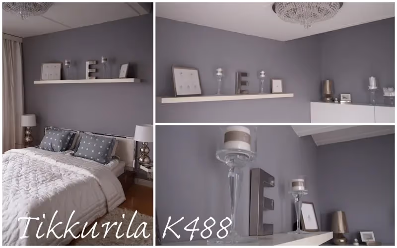
Tikkurila K488
Contentsshow +hide -
| Code: | K488 |
| Name: | |
| Brand: | Tikkurila |
What color is Tikkurila K488?
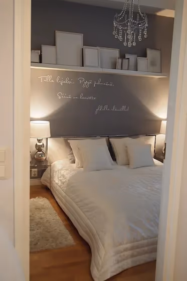
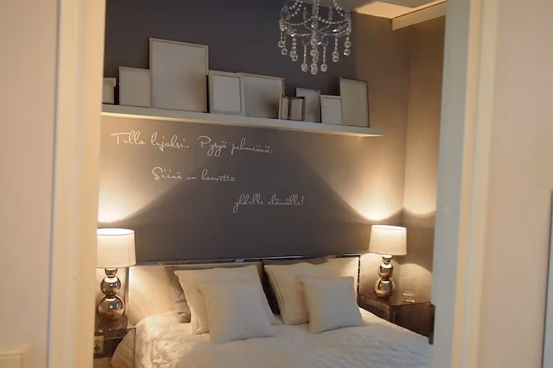
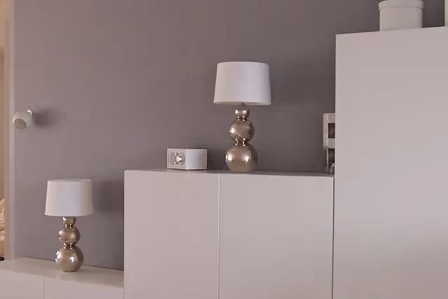
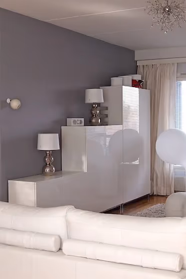
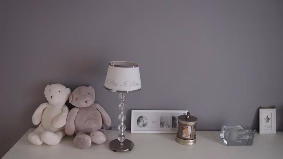
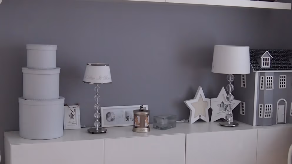
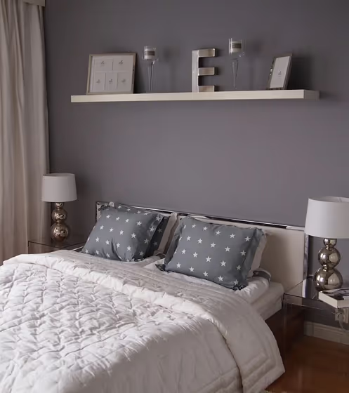
Tikkurila K488 is a soothing and versatile shade that effortlessly adds warmth to any space. This rich hue pairs beautifully with soft neutrals like cream and taupe, creating a cozy and inviting atmosphere. To enhance the depth of Tikkurila K488, consider pairing it with accents in shades of deep blue or forest green for a sophisticated and harmonious color palette. Whether used as a wall color or as an accent, Tikkurila K488 brings a sense of elegance and tranquility to your home decor.
Loading...
LRV of K488
K488 has an LRV of 34.43% and refers to Medium colors that reflect a lot of light. Why LRV is important?

Light Reflectance Value measures the amount of visible and usable light that reflects from a painted surface.
Simply put, the higher the LRV of a paint color, the brighter the room you will get.
The scale goes from 0% (absolute black, absorbing all light) to 100% (pure white, reflecting all light).
Act like a pro: When choosing paint with an LRV of 34.43%, pay attention to your bulbs' brightness. Light brightness is measured in lumens. The lower the paint's LRV, the higher lumen level you need. Every square foot of room needs at least 40 lumens. That means for a 200 ft2 living room you'll need about 8000 lumens of light – e.g., eight 1000 lm bulbs.
Color codes
We have collected almost every possible color code you could ever need.
| Format | Code |
|---|---|
| HEX | #9F9DA2 |
| RGB Decimal | 159, 157, 162 |
| RGB Percent | 62.35%, 61.57%, 63.53% |
| HSV | Hue: 264° Saturation: 3.09% Value: 63.53% |
| HSL | hsl(264, 3, 63) |
| CMYK | Cyan: 1.85 Magenta: 3.09 Yellow: 0.0 Key: 36.47 |
| YIQ | Y: 158.168 I: -0.415 Q: 1.979 |
| XYZ | X: 32.875 Y: 34.093 Z: 39.021 |
| CIE Lab | L:65.037 a:1.681 b:-2.343 |
| CIE Luv | L:65.037 u:0.844 v:-3.693 |
| Decimal | 10460578 |
| Hunter Lab | 58.39, -1.681, 1.25 |