Tikkurila Serpentine V447
| Code: | V447 |
| Name: | Serpentine |
| Brand: | Tikkurila |
What color is Tikkurila Serpentine?
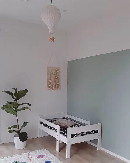
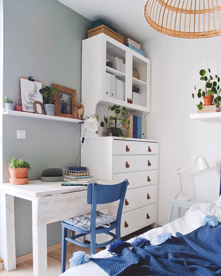
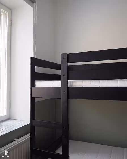
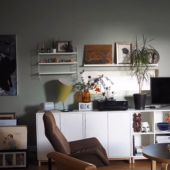
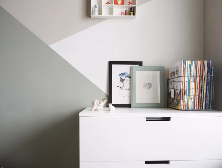
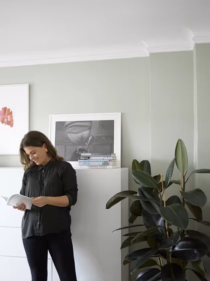
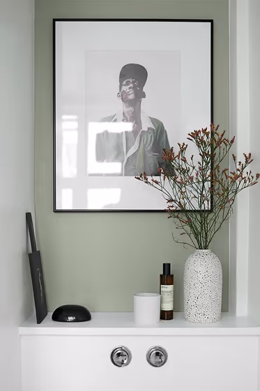
Tikkurila's V447 Serpentine is a captivating blend of green and gray, resembling the intricate patterns found in nature. This versatile hue can create a serene atmosphere in any space, adding a touch of sophistication and tranquility. Serpentine pairs beautifully with warm neutrals such as V447 Curtain and V447 Nomad, enhancing its natural appeal. For a more daring look, consider combining Serpentine with V447 Spiced to add a pop of contrast and visual interest to your interior design. Embrace the calming and grounding energy of Tikkurila's V447 Serpentine in your home.
Tikkurila Serpentine reviews
View the photos of real spaces painted with this that were not included in specific categories.Close-ups, painted furniture, storages and dressers, hallways, stairs and ceilings.
Try before you buy

100% accurate
reusable paint samples
Peel, stick,
and repeat
Twice painted
with real paint
Next day
delivery
What are Tikkurila Serpentine undertones?
The undertone of Serpentine can be accurately described as a Green hue, as is apparent from the color space provided. By isolating the pure hue and eliminating any tints, tones, and shades, we were able to precisely determine its undertone. This approach has proven to be more accurate than traditional methods of defining undertones on a white background, which are now considered outdated.
HEX value
HEX value:
#ACB1A3
RGB code:
172, 177, 163
Is Tikkurila Serpentine V447 cool or warm?
With a hue of 81° thisGreenrefers warm paint shade according to HSL (Hue, Saturation, Lightness) on the color wheel.
V447 Serpentine HSL code: 81, 8%, 67%
Hue - degree on a color wheel from 0 to 360. 0 is red, 120 is green, and 240 is blue.
Saturation is expressed as a percentage. At 0%, it appears as a shade of grey, and at 100%, it is in full color..
Lightness is also a percentage value. 0% is black, and 100% is white.
- Warm colors are ideal for kitchens, living rooms or bathrooms
- Warmer hues make larger spaces feel more inviting
- Warm green shades evoke a sense of nature and comfort, creating a welcoming and soothing environment ideal for living rooms, kitchens, and bedrooms.
- Warm mid-tone shades like terracotta and warm beige create a cozy and inviting atmosphere in living rooms, bedrooms, and kitchens. They can brighten up spaces without being too overwhelming. However, it's best to avoid using these shades in very sunny rooms, as they can become too intense.
Act like a pro: Mixing warm and cool shades is a must have to get harmonius interior. Add accents that contrast with the primary color to create visual balance. If your walls are a warm color, don’t forget to add accent in cold colors (furniture, art, décor). A good practice is too use a complementary color scheme.
How light temperature affects Serpentine
Natural Lighting. During the day, natural light shifts from about 2000 K at sunrise/sunset to 5500–6500 K at noon.
In addition, natural‑light temperature depends on its direction:
| Direction of sunlight | Visible temp. | Hue | Duration |
|---|---|---|---|
| North | Cool | Bluish | All day |
| East | Warm | Yellow | Before noon |
| West | Warm | Orange‑red | After noon |
| South | Warm | Orange‑yellow | All day |
Artificial Lighting. When choosing bulbs, pay attention to their color‑temperature (Kelvins).
Use the slider to see how this Green shade looks under different lighting:


4000K
Coordinating colors.
Colors that go with Tikkurila Serpentine:
Complementary color scheme
This color scheme is a combination of two shades that are opposite each other on the color wheel. The high contrast between these colors creates a vibrant and dynamic visual effect. For the color Serpentine with a orange hue, complementary colors are those with a blue hue close to 261, such as Tikkurila .
V447
Serpentine
LRV of Serpentine
Serpentine has an LRV of 42.36% and refers to Light Medium colors that reflect half of the incident light. Why LRV is important?
Light Reflectance Value measures the amount of visible and usable light that reflects from a painted surface.
Simply put, the higher the LRV of a paint color, the brighter the room you will get.
The scale goes from 0% (absolute black, absorbing all light) to 100% (pure white, reflecting all light).
Act like a pro: When choosing paint with an LRV of 42.36%, pay attention to your bulbs' brightness. Light brightness is measured in lumens. The lower the paint's LRV, the higher lumen level you need. Every square foot of room needs at least 40 lumens. That means for a 200 ft2 living room you’ll need about 8000 lumens of light – e.g., eight 1000 lm bulbs.
Color codes
We have collected almost every possible color code you could ever need. To copy the code, just click the icon to the right of it.
| Format | Code | |
|---|---|---|
| HEX | #acb1a3 | |
| RGB Decimal | 172, 177, 163 | |
| RGB Percent | 67.45%, 69.41%, 63.92% | |
| HSV | Hue: 81° Saturation: 7.91% Value: 69.41% | |
| HSL | hsl(81, 8, 67) | |
| CMYK | Cyan: 2.82 Magenta: 0.0 Yellow: 7.91 Key: 30.59 | |
| YIQ | Y: 173.909 I: 1.519 Q: -5.414 | |
| XYZ | X: 39.345 Y: 42.859 Z: 40.84 | |
| CIE Lab | L:71.459 a:-4.343 b:6.556 | |
| CIE Luv | L:71.459 u:-2.117 v:10.202 | |
| Decimal | 11317667 | |
| Hunter Lab | 65.467, -7.291, 8.84 |
Color equivalents
291
North Brink Grey
Little Greene

20GY 46/067
Silver Lichen
Dulux

7685
Subtle Green
Jotun

91
Blue Gray
Farrow and Ball

7628
Treasure
Jotun

10GY 49/081
Green Ivy
Dulux

H444
Tikkurila

RAL 7038
Agate Grey
RAL Classic

234
Vert De Terre
Farrow and Ball

90GY 46/061
Highland Falls 3
Dulux
7637
Exhale
Jotun

163
French Grey Dark
Little Greene

70YY 46/053
Stone Green
Dulux

8478
Pale Green
Jotun

88
Lamp Room Gray
Farrow and Ball

J446
Flannel
Tikkurila

295
Boringdon Green
Little Greene

78
Tracery II
Little Greene

22
Light Blue
Farrow and Ball


