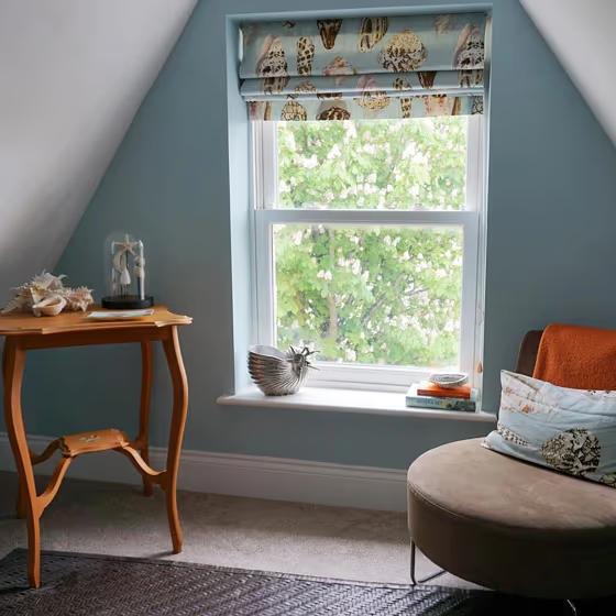
Little Greene Brighton 203
Official page: | Brighton 203 |
Code: | 203 |
Name: | Brighton |
Brand: | Little Greene |
Collections: | Colours of England |
What color is Little Greene Brighton?
Little Greene 203 Brighton, a serene and elegant pale grey with a hint of blue undertone, brings a touch of sophistication to any space. This versatile color pairs harmoniously with accents in soft whites, such as Farrow & Ball Wimborne White, for a timeless and refined look. Complement Little Greene 203 Brighton with bold accents in deep navy like Farrow & Ball Stiffkey Blue and rich greys like Dulux 30BB 21/022 to create a modern and balanced ambiance. Elevate the tranquility of this color by incorporating natural textures such as wood or rattan, enhancing its calming and inviting feel. Whether used in a living room, bedroom, or kitchen, Little Greene 203 Brighton adds a sense of relaxation and style to any interior.
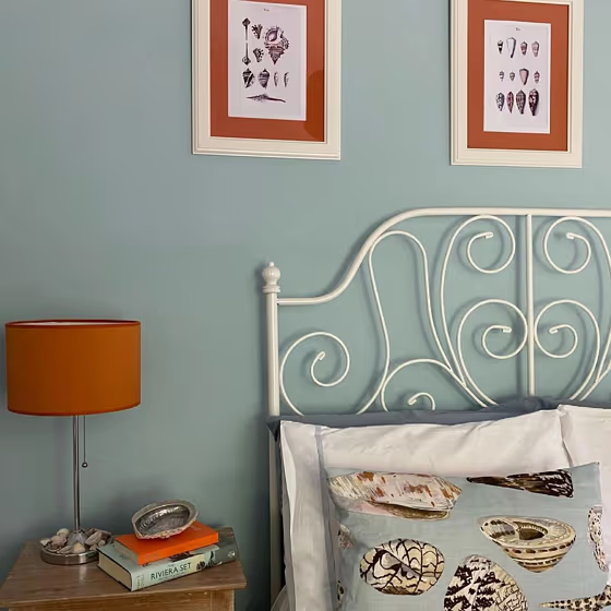
Brighton for bedroom
We’ve hand-picked a beautiful collection of photos of this amazing Beige shade used in real bedrooms. Take a look and imagine how this wonderful cool Light paint color could transform your own bedroom space.
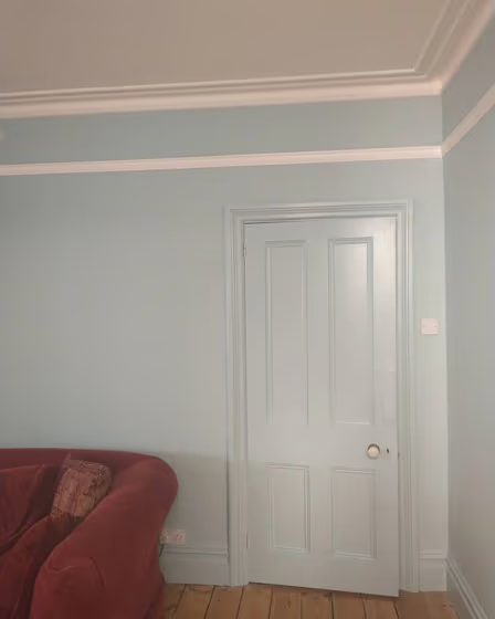
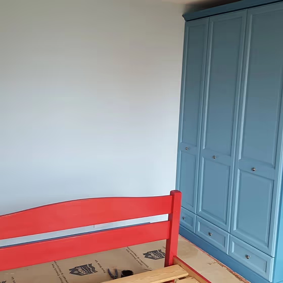
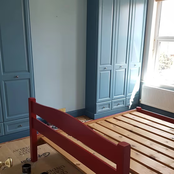
Little Greene Brighton reviews
View the photos of real spaces painted with this that were not included in specific categories.Close-ups, painted furniture, storages and dressers, hallways, stairs and ceilings.
What are Little Greene Brighton undertones?
The undertone of Brighton can be accurately described as a Green hue, as is apparent from the color space provided. By isolating the pure hue and eliminating any tints, tones, and shades, we were able to precisely determine its undertone. This approach has proven to be more accurate than traditional methods of defining undertones on a white background, which are now considered outdated.
HEX value
HEX value:
#BFD5CB
RGB code:
191, 213, 203
Is Little Greene Brighton 203 cool or warm?
With a hue of 153° this Blue refers cool paint shade according to HSL (Hue, Saturation, Lightness) on the color wheel.
203 Brighton HSL code: 153, 21%, 79%
Hue - degree on a color wheel from 0 to 360. 0 is red, 120 is green, and 240 is blue.
Saturation is expressed as a percentage. At 0%, it appears as a shade of grey, and at 100%, it is in full color..
Lightness is also a percentage value. 0% is black, and 100% is white.
- Cooler hues have a calm and relaxation effect
- Cool blue shades make a room feel sleek, fresh, and modern, perfect for bedrooms, bathrooms, and home offices where a sense of calm and sophistication is desired.
- Cool green shades bring a refreshing and tranquil vibe to a space, making it feel rejuvenating and connected to nature, ideal for bathrooms, bedrooms, and living rooms.
- Light, soft colors like pastel blues and greens make a room feel fresh and open. They're great for bathrooms, nurseries, and kitchens, creating a calm and inviting atmosphere. Just avoid using these colors in north-facing rooms, as they might feel too cold.
Act like a pro: Mixing warm and cool shades is a must have to get harmonius interior. Add accents that contrast with the primary color to create visual balance. If your walls are a warm color, don’t forget to add accent in cold colors (furniture, art, décor). A good practice is too use a complementary color scheme.