Little Greene Leather 191
Contentsshow +hide -
| Official page: | Leather 191 |
| Code: | 191 |
| Name: | Leather |
| Brand: | Little Greene |
| Collections: | Colours of England |
What color is Little Greene Leather?
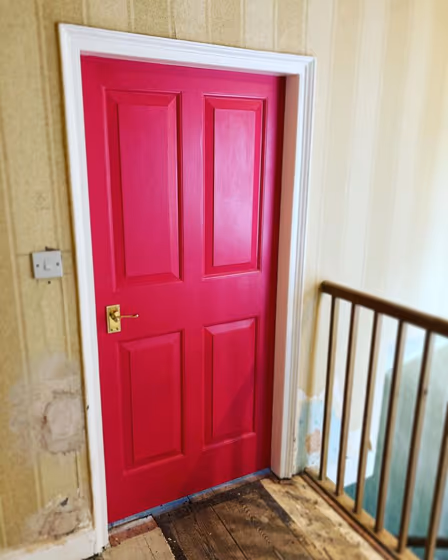
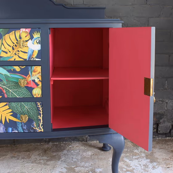
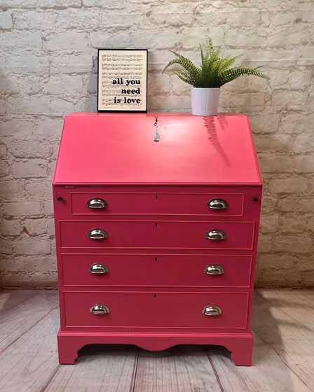
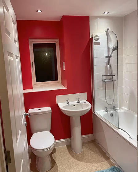
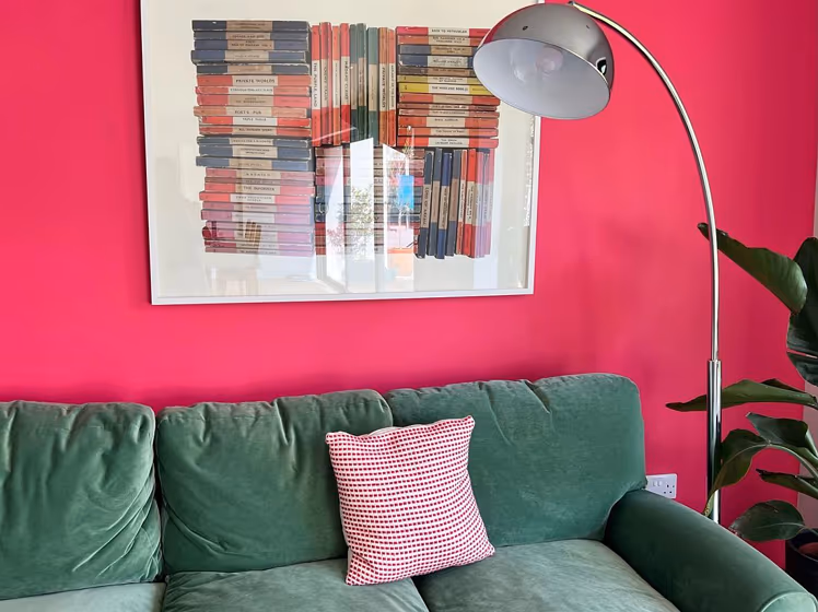
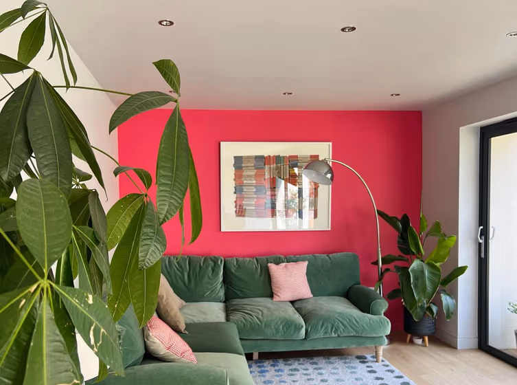
Enhance your space with the inviting warmth of Little Greene 191 Leather. This rich and earthy shade, reminiscent of sun-drenched terracotta, adds a touch of sophistication to any room. Pair Leather (191) with soft neutrals like Warm White or contemporary shades like Invisible Green (56) for a harmonious and elegant look. Embrace the versatility of this timeless color by combining it with accents in Clay (50) or pale creams for a subtle contrast. Elevate your interior design with the timeless allure of Little Greene 191 Leather.
Loading...
Color codes
We have collected almost every possible color code you could ever need.
Not sure what the difference between HEX and RGB is? We break down color models in plain language. Understanding color models
| Format | Code |
|---|---|
| HEX | #cc3852 |
| RGB Decimal | 204, 56, 82 |
| RGB Percent | 80.00%, 21.96%, 32.16% |
| HSV | Hue: 349° Saturation: 72.55% Value: 80.0% |
| HSL | hsl(349, 59, 51) |
| CMYK | Cyan: 0.0 Magenta: 72.55 Yellow: 59.8 Key: 20.0 |
| YIQ | Y: 103.216 I: 79.838 Q: 39.399 |
| XYZ | X: 27.841 Y: 16.279 Z: 9.656 |
| CIE Lab | L:47.338 a:59.054 b:20.014 |
| CIE Luv | L:47.338 u:105.944 v:11.334 |
| Decimal | 13383762 |
| Hunter Lab | 40.347, 52.567, 14.053 |