Little Greene Middle Buff 122
Contentsshow +hide -
| Official page: | Middle Buff 122 |
| Code: | 122 |
| Name: | Middle Buff |
| Brand: | Little Greene |
| Collections: | Colours of England |
What color is Little Greene Middle Buff?
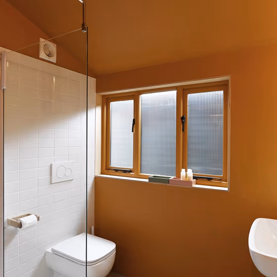
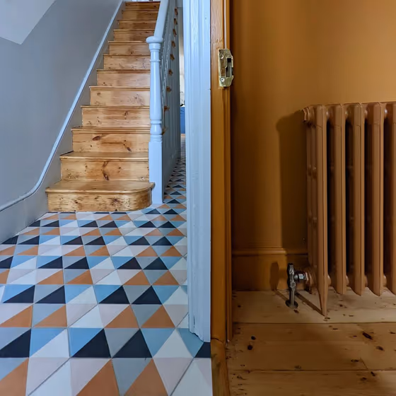
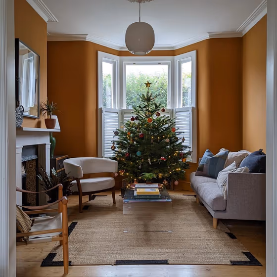
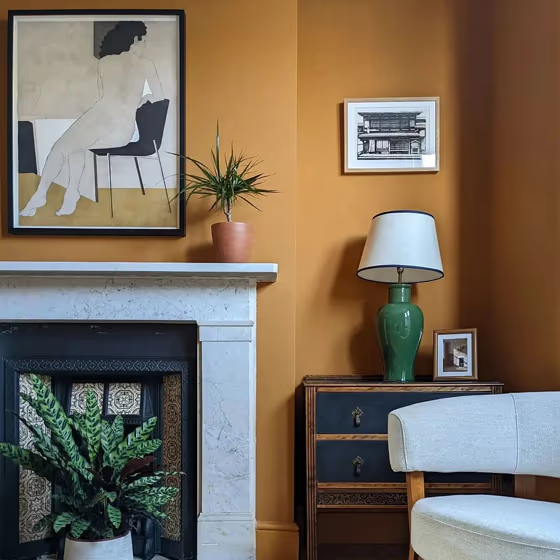
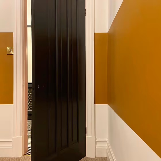
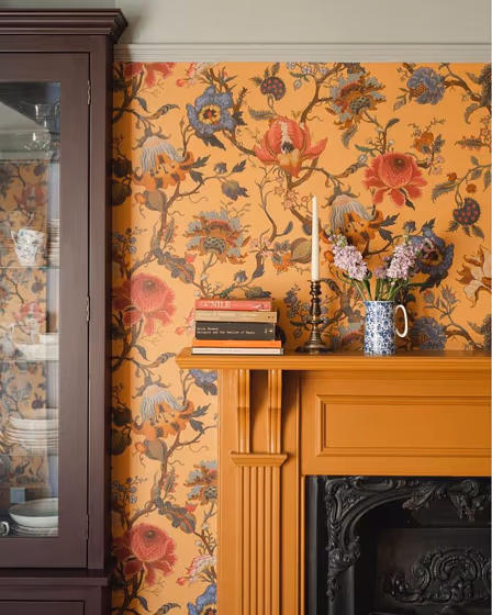
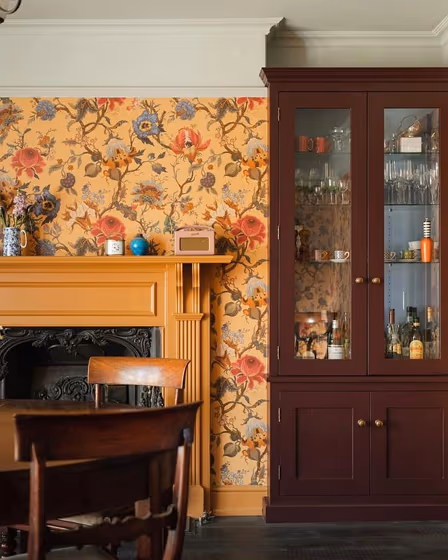
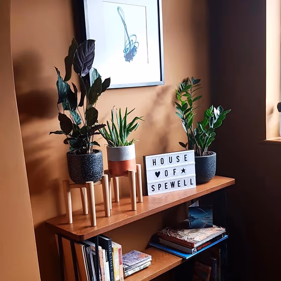
Elevate your living space with the warm and inviting hue of Little Greene 122 Middle Buff. This timeless color effortlessly infuses any room with a cozy and welcoming atmosphere. Whether used in a bedroom, dining room, or study, Middle Buff adds a touch of effortless sophistication. Its versatility makes it an ideal choice for creating a serene and harmonious ambiance in both traditional and modern interiors. Embrace the elegance of Little Greene 122 Middle Buff to transform your space into a stylish retreat.
Loading...
LRV of Middle Buff
Middle Buff has an LRV of 20.58% and refers to Medium colors that reflect a lot of light. Why LRV is important?

Light Reflectance Value measures the amount of visible and usable light that reflects from a painted surface.
Simply put, the higher the LRV of a paint color, the brighter the room you will get.
The scale goes from 0% (absolute black, absorbing all light) to 100% (pure white, reflecting all light).
Act like a pro: When choosing paint with an LRV of 20.58%, pay attention to your bulbs' brightness. Light brightness is measured in lumens. The lower the paint's LRV, the higher lumen level you need. Every square foot of room needs at least 40 lumens. That means for a 200 ft2 living room you'll need about 8000 lumens of light – e.g., eight 1000 lm bulbs.
Color codes
We have collected almost every possible color code you could ever need.
Not sure what the difference between HEX and RGB is? We break down color models in plain language. Understanding color models
| Format | Code |
|---|---|
| HEX | #af732b |
| RGB Decimal | 175, 115, 43 |
| RGB Percent | 68.63%, 45.10%, 16.86% |
| HSV | Hue: 33° Saturation: 75.43% Value: 68.63% |
| HSL | hsl(33, 61, 43) |
| CMYK | Cyan: 0.0 Magenta: 34.29 Yellow: 75.43 Key: 31.37 |
| YIQ | Y: 124.732 I: 58.891 Q: -9.714 |
| XYZ | X: 24.248 Y: 21.552 Z: 5.168 |
| CIE Lab | L:53.549 a:17.335 b:47.499 |
| CIE Luv | L:53.549 u:48.262 v:45.92 |
| Decimal | 11498283 |
| Hunter Lab | 46.424, 11.989, 25.897 |