Little Greene Pearl Colour 100
Contentsshow +hide -
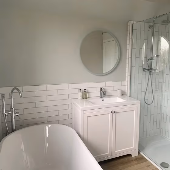
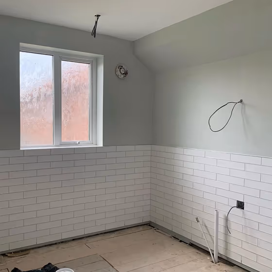
- Little Greene Pearl Colour for bathroom (3 photos)
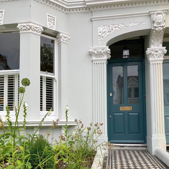
- Pearl Colour for exterior (1 photo)
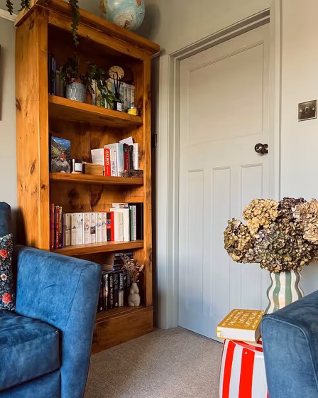
- Little Greene Pearl Colour reviews (3 photos)
- What are Little Greene Pearl Colour undertones?
- Is Pearl Colour 100 cool or warm?
- How light temperature affects on Pearl Colour
- Monochromatic color scheme
- Color comparison and matching
- LRV of Pearl Colour 100
- Color codes
- Color equivalents
| Official page: | Pearl Colour 100 |
| Code: | 100 |
| Name: | Pearl Colour |
| Brand: | Little Greene |
| Collections: | Colours of England, Colour Scales |
What color is Little Greene Pearl Colour?
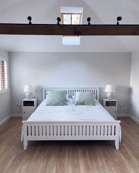
Step into a world of elegance and sophistication with Little Greene 100 Pearl Colour. This exquisite shade creates a serene and tranquil atmosphere, perfect for bedrooms, living rooms, and home offices. The subtle hints of warmth in Pearl Colour bring a cozy and inviting feel to any space, making it ideal for creating a peaceful retreat from the hustle and bustle of everyday life. Let the timeless beauty of Little Greene 100 envelop you in a sense of calm and relaxation, turning your room into a sanctuary of style and comfort.
Loading...
LRV of Pearl Colour
Pearl Colour has an LRV of 67.55% and refers to Light colors that reflect most of the incident light. Why LRV is important?

Light Reflectance Value measures the amount of visible and usable light that reflects from a painted surface.
Simply put, the higher the LRV of a paint color, the brighter the room you will get.
The scale goes from 0% (absolute black, absorbing all light) to 100% (pure white, reflecting all light).
Act like a pro: When choosing paint with an LRV of 67.55%, pay attention to your bulbs' brightness. Light brightness is measured in lumens. The lower the paint's LRV, the higher lumen level you need. Every square foot of room needs at least 40 lumens. That means for a 200 ft2 living room you'll need about 8000 lumens of light – e.g., eight 1000 lm bulbs.
Color codes
We have collected almost every possible color code you could ever need.
Not sure what the difference between HEX and RGB is? We break down color models in plain language. Understanding color models
| Format | Code |
|---|---|
| HEX | #d4dacc |
| RGB Decimal | 212, 218, 204 |
| RGB Percent | 83.14%, 85.49%, 80.00% |
| HSV | Hue: 86° Saturation: 6.42% Value: 85.49% |
| HSL | hsl(86, 16, 83) |
| CMYK | Cyan: 2.75 Magenta: 0.0 Yellow: 6.42 Key: 14.51 |
| YIQ | Y: 214.61 I: 0.923 Q: -5.626 |
| XYZ | X: 63.119 Y: 68.499 Z: 67.007 |
| CIE Lab | L:86.256 a:-4.531 b:6.185 |
| CIE Luv | L:86.256 u:-2.656 v:10.051 |
| Decimal | 13949644 |
| Hunter Lab | 82.764, -8.707, 9.933 |