Little Greene Pearl Colour - Mid 168
Contentsshow +hide -
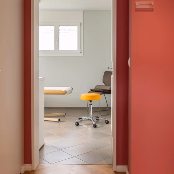
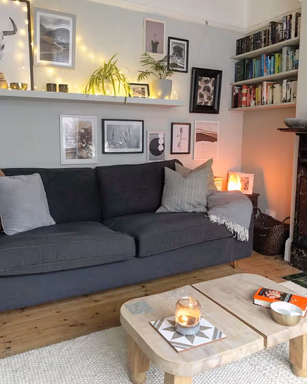
- Little Greene Pearl Colour - Mid reviews (2 photos)
- What are Little Greene Pearl Colour - Mid undertones?
- Is Pearl Colour - Mid 168 cool or warm?
- How light temperature affects on Pearl Colour - Mid
- Monochromatic color scheme
- Color comparison and matching
- LRV of Pearl Colour - Mid 168
- Color codes
- Color equivalents
| Official page: | Pearl Colour - Mid 168 |
| Code: | 168 |
| Name: | Pearl Colour - Mid |
| Brand: | Little Greene |
| Collections: | Colour Scales |
What color is Little Greene Pearl Colour - Mid?
Little Greene 168 Pearl Colour - Mid, a soft and subtle hue that exudes warmth and sophistication. This shade pairs beautifully with earthy tones such as sand beige, forest green, and slate gray, creating a harmonious and welcoming atmosphere in any space. Its versatility allows it to complement both traditional and modern interior styles effortlessly. Whether used as a wall color or as an accent, Little Greene 168 Pearl Colour - Mid adds a touch of elegance and tranquility to a room, making it the perfect choice for those seeking a timeless and refined look.
Loading...
LRV of Pearl Colour - Mid
Pearl Colour - Mid has an LRV of 74.22% and refers to Off‑White colors that reflect a lot of light. Why LRV is important?

Light Reflectance Value measures the amount of visible and usable light that reflects from a painted surface.
Simply put, the higher the LRV of a paint color, the brighter the room you will get.
The scale goes from 0% (absolute black, absorbing all light) to 100% (pure white, reflecting all light).
Act like a pro: When choosing paint with an LRV of 74.22%, pay attention to your bulbs' brightness. Light brightness is measured in lumens. The lower the paint's LRV, the higher lumen level you need. Every square foot of room needs at least 40 lumens. That means for a 200 ft2 living room you'll need about 8000 lumens of light – e.g., eight 1000 lm bulbs.
Color codes
We have collected almost every possible color code you could ever need.
Not sure what the difference between HEX and RGB is? We break down color models in plain language. Understanding color models
| Format | Code |
|---|---|
| HEX | #dde3d6 |
| RGB Decimal | 221, 227, 214 |
| RGB Percent | 86.67%, 89.02%, 83.92% |
| HSV | Hue: 88° Saturation: 5.73% Value: 89.02% |
| HSL | hsl(88, 19, 86) |
| CMYK | Cyan: 2.64 Magenta: 0.0 Yellow: 5.73 Key: 10.98 |
| YIQ | Y: 223.724 I: 0.602 Q: -5.315 |
| XYZ | X: 69.423 Y: 75.165 Z: 74.451 |
| CIE Lab | L:89.47 a:-4.325 b:5.648 |
| CIE Luv | L:89.47 u:-2.697 v:9.279 |
| Decimal | 14541782 |
| Hunter Lab | 86.698, -8.789, 9.774 |