Little Greene Pearl Colour - Dark 169
| Official page: | Pearl Colour - Dark 169 |
| Code: | 169 |
| Name: | Pearl Colour - Dark |
| Brand: | Little Greene |
| Collections: | Colour Scales |
What color is Little Greene Pearl Colour - Dark?
Elevate your space with the timeless elegance of Little Greene 169 Pearl Colour - Dark. This sophisticated hue, with its deep and rich tones, adds a touch of luxury to any room. Pair this versatile color with soft neutrals like Soft White-10 for a harmonious and calming atmosphere. For a bold and dramatic look, complement Little Greene 169 Pearl Colour - Dark with accents in Sage-94 or Midnight Blue-501. Whether used as a statement wall color or throughout the entire room, this deep shade will create a sense of depth and warmth in your home.
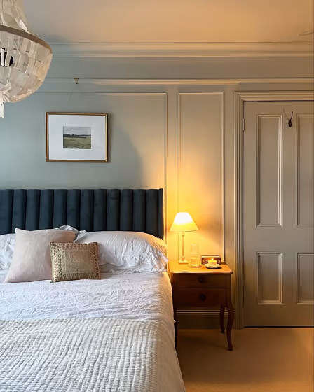
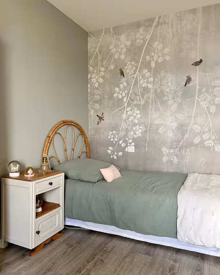
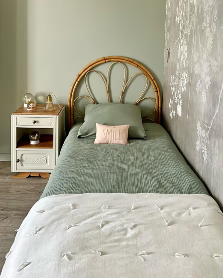
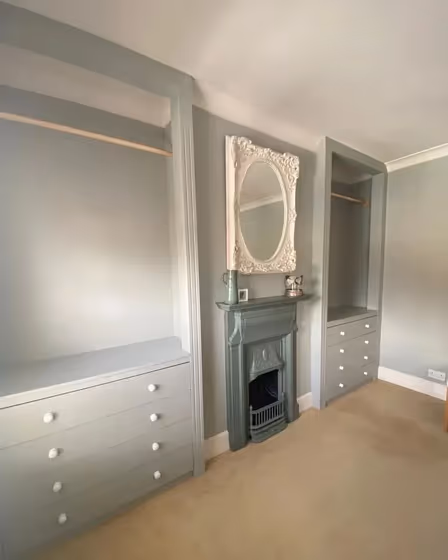
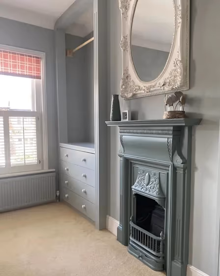
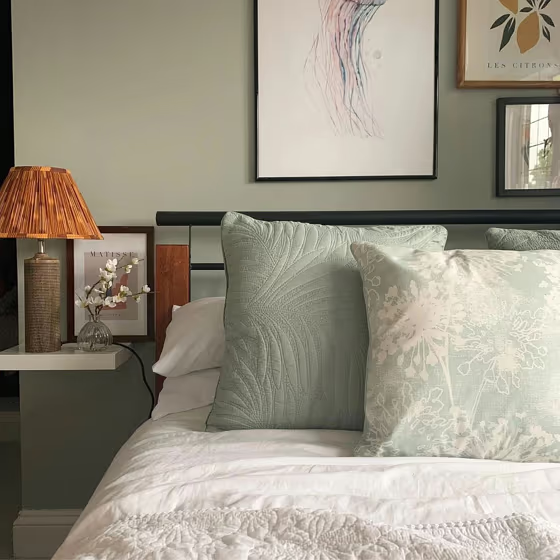
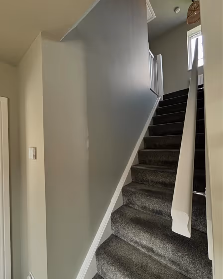
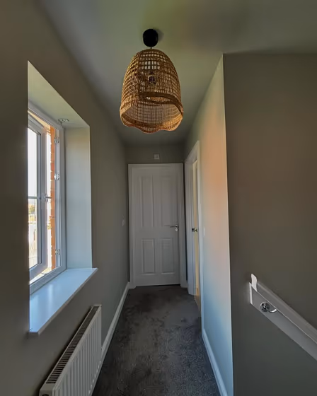
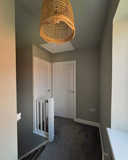
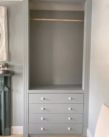
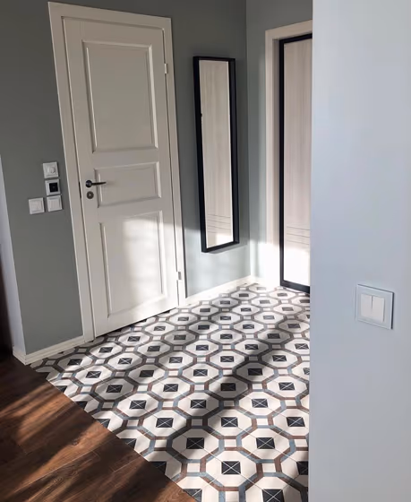
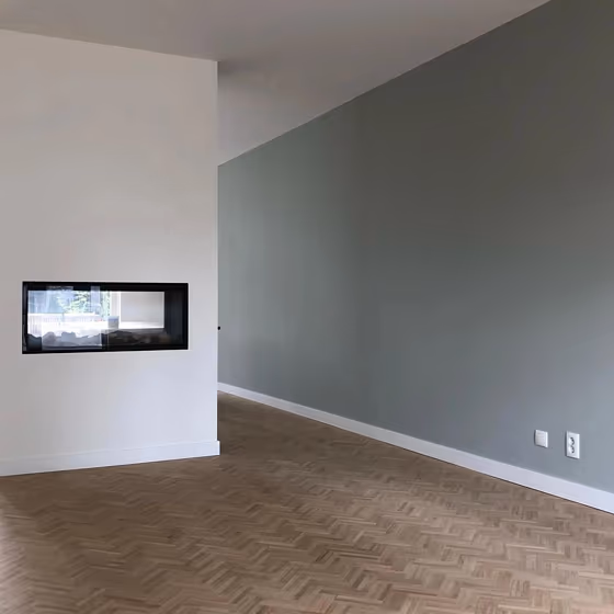
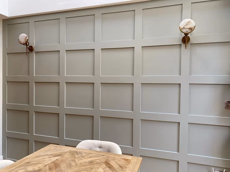
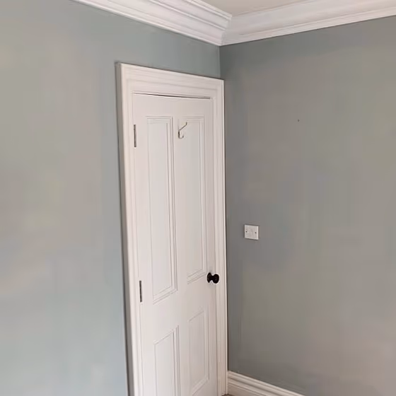
Pearl Colour - Dark for bedroom (7 photos)
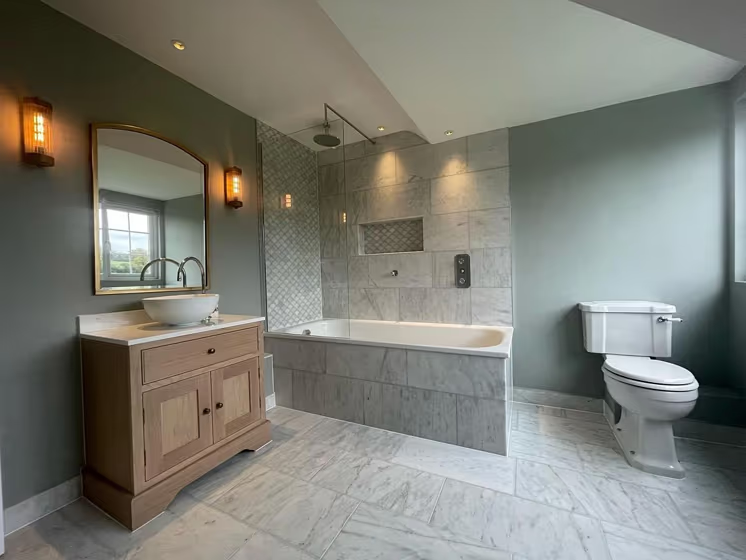
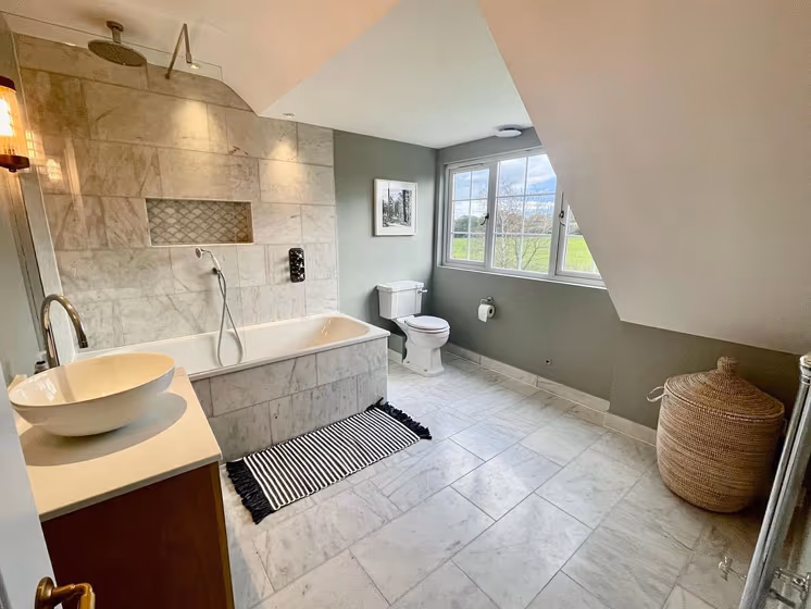
We’ve hand-picked a beautiful collection of photos of this amazing grey shade used in real bedrooms. Take a look and imagine how this wonderful cool light paint color could transform your own bedroom space.


Little Greene 169 for bathroom (2 photos)
Looking for inspiration for your dream bathroom renovation project? These beautiful handpicked photos will show you this delightfully cool Light grey real bathrooms.


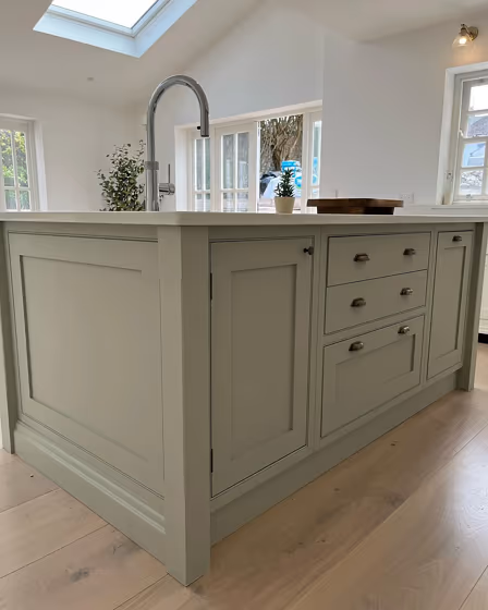
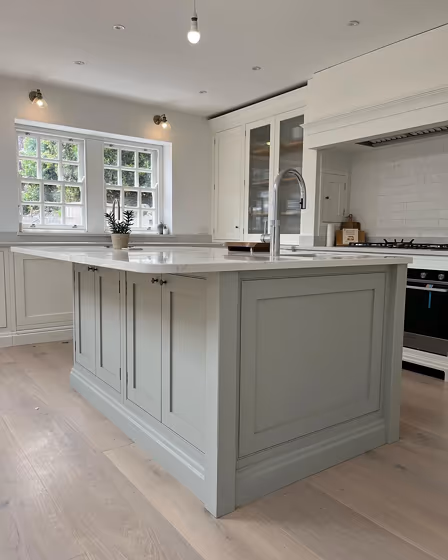
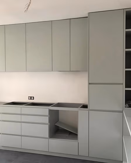
Little Greene 169 on kitchen cabinets (3 photos)
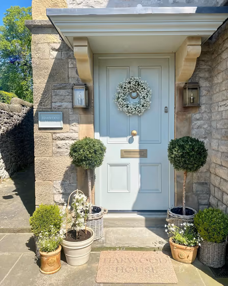
Want a stylish kitchen? View real-life photo examples of this fascinating cool grey hue is paired with backsplashes, countertops, and hardware.


Pearl Colour - Dark for exterior
Looking for a fresh new look for your house exterior or starting from skretch? We’ve collected pictures of real-life homes that have been painted with this cool grey hue. Find inspiration for your house’s exterior, front doors, gates, shutters, frames or windows.

Little Greene Pearl Colour - Dark reviews (8 photos)
View the photos of real spaces painted with this grey that were not included in specific categories.Close-ups, painted furniture, storages and dressers, hallways, stairs and ceilings.


Try before you buy

100% accurate
reusable paint samples
Peel, stick,
and repeat
Twice painted
with real paint
Next day
delivery
What are Little Greene Pearl Colour - Dark undertones?
Pearl Colour - Dark has a clear green undertone based on its position in the color space. We identify undertones by isolating the pure hue (separating it from lightness and saturation), which avoids distortions caused by tints, tones, and shades.
This method is generally more reliable than judging undertones on a white background.
HEX value:
#BEC5B8
RGB code:
190, 197, 184
Is Little Greene Pearl Colour - Dark 169 cool or warm?
With a hue of 92°, this Grey shade sits right in the neutral zone on the HSL color wheel—neither warm nor cool.
169 Pearl Colour - Dark HSL code: 92, 10%, 75%
Hue - degree on a color wheel from 0 to 360. 0 is red, 120 is green, and 240 is blue.
Saturation is expressed as a percentage. At 0%, it appears as a shade of grey, and at 100%, it is in full color.
Lightness is also a percentage value. 0% is black, and 100% is white.
How light temperature affects Pearl Colour - Dark
Natural Lighting. During the day, natural light shifts from about 2000 K at sunrise/sunset to 5500–6500 K at noon.
In addition, natural‑light temperature depends on its direction:
| Direction of sunlight | Visible temp. | Hue | Duration |
|---|---|---|---|
| North | Cool | Bluish | All day |
| East | Warm | Yellow | Before noon |
| West | Warm | Orange‑red | After noon |
| South | Warm | Orange‑yellow | All day |
Artificial Lighting. When choosing bulbs, pay attention to their color‑temperature (Kelvins).
Use the slider to see how this Grey shade looks under different lighting:


4000K
Coordinating colors.
Colors that go with Little Greene Pearl Colour - Dark:
Monochromatic color scheme
This scheme consists of various shades, tints, and tones of a single color. While it offers a perfect combination of hues, without accent décor it may become monotonous.
Lighter shades
169
Pearl Colour - Dark
LRV of Pearl Colour - Dark
Pearl Colour - Dark has an LRV of 53.56% and refers to Light Medium colors that reflect half of the incident light. Why LRV is important?
Light Reflectance Value measures the amount of visible and usable light that reflects from a painted surface.
Simply put, the higher the LRV of a paint color, the brighter the room you will get.
The scale goes from 0% (absolute black, absorbing all light) to 100% (pure white, reflecting all light).
Act like a pro: When choosing paint with an LRV of 53.56%, pay attention to your bulbs' brightness. Light brightness is measured in lumens. The lower the paint's LRV, the higher lumen level you need. Every square foot of room needs at least 40 lumens. That means for a 200 ft2 living room you’ll need about 8000 lumens of light – e.g., eight 1000 lm bulbs.
Color codes
We have collected almost every possible color code you could ever need. To copy the code, just click the icon to the right of it.
| Format | Code | |
|---|---|---|
| HEX | #bec5b8 | |
| RGB Decimal | 190, 197, 184 | |
| RGB Percent | 74.51%, 77.25%, 72.16% | |
| HSV | Hue: 92° Saturation: 6.6% Value: 77.25% | |
| HSL | hsl(92, 10, 75) | |
| CMYK | Cyan: 3.55 Magenta: 0.0 Yellow: 6.6 Key: 22.75 | |
| YIQ | Y: 193.425 I: 0.006 Q: -5.526 | |
| XYZ | X: 49.851 Y: 54.34 Z: 53.197 | |
| CIE Lab | L:78.66 a:-4.79 b:5.685 | |
| CIE Luv | L:78.66 u:-3.285 v:9.213 | |
| Decimal | 12502456 | |
| Hunter Lab | 73.716, -8.29, 8.815 |
Color equivalents
K494
Tikkurila

45GY 55/052
Tranquil Dawn
Dulux

J446
Flannel
Tikkurila

266
Mizzle
Farrow and Ball

7637
Exhale
Jotun

50GY 57/096
Common Land
Dulux

8118
Crisp
Jotun

7627
Refresh
Jotun

99YY 55/056
Lunar Landing
Dulux
7555
Soft Mint
Jotun

90GY 70/221
Graceful Green
Dulux

X445
Lido
Tikkurila

8281
Pale Linden
Jotun

301
Eddy
Farrow and Ball

236
Teresa's Green
Farrow and Ball

90GY 63/047
Tumbled Glass
Dulux

