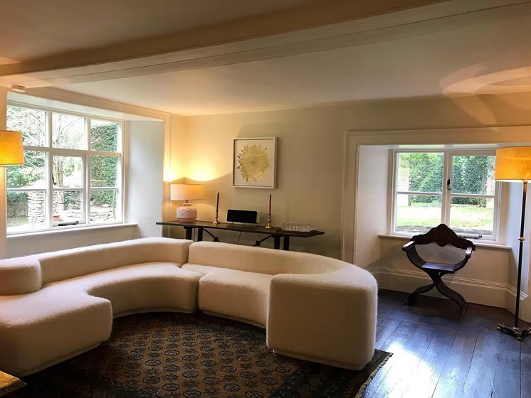
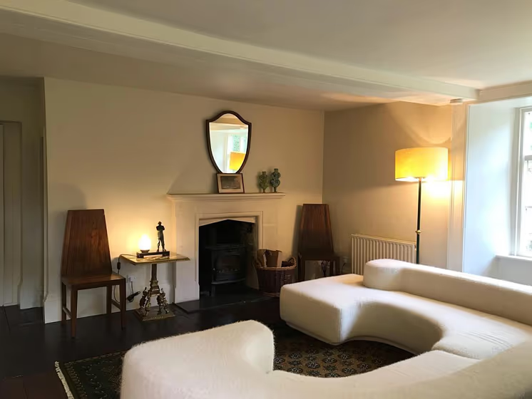
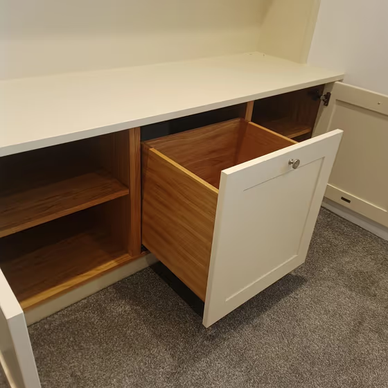
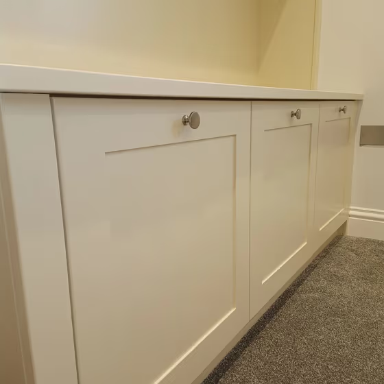
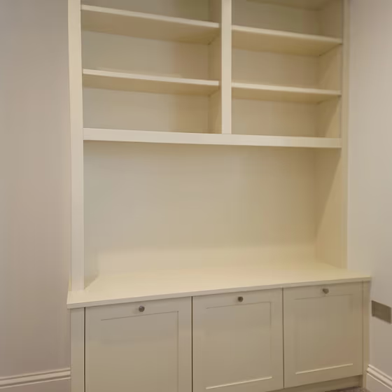
Little Greene Travertine - Light 272
Contentsshow +hide -
- Little Greene Travertine - Light reviews (5 photos)
- What are Little Greene Travertine - Light undertones?
- Is Travertine - Light 272 cool or warm?
- How light temperature affects on Travertine - Light
- Monochromatic color scheme
- Complementary color scheme
- Color comparison and matching
- Color codes
- Color equivalents
| Official page: | Travertine - Light 272 |
| Code: | 272 |
| Name: | Travertine - Light |
| Brand: | Little Greene |
| Collections: | Stone |
What color is Little Greene Travertine - Light?
Introducing a serene touch to your space with Little Greene's 272 Travertine - Light (color code). This soft and tranquil hue brings a sense of sophistication and warmth to any room. Pair this versatile color with earthy tones such as sage green, sandy beige, and stone gray for a harmonious and inviting vibe. Complement 272 Travertine - Light with accents in muted blues or blush pinks to add a subtle pop of color and contrast. Elevate your interior design with this timeless shade that effortlessly blends with a variety of color palettes.
Color codes
We have collected almost every possible color code you could ever need.
| Format | Code |
|---|---|
| HEX | #f0e4ca |
| RGB Decimal | 240, 228, 202 |
| RGB Percent | 94.12%, 89.41%, 79.22% |
| HSV | Hue: 41° Saturation: 15.83% Value: 94.12% |
| HSL | hsl(41, 56, 87) |
| CMYK | Cyan: 0.0 Magenta: 5.0 Yellow: 15.83 Key: 5.88 |
| YIQ | Y: 228.624 I: 15.506 Q: -5.553 |
| XYZ | X: 74.338 Y: 78.278 Z: 67.054 |
| CIE Lab | L:90.906 a:-0.13 b:14.164 |
| CIE Luv | L:90.906 u:8.6 v:20.843 |
| Decimal | 15787210 |
| Hunter Lab | 88.475, -4.852, 16.997 |


