Tikkurila M502
| Code: | M502 |
| Name: | |
| Brand: | Tikkurila |
What color is Tikkurila M502?
The vibrant Tikkurila M502 is a rich and warm shade that adds depth to any interior space. Its subtle undertones of burnt sienna make it a versatile choice that pairs beautifully with neutrals, such as vanilla white and charcoal black. For a more adventurous look, consider combining it with accents in emerald green or midnight blue to create a striking contrast. Whether used as a dominant color or as an accent, Tikkurila M502 adds a touch of sophistication and elegance to any room.
Tikkurila M502 reviews
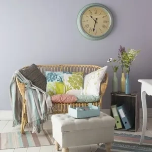
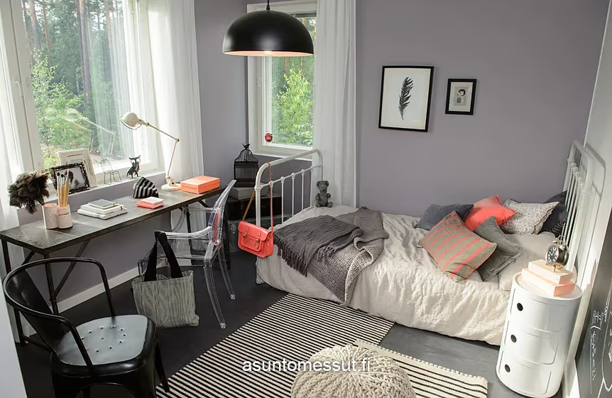
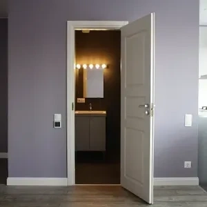
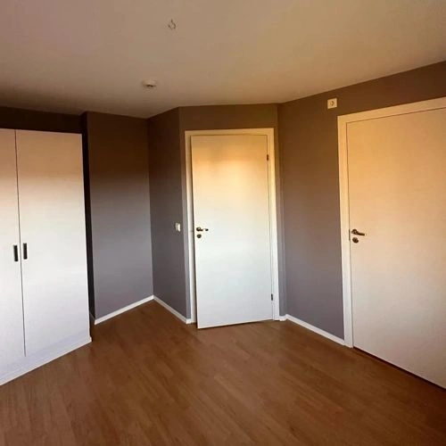
View the photos of real spaces painted with this purple that were not included in specific categories.Close-ups, painted furniture, storages and dressers, hallways, stairs and ceilings.
Try before you buy

100% accurate
reusable paint samples

Peel, stick,
and repeat

Twice painted
with real paint

Next day
delivery
What are Tikkurila M502 undertones?
M502 has a clear purple undertone based on its position in the color space. We identify undertones by isolating the pure hue (separating it from lightness and saturation), which avoids distortions caused by tints, tones, and shades.
This method is generally more reliable than judging undertones on a white background.
HEX value:
#A59EA9
RGB code:
165, 158, 169
Is Tikkurila M502 cool or warm?

With a hue of 278°, this Purple leans warm, but it's close to neutral and can read cooler in some light.
M502 HSL code: 278, 6%, 64%
Hue - degree on a color wheel from 0 to 360. 0 is red, 120 is green, and 240 is blue.
Saturation is expressed as a percentage. At 0%, it appears as a shade of grey, and at 100%, it is in full color.
Lightness is also a percentage value. 0% is black, and 100% is white.
How light temperature affects M502
Natural Lighting. During the day, natural light shifts from about 2000 K at sunrise/sunset to 5500–6500 K at noon.
In addition, natural‑light temperature depends on its direction:
| Direction of sunlight | Visible temp. | Hue | Duration |
|---|---|---|---|
| North | Cool | Bluish | All day |
| East | Warm | Yellow | Before noon |
| West | Warm | Orange‑red | After noon |
| South | Warm | Orange‑yellow | All day |
Artificial Lighting. When choosing bulbs, pay attention to their color‑temperature (Kelvins).
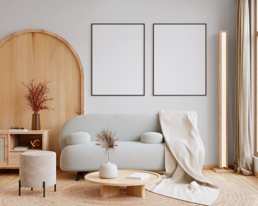
Use the slider to see how this Purple shade looks under different lighting:
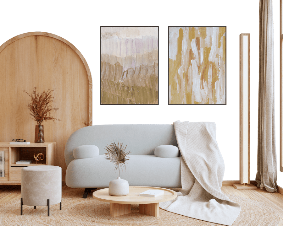
4000K
Coordinating colors.
Colors that go with Tikkurila M502:
Complementary color scheme

This color scheme is a combination of two shades that are opposite each other on the color wheel. The high contrast between these colors creates a vibrant and dynamic visual effect. For the color M502 with a purple hue, complementary colors are those with a yellow hue close to 98, such as Tikkurila .
M502
LRV of M502
M502 has an LRV of 35.96% and refers to Medium colors that reflect a lot of light. Why LRV is important?

Light Reflectance Value measures the amount of visible and usable light that reflects from a painted surface.
Simply put, the higher the LRV of a paint color, the brighter the room you will get.
The scale goes from 0% (absolute black, absorbing all light) to 100% (pure white, reflecting all light).
Act like a pro: When choosing paint with an LRV of 35.96%, pay attention to your bulbs' brightness. Light brightness is measured in lumens. The lower the paint's LRV, the higher lumen level you need. Every square foot of room needs at least 40 lumens. That means for a 200 ft2 living room you’ll need about 8000 lumens of light – e.g., eight 1000 lm bulbs.
Color codes
We have collected almost every possible color code you could ever need. To copy the code, just click the icon to the right of it.
| Format | Code | |
|---|---|---|
| HEX | #A59EA9 | |
| RGB Decimal | 165, 158, 169 | |
| RGB Percent | 64.71%, 61.96%, 66.27% | |
| HSV | Hue: 278° Saturation: 6.51% Value: 66.27% | |
| HSL | hsl(278, 6, 64) | |
| CMYK | Cyan: 2.37 Magenta: 6.51 Yellow: 0.0 Key: 33.73 | |
| YIQ | Y: 161.347 I: 0.637 Q: 4.904 | |
| XYZ | X: 34.904 Y: 35.318 Z: 42.504 | |
| CIE Lab | L:65.995 a:4.625 b:-4.797 | |
| CIE Luv | L:65.995 u:3.314 v:-7.826 | |
| Decimal | 10854057 | |
| Hunter Lab | 59.429, 0.836, -0.804 |
Color equivalents
50RB 35/067
Twilight Cinders 3
Dulux
10RB 36/082
Brooklyn Nights 3
Dulux
30RB 33/103
Violet Surprise 2
Dulux
K488
Tikkurila

10RR 41/042
Mercury Shower 3
Dulux
70RB 31/090
Mellow Heather 2
Dulux
3325
Movement
Jotun
Birch Root
Dulux
X425
Blueberry milk
Tikkurila

Heather Solstice
Dulux
90RR 35/060
Dusted Heather
Dulux

10YR 40/054
Nordic Sails 3
Dulux
Violet Storm
Dulux
Lilac Skies
Dulux
70RB 50/062
Mellow Heather 3
Dulux
20218
Healing Lavender
Jotun
J428
Panorama
Tikkurila
