Tikkurila J499

Code:J499
Name:
Brand:Tikkurila

What color is Tikkurila J499?

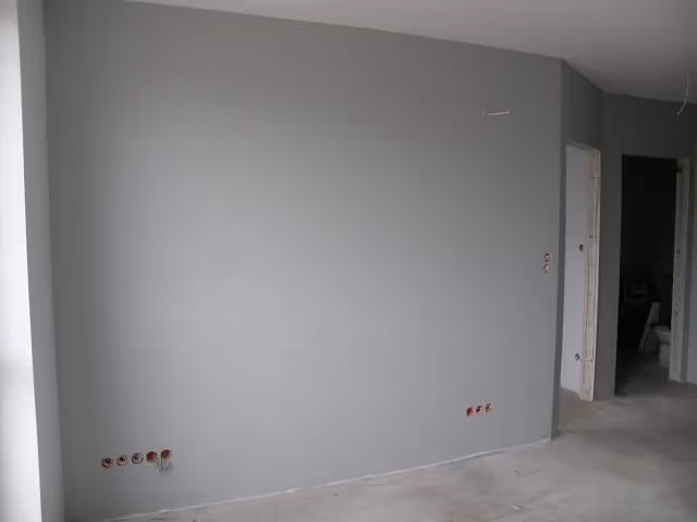
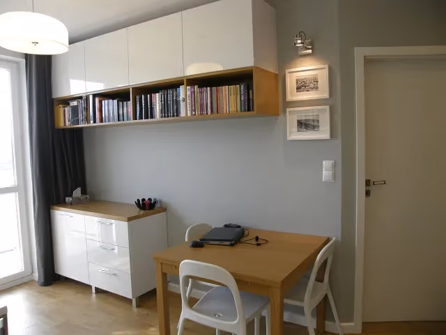
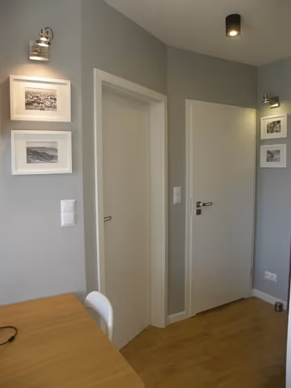
Tikkurila J499 is a beautiful neutral grey paint color that looks amazing in Scandinavian interiors. It is a versatile shade that complements a variety of interior design styles and is perfect for creating a calming and relaxing atmosphere

Tikkurila J499 reviews

View the photos of real spaces painted with this that were not included in specific categories.Close-ups, painted furniture, storages and dressers, hallways, stairs and ceilings.

Interior with paint color Tikkurila  J499
Image source
Interior with paint color Tikkurila  J499
Source link not active
Interior with paint color Tikkurila  J499
Source link not active
Interior with paint color Tikkurila  J499
Image source
Interior with paint color Tikkurila  J499
Source link not active
Interior with paint color Tikkurila  J499
Source link not active
Interior with paint color Tikkurila  J499
Image source
Interior with paint color Tikkurila  J499
Source link not active
Interior with paint color Tikkurila  J499
Source link not active

Try before you buy

Samplize samples on the wall
Samplize logo

100% accurate
reusable paint samples

Peel, stick and repeat

Peel, stick,
and repeat

Twice painted samples

Twice painted
with real paint

Fast delivery

Next day
delivery

Shop now

What are Tikkurila J499 undertones?

The undertone of J499 can be accurately described as a Green hue, as is apparent from the color space provided. By isolating the pure hue and eliminating any tints, tones, and shades, we were able to precisely determine its undertone. This approach has proven to be more accurate than traditional methods of defining undertones on a white background, which are now considered outdated.

R
G
B

HEX value

HEX value:

#BBBDBA

RGB code:

187, 189, 186

Is Tikkurila J499 cool or warm?

warm
Color wheel
cool

With a hue of 100° thisGreyrefers cool paint shade according to HSL (Hue, Saturation, Lightness) on the color wheel.

J499 HSL code: 100, 2%, 74%

Hue - degree on a color wheel from 0 to 360. 0 is red, 120 is green, and 240 is blue.
Saturation is expressed as a percentage. At 0%, it appears as a shade of grey, and at 100%, it is in full color..
Lightness is also a percentage value. 0% is black, and 100% is white.

  • Cooler hues have a calm and relaxation effect
  • Cool grey shades are versatile and provide a neutral canvas for your interior design. They seamlessly complement any style, whether it's Victorian, Scandinavian, or Modern.
  • Light, soft colors like pastel blues and greens make a room feel fresh and open. They're great for bathrooms, nurseries, and kitchens, creating a calm and inviting atmosphere. Just avoid using these colors in north-facing rooms, as they might feel too cold.

Act like a pro: Mixing warm and cool shades is a must have to get harmonius interior. Add accents that contrast with the primary color to create visual balance. If your walls are a warm color, don’t forget to add accent in cold colors (furniture, art, décor). A good practice is too use a complementary color scheme.

How light temperature affects J499

Natural Lighting. During the day, natural light shifts from about 2000 K at sunrise/sunset to 5500–6500 K at noon.

In addition, natural‑light temperature depends on its direction:

Direction of sunlightVisible temp.HueDuration
NorthCoolBluishAll day
EastWarmYellowBefore noon
WestWarmOrange‑redAfter noon
SouthWarmOrange‑yellowAll day

Artificial Lighting. When choosing bulbs, pay attention to their color‑temperature (Kelvins).
Use the slider to see how this Grey shade looks under different lighting:

Living‑room mockup
Living‑room overlay

4000K

2000K
3000K
4000K
5000K
6000K
7000K

Coordinating colors.
Colors that go with Tikkurila J499:

Complementary color scheme

Complementary color scheme

This color scheme is a combination of two shades that are opposite each other on the color wheel. The high contrast between these colors creates a vibrant and dynamic visual effect. For the color J499 with a yellow hue, complementary colors are those with a purple hue close to 280, such as Tikkurila Fig and M502.

LRV of J499

J499 has an LRV of 50.33% and refers to Light Medium colors that reflect half of the incident lightWhy LRV is important?

Light Reflectance Value scale illustration

Light Reflectance Value measures the amount of visible and usable light that reflects from a painted surface.
Simply put, the higher the LRV of a paint color, the brighter the room you will get.
The scale goes from 0% (absolute black, absorbing all light) to 100% (pure white, reflecting all light).

Act like a pro: When choosing paint with an LRV of 50.33%, pay attention to your bulbs' brightness. Light brightness is measured in lumens. The lower the paint's LRV, the higher lumen level you need. Every square foot of room needs at least 40 lumens. That means for a 200 ft2 living room you’ll need about 8000 lumens of light – e.g., eight 1000 lm bulbs.

Color codes

We have collected almost every possible color code you could ever need. To copy the code, just click the icon to the right of it.

FormatCode
HEX#BBBDBACopy color code
RGB Decimal187, 189, 186Copy color code
RGB Percent73.33%, 74.12%, 72.94%Copy color code
HSVHue: 100° Saturation: 1.59% Value: 74.12%Copy color code
HSLhsl(100, 2, 74)Copy color code
CMYKCyan: 1.06 Magenta: 0.0 Yellow: 1.59 Key: 25.88Copy color code
YIQY: 188.06 I: -0.228 Q: -1.357Copy color code
XYZX: 47.552 Y: 50.505 Z: 53.684Copy color code
CIE LabL:76.378 a:-1.253 b:1.272Copy color code
CIE LuvL:76.378 u:-0.968 v:2.105Copy color code
Decimal12303802Copy color code
Hunter Lab71.067, -4.93, 4.959Copy color code
Copy color code
Copy paint color code