Tikkurila N470
| Code: | N470 |
| Name: | |
| Brand: | Tikkurila |
What color is Tikkurila N470?
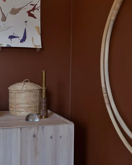
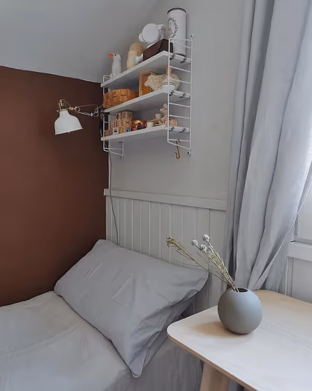
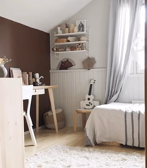
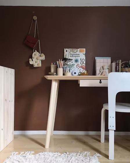
Experience the timeless elegance of Tikkurila N470 None (Rye) in your home. This warm, earthy tone brings a sense of tranquility and sophistication to any space. Ideal for creating a cozy atmosphere in living rooms, bedrooms, or home offices, this versatile color pairs beautifully with both modern and traditional decor. Allow Tikkurila N470 None to envelop your space in a subtle yet inviting charm, making it the perfect choice for those seeking a harmonious and stylish interior.
Tikkurila N470 reviews
View the photos of real spaces painted with this that were not included in specific categories.Close-ups, painted furniture, storages and dressers, hallways, stairs and ceilings.
Try before you buy

100% accurate
reusable paint samples
Peel, stick,
and repeat
Twice painted
with real paint
Next day
delivery
What are Tikkurila N470 undertones?
The undertone of N470 can be accurately described as a Red hue, as is apparent from the color space provided. By isolating the pure hue and eliminating any tints, tones, and shades, we were able to precisely determine its undertone. This approach has proven to be more accurate than traditional methods of defining undertones on a white background, which are now considered outdated.
HEX value
HEX value:
#714F42
RGB code:
113, 79, 66
Is Tikkurila N470 cool or warm?
With a hue of 17° thisbrownrefers warm paint shade according to HSL (Hue, Saturation, Lightness) on the color wheel.
N470 HSL code: 17, 26%, 35%
Hue - degree on a color wheel from 0 to 360. 0 is red, 120 is green, and 240 is blue.
Saturation is expressed as a percentage. At 0%, it appears as a shade of grey, and at 100%, it is in full color..
Lightness is also a percentage value. 0% is black, and 100% is white.
- Warm colors are ideal for kitchens, living rooms or bathrooms
- Warmer hues make larger spaces feel more inviting
- Warm beige shades create a cozy and inviting atmosphere, making any room feel comfortable and welcoming, perfect for living rooms, bedrooms, and hallways.
- Using dark warm shades like rich reds and browns creates a cozy and intimate atmosphere, perfect for dining rooms, libraries, and living rooms. These colors add depth and warmth. However, be careful when using them in small spaces or rooms with low ceilings, as they can make the space feel even smaller.
Act like a pro: Mixing warm and cool shades is a must have to get harmonius interior. Add accents that contrast with the primary color to create visual balance. If your walls are a warm color, don’t forget to add accent in cold colors (furniture, art, décor). A good practice is too use a complementary color scheme.
How light temperature affects N470
Natural Lighting. During the day, natural light shifts from about 2000 K at sunrise/sunset to 5500–6500 K at noon.
In addition, natural‑light temperature depends on its direction:
| Direction of sunlight | Visible temp. | Hue | Duration |
|---|---|---|---|
| North | Cool | Bluish | All day |
| East | Warm | Yellow | Before noon |
| West | Warm | Orange‑red | After noon |
| South | Warm | Orange‑yellow | All day |
Artificial Lighting. When choosing bulbs, pay attention to their color‑temperature (Kelvins).
Use the slider to see how this brown shade looks under different lighting:


4000K
Coordinating colors.
Colors that go with Tikkurila N470:
Complementary color scheme
This color scheme is a combination of two shades that are opposite each other on the color wheel. The high contrast between these colors creates a vibrant and dynamic visual effect. For the color N470 with a red hue, complementary colors are those with a green hue close to 197, such as Tikkurila .
N470
LRV of N470
N470 has an LRV of 9.9% and refers to Dark colors which means that this color almost does not reflect light. Why LRV is important?
Light Reflectance Value measures the amount of visible and usable light that reflects from a painted surface.
Simply put, the higher the LRV of a paint color, the brighter the room you will get.
The scale goes from 0% (absolute black, absorbing all light) to 100% (pure white, reflecting all light).
Act like a pro: When choosing paint with an LRV of 9.9%, pay attention to your bulbs' brightness. Light brightness is measured in lumens. The lower the paint's LRV, the higher lumen level you need. Every square foot of room needs at least 40 lumens. That means for a 200 ft2 living room you’ll need about 8000 lumens of light – e.g., eight 1000 lm bulbs.
Color codes
We have collected almost every possible color code you could ever need. To copy the code, just click the icon to the right of it.
| Format | Code | |
|---|---|---|
| HEX | #714F42 | |
| RGB Decimal | 113, 79, 66 | |
| RGB Percent | 44.31%, 30.98%, 25.88% | |
| HSV | Hue: 17° Saturation: 41.59% Value: 44.31% | |
| HSL | hsl(17, 26, 35) | |
| CMYK | Cyan: 0.0 Magenta: 30.09 Yellow: 41.59 Key: 55.69 | |
| YIQ | Y: 87.684 I: 24.438 Q: 3.147 | |
| XYZ | X: 10.59 Y: 9.497 Z: 6.428 | |
| CIE Lab | L:36.924 a:12.475 b:13.372 | |
| CIE Luv | L:36.924 u:23.025 v:13.272 | |
| Decimal | 7425858 | |
| Hunter Lab | 30.817, 7.41, 9.204 |
Color equivalents
2993
Kilim
Jotun

50YR 10/151
Exotic Spice 2
Dulux
RAL 8002
Signal brown
RAL Classic
80YR 11/151
Velvet Truffle 2
Dulux
Chocolate Fountain
Dulux
RAL 8025
Pale brown
RAL Classic

60YR 08/186
Ginger Glow 1
Dulux
M476
Rooibos
Tikkurila

RAL 8024
Beige brown
RAL Classic

70YR 08/186
Rich Havana 1
Dulux
80YR 09/163
Roasted Pumpkin 1
Dulux
Mexican Mosaic 1
Dulux
318
Scullery
Little Greene

345
Ganache
Little Greene

10981
Norwegian Wood
Jotun

50YR 07/162
Nigerian Sands 1
Dulux
2727
Red Maple
Jotun

2846
Bordeaux
Jotun


