Tikkurila G436
| Code: | G436 |
| Name: | |
| Brand: | Tikkurila |
What color is Tikkurila G436?
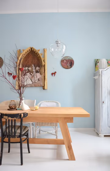
Tikkurila's G436 None is a sophisticated and versatile color that exudes timeless elegance. This neutral hue pairs impeccably with deep shades such as Tikkurila's R495 Soft and lighter tones like Tikkurila's G525 Afternoon. The balanced undertones of G436 None make it a perfect choice for creating a harmonious color palette in any space. Incorporating this color into your interior design scheme will add a touch of refined charm while allowing for endless flexibility in decor choices.
Tikkurila G436 reviews
View the photos of real spaces painted with this that were not included in specific categories.Close-ups, painted furniture, storages and dressers, hallways, stairs and ceilings.
Try before you buy

100% accurate
reusable paint samples
Peel, stick,
and repeat
Twice painted
with real paint
Next day
delivery
What are Tikkurila G436 undertones?
The undertone of G436 can be accurately described as a Blue hue, as is apparent from the color space provided. By isolating the pure hue and eliminating any tints, tones, and shades, we were able to precisely determine its undertone. This approach has proven to be more accurate than traditional methods of defining undertones on a white background, which are now considered outdated.
HEX value
HEX value:
#C4D6DC
RGB code:
196, 214, 220
Is Tikkurila G436 cool or warm?
With a hue of 195° thisBluerefers cool paint shade according to HSL (Hue, Saturation, Lightness) on the color wheel.
G436 HSL code: 195, 26%, 82%
Hue - degree on a color wheel from 0 to 360. 0 is red, 120 is green, and 240 is blue.
Saturation is expressed as a percentage. At 0%, it appears as a shade of grey, and at 100%, it is in full color..
Lightness is also a percentage value. 0% is black, and 100% is white.
- Cooler hues have a calm and relaxation effect
- Cool blue shades make a room feel sleek, fresh, and modern, perfect for bedrooms, bathrooms, and home offices where a sense of calm and sophistication is desired.
- Light, soft colors like pastel blues and greens make a room feel fresh and open. They're great for bathrooms, nurseries, and kitchens, creating a calm and inviting atmosphere. Just avoid using these colors in north-facing rooms, as they might feel too cold.
Act like a pro: Mixing warm and cool shades is a must have to get harmonius interior. Add accents that contrast with the primary color to create visual balance. If your walls are a warm color, don’t forget to add accent in cold colors (furniture, art, décor). A good practice is too use a complementary color scheme.
How light temperature affects G436
Natural Lighting. During the day, natural light shifts from about 2000 K at sunrise/sunset to 5500–6500 K at noon.
In addition, natural‑light temperature depends on its direction:
| Direction of sunlight | Visible temp. | Hue | Duration |
|---|---|---|---|
| North | Cool | Bluish | All day |
| East | Warm | Yellow | Before noon |
| West | Warm | Orange‑red | After noon |
| South | Warm | Orange‑yellow | All day |
Artificial Lighting. When choosing bulbs, pay attention to their color‑temperature (Kelvins).
Use the slider to see how this Blue shade looks under different lighting:


4000K
Coordinating colors.
Colors that go with Tikkurila G436:
Complementary color scheme
This color scheme is a combination of two shades that are opposite each other on the color wheel. The high contrast between these colors creates a vibrant and dynamic visual effect. For the color G436 with a green hue, complementary colors are those with a red hue close to 15, such as Tikkurila and G475.
LRV of G436
G436 has an LRV of 63.86% and refers to Light colors that reflect most of the incident light. Why LRV is important?
Light Reflectance Value measures the amount of visible and usable light that reflects from a painted surface.
Simply put, the higher the LRV of a paint color, the brighter the room you will get.
The scale goes from 0% (absolute black, absorbing all light) to 100% (pure white, reflecting all light).
Act like a pro: When choosing paint with an LRV of 63.86%, pay attention to your bulbs' brightness. Light brightness is measured in lumens. The lower the paint's LRV, the higher lumen level you need. Every square foot of room needs at least 40 lumens. That means for a 200 ft2 living room you’ll need about 8000 lumens of light – e.g., eight 1000 lm bulbs.
Color codes
We have collected almost every possible color code you could ever need. To copy the code, just click the icon to the right of it.
| Format | Code | |
|---|---|---|
| HEX | #C4D6DC | |
| RGB Decimal | 196, 214, 220 | |
| RGB Percent | 76.86%, 83.92%, 86.27% | |
| HSV | Hue: 195° Saturation: 10.91% Value: 86.27% | |
| HSL | hsl(195, 26, 82) | |
| CMYK | Cyan: 10.91 Magenta: 2.73 Yellow: 0.0 Key: 13.73 | |
| YIQ | Y: 209.302 I: -12.654 Q: -1.94 | |
| XYZ | X: 59.726 Y: 64.995 Z: 77.089 | |
| CIE Lab | L:84.481 a:-4.845 b:-5.011 | |
| CIE Luv | L:84.481 u:-10.017 v:-6.871 | |
| Decimal | 12900060 | |
| Hunter Lab | 80.62, -8.845, -0.26 |
Color equivalents
70BG 69/075
Winter Teal 5
Dulux
90BG 63/072
Pebble Drift 5
Dulux
10BB 83/006
Atmosphere
Dulux

70BG 68/056
Celestial Cloud 5
Dulux
Blue Seduction 6
Dulux
Blue Opal
Dulux
01BB 69/098
Mineral Mist
Dulux

325
Bone China Blue - Faint
Little Greene

70BG 72/057
Winter Teal 6
Dulux
Glacial Spring
Dulux
Luna Landscape 6
Dulux
Liberty Blue 5
Dulux
30BG 64/072
Jewelled Creek 5
Dulux
Holiday Blues 5
Dulux
Y436
Tikkurila

90BG 72/063
Borrowed Blue
Dulux

4468
Alladin
Jotun

G358
Tikkurila


