Sherwin Williams Paradise SW 6720
Contentsshow +hide -
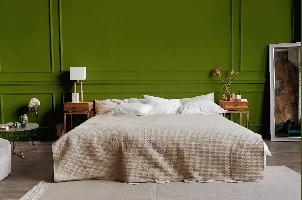
- Paradise for bedroom (1 photo)
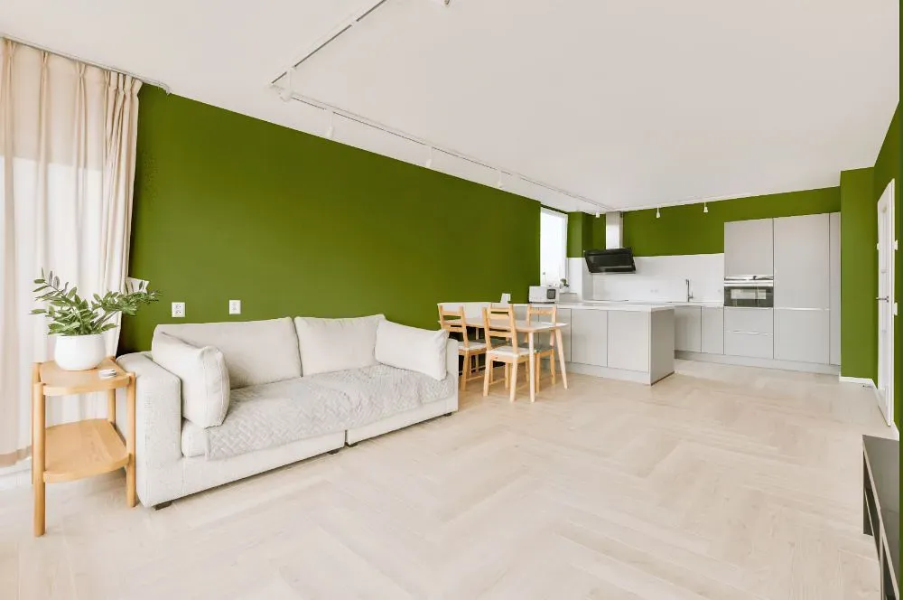
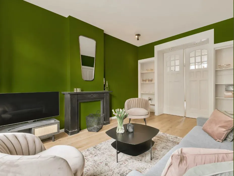
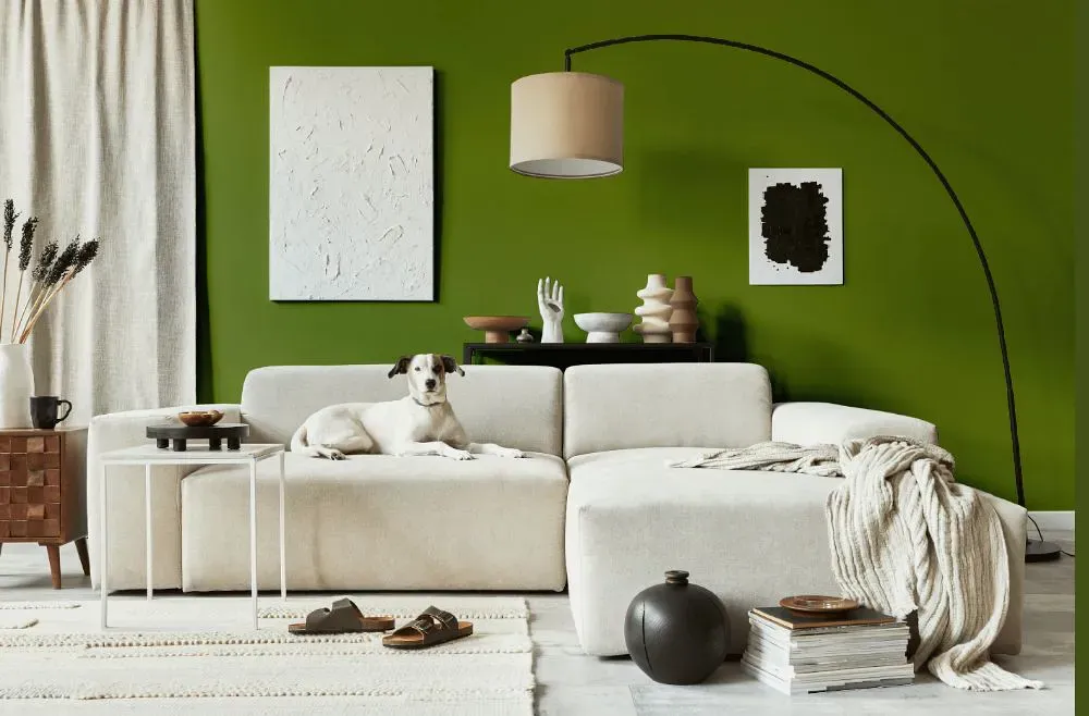
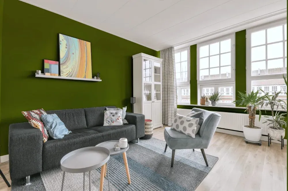
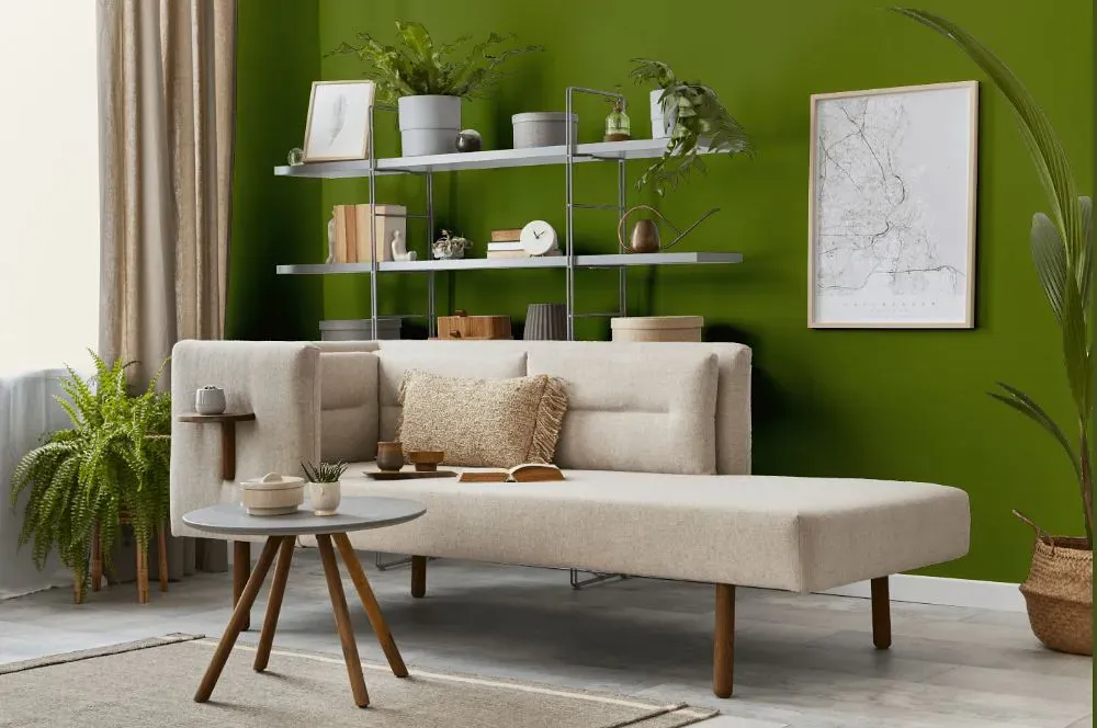
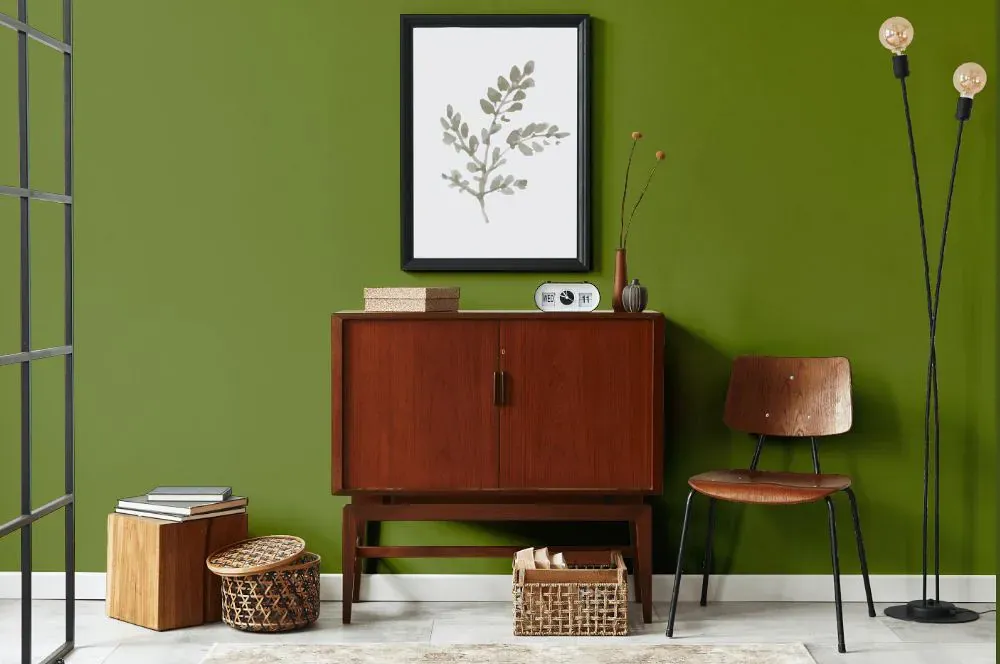
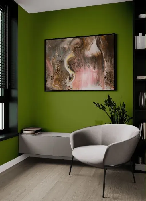
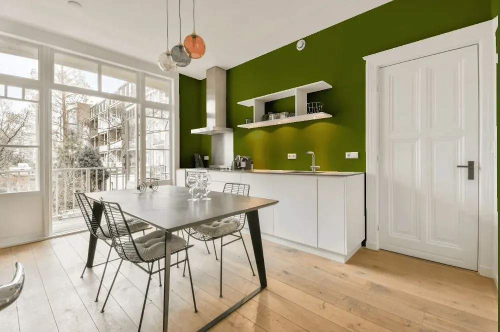
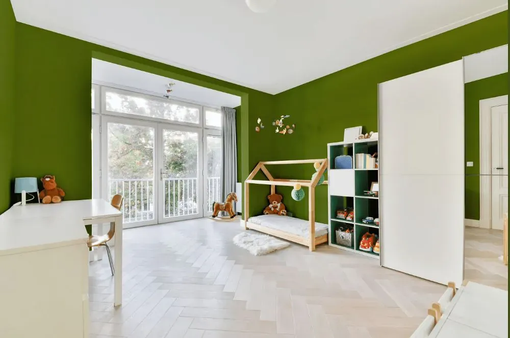
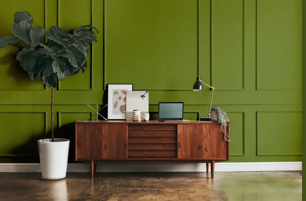
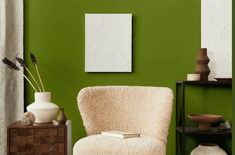
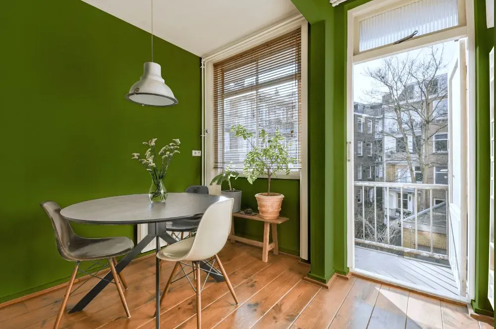
- Paradise for living room (7 photos)
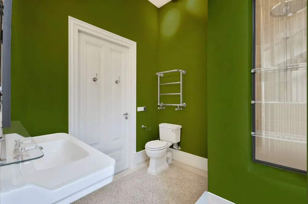
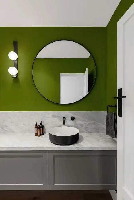
- Sherwin Williams Paradise for bathroom (2 photos)
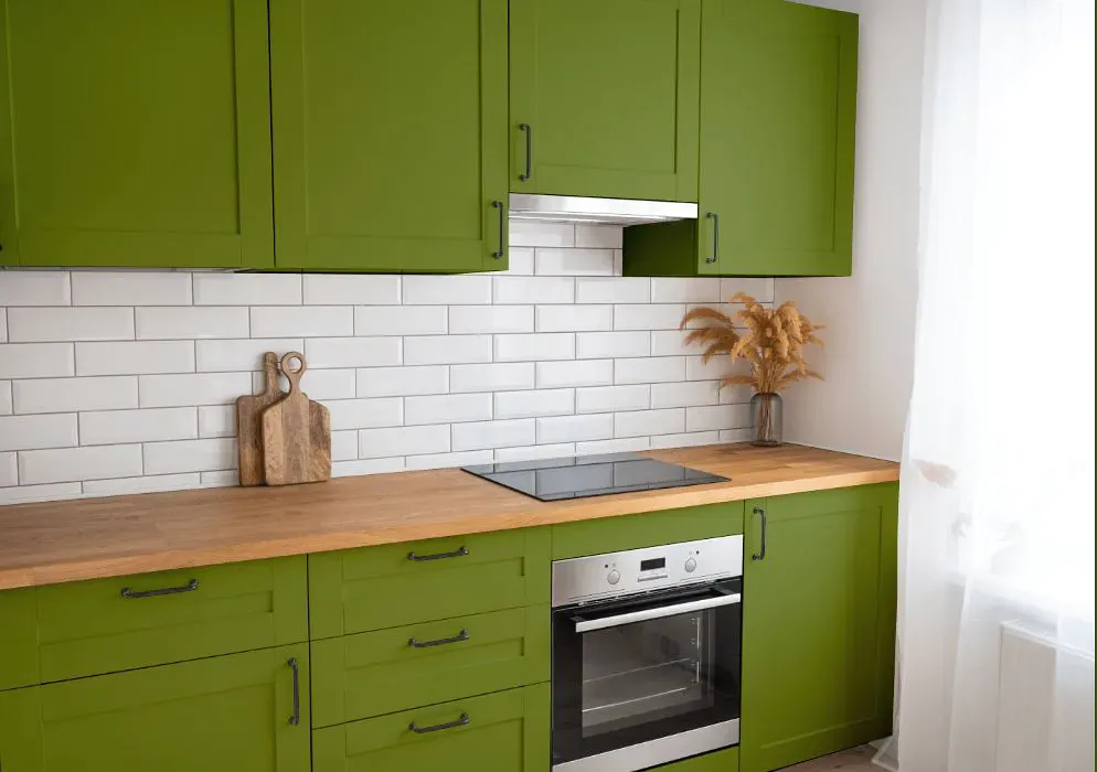
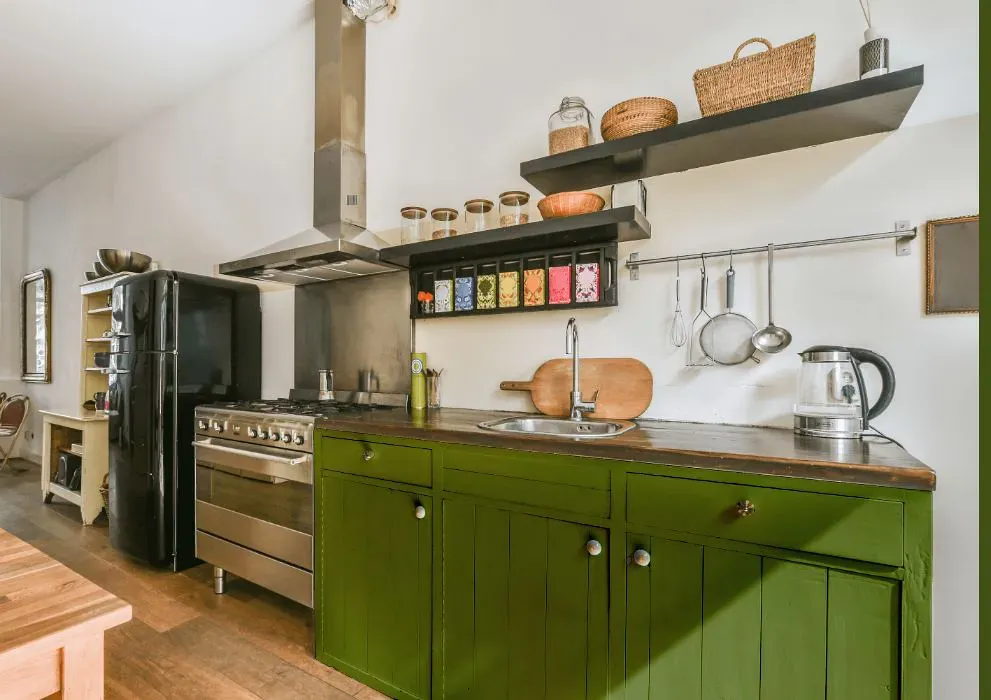
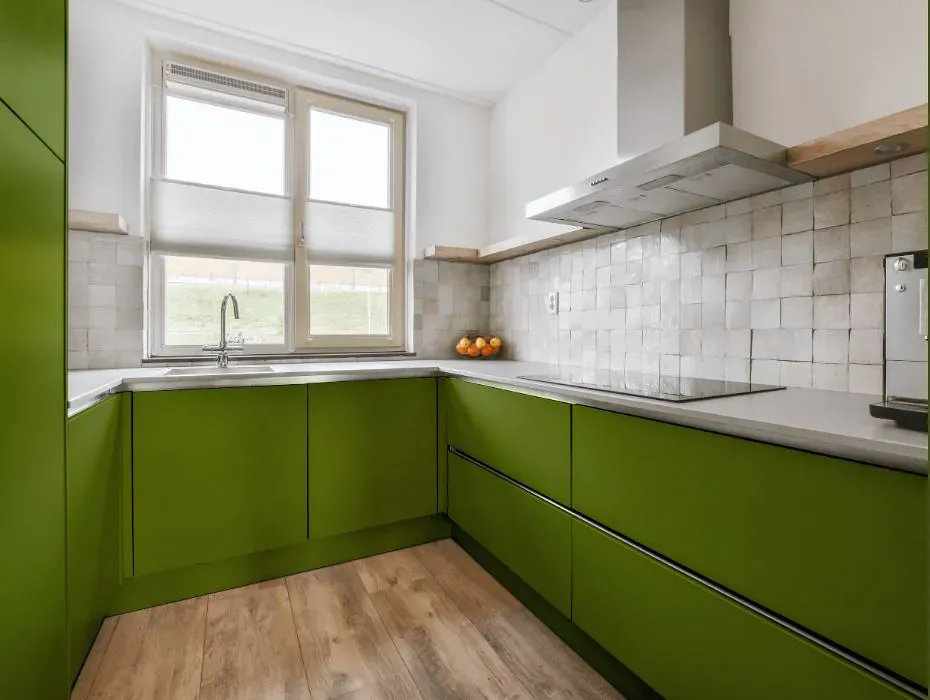
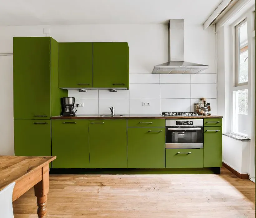
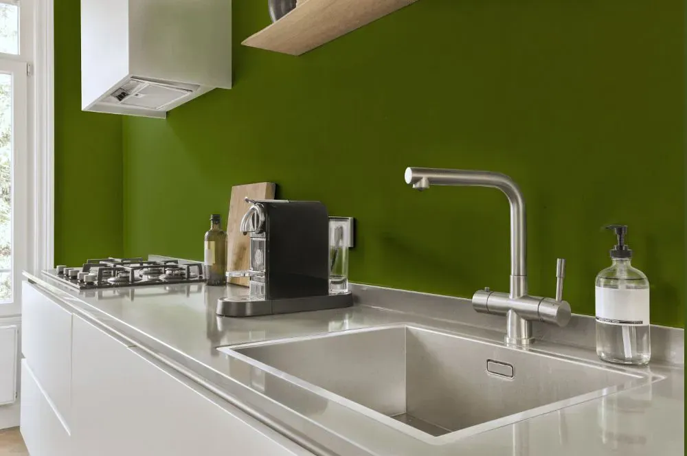
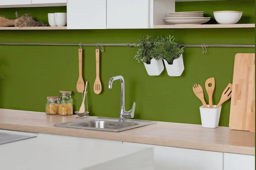
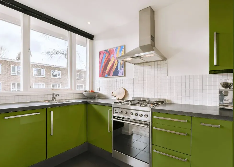
- Sherwin Williams SW 6720 on kitchen cabinets (4 photos)
- Sherwin Williams Paradise reviews (9 photos)
- What are Sherwin Williams Paradise undertones?
- Is Paradise SW 6720 cool or warm?
- How light temperature affects on Paradise
- Monochromatic color scheme
- Complementary color scheme
- Color comparison and matching
- LRV of Paradise SW 6720
- Color codes
- Color equivalents
| Official page: | Paradise SW 6720 |
| Code: | SW 6720 |
| Name: | Paradise |
| Brand: | Sherwin Williams |
| Collections: | 2015 Buoyant |
What color is Sherwin Williams Paradise?
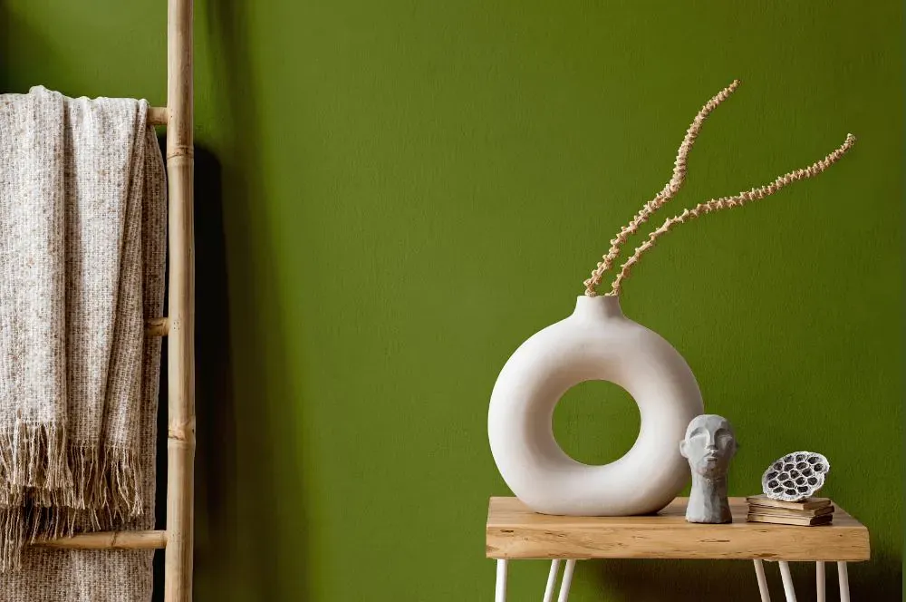
Sherwin Williams Paradise SW 6720 is a vibrant and inviting hue that exudes a sense of tropical charm. This vivid color pairs beautifully with light neutrals like soft beige and warm tans to create a serene and relaxing space. When combined with hints of teal and aqua, Paradise infuses a room with a playful and refreshing vibe. For a more sophisticated look, try blending Paradise with deep navy blues and rich earth tones to add depth and drama to your interior. Whether used as an accent or a focal point, this versatile color can transform any room into a tranquil oasis.
Loading...
LRV of Paradise
Paradise has an LRV of 17.68% and refers to Medium Dark which means that this color reflects very little light. Why LRV is important?

Light Reflectance Value measures the amount of visible and usable light that reflects from a painted surface.
Simply put, the higher the LRV of a paint color, the brighter the room you will get.
The scale goes from 0% (absolute black, absorbing all light) to 100% (pure white, reflecting all light).
Act like a pro: When choosing paint with an LRV of 17.68%, pay attention to your bulbs' brightness. Light brightness is measured in lumens. The lower the paint's LRV, the higher lumen level you need. Every square foot of room needs at least 40 lumens. That means for a 200 ft2 living room you'll need about 8000 lumens of light – e.g., eight 1000 lm bulbs.
Color codes
We have collected almost every possible color code you could ever need.
Not sure what the difference between HEX and RGB is? We break down color models in plain language. Understanding color models
| Format | Code |
|---|---|
| HEX | #6c7b30 |
| RGB Decimal | 108, 123, 48 |
| RGB Percent | 42.35%, 48.24%, 18.82% |
| HSV | Hue: 72° Saturation: 60.98% Value: 48.24% |
| HSL | hsl(72, 44, 34) |
| CMYK | Cyan: 12.2 Magenta: 0.0 Yellow: 60.98 Key: 51.76 |
| YIQ | Y: 109.965 I: 15.162 Q: -26.513 |
| XYZ | X: 13.801 Y: 17.568 Z: 5.459 |
| CIE Lab | L:48.967 a:-17.231 b:38.264 |
| CIE Luv | L:48.967 u:-6.287 v:44.567 |
| Decimal | 7109424 |
| Hunter Lab | 41.914, -14.574, 21.617 |