Sherwin Williams Parisian Patina SW 9041
Contentsshow +hide -
- Sherwin Williams SW 9041 on kitchen cabinets (2 photos)
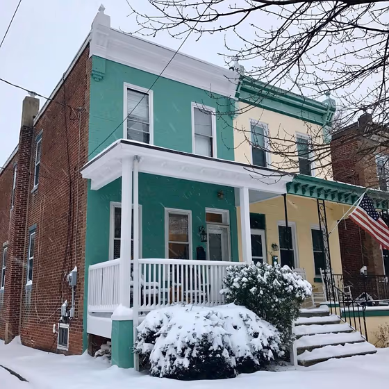
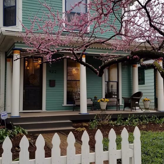
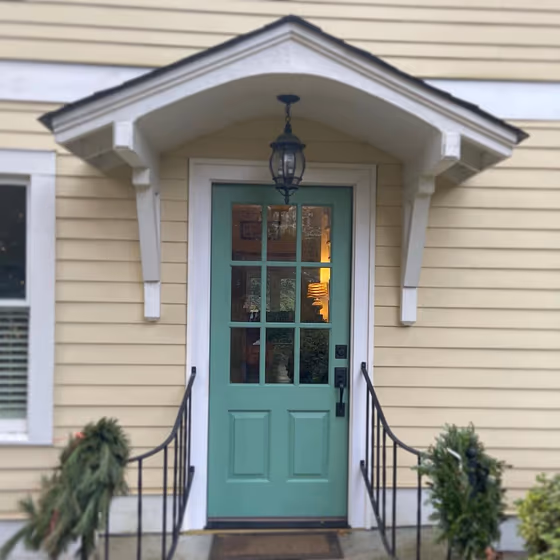
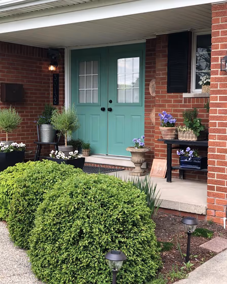
- Parisian Patina for exterior (2 photos)
- Sherwin Williams Parisian Patina reviews (6 photos)
- What are Sherwin Williams Parisian Patina undertones?
- Is Parisian Patina SW 9041 cool or warm?
- How light temperature affects on Parisian Patina
- Monochromatic color scheme
- Complementary color scheme
- Color comparison and matching
- LRV of Parisian Patina SW 9041
- Color codes
- Color equivalents
| Official page: | Parisian Patina SW 9041 |
| Code: | SW 9041 |
| Name: | Parisian Patina |
| Brand: | Sherwin Williams |
| Collections: | West Elm |
What color is Sherwin Williams Parisian Patina?
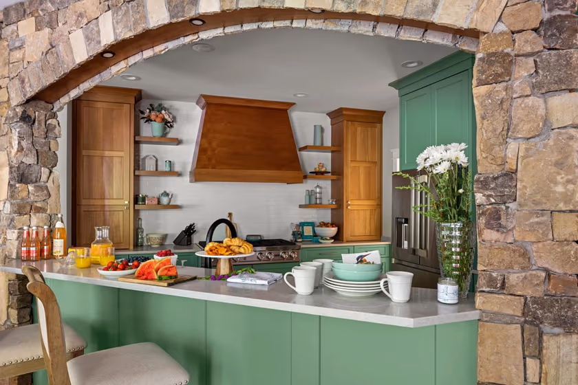
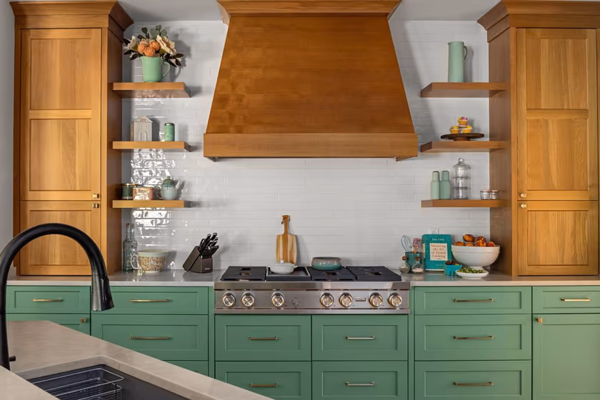
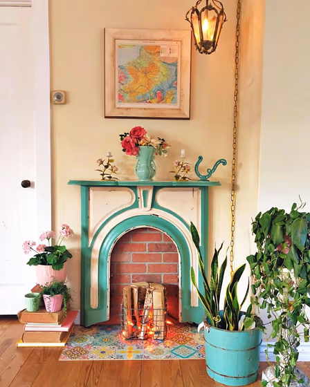
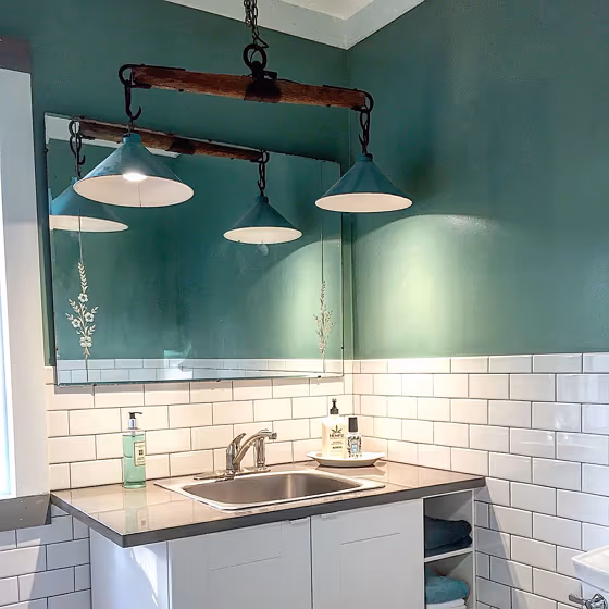
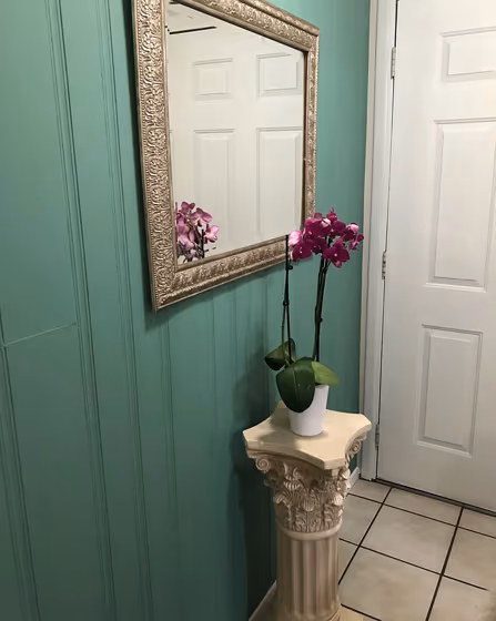
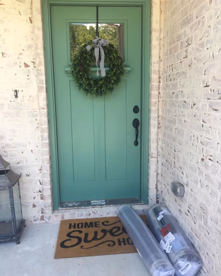
Sherwin Williams SW 9041 Parisian Patina, a lush green hue reminiscent of aged copper, adds a touch of elegance and sophistication to any interior space. This versatile color effortlessly transforms a living room into a cozy retreat or a bedroom into a tranquil sanctuary. In the kitchen, SW 9041 enhances a classic or modern aesthetic, creating a warm and inviting atmosphere for gatherings. With its timeless appeal, Parisian Patina is the perfect choice for accent walls, furniture, or cabinetry in any home looking to exude charm and style. Whether used in a study, a bathroom, or a dining room, this color elevates the ambiance with its calming and luxurious vibe.
Loading...
LRV of Parisian Patina
Parisian Patina has an LRV of 29.74% and refers to Medium colors that reflect a lot of light. Why LRV is important?

Light Reflectance Value measures the amount of visible and usable light that reflects from a painted surface.
Simply put, the higher the LRV of a paint color, the brighter the room you will get.
The scale goes from 0% (absolute black, absorbing all light) to 100% (pure white, reflecting all light).
Act like a pro: When choosing paint with an LRV of 29.74%, pay attention to your bulbs' brightness. Light brightness is measured in lumens. The lower the paint's LRV, the higher lumen level you need. Every square foot of room needs at least 40 lumens. That means for a 200 ft2 living room you'll need about 8000 lumens of light – e.g., eight 1000 lm bulbs.
Color codes
We have collected almost every possible color code you could ever need.
Not sure what the difference between HEX and RGB is? We break down color models in plain language. Understanding color models
| Format | Code |
|---|---|
| HEX | #7d9b89 |
| RGB Decimal | 125, 155, 137 |
| RGB Percent | 49.02%, 60.78%, 53.73% |
| HSV | Hue: 144° Saturation: 19.35% Value: 60.78% |
| HSL | hsl(144, 13, 55) |
| CMYK | Cyan: 19.35 Magenta: 0.0 Yellow: 11.61 Key: 39.22 |
| YIQ | Y: 143.978 I: -12.093 Q: -11.948 |
| XYZ | X: 24.693 Y: 29.608 Z: 28.074 |
| CIE Lab | L:61.315 a:-14.212 b:6.006 |
| CIE Luv | L:61.315 u:-15.339 v:10.761 |
| Decimal | 8231817 |
| Hunter Lab | 54.413, -14.221, 7.499 |