Sherwin Williams Quietude SW 6212
Contentsshow +hide -
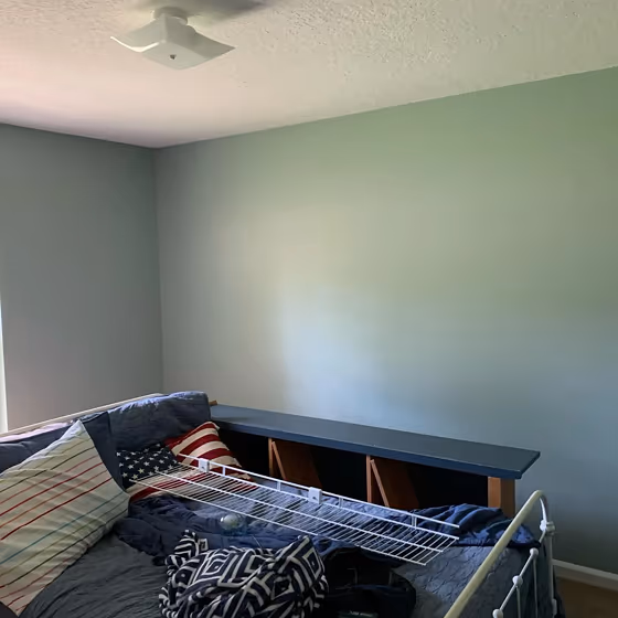
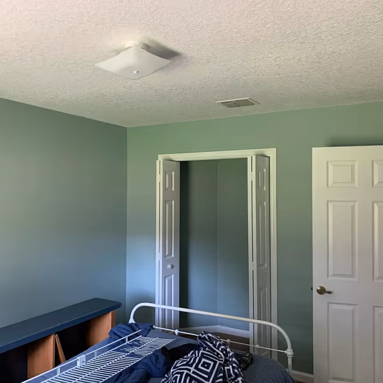
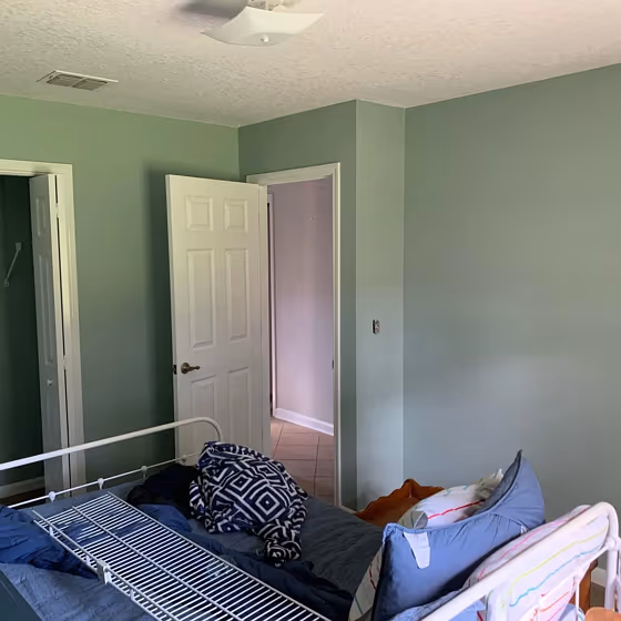
- Quietude for bedroom (3 photos)
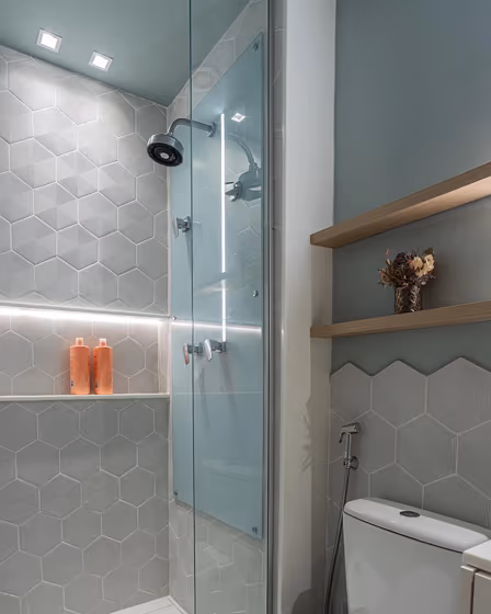
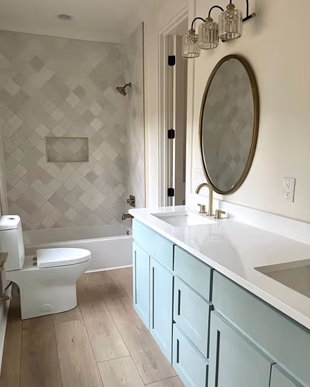
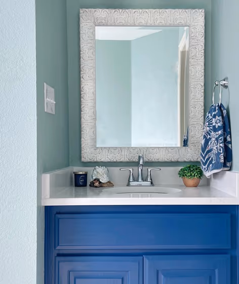
- Sherwin Williams Quietude for bathroom (3 photos)
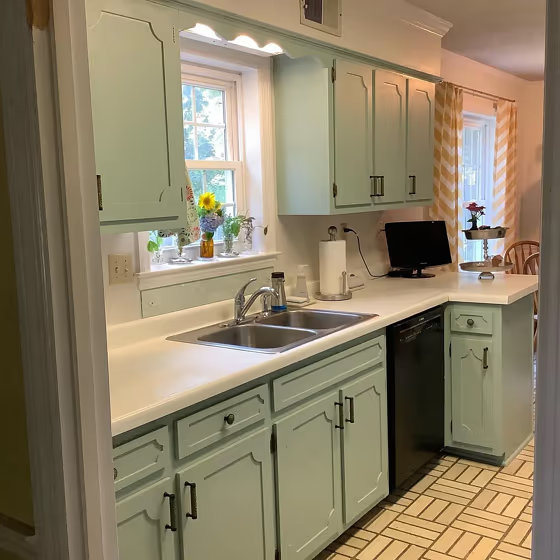
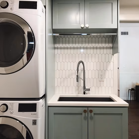
- Sherwin Williams SW 6212 on kitchen cabinets (1 photo)
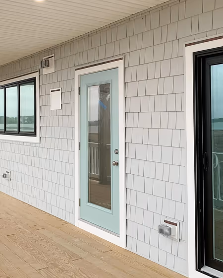
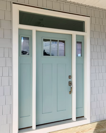
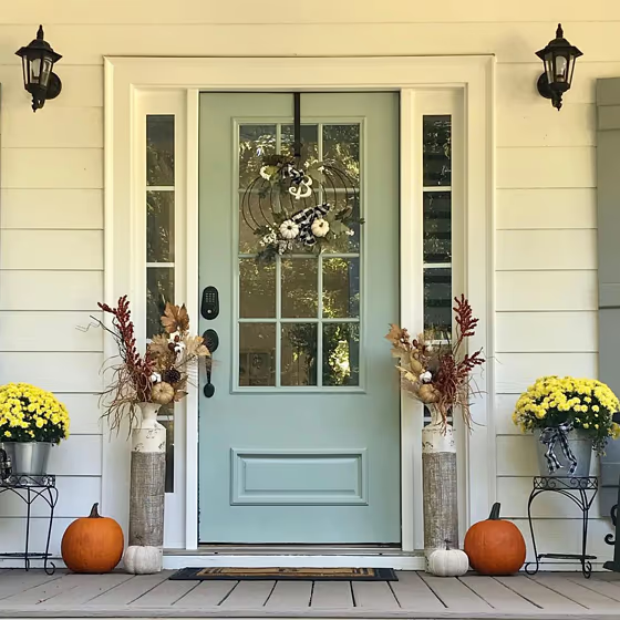
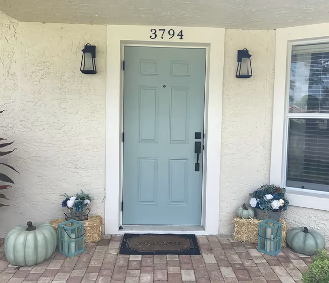
- Quietude for exterior (4 photos)
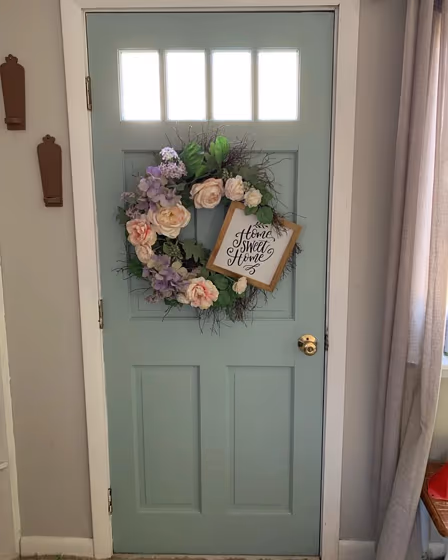
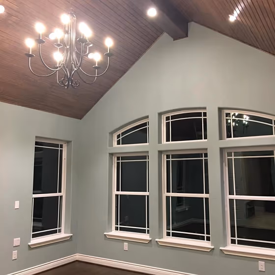
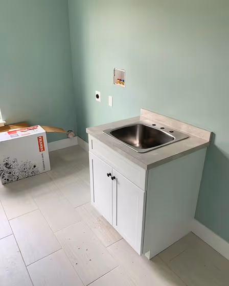
- Sherwin Williams Quietude reviews (10 photos)
- What are Sherwin Williams Quietude undertones?
- Is Quietude SW 6212 cool or warm?
- How light temperature affects on Quietude
- Monochromatic color scheme
- Complementary color scheme
- Color comparison and matching
- LRV of Quietude SW 6212
- Color codes
- Color equivalents
| Official page: | Quietude SW 6212 |
| Code: | SW 6212 |
| Name: | Quietude |
| Brand: | Sherwin Williams |
| Collections: | Living Well, Organic |
What color is Sherwin Williams Quietude?
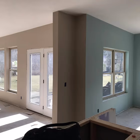
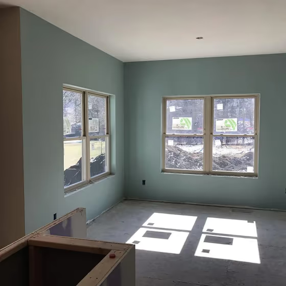
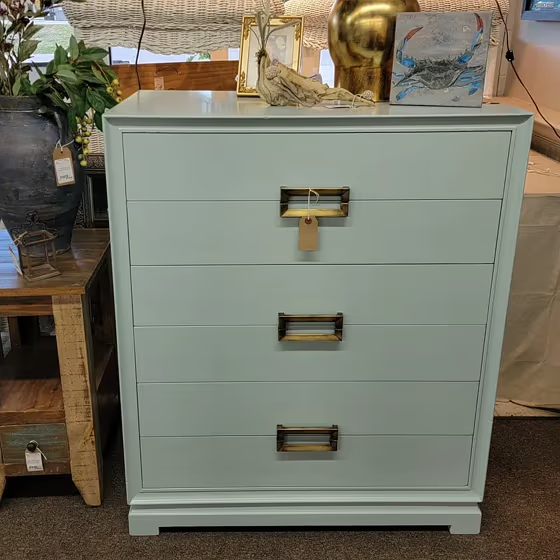
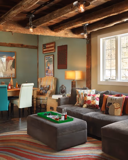
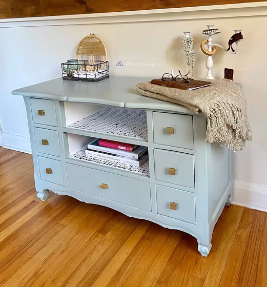
Sherwin Williams Quietude (SW 6212) is a muted blue-green that sits right between sage and soft coastal teal. It reads calm and slightly gray, so it won't scream "color", but it also won't look flat like a plain neutral. Quietude is easiest to style with warm whites, light woods, linen textures, and brushed brass - think cozy, lived-in, and airy. In north-facing or low light it can lean a bit cooler and bluer, while strong sun pulls out more green. If you want a gentle color that still feels fresh, this one is a safe bet.
Loading...
LRV of Quietude
Quietude has an LRV of 47.6% and refers to Light Medium colors that reflect half of the incident light. Why LRV is important?

Light Reflectance Value measures the amount of visible and usable light that reflects from a painted surface.
Simply put, the higher the LRV of a paint color, the brighter the room you will get.
The scale goes from 0% (absolute black, absorbing all light) to 100% (pure white, reflecting all light).
Act like a pro: When choosing paint with an LRV of 47.6%, pay attention to your bulbs' brightness. Light brightness is measured in lumens. The lower the paint's LRV, the higher lumen level you need. Every square foot of room needs at least 40 lumens. That means for a 200 ft2 living room you'll need about 8000 lumens of light – e.g., eight 1000 lm bulbs.
Color codes
We have collected almost every possible color code you could ever need.
Not sure what the difference between HEX and RGB is? We break down color models in plain language. Understanding color models
| Format | Code |
|---|---|
| HEX | #adbbb2 |
| RGB Decimal | 173, 187, 178 |
| RGB Percent | 67.84%, 73.33%, 69.80% |
| HSV | Hue: 141° Saturation: 7.49% Value: 73.33% |
| HSL | hsl(141, 9, 71) |
| CMYK | Cyan: 7.49 Magenta: 0.0 Yellow: 4.81 Key: 26.67 |
| YIQ | Y: 181.788 I: -5.451 Q: -5.762 |
| XYZ | X: 43.038 Y: 47.639 Z: 49.035 |
| CIE Lab | L:74.597 a:-6.554 b:2.9 |
| CIE Luv | L:74.597 u:-7.332 v:5.395 |
| Decimal | 11385778 |
| Hunter Lab | 69.021, -9.484, 6.193 |