Sherwin Williams Respite SW 6514
Contentsshow +hide -
| Official page: | Respite SW 6514 |
| Code: | SW 6514 |
| Name: | Respite |
| Brand: | Sherwin Williams |
| Collections: | Memory, Living Well - Focus |
What color is Sherwin Williams Respite?
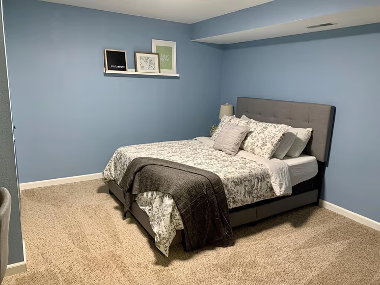
Sherwin Williams SW 6514 Respite is a soothing and versatile color that creates a serene atmosphere in any space. This light and airy hue pairs beautifully with soft neutrals such as SW 7015 Repose Gray and SW 7008 Alabaster, creating a harmonious and calming palette. For a pop of contrast, consider adding accents in darker shades like SW 7046 Anonymous or SW 6214 Underseas. Whether used as a main wall color or as an accent, SW 6514 Respite brings a sense of tranquility and sophistication to any room. Elevate your interior design with this timeless and elegant color choice.
Loading...
LRV of Respite
Respite has an LRV of 43.05% and refers to Light Medium colors that reflect half of the incident light. Why LRV is important?

Light Reflectance Value measures the amount of visible and usable light that reflects from a painted surface.
Simply put, the higher the LRV of a paint color, the brighter the room you will get.
The scale goes from 0% (absolute black, absorbing all light) to 100% (pure white, reflecting all light).
Act like a pro: When choosing paint with an LRV of 43.05%, pay attention to your bulbs' brightness. Light brightness is measured in lumens. The lower the paint's LRV, the higher lumen level you need. Every square foot of room needs at least 40 lumens. That means for a 200 ft2 living room you'll need about 8000 lumens of light – e.g., eight 1000 lm bulbs.
Color codes
We have collected almost every possible color code you could ever need.
Not sure what the difference between HEX and RGB is? We break down color models in plain language. Understanding color models
| Format | Code |
|---|---|
| HEX | #97b4c3 |
| RGB Decimal | 151, 180, 195 |
| RGB Percent | 59.22%, 70.59%, 76.47% |
| HSV | Hue: 200° Saturation: 22.56% Value: 76.47% |
| HSL | hsl(200, 27, 68) |
| CMYK | Cyan: 22.56 Magenta: 7.69 Yellow: 0.0 Key: 23.53 |
| YIQ | Y: 173.039 I: -22.101 Q: -1.467 |
| XYZ | X: 38.931 Y: 43.161 Z: 57.895 |
| CIE Lab | L:71.664 a:-6.536 b:-10.883 |
| CIE Luv | L:71.664 u:-15.626 v:-15.528 |
| Decimal | 9942211 |
| Hunter Lab | 65.697, -9.194, -6.261 |