Tikkurila S448
Contentsshow +hide -
| Code: | S448 |
| Name: | |
| Brand: | Tikkurila |
What color is Tikkurila S448?
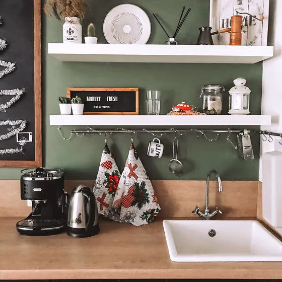
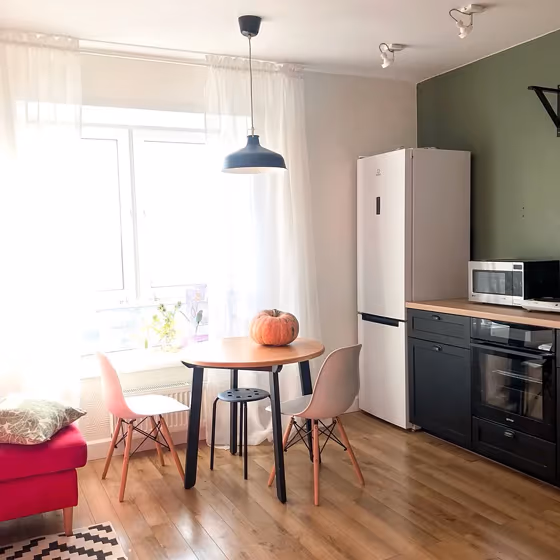
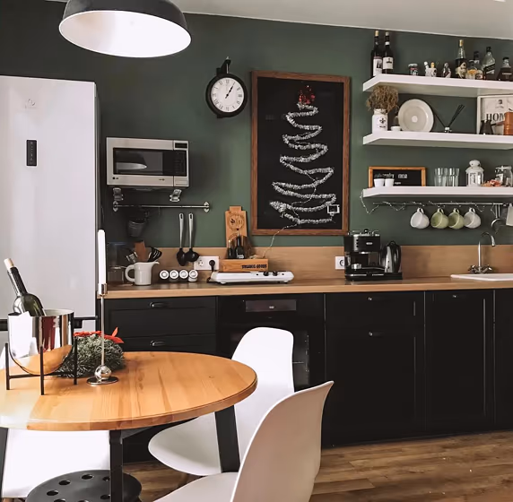
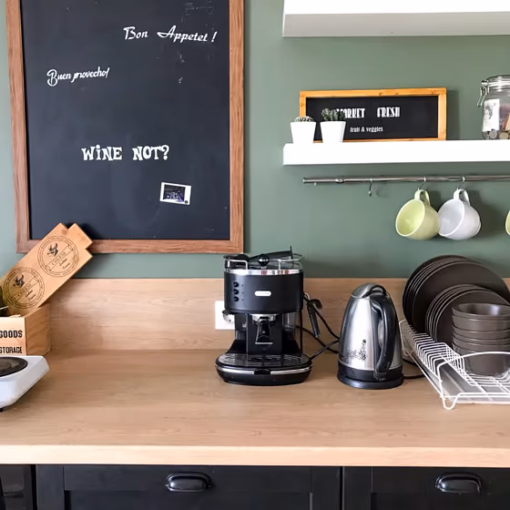
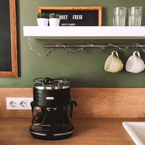
Introducing the versatile Tikkurila S448 None, a unique and elegant shade that effortlessly enhances any interior space. This subdued hue pairs beautifully with natural tones such as Sand Dune S201-4 and Soft Clay G451-4, creating a soothing and harmonious ambiance. To add a touch of contrast and sophistication, consider combining Tikkurila S448 None with deeper shades like Forest Green G487-7 or Navy Blue S502-4. Whether used as a primary color or for accentuating architectural details, this color is sure to bring a timeless allure to your home. Experience the transformative power of Tikkurila S448 None and elevate your living space with understated luxury.
Loading...
LRV of S448
S448 has an LRV of 21.16% and refers to Medium colors that reflect a lot of light. Why LRV is important?

Light Reflectance Value measures the amount of visible and usable light that reflects from a painted surface.
Simply put, the higher the LRV of a paint color, the brighter the room you will get.
The scale goes from 0% (absolute black, absorbing all light) to 100% (pure white, reflecting all light).
Act like a pro: When choosing paint with an LRV of 21.16%, pay attention to your bulbs' brightness. Light brightness is measured in lumens. The lower the paint's LRV, the higher lumen level you need. Every square foot of room needs at least 40 lumens. That means for a 200 ft2 living room you'll need about 8000 lumens of light – e.g., eight 1000 lm bulbs.
Color codes
We have collected almost every possible color code you could ever need.
| Format | Code |
|---|---|
| HEX | #7D826F |
| RGB Decimal | 125, 130, 111 |
| RGB Percent | 49.02%, 50.98%, 43.53% |
| HSV | Hue: 76° Saturation: 14.62% Value: 50.98% |
| HSL | hsl(76, 8, 47) |
| CMYK | Cyan: 3.85 Magenta: 0.0 Yellow: 14.62 Key: 49.02 |
| YIQ | Y: 126.339 I: 3.126 Q: -6.97 |
| XYZ | X: 19.309 Y: 21.473 Z: 18.162 |
| CIE Lab | L:53.463 a:-5.482 b:9.67 |
| CIE Luv | L:53.463 u:-1.91 v:13.777 |
| Decimal | 8225391 |
| Hunter Lab | 46.339, -6.715, 9.199 |