Tikkurila Fig V502
Contentsshow +hide -
| Code: | V502 |
| Name: | Fig |
| Brand: | Tikkurila |
What color is Tikkurila Fig?
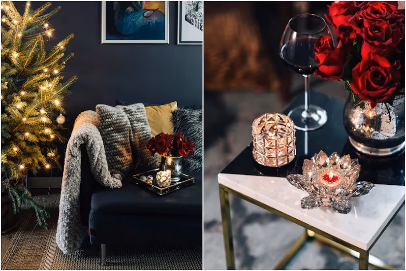
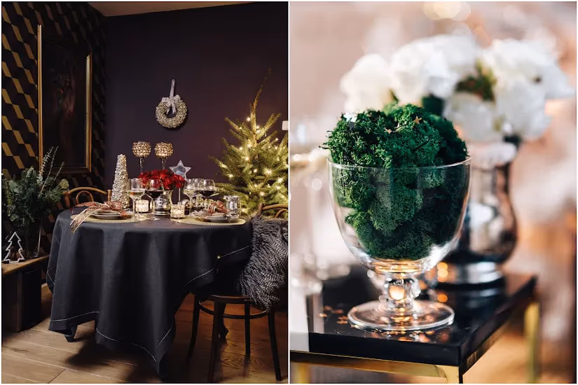
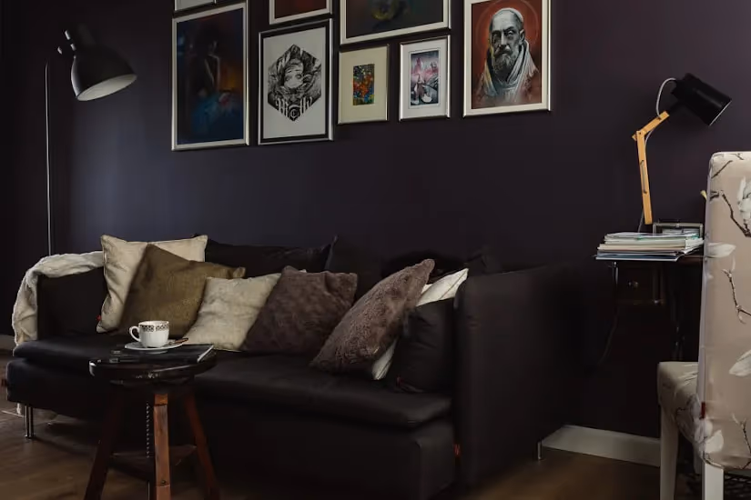
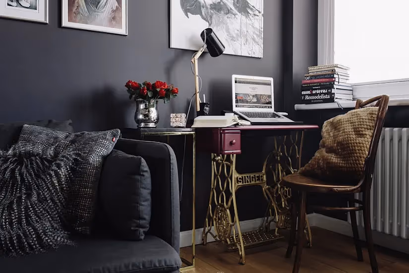
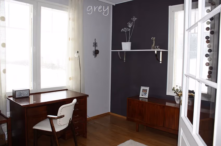
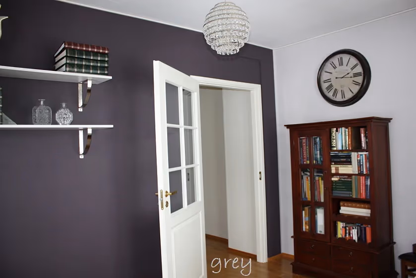
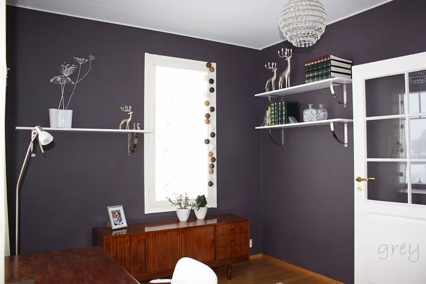
Enhance your space with Tikkurila V502 Fig, a deep and rich color that exudes elegance and sophistication. This versatile hue pairs beautifully with neutrals such as Tikkurila N499 Off-white and bold complementary shades like Tikkurila L494 Midnight Blue. Create a cozy and inviting atmosphere by combining V502 Fig with warm tones like Tikkurila Y488 Goldenrod. Elevate your interior design with this timeless color that adds depth and character to any room. Experience the transformative power of Tikkurila V502 Fig (Fig) and turn your space into a stylish sanctuary.
Loading...
LRV of Fig
Fig has an LRV of 10.49% and refers to Medium Dark which means that this color reflects very little light. Why LRV is important?

Light Reflectance Value measures the amount of visible and usable light that reflects from a painted surface.
Simply put, the higher the LRV of a paint color, the brighter the room you will get.
The scale goes from 0% (absolute black, absorbing all light) to 100% (pure white, reflecting all light).
Act like a pro: When choosing paint with an LRV of 10.49%, pay attention to your bulbs' brightness. Light brightness is measured in lumens. The lower the paint's LRV, the higher lumen level you need. Every square foot of room needs at least 40 lumens. That means for a 200 ft2 living room you'll need about 8000 lumens of light – e.g., eight 1000 lm bulbs.
Color codes
We have collected almost every possible color code you could ever need.
Not sure what the difference between HEX and RGB is? We break down color models in plain language. Understanding color models
| Format | Code |
|---|---|
| HEX | #5D585F |
| RGB Decimal | 93, 88, 95 |
| RGB Percent | 36.47%, 34.51%, 37.25% |
| HSV | Hue: 283° Saturation: 7.37% Value: 37.25% |
| HSL | hsl(283, 4, 36) |
| CMYK | Cyan: 2.11 Magenta: 7.37 Yellow: 0.0 Key: 62.75 |
| YIQ | Y: 90.293 I: 0.73 Q: 3.236 |
| XYZ | X: 10.069 Y: 10.133 Z: 12.249 |
| CIE Lab | L:38.08 a:3.482 b:-3.306 |
| CIE Luv | L:38.08 u:2.35 v:-4.764 |
| Decimal | 6117471 |
| Hunter Lab | 31.832, 0.756, -0.532 |