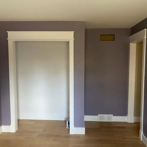
Valspar UK Pretty as a Picture X13R25D
Contentsshow +hide -
| Official page: | Pretty as a Picture X13R25D |
| Code: | X13R25D |
| Name: | Pretty as a Picture |
| Brand: | Valspar UK |
What color is Valspar UK Pretty as a Picture?
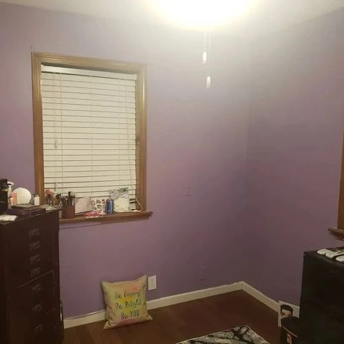
Let's dive into a full Pretty as a Picture paint color review. Take a look at pictures of real interiors and exteriors painted with beautiful X13R25D. Find out if this gorgeous cold purple paint color would look great on your living room walls or trims, kitchen cabinet, bedroom accent wall, bathroom or house exterior.
Try before you buy


100% accurate
reusable paint samples

Peel, stick,
and repeat

Twice painted
with real paint

Next day
delivery
What are Valspar UK Pretty as a Picture undertones?
Pretty as a Picture is a midtone, muted muted mauve. The HEX sample leans purple; this describes its measurable digital hue direction, not a hidden paint pigment. Warm light may bring out its red or mauve side, while cool daylight can make the violet direction clearer.
HEX value:
RGB code:
156, 147, 170
Is Valspar UK Pretty as a Picture cool or warm?
warm
cool
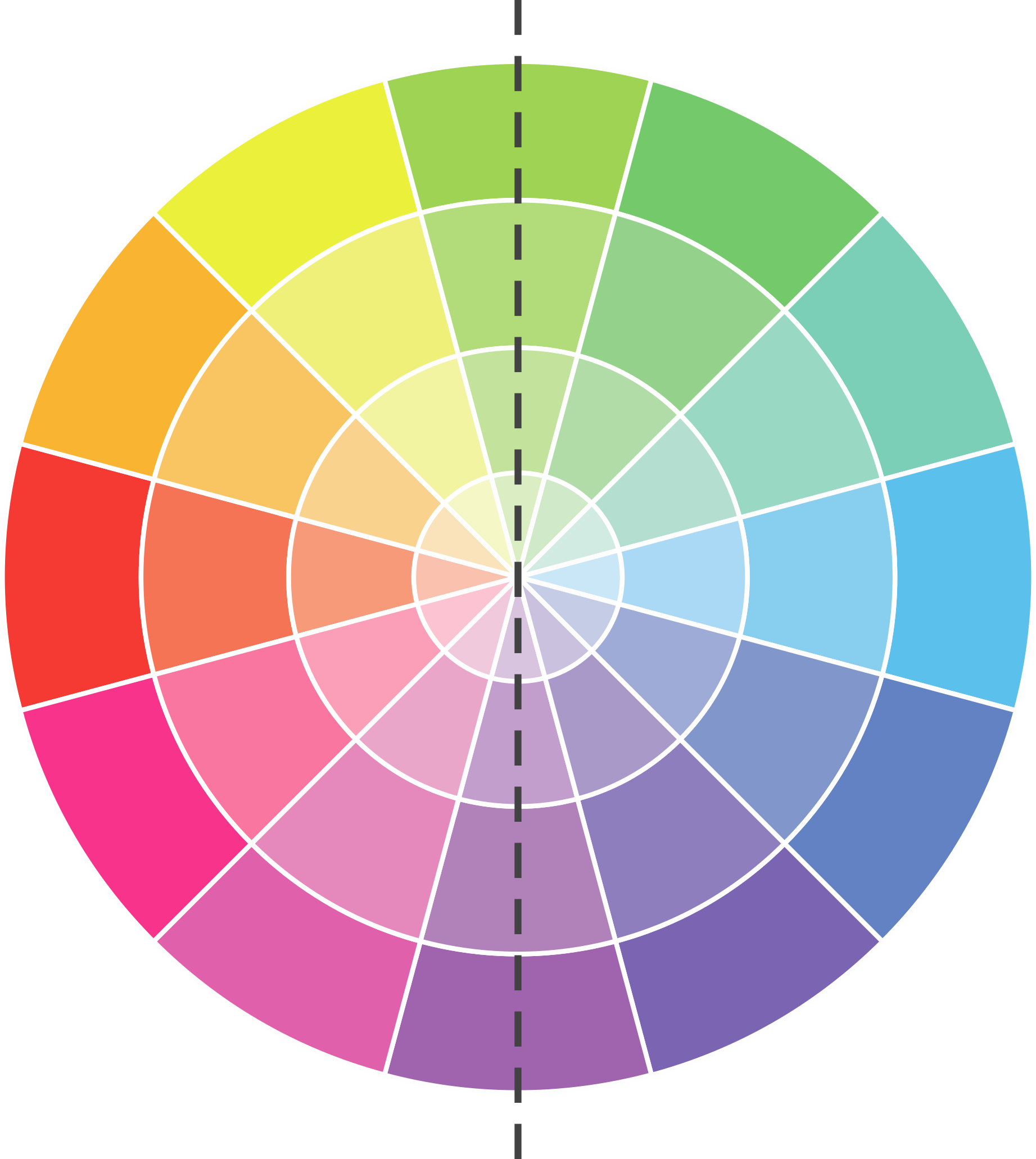
With a hue of 263°, this Purple leans cool, but it is near the neutral line and may feel warmer in certain lighting.
X13R25D Pretty as a Picture HSL code: 263, 12%, 62%
Hue - degree on a color wheel from 0 to 360. 0 is red, 120 is green, and 240 is blue.
Saturation is expressed as a percentage. At 0%, it appears as a shade of grey, and at 100%, it is in full color.
Lightness is also a percentage value. 0% is black, and 100% is white.
How light temperature affects Pretty as a Picture
Natural Lighting. During the day, natural light shifts from about 2000 K at sunrise/sunset to 5500–6500 K at noon.
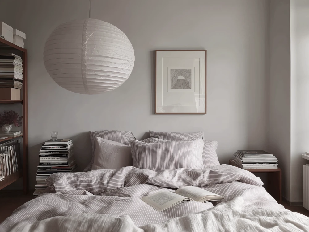
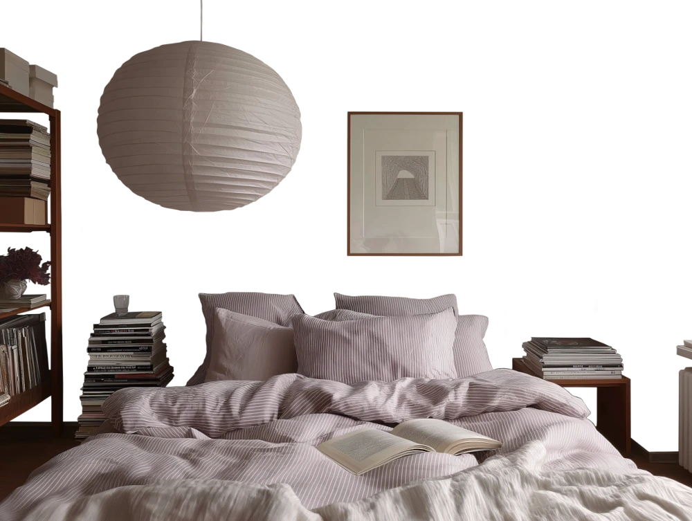
In addition, natural-light temperature depends on its direction:
| Direction of sunlight | Visible temp. | Hue | Duration |
|---|---|---|---|
| North | Cool | Bluish | All day |
| East | Warm | Yellow | Before noon |
| West | Warm | Orange-red | After noon |
| South | Warm | Orange-yellow | All day |
Artificial Lighting. When choosing bulbs, pay attention to their color temperature in Kelvins.
Use the slider to see how this Purple shade looks under different lighting:
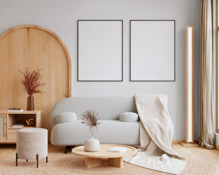
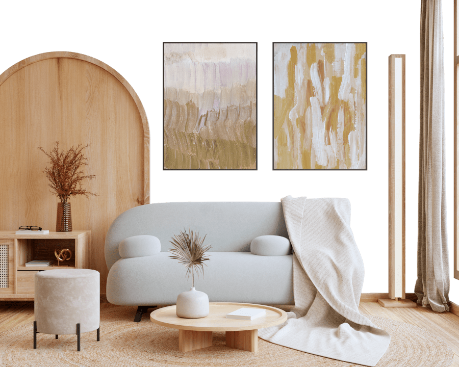
4000K
Coordinating colors.
Colors that go with Valspar UK Pretty as a Picture:
Monochromatic color scheme
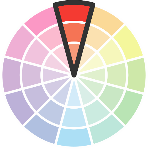
This scheme consists of various shades, tints, and tones of a single color. While it offers a perfect combination of hues, without accent décor it may become monotonous.
Lighter shades
X13R25D
Pretty as a Picture

Darker shades
X13R25D
Pretty as a Picture
Complementary color scheme
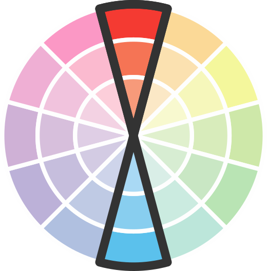
This color scheme is a combination of two shades that are opposite each other on the color wheel. The high contrast between these colors creates a vibrant and dynamic visual effect. For the color Pretty as a Picture with a blue hue, complementary colors are those with a orange hue close to 83, such as Valspar UK Green Beret and Jade Cameo.








Color codes
We have collected almost every possible color code you could ever need.
Not sure what the difference between HEX and RGB is? We break down color models in plain language. Understanding color models
| Format | Code |
|---|---|
| HEX | #9c93aa |
| RGB Decimal | 156, 147, 170 |
| RGB Percent | 61.18%, 57.65%, 66.67% |
| HSV | Hue: 263° Saturation: 13.53% Value: 66.67% |
| HSL | hsl(263, 11.92, 62.16) |
| CMYK | Cyan: 8.24 Magenta: 13.53 Yellow: 0.0 Key: 33.33 |
| YIQ | Y: 152.313 I: -2.028 Q: 9.061 |
| XYZ | X: 31.398 Y: 30.838 Z: 42.317 |
| CIE Lab | L:62.37 a:7.837 b:-10.833 |
| CIE Luv | L:62.37 u:3.591 v:-17.313 |
| Decimal | 10261418 |
| Hunter Lab | 55.532, 3.744, -6.309 |

Color equivalents
S570-4
Night Music
Behr

R26D
Honeymoon Romance
Valspar UK
S 3020-R60B
NCS

S100-4
Ancestry Violet
Behr
SW 9075
Berry Cream
Sherwin Williams
30RB 33/103
Violet Surprise 2
Dulux
50RB 34/153
Purple Sage 3
Dulux
R13D
Will o' the Wisp
Valspar UK
V075-4
Fields of Provence
Valspar US
10RB 35/167
Purple Polka 3
Dulux
X14R27D
Fields of Provence
Valspar UK
R37D
Bolt of Lightning
Valspar UK
70RB 31/090
Mellow Heather 2
Dulux
Purple Infusion 6
Dulux
PPU16-12
Charm
Behr
R15D
Dusty Lilac
Valspar UK
SW 6549
Ash Violet
Sherwin Williams
N560-4
Evening in Paris
Behr