Tikkurila Piazza Y487
Contentsshow +hide -
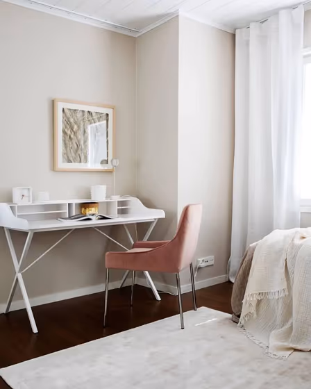
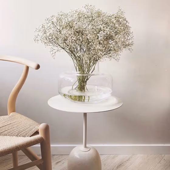
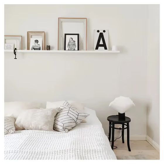
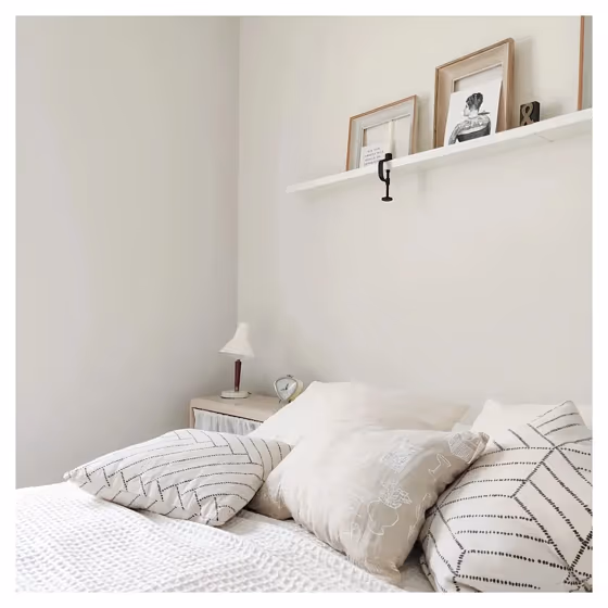
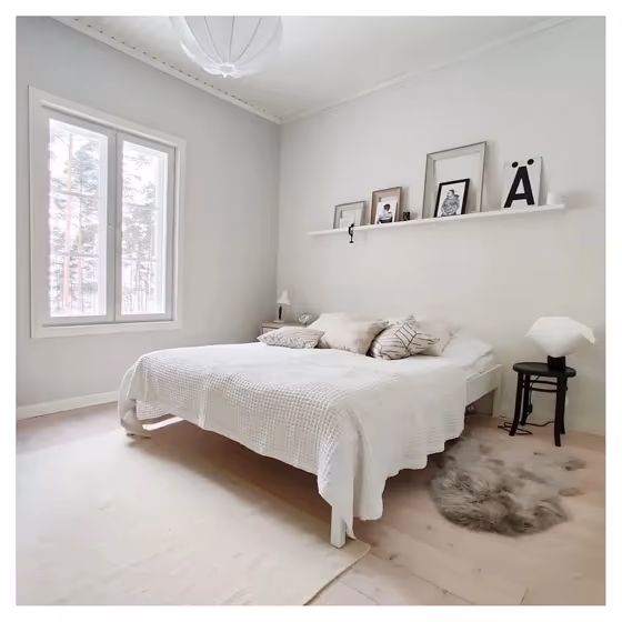
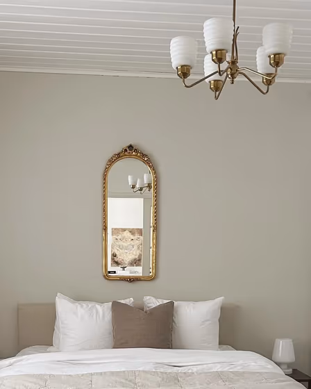
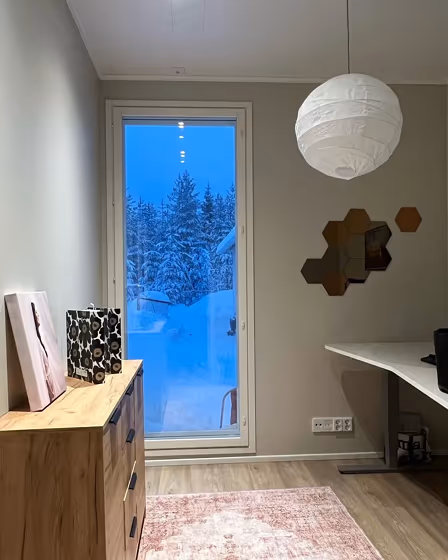
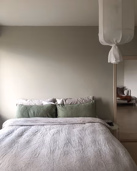
- Piazza for bedroom (17 photos)
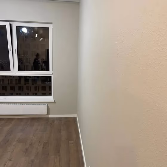
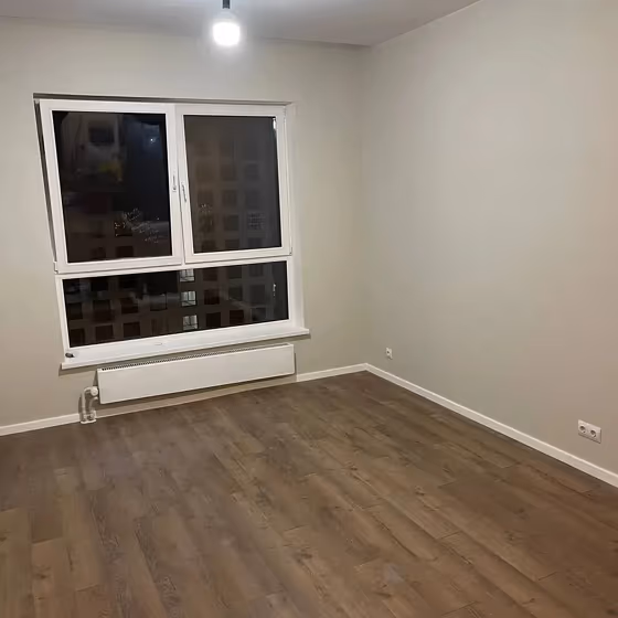
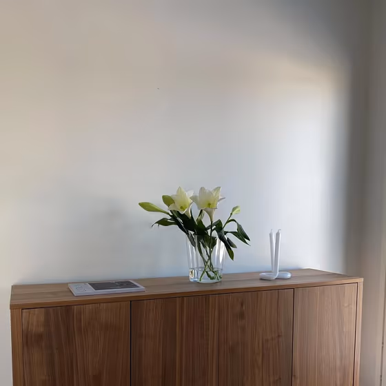
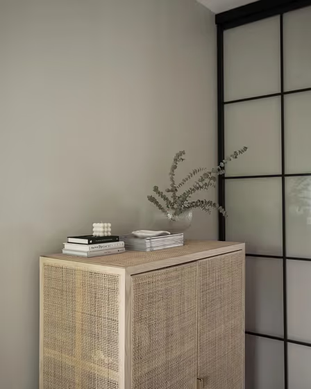
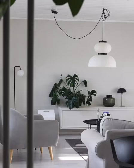
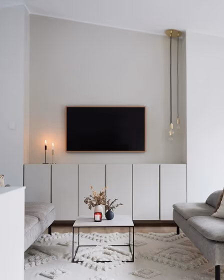
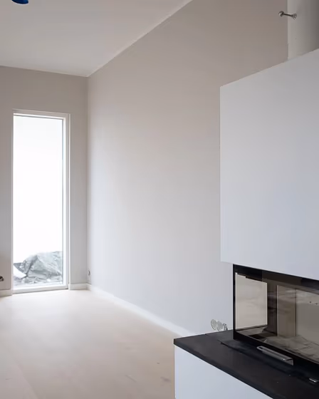
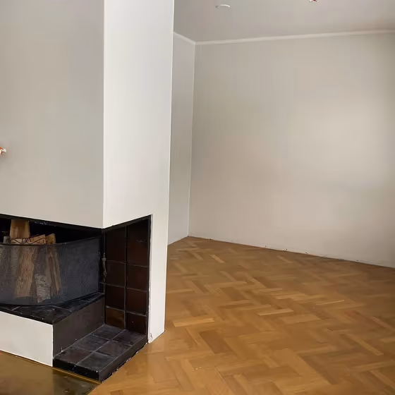
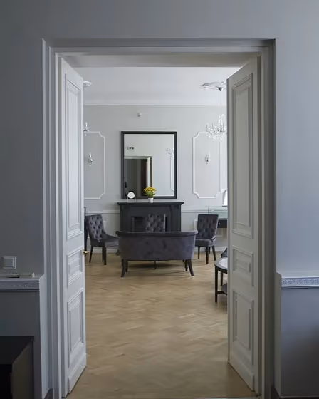
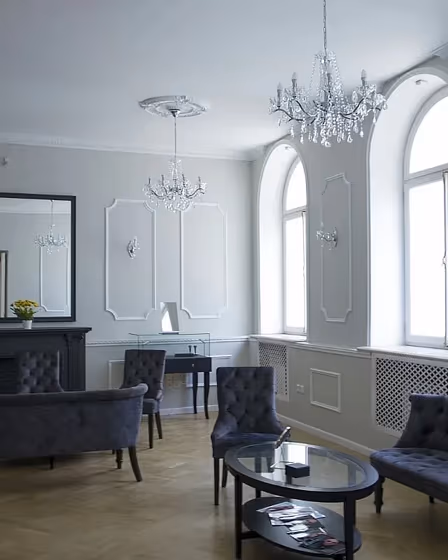
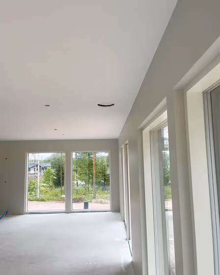
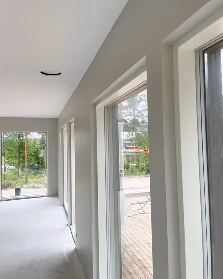
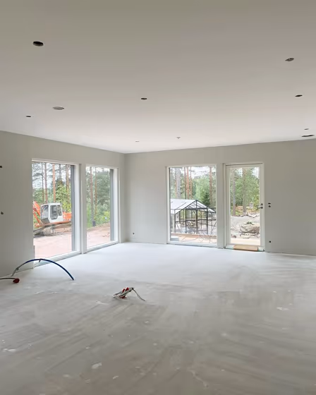
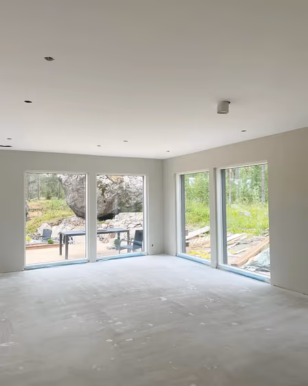
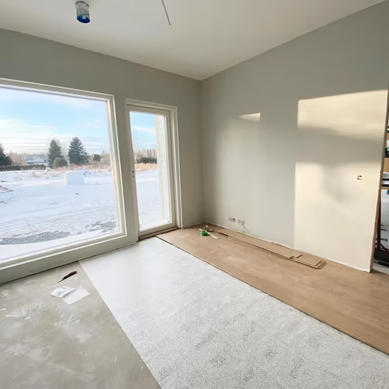
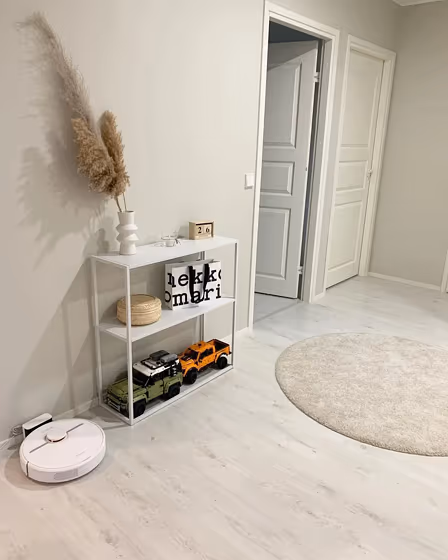
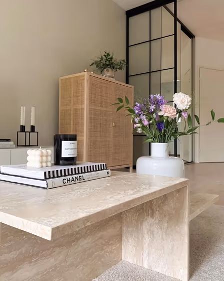
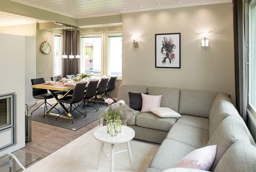
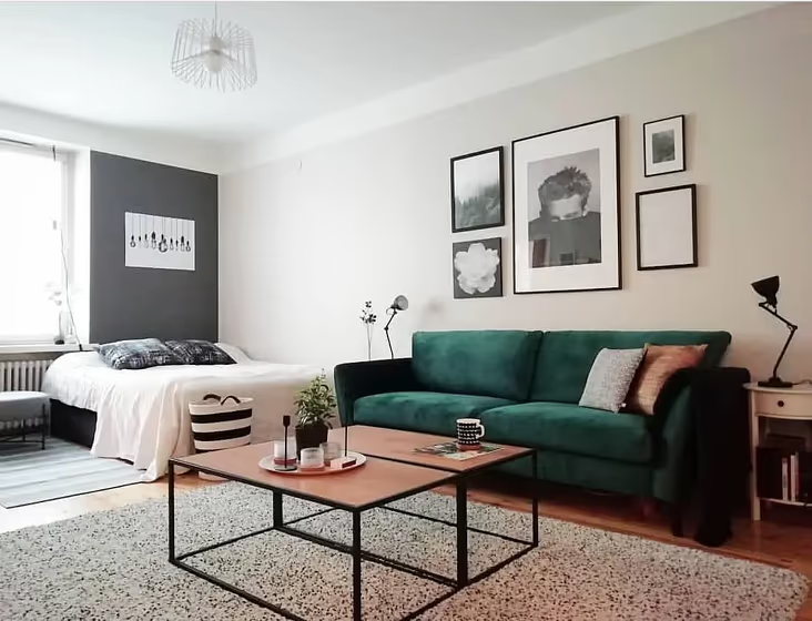
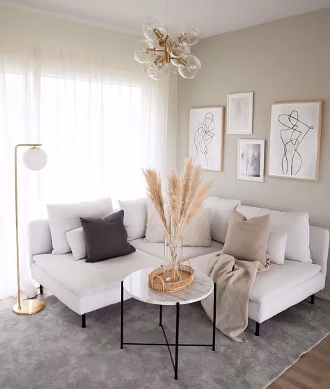
- Piazza for living room (22 photos)
- Tikkurila Piazza reviews (17 photos)
- What are Tikkurila Piazza undertones?
- Is Piazza Y487 cool or warm?
- How light temperature affects on Piazza
- Monochromatic color scheme
- Color comparison and matching
- LRV of Piazza Y487
- Color codes
- Color equivalents
| Code: | Y487 |
| Name: | Piazza |
| Brand: | Tikkurila |
What color is Tikkurila Piazza?
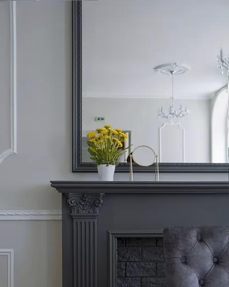
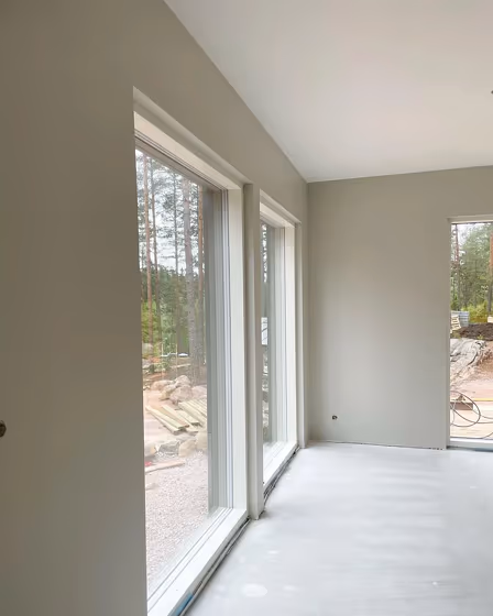
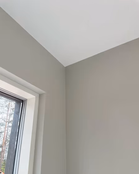
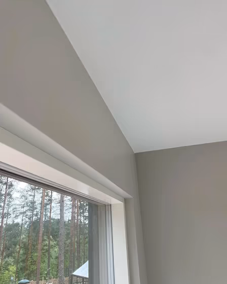
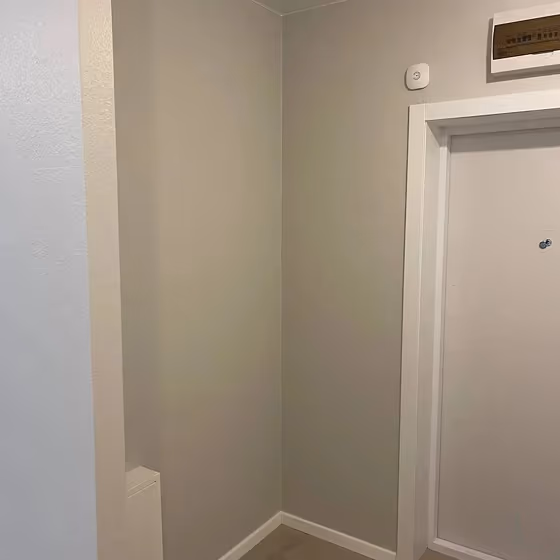
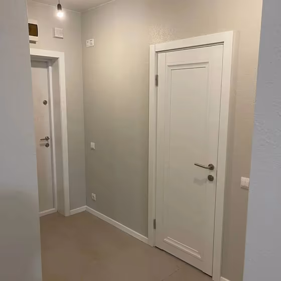
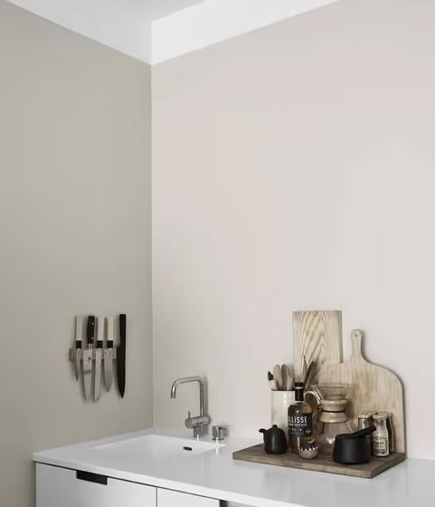
Greige is definitely a trend that doesn’t seem to be going away. Perfect mix of brown and grey it’s considered a warm grey and literally goes with any interior.
Loading...
LRV of Piazza
Piazza has an LRV of 64.98% and refers to Light colors that reflect most of the incident light. Why LRV is important?

Light Reflectance Value measures the amount of visible and usable light that reflects from a painted surface.
Simply put, the higher the LRV of a paint color, the brighter the room you will get.
The scale goes from 0% (absolute black, absorbing all light) to 100% (pure white, reflecting all light).
Act like a pro: When choosing paint with an LRV of 64.98%, pay attention to your bulbs' brightness. Light brightness is measured in lumens. The lower the paint's LRV, the higher lumen level you need. Every square foot of room needs at least 40 lumens. That means for a 200 ft2 living room you'll need about 8000 lumens of light – e.g., eight 1000 lm bulbs.
Color codes
We have collected almost every possible color code you could ever need.
Not sure what the difference between HEX and RGB is? We break down color models in plain language. Understanding color models
| Format | Code |
|---|---|
| HEX | #D7D3C8 |
| RGB Decimal | 215, 211, 200 |
| RGB Percent | 84.31%, 82.75%, 78.43% |
| HSV | Hue: 44° Saturation: 6.98% Value: 84.31% |
| HSL | hsl(44, 16, 81) |
| CMYK | Cyan: 0.0 Magenta: 1.86 Yellow: 6.98 Key: 15.69 |
| YIQ | Y: 210.942 I: 5.918 Q: -2.577 |
| XYZ | X: 61.742 Y: 65.206 Z: 63.961 |
| CIE Lab | L:84.59 a:-0.548 b:5.93 |
| CIE Luv | L:84.59 u:2.932 v:8.925 |
| Decimal | 14144456 |
| Hunter Lab | 80.75, -4.832, 9.562 |