Benjamin Moore Iron Ore Red 2089-10
Contentsshow +hide -
- Benjamin Moore Iron Ore Red reviews (2 photos)
- What are Benjamin Moore Iron Ore Red undertones?
- Is Iron Ore Red 2089-10 cool or warm?
- How light temperature affects on Iron Ore Red
- Monochromatic color scheme
- Complementary color scheme
- Color comparison and matching
- LRV of Iron Ore Red 2089-10
- Color codes
- Color equivalents
| Official page: | Iron Ore Red 2089-10 |
| Code: | 2089-10 |
| Name: | Iron Ore Red |
| Brand: | Benjamin Moore |
What color is Benjamin Moore Iron Ore Red?
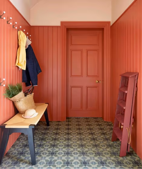
Step into a world of bold sophistication with Benjamin Moore Iron Ore Red (2089-10). This rich and alluring hue infuses any space with a sense of luxury and drama, making it ideal for spaces seeking a touch of glamour. Whether used in a formal dining room or a cozy bedroom retreat, Iron Ore Red adds a layer of depth and character that elevates the entire room. This captivating color creates a warm and inviting ambiance perfect for intimate gatherings or moments of relaxation. Embrace the power of Benjamin Moore 2089-10 Iron Ore Red to transform your home into a haven of style and elegance.
Loading...
LRV of Iron Ore Red
Iron Ore Red has an LRV of 16.24% and refers to Medium Dark which means that this color reflects very little light. Why LRV is important?

Light Reflectance Value measures the amount of visible and usable light that reflects from a painted surface.
Simply put, the higher the LRV of a paint color, the brighter the room you will get.
The scale goes from 0% (absolute black, absorbing all light) to 100% (pure white, reflecting all light).
Act like a pro: When choosing paint with an LRV of 16.24%, pay attention to your bulbs' brightness. Light brightness is measured in lumens. The lower the paint's LRV, the higher lumen level you need. Every square foot of room needs at least 40 lumens. That means for a 200 ft2 living room you'll need about 8000 lumens of light – e.g., eight 1000 lm bulbs.
Color codes
We have collected almost every possible color code you could ever need.
Not sure what the difference between HEX and RGB is? We break down color models in plain language. Understanding color models
| Format | Code |
|---|---|
| HEX | #A95445 |
| RGB Decimal | 169, 84, 69 |
| RGB Percent | 66.27%, 32.94%, 27.06% |
| HSV | Hue: 9° Saturation: 59.17% Value: 66.27% |
| HSL | hsl(9, 42, 47) |
| CMYK | Cyan: 0.0 Magenta: 50.3 Yellow: 59.17 Key: 33.73 |
| YIQ | Y: 107.705 I: 55.472 Q: 13.313 |
| XYZ | X: 20.608 Y: 15.208 Z: 7.479 |
| CIE Lab | L:45.917 a:33.495 b:24.847 |
| CIE Luv | L:45.917 u:63.371 v:21.739 |
| Decimal | 11097157 |
| Hunter Lab | 38.997, 26.085, 15.927 |