Benjamin Moore Georgia Pink 2092-60
Contentsshow +hide -
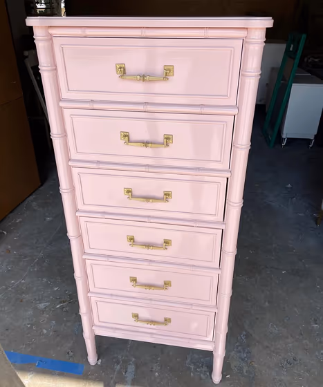
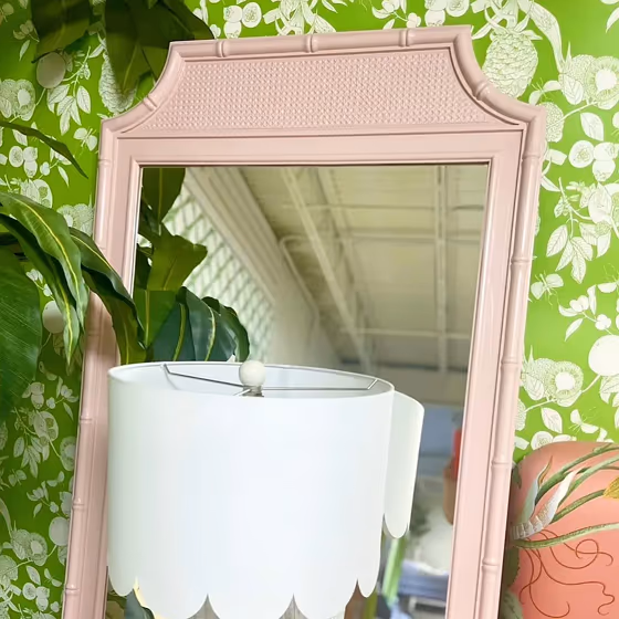
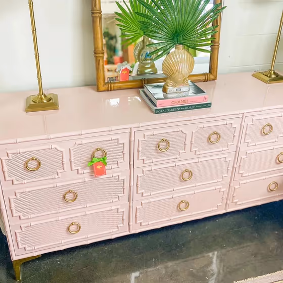
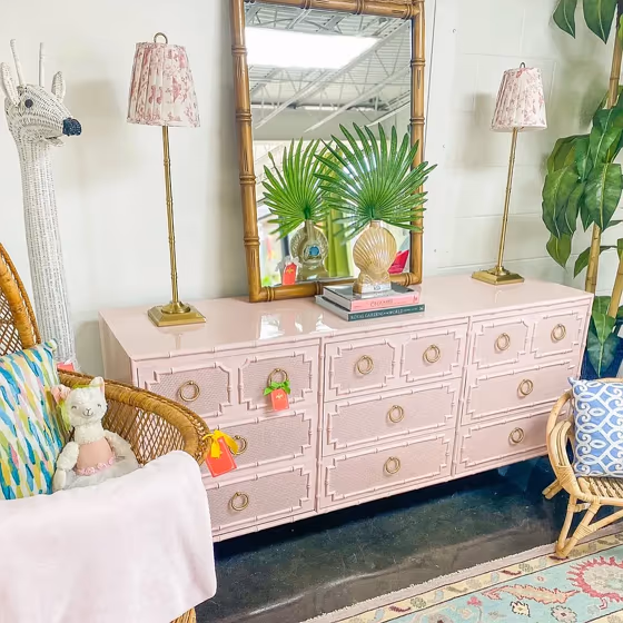
- Benjamin Moore Georgia Pink reviews (6 photos)
- What are Benjamin Moore Georgia Pink undertones?
- Is Georgia Pink 2092-60 cool or warm?
- How light temperature affects on Georgia Pink
- Monochromatic color scheme
- Complementary color scheme
- Color comparison and matching
- LRV of Georgia Pink 2092-60
- Color codes
- Color equivalents
| Official page: | Georgia Pink 2092-60 |
| Code: | 2092-60 |
| Name: | Georgia Pink |
| Brand: | Benjamin Moore |
What color is Benjamin Moore Georgia Pink?
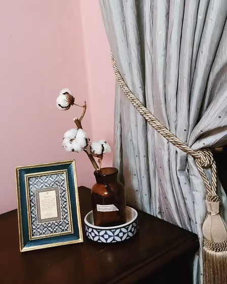
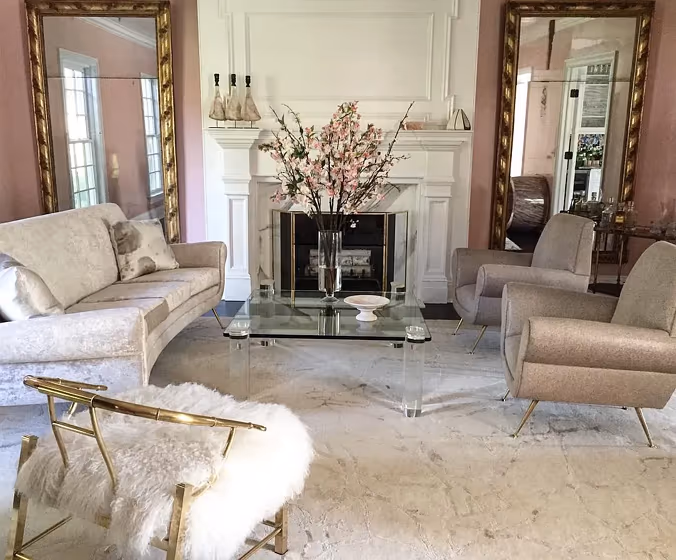
Looking for a soft and warm touch in your space? Consider incorporating Georgia Pink (Benjamin Moore 2092-60) into your interior design palette. This gentle hue pairs beautifully with muted greens like sage and dusty blues for a calming and harmonious look. To elevate the elegance, contrast Georgia Pink with deep navy or charcoal gray accents for a sophisticated and timeless aesthetic. The versatility of Georgia Pink allows for endless creativity in styling your space, making it a versatile and inviting choice for any room.
Loading...
LRV of Georgia Pink
Georgia Pink has an LRV of 57.23% and refers to Light colors that reflect most of the incident light. Why LRV is important?

Light Reflectance Value measures the amount of visible and usable light that reflects from a painted surface.
Simply put, the higher the LRV of a paint color, the brighter the room you will get.
The scale goes from 0% (absolute black, absorbing all light) to 100% (pure white, reflecting all light).
Act like a pro: When choosing paint with an LRV of 57.23%, pay attention to your bulbs' brightness. Light brightness is measured in lumens. The lower the paint's LRV, the higher lumen level you need. Every square foot of room needs at least 40 lumens. That means for a 200 ft2 living room you'll need about 8000 lumens of light – e.g., eight 1000 lm bulbs.
Color codes
We have collected almost every possible color code you could ever need.
Not sure what the difference between HEX and RGB is? We break down color models in plain language. Understanding color models
| Format | Code |
|---|---|
| HEX | #E3C1BD |
| RGB Decimal | 227, 193, 189 |
| RGB Percent | 89.02%, 75.69%, 74.12% |
| HSV | Hue: 6° Saturation: 16.74% Value: 89.02% |
| HSL | hsl(6, 40, 82) |
| CMYK | Cyan: 0.0 Magenta: 14.98 Yellow: 16.74 Key: 10.98 |
| YIQ | Y: 202.71 I: 21.546 Q: 5.947 |
| XYZ | X: 59.933 Y: 58.147 Z: 56.197 |
| CIE Lab | L:80.82 a:11.429 b:6.503 |
| CIE Luv | L:80.82 u:20.966 v:7.456 |
| Decimal | 14926269 |
| Hunter Lab | 76.254, 6.85, 9.683 |