Benjamin Moore Rosetone 1186
Contentsshow +hide -
| Official page: | Rosetone 1186 |
| Code: | 1186 |
| Name: | Rosetone |
| Brand: | Benjamin Moore |
What color is Benjamin Moore Rosetone?
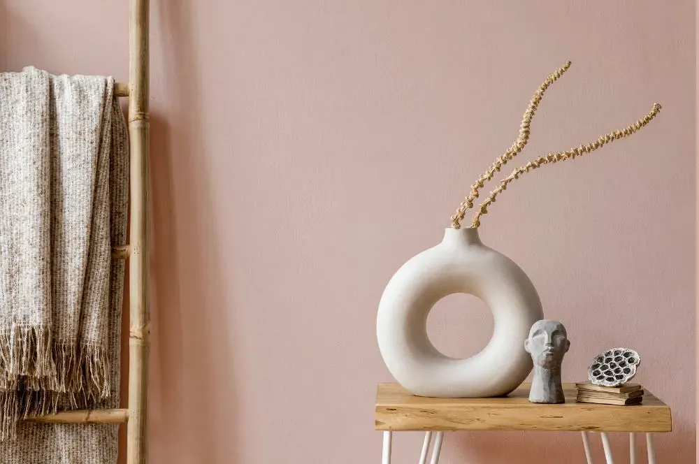
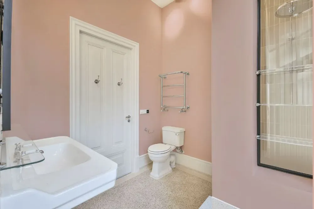
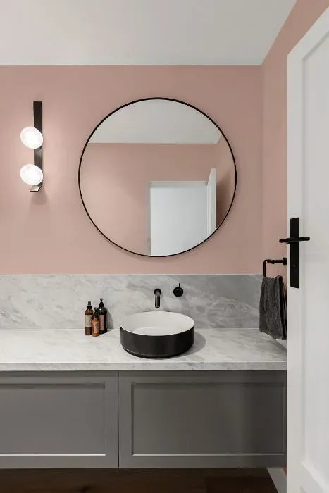
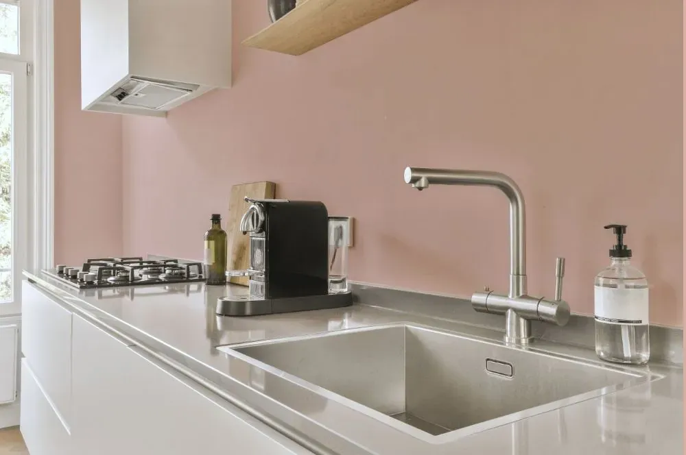
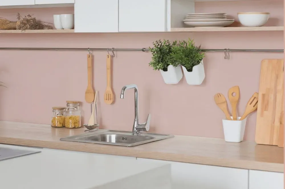
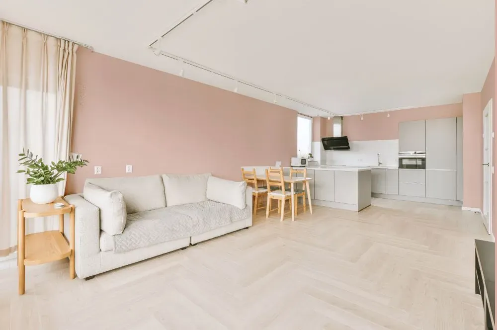
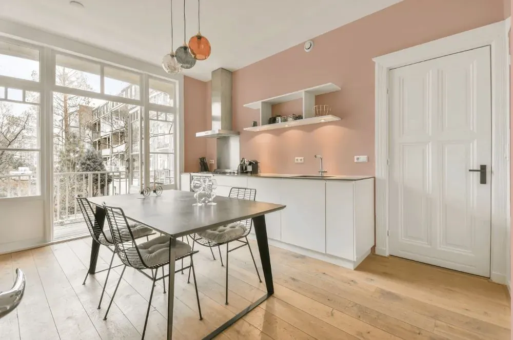
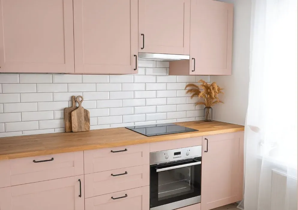
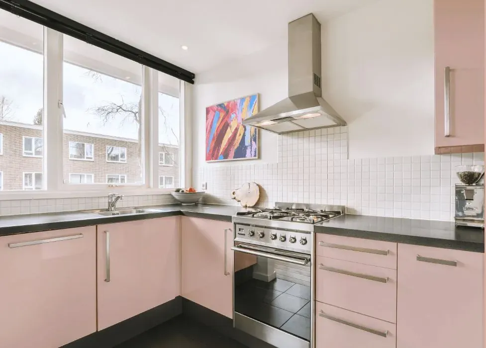
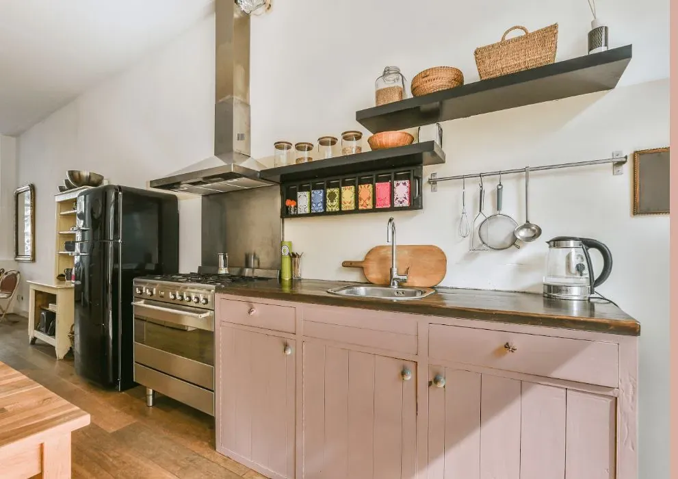
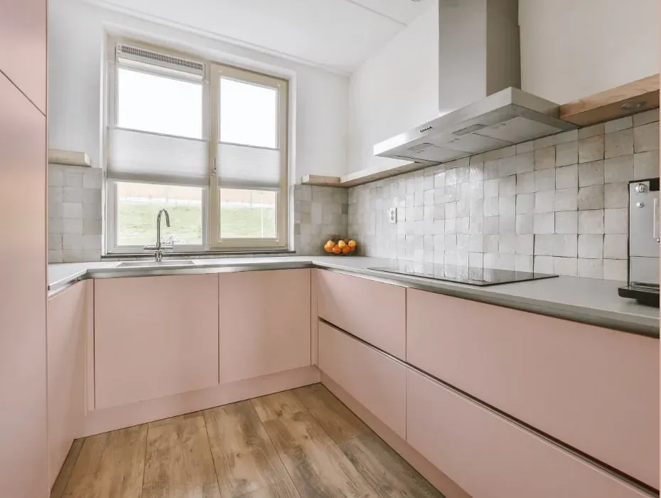
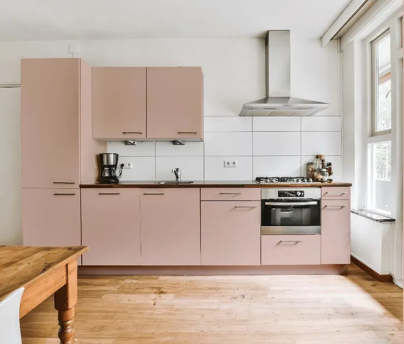
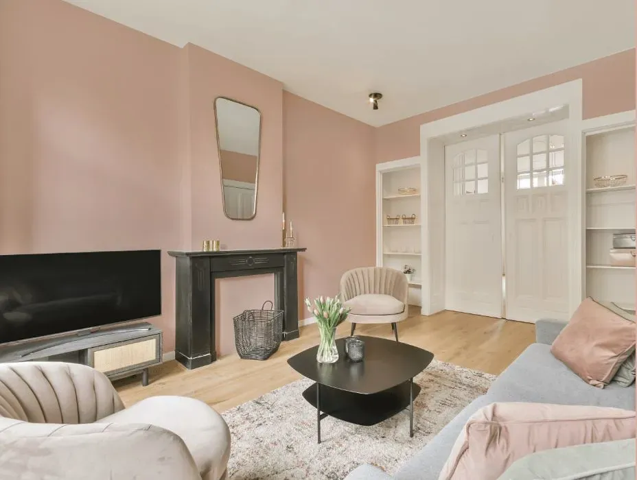
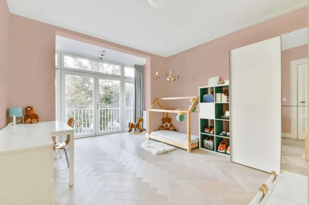
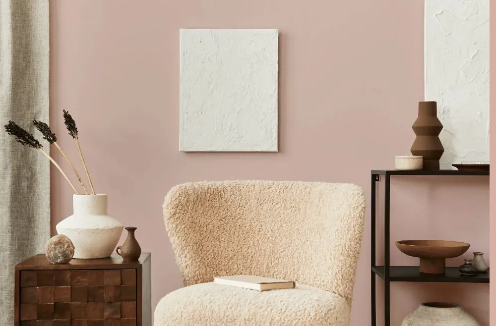
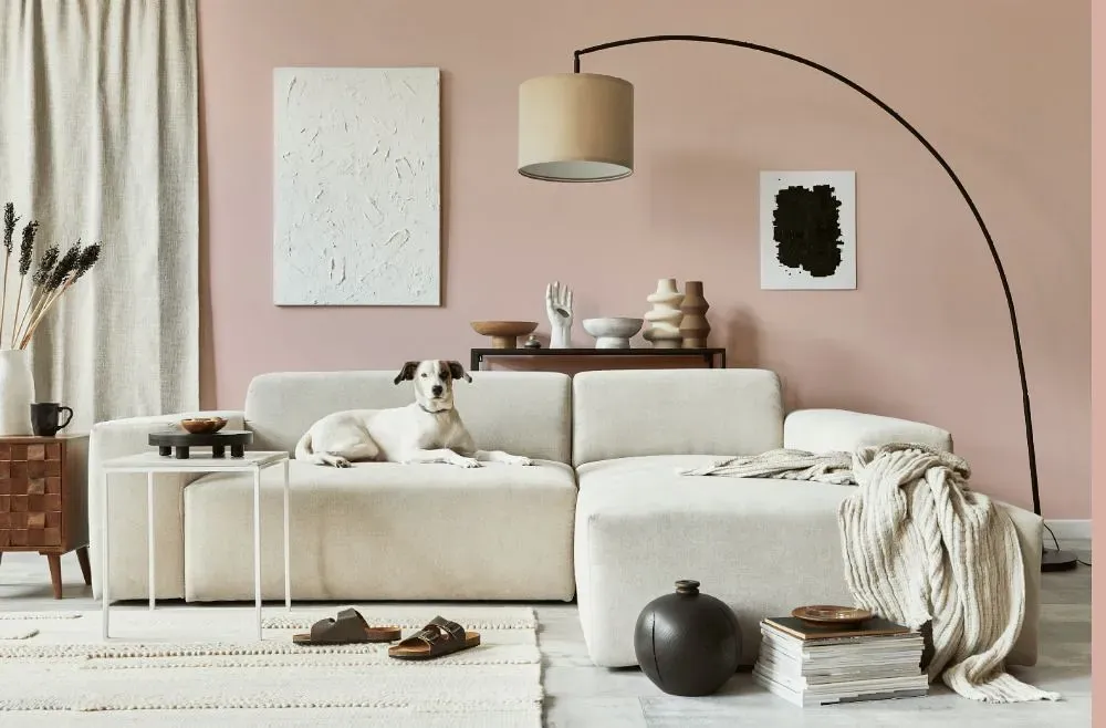
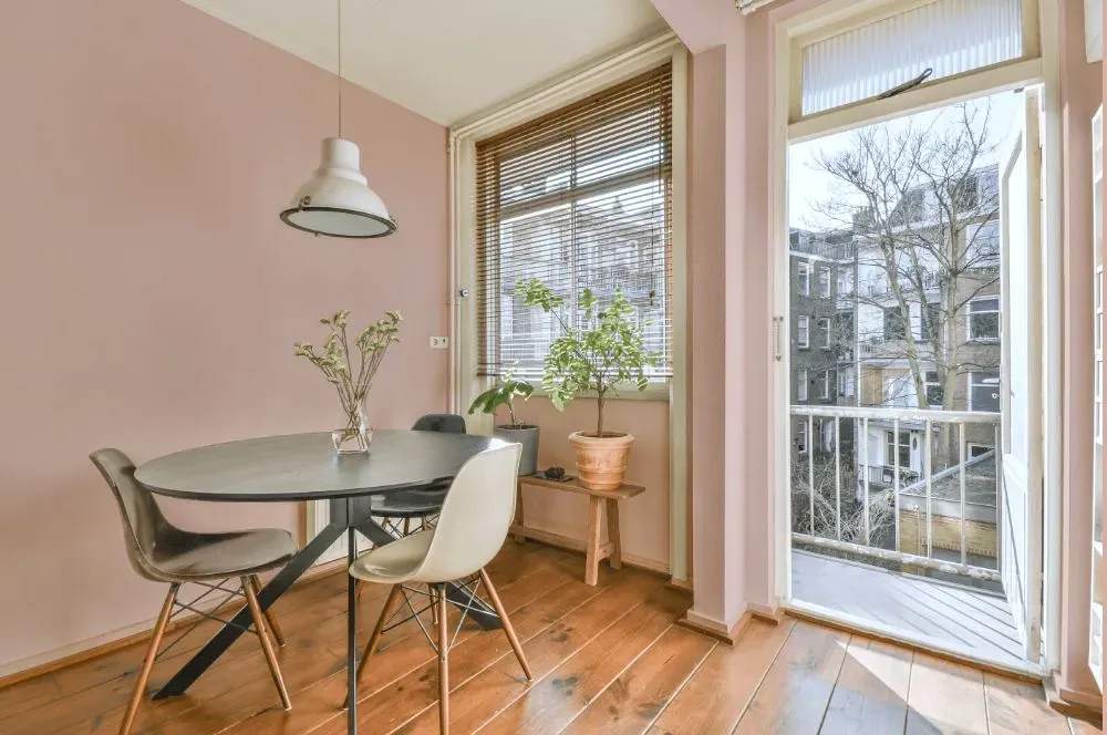
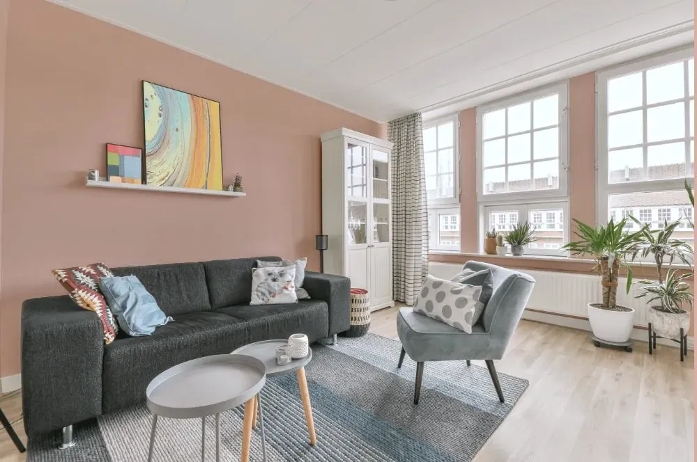
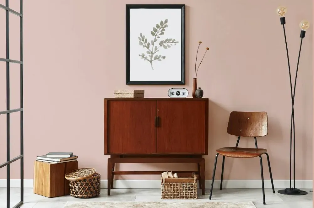
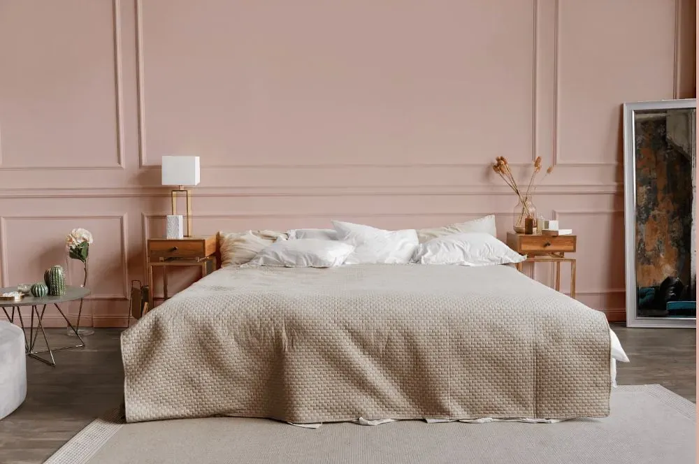
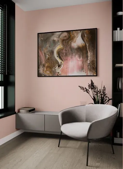
Benjamin Moore's color 1186 Rosetone exudes a soft and romantic ambiance, perfect for creating a cozy and inviting space. This warm beige with pink undertones pairs beautifully with crisp whites for a classic look or with soft greys for a more modern feel. Rosetone complements earthy tones such as olive green and terracotta for a harmonious and sophisticated palette. Whether used as an accent wall or throughout a room, this versatile color adds a touch of elegance and warmth to any interior design scheme. Experience the timeless allure of Rosetone to elevate your home decor to new heights.
Loading...
LRV of Rosetone
Rosetone has an LRV of 60.09% and refers to Light colors that reflect most of the incident light. Why LRV is important?

Light Reflectance Value measures the amount of visible and usable light that reflects from a painted surface.
Simply put, the higher the LRV of a paint color, the brighter the room you will get.
The scale goes from 0% (absolute black, absorbing all light) to 100% (pure white, reflecting all light).
Act like a pro: When choosing paint with an LRV of 60.09%, pay attention to your bulbs' brightness. Light brightness is measured in lumens. The lower the paint's LRV, the higher lumen level you need. Every square foot of room needs at least 40 lumens. That means for a 200 ft2 living room you'll need about 8000 lumens of light – e.g., eight 1000 lm bulbs.
Color codes
We have collected almost every possible color code you could ever need.
Not sure what the difference between HEX and RGB is? We break down color models in plain language. Understanding color models
| Format | Code |
|---|---|
| HEX | #E5C8BF |
| RGB Decimal | 229, 200, 191 |
| RGB Percent | 89.80%, 78.43%, 74.90% |
| HSV | Hue: 14° Saturation: 16.59% Value: 89.8% |
| HSL | hsl(14, 42, 82) |
| CMYK | Cyan: 0.0 Magenta: 12.66 Yellow: 16.59 Key: 10.2 |
| YIQ | Y: 207.645 I: 20.173 Q: 3.334 |
| XYZ | X: 62.37 Y: 61.73 Z: 57.906 |
| CIE Lab | L:82.77 a:8.763 b:8.254 |
| CIE Luv | L:82.77 u:18.135 v:10.505 |
| Decimal | 15059135 |
| Hunter Lab | 78.568, 4.205, 11.3 |