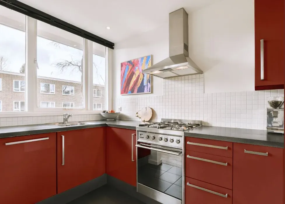
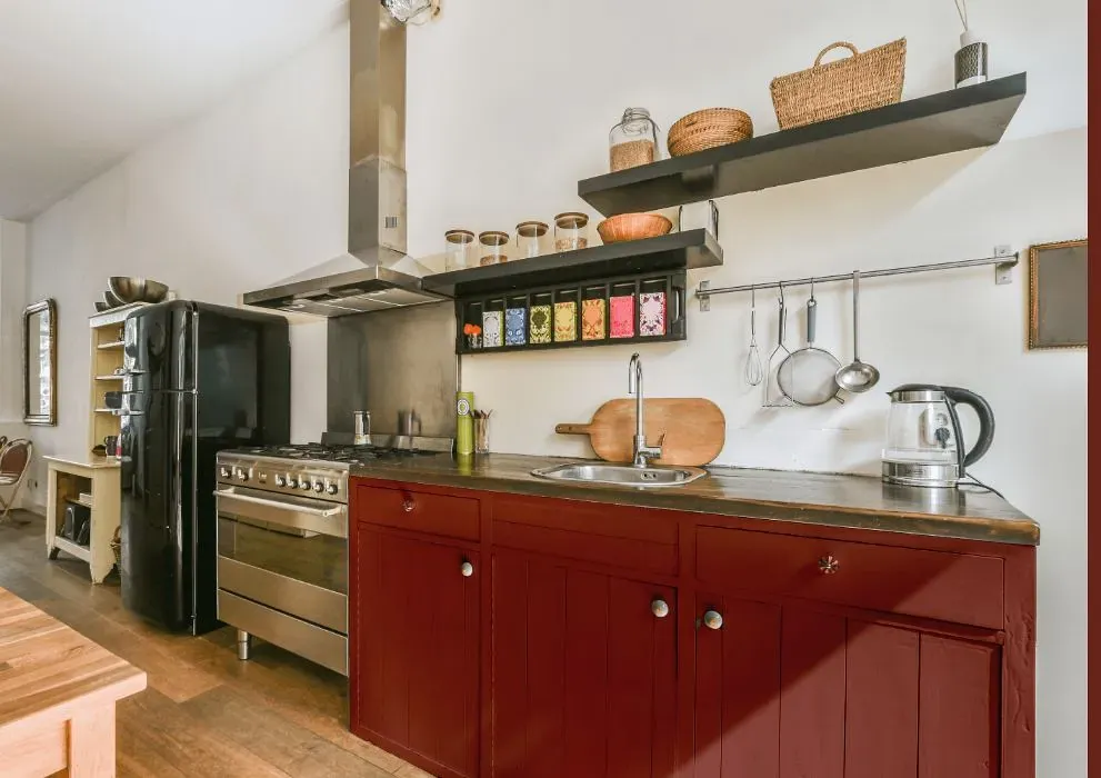
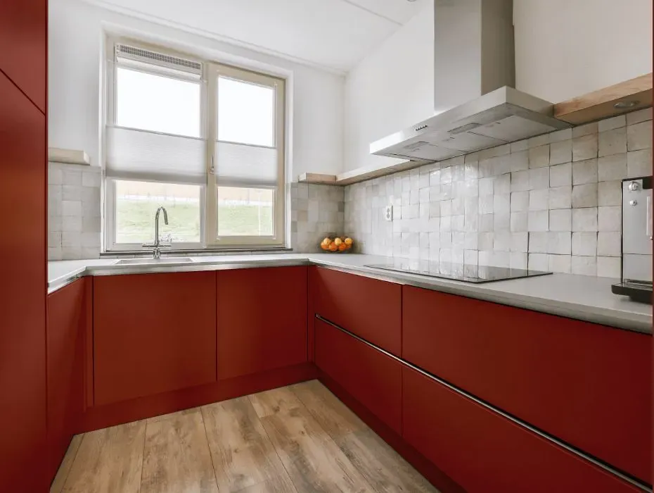
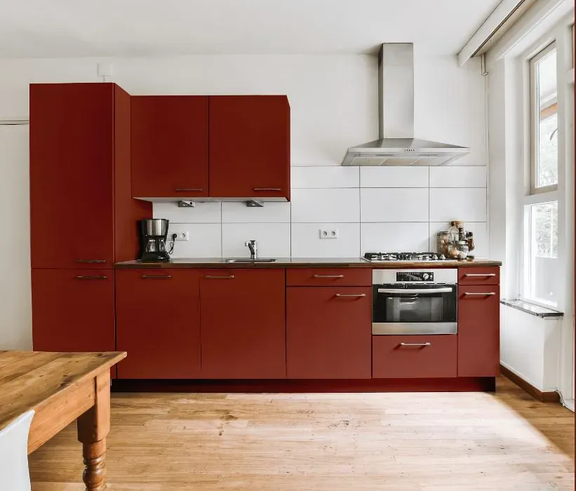
Benjamin Moore Rustic Brick 2091-20
Contentsshow +hide -
- Benjamin Moore Rustic Brick reviews (23 photos)
- What are Benjamin Moore Rustic Brick undertones?
- Is Rustic Brick 2091-20 cool or warm?
- How light temperature affects on Rustic Brick
- Monochromatic color scheme
- Complementary color scheme
- Color comparison and matching
- LRV of Rustic Brick 2091-20
- Color codes
- Color equivalents
| Official page: | Rustic Brick 2091-20 |
| Code: | 2091-20 |
| Name: | Rustic Brick |
| Brand: | Benjamin Moore |
What color is Benjamin Moore Rustic Brick?
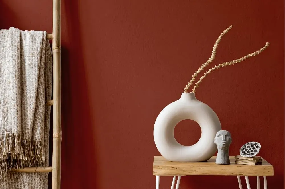
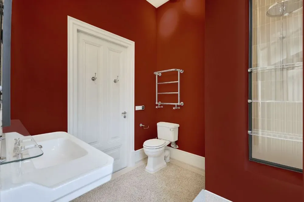
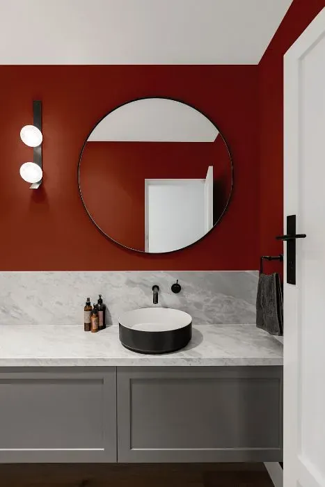
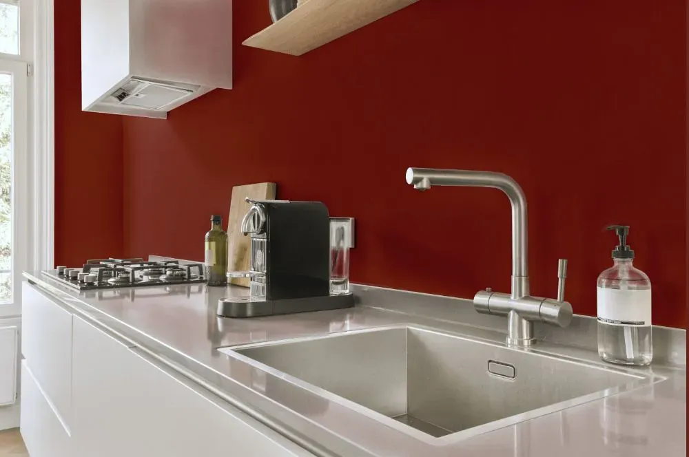
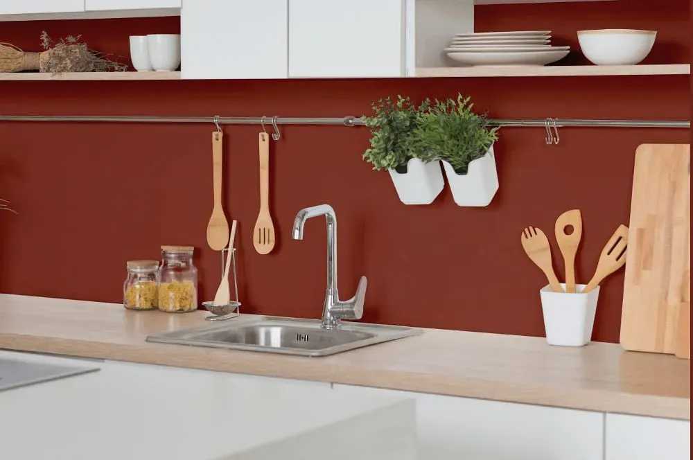
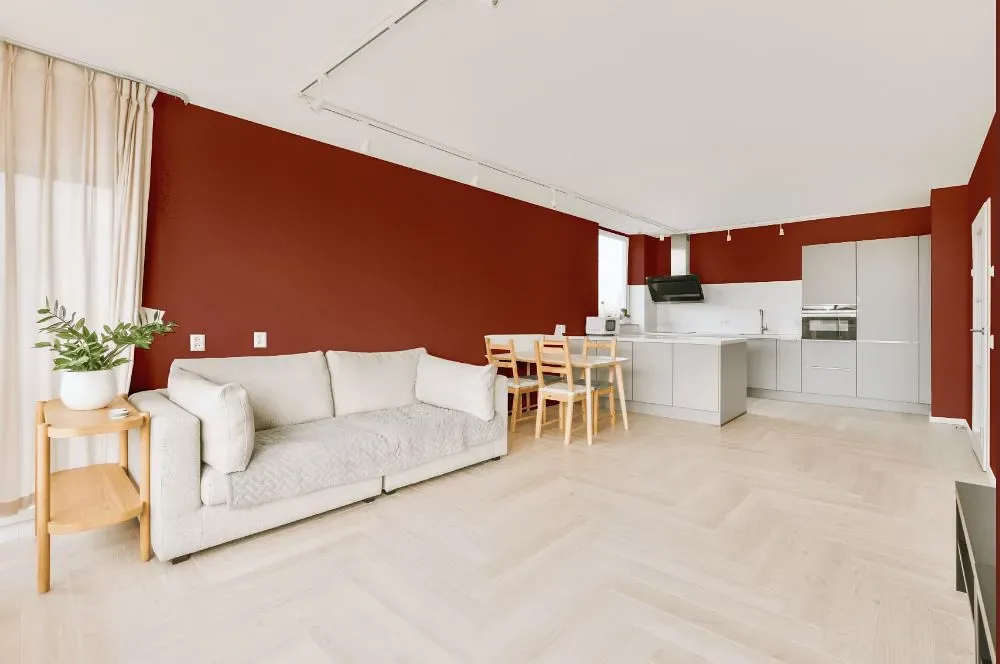
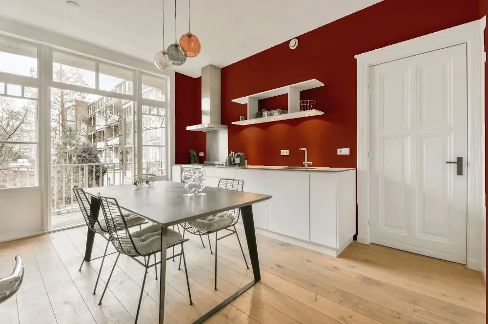
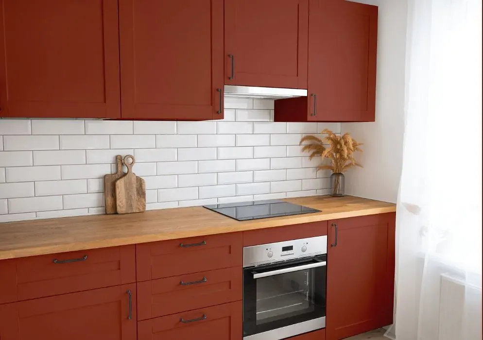
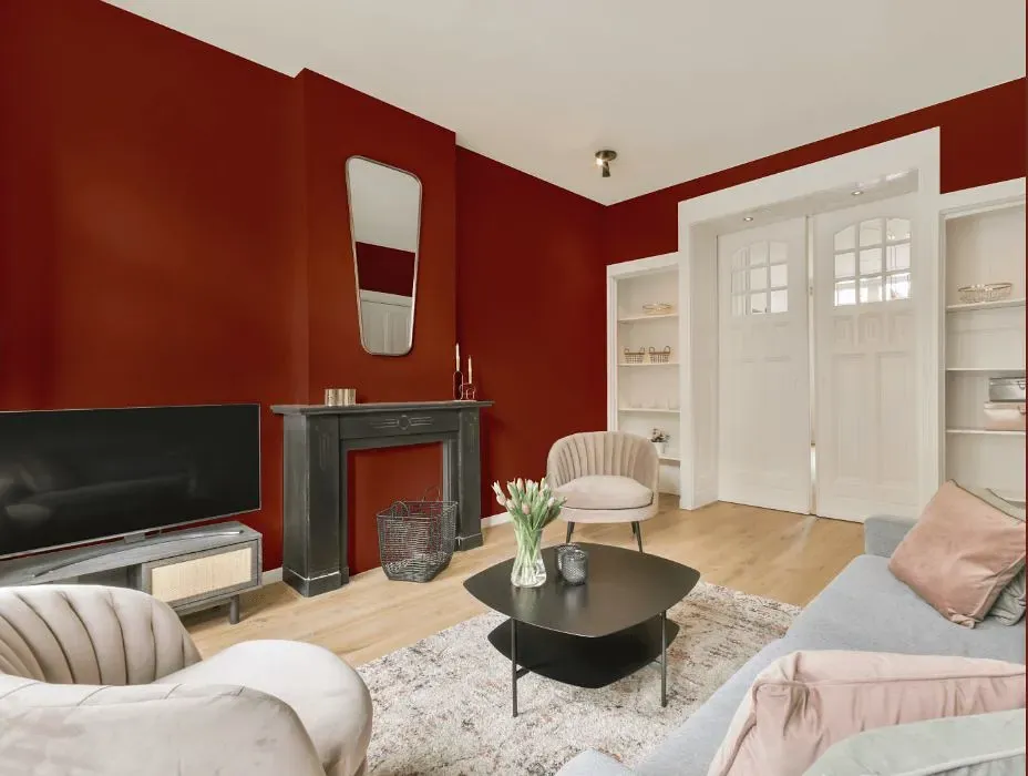
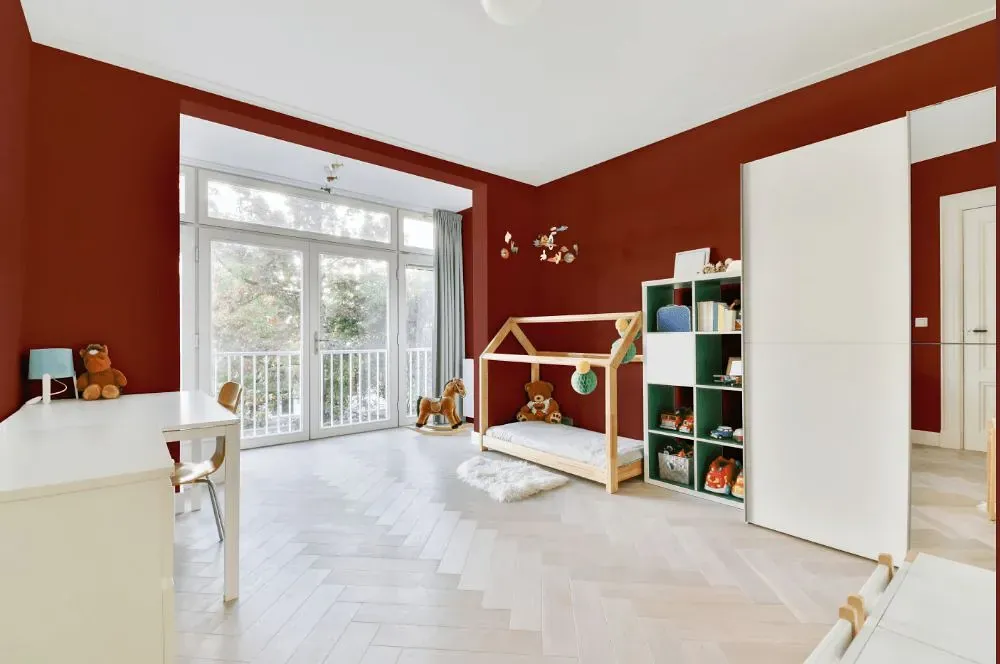
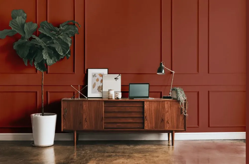
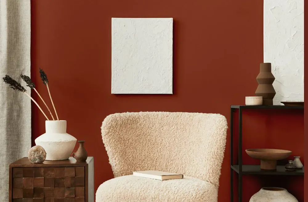
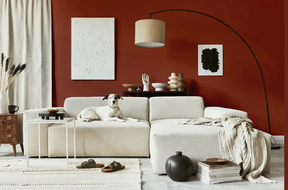
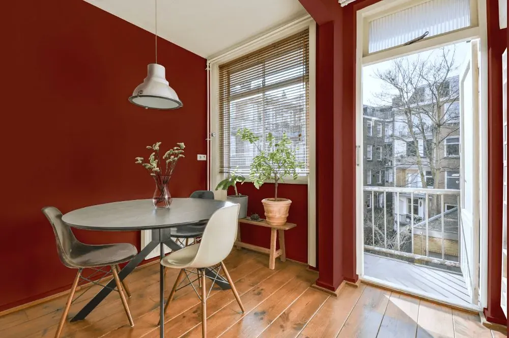
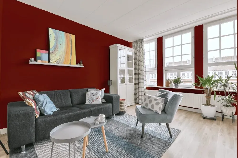
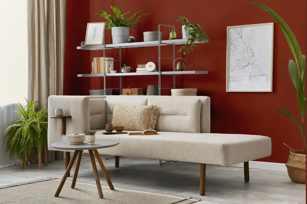
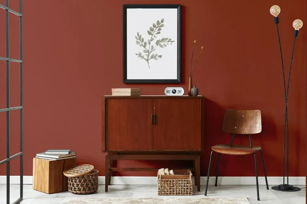
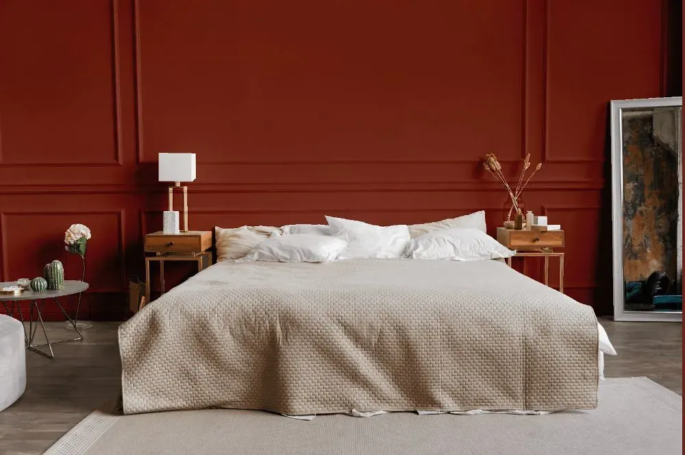
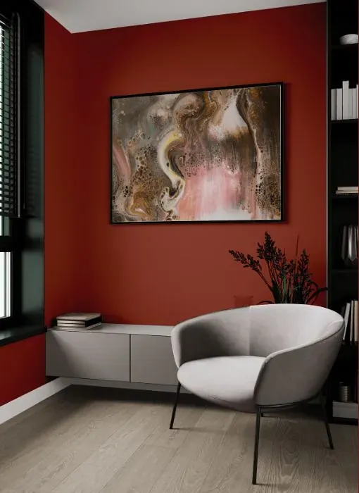
Imagine a warm and inviting living room painted in Benjamin Moore's Rustic Brick (2091-20), exuding charm and sophistication. This rich hue infuses a sense of coziness and elegance, perfect for creating a rustic chic vibe in a dining room or an accent wall in a cozy den. Rustic Brick adds depth and character to a bedroom or study, evoking a sense of timeless beauty and comfort. With its versatile appeal, this color transforms any space into a welcoming retreat, making it ideal for those seeking a touch of understated luxury in their interiors.
Loading...
LRV of Rustic Brick
Rustic Brick has an LRV of 11.01% and refers to Medium Dark which means that this color reflects very little light. Why LRV is important?

Light Reflectance Value measures the amount of visible and usable light that reflects from a painted surface.
Simply put, the higher the LRV of a paint color, the brighter the room you will get.
The scale goes from 0% (absolute black, absorbing all light) to 100% (pure white, reflecting all light).
Act like a pro: When choosing paint with an LRV of 11.01%, pay attention to your bulbs' brightness. Light brightness is measured in lumens. The lower the paint's LRV, the higher lumen level you need. Every square foot of room needs at least 40 lumens. That means for a 200 ft2 living room you'll need about 8000 lumens of light – e.g., eight 1000 lm bulbs.
Color codes
We have collected almost every possible color code you could ever need.
Not sure what the difference between HEX and RGB is? We break down color models in plain language. Understanding color models
| Format | Code |
|---|---|
| HEX | #8E4738 |
| RGB Decimal | 142, 71, 56 |
| RGB Percent | 55.69%, 27.84%, 21.96% |
| HSV | Hue: 10° Saturation: 60.56% Value: 55.69% |
| HSL | hsl(10, 43, 39) |
| CMYK | Cyan: 0.0 Magenta: 50.0 Yellow: 60.56 Key: 44.31 |
| YIQ | Y: 90.519 I: 47.129 Q: 10.351 |
| XYZ | X: 14.123 Y: 10.544 Z: 5.032 |
| CIE Lab | L:38.802 a:28.616 b:22.715 |
| CIE Luv | L:38.802 u:52.282 v:19.221 |
| Decimal | 9324344 |
| Hunter Lab | 32.472, 20.811, 13.543 |