Benjamin Moore Love & Happiness 1191
Contentsshow +hide -
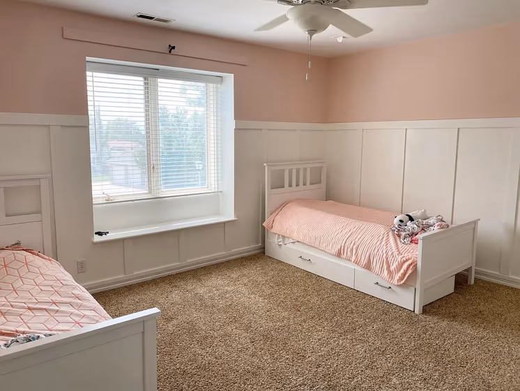
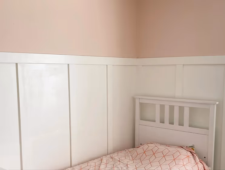
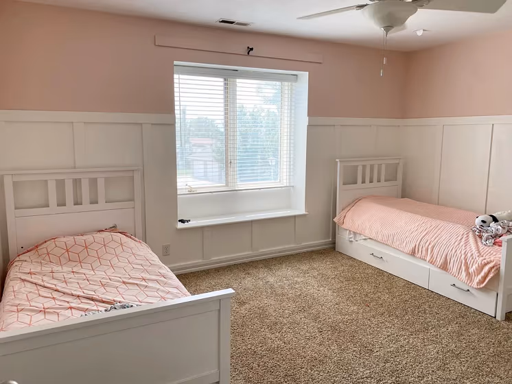
- Benjamin Moore Love & Happiness reviews (3 photos)
- What are Benjamin Moore Love & Happiness undertones?
- Is Love & Happiness 1191 cool or warm?
- How light temperature affects on Love & Happiness
- Monochromatic color scheme
- Complementary color scheme
- Color comparison and matching
- LRV of Love & Happiness 1191
- Color codes
- Color equivalents
| Official page: | Love & Happiness 1191 |
| Code: | 1191 |
| Name: | Love & Happiness |
| Brand: | Benjamin Moore |
What color is Benjamin Moore Love & Happiness?
The warm and inviting Benjamin Moore 1191 Love & Happiness paint color exudes charm and comfort in any space. This soft and subtle hue pairs beautifully with crisp whites like Benjamin Moore Chantilly Lace OC-65, creating a timeless and elegant look. For a modern twist, consider combining Love & Happiness with a dusky blue such as Benjamin Moore Hale Navy HC-154 for a sophisticated contrast. Whether used as an accent or main color, this versatile shade effortlessly complements a variety of design styles and can easily create a welcoming atmosphere in any room. Elevate your interiors with the harmonious blend of Love & Happiness and discover a fresh perspective on color pairing.
Loading...
LRV of Love & Happiness
Love & Happiness has an LRV of 71.95% and refers to Light colors that reflect most of the incident light. Why LRV is important?

Light Reflectance Value measures the amount of visible and usable light that reflects from a painted surface.
Simply put, the higher the LRV of a paint color, the brighter the room you will get.
The scale goes from 0% (absolute black, absorbing all light) to 100% (pure white, reflecting all light).
Act like a pro: When choosing paint with an LRV of 71.95%, pay attention to your bulbs' brightness. Light brightness is measured in lumens. The lower the paint's LRV, the higher lumen level you need. Every square foot of room needs at least 40 lumens. That means for a 200 ft2 living room you'll need about 8000 lumens of light – e.g., eight 1000 lm bulbs.
Color codes
We have collected almost every possible color code you could ever need.
Not sure what the difference between HEX and RGB is? We break down color models in plain language. Understanding color models
| Format | Code |
|---|---|
| HEX | #F2D9CC |
| RGB Decimal | 242, 217, 204 |
| RGB Percent | 94.90%, 85.10%, 80.00% |
| HSV | Hue: 21° Saturation: 15.7% Value: 94.9% |
| HSL | hsl(21, 59, 87) |
| CMYK | Cyan: 0.0 Magenta: 10.33 Yellow: 15.7 Key: 5.1 |
| YIQ | Y: 222.993 I: 19.075 Q: 1.243 |
| XYZ | X: 72.329 Y: 72.864 Z: 67.364 |
| CIE Lab | L:88.383 a:6.559 b:9.551 |
| CIE Luv | L:88.383 u:15.789 v:12.925 |
| Decimal | 15915468 |
| Hunter Lab | 85.361, 1.867, 12.962 |