Benjamin Moore Peaches 'n Cream 040
Contentsshow +hide -
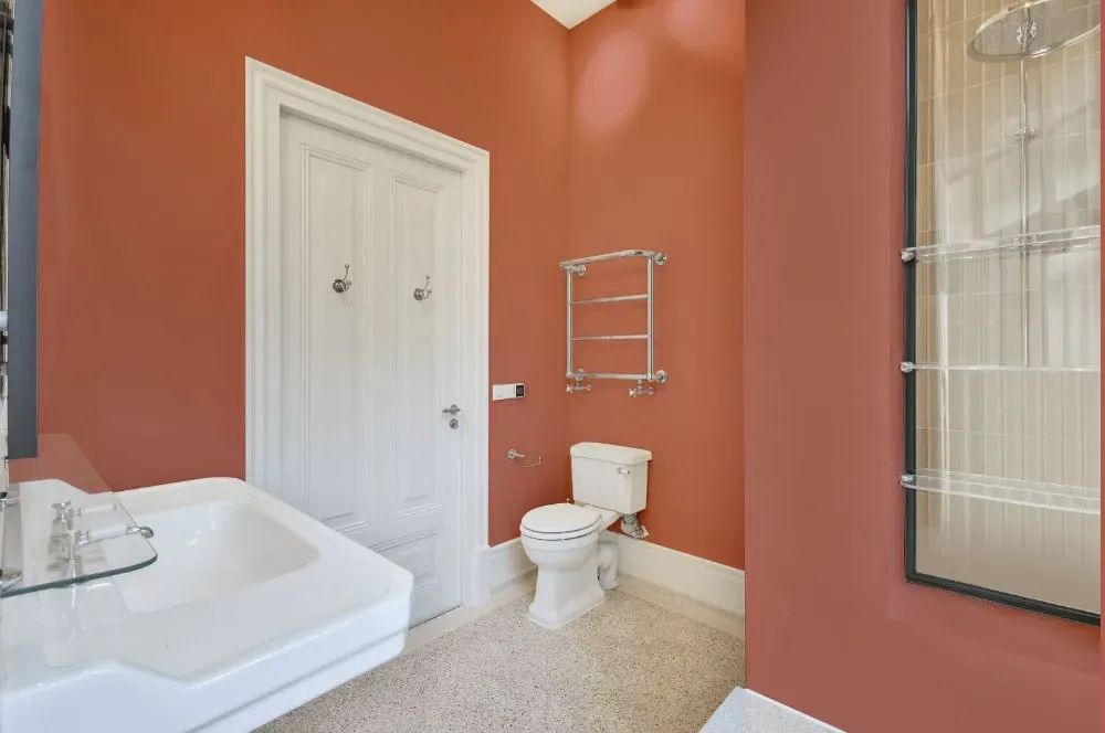
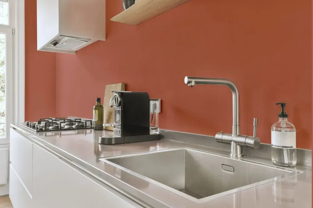
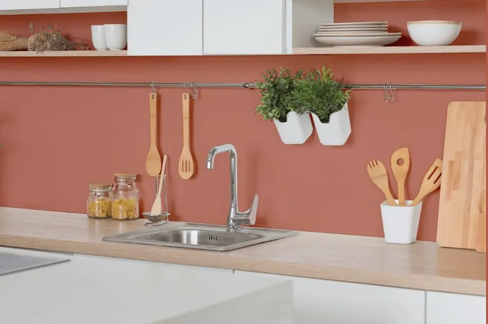
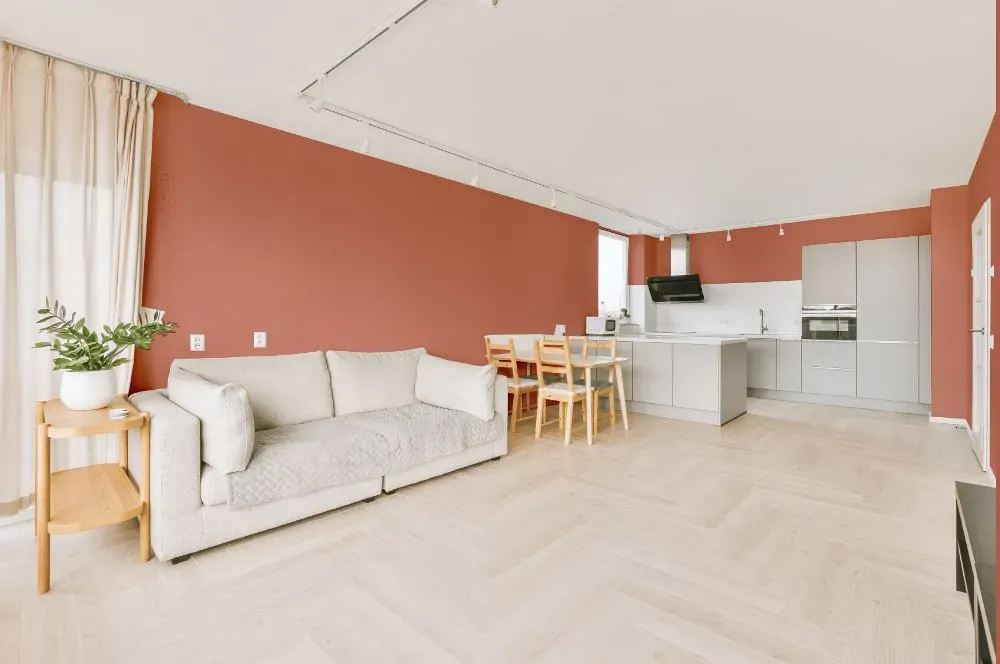
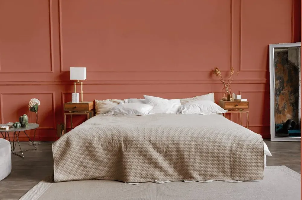
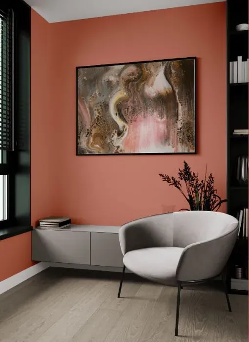
- Benjamin Moore Peaches 'n Cream reviews (23 photos)
- What are Benjamin Moore Peaches 'n Cream undertones?
- Is Peaches 'n Cream 040 cool or warm?
- How light temperature affects on Peaches 'n Cream
- Monochromatic color scheme
- Complementary color scheme
- Color comparison and matching
- LRV of Peaches 'n Cream 040
- Color codes
- Color equivalents
| Official page: | Peaches 'n Cream 040 |
| Code: | 040 |
| Name: | Peaches 'n Cream |
| Brand: | Benjamin Moore |
What color is Benjamin Moore Peaches 'n Cream?
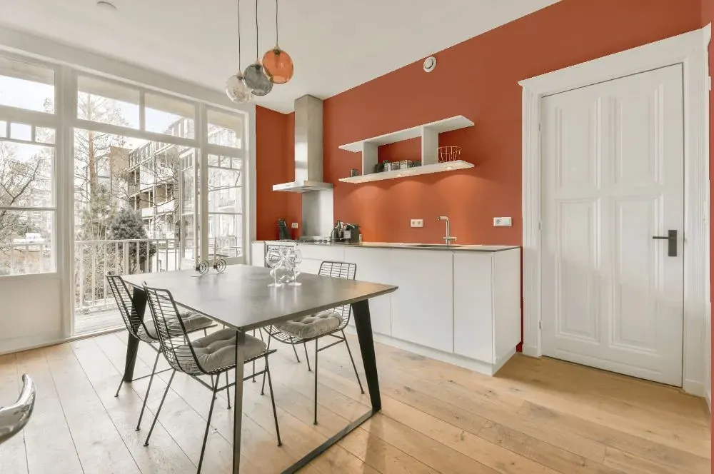
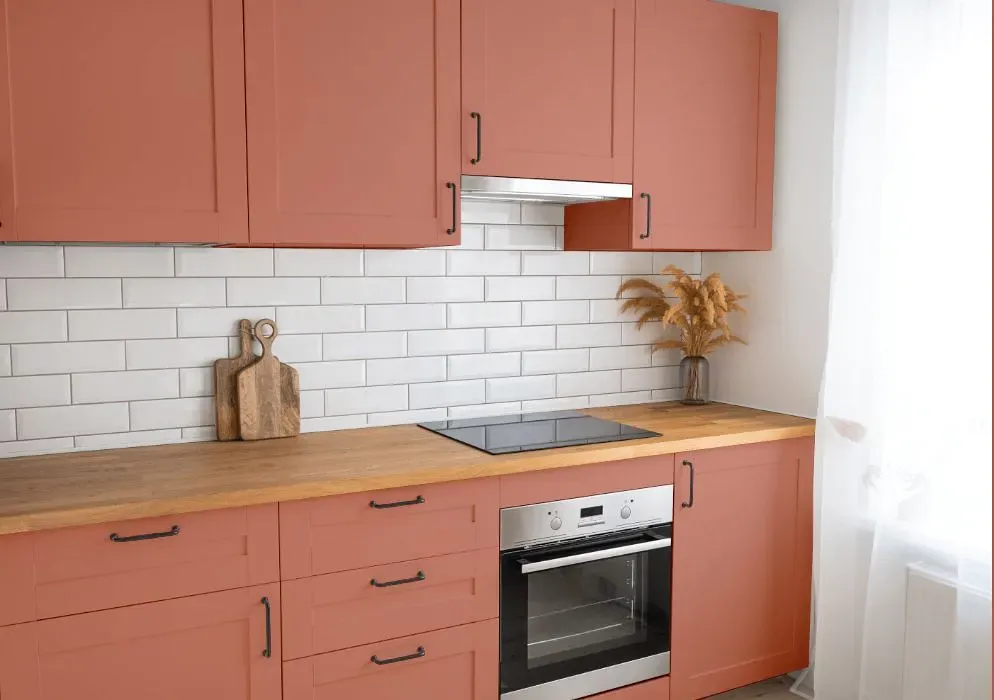
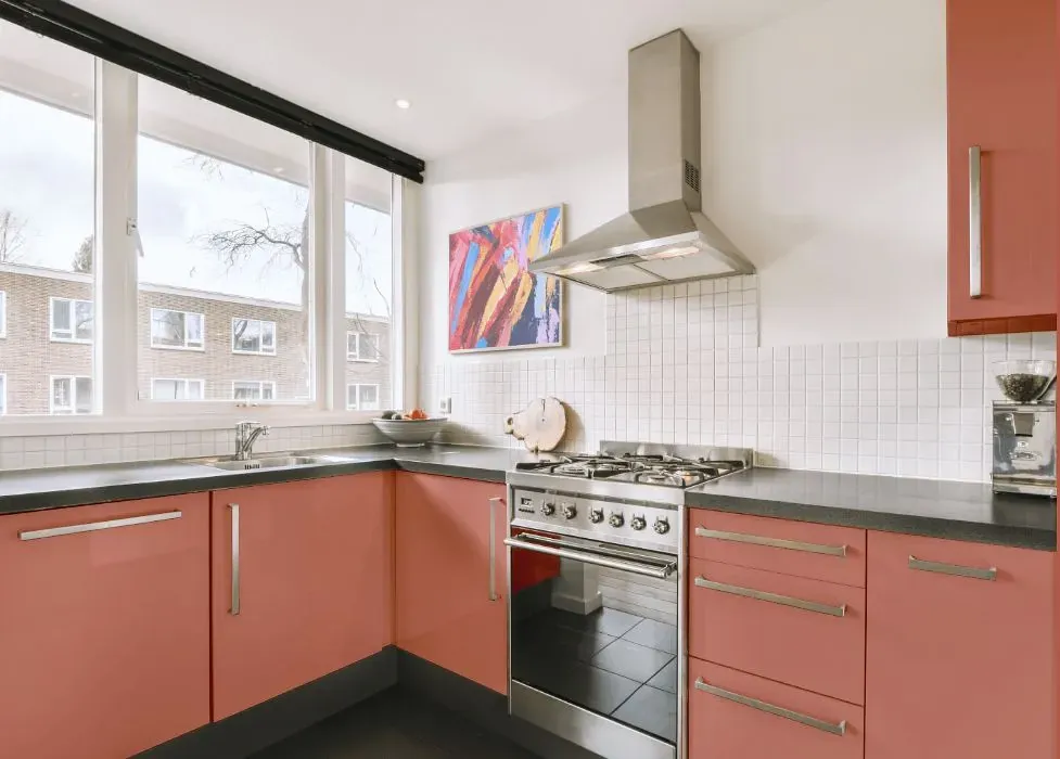
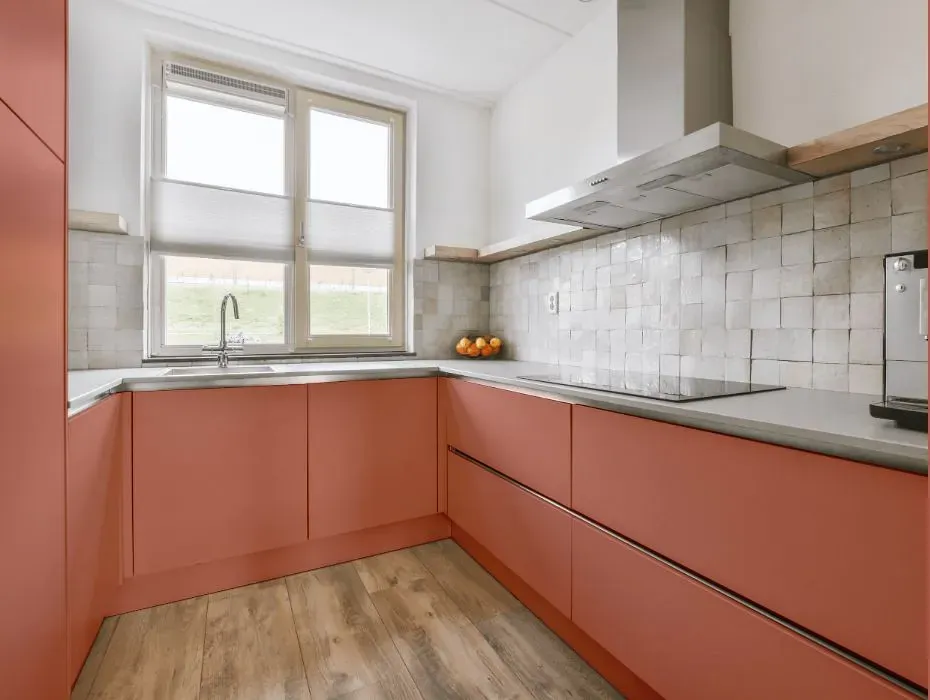
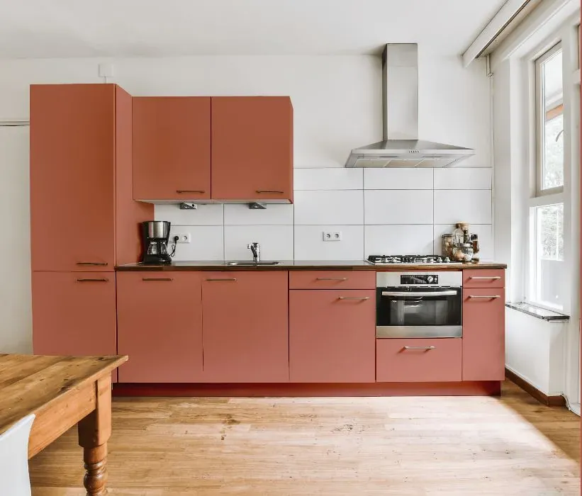
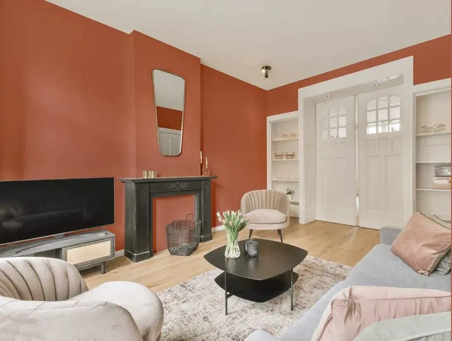
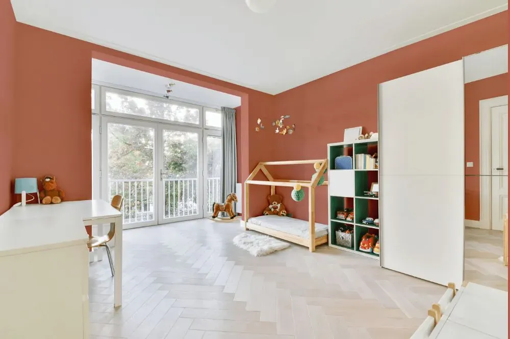
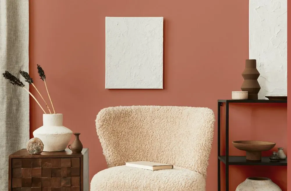
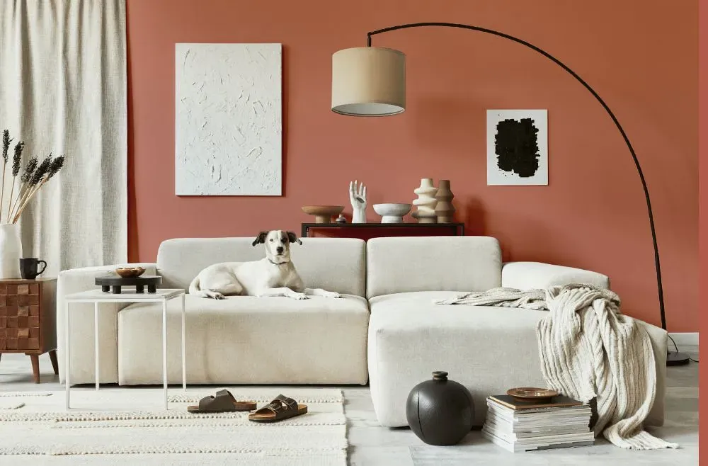
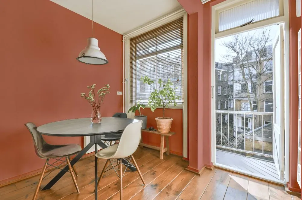
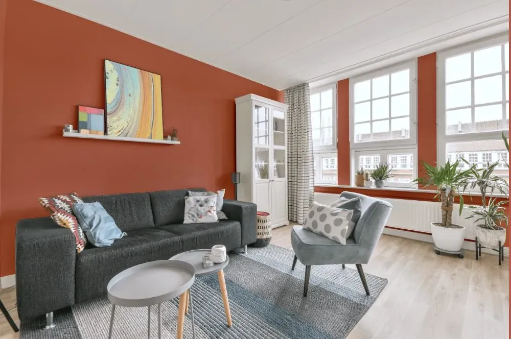
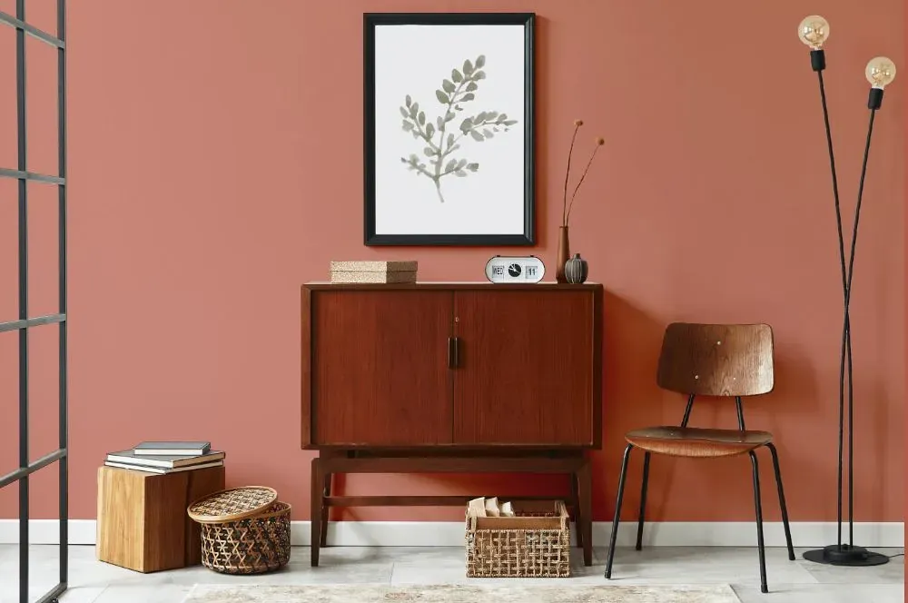
Benjamin Moore 040 Peaches 'n Cream exudes a warm and inviting ambiance with its soft peachy hue. This delightful color pairs gracefully with earthy tones like Benjamin Moore 305 Sandy Hook Gray and Benjamin Moore 2111-50 Barren Plain to create a calming and harmonious palette. For a sophisticated contrast, consider combining Peaches 'n Cream with a deep navy such as Benjamin Moore 2121-10 Black Iron. Whether used as a main wall color or as an accent, this versatile shade brings a touch of elegance to any space. Elevate your interior design with the timeless charm of Benjamin Moore 040 Peaches 'n Cream.
Loading...
LRV of Peaches 'n Cream
Peaches 'n Cream has an LRV of 30.88% and refers to Medium colors that reflect a lot of light. Why LRV is important?

Light Reflectance Value measures the amount of visible and usable light that reflects from a painted surface.
Simply put, the higher the LRV of a paint color, the brighter the room you will get.
The scale goes from 0% (absolute black, absorbing all light) to 100% (pure white, reflecting all light).
Act like a pro: When choosing paint with an LRV of 30.88%, pay attention to your bulbs' brightness. Light brightness is measured in lumens. The lower the paint's LRV, the higher lumen level you need. Every square foot of room needs at least 40 lumens. That means for a 200 ft2 living room you'll need about 8000 lumens of light – e.g., eight 1000 lm bulbs.
Color codes
We have collected almost every possible color code you could ever need.
Not sure what the difference between HEX and RGB is? We break down color models in plain language. Understanding color models
| Format | Code |
|---|---|
| HEX | #CB8574 |
| RGB Decimal | 203, 133, 116 |
| RGB Percent | 79.61%, 52.16%, 45.49% |
| HSV | Hue: 12° Saturation: 42.86% Value: 79.61% |
| HSL | hsl(12, 46, 63) |
| CMYK | Cyan: 0.0 Magenta: 34.48 Yellow: 42.86 Key: 20.39 |
| YIQ | Y: 151.992 I: 47.176 Q: 9.517 |
| XYZ | X: 36.17 Y: 30.735 Z: 20.546 |
| CIE Lab | L:62.284 a:24.903 b:20.257 |
| CIE Luv | L:62.284 u:49.435 v:21.58 |
| Decimal | 13337972 |
| Hunter Lab | 55.439, 19.438, 16.835 |