Benjamin Moore Peatmoss 2103-30
Contentsshow +hide -
| Official page: | Peatmoss 2103-30 |
| Code: | 2103-30 |
| Name: | Peatmoss |
| Brand: | Benjamin Moore |
What color is Benjamin Moore Peatmoss?
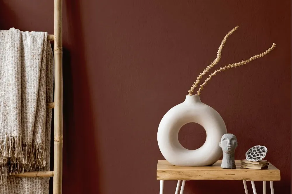
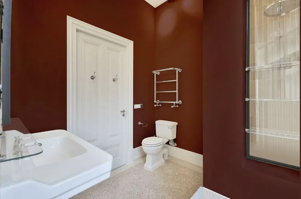
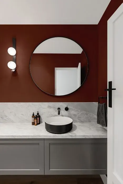
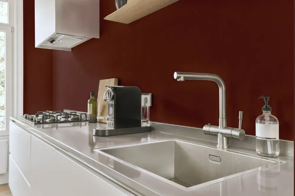
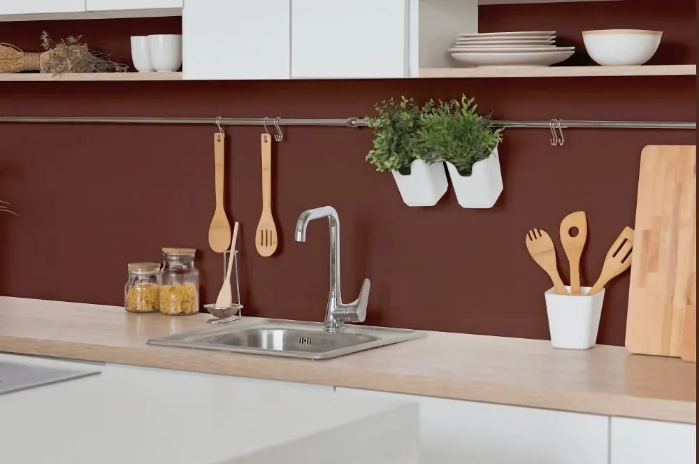
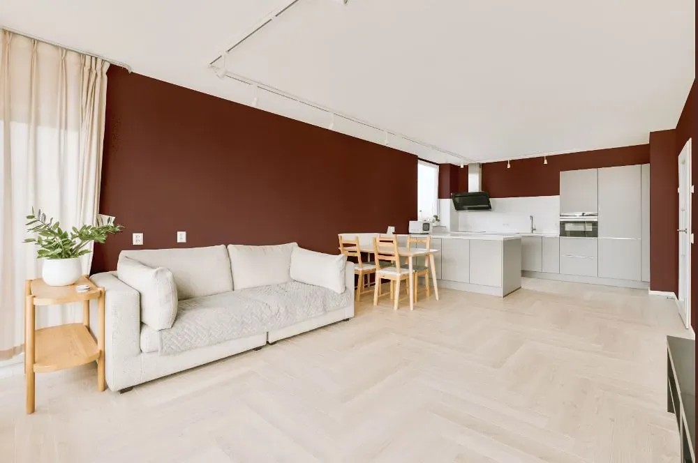
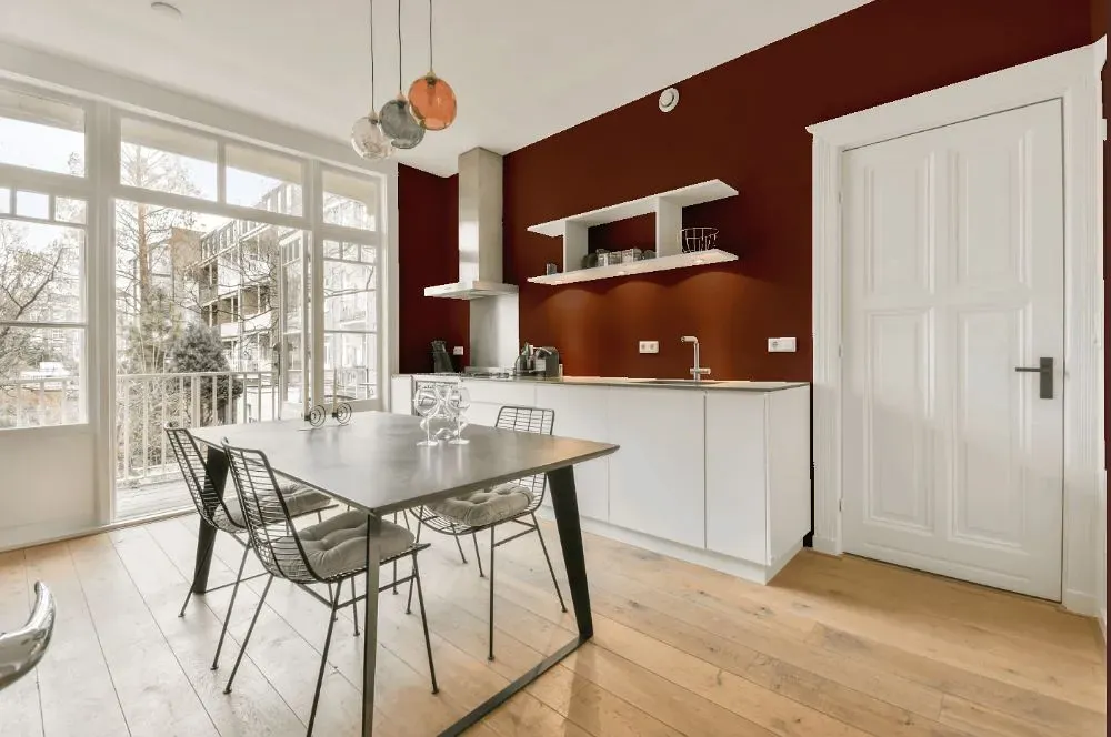
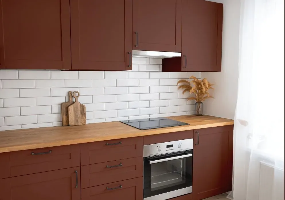
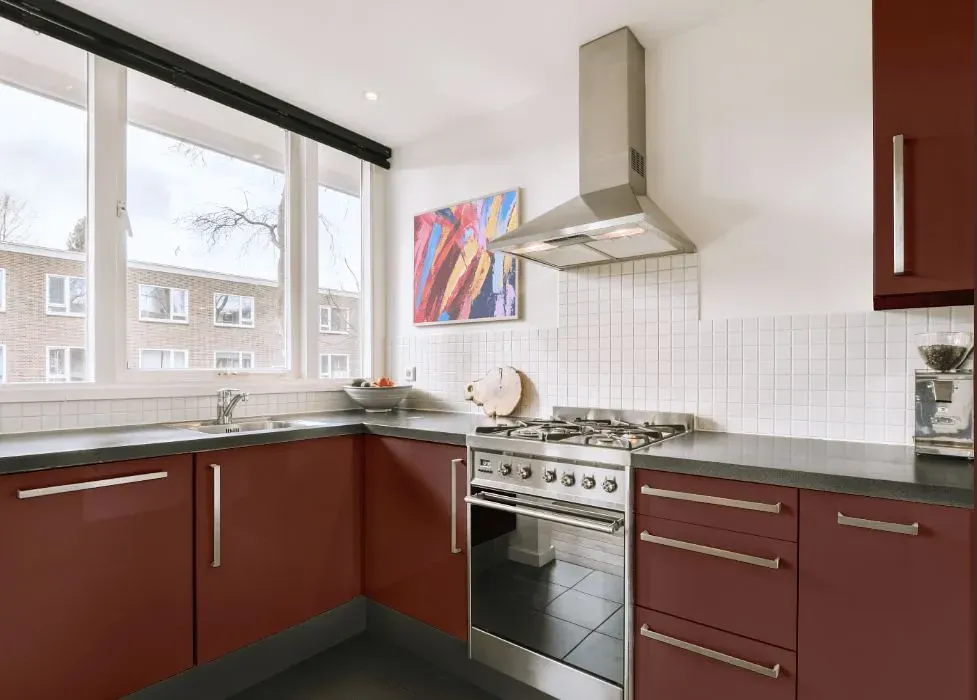
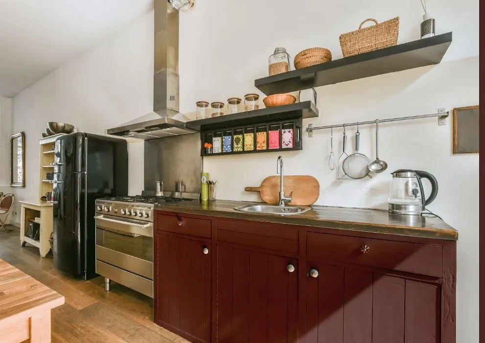
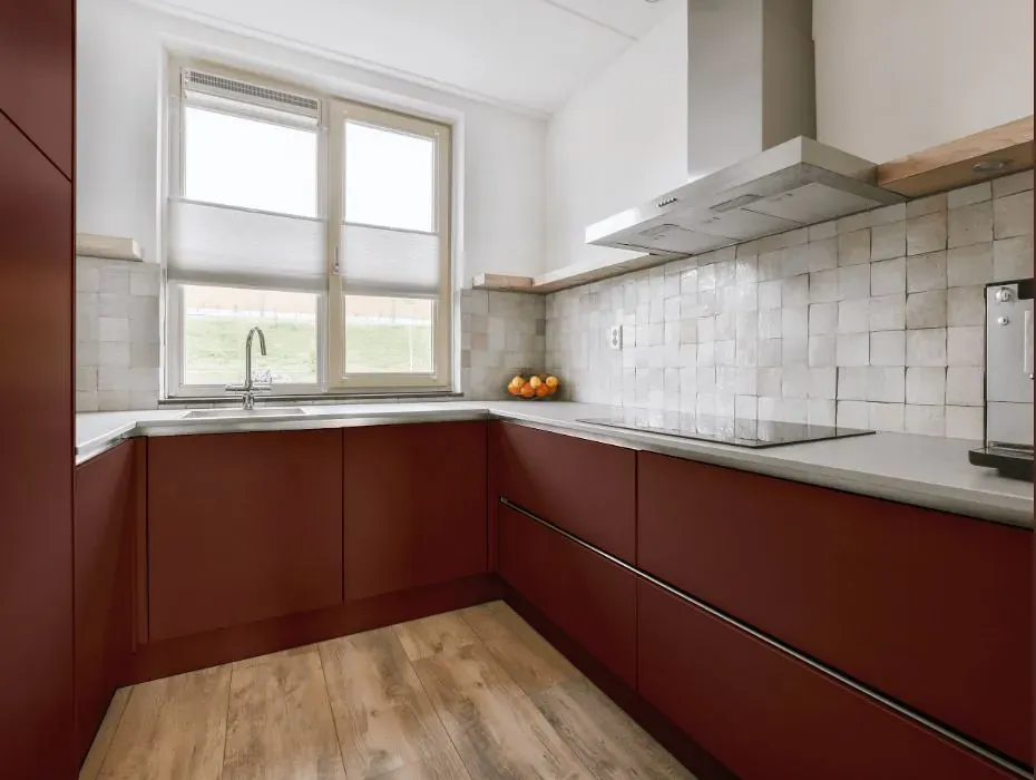
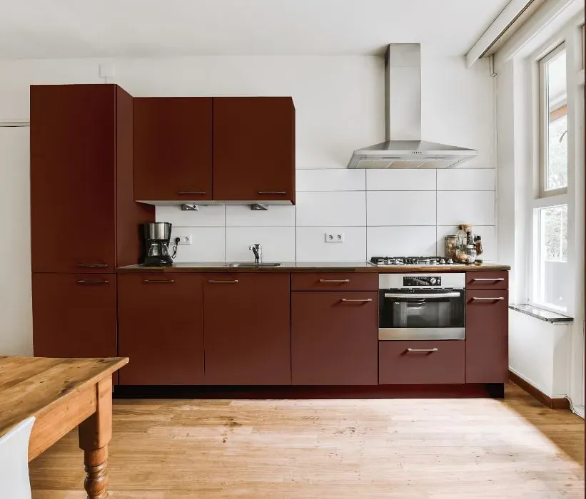
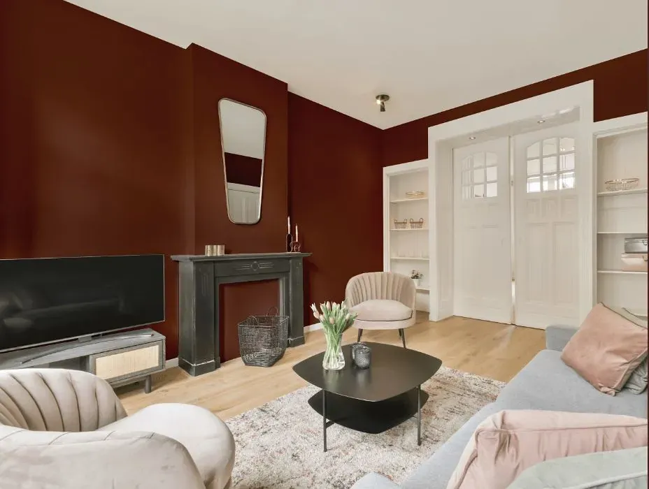
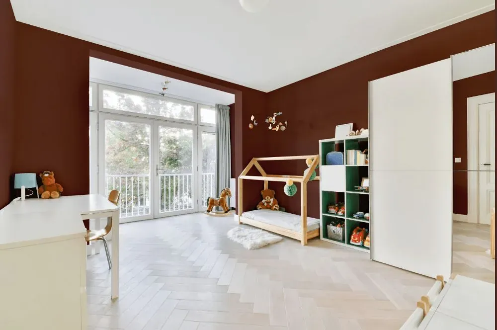
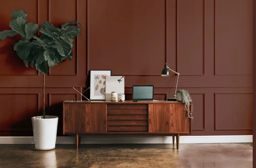
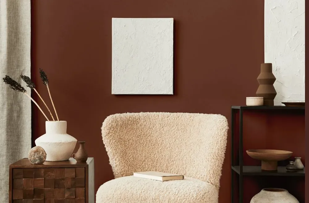
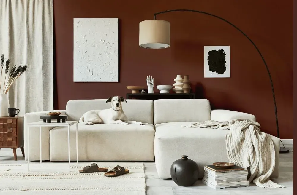
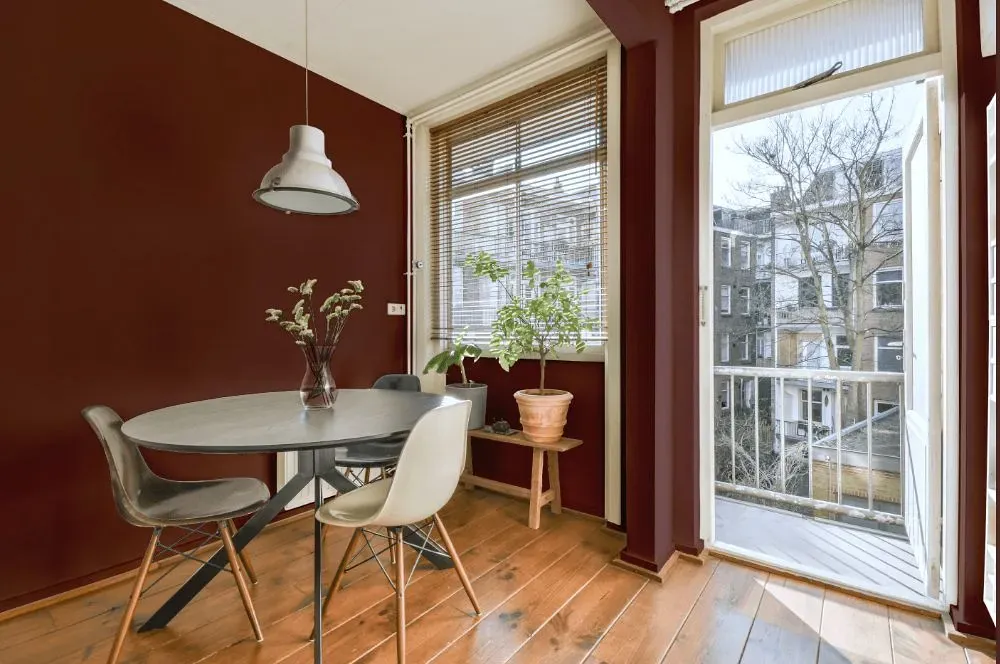
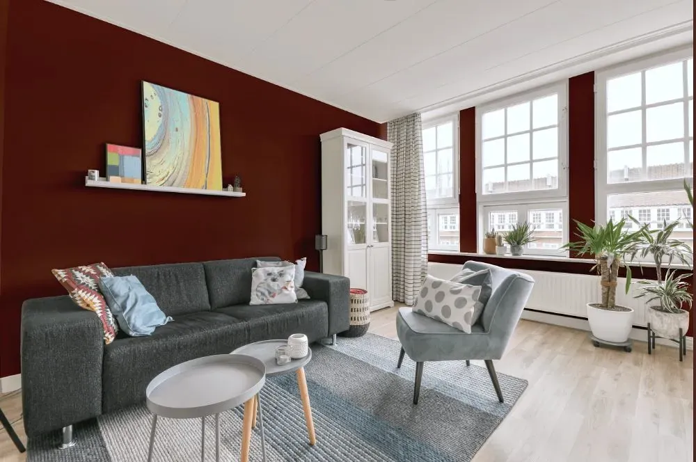
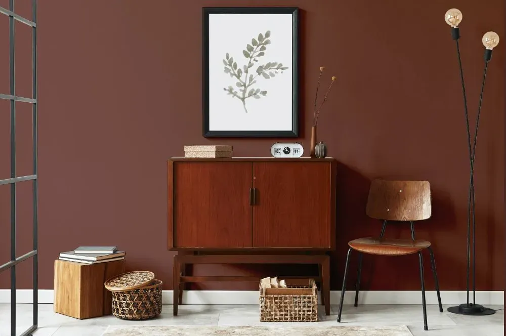
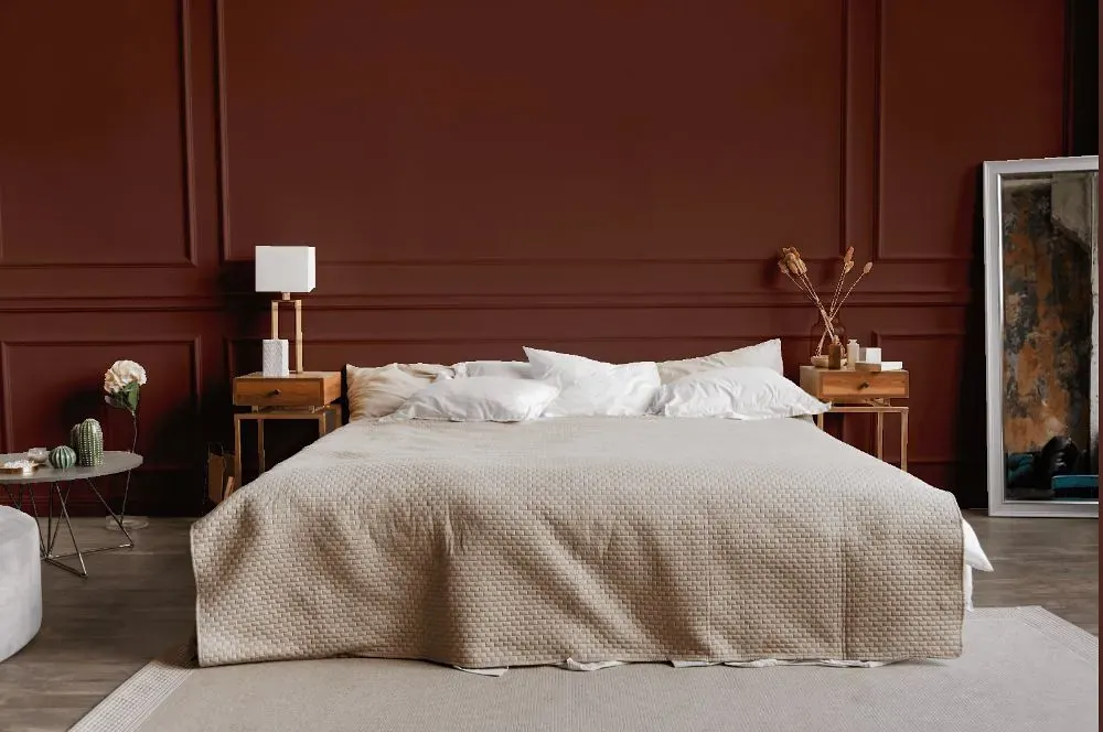
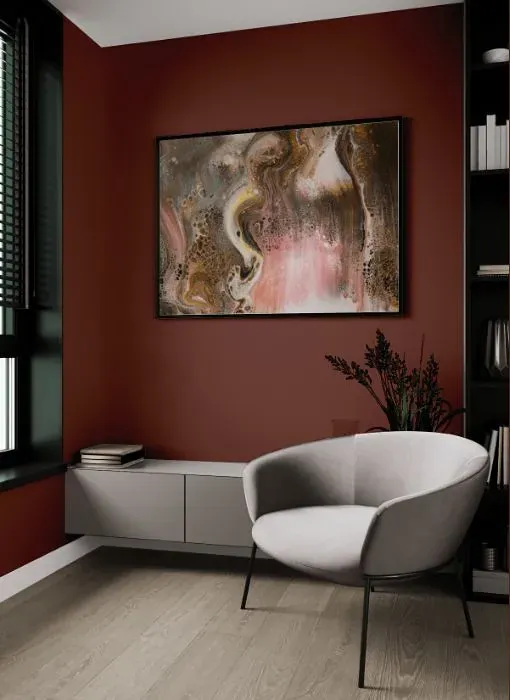
Elevate your space with the warm and earthy tones of Benjamin Moore 2103-30 Peatmoss. This rich and inviting color effortlessly bridges the gap between modern and cozy aesthetics. Perfect for a living room or den, Peatmoss adds depth and sophistication to any space, creating a serene retreat from the outside world. Whether used as an accent wall or throughout the room, Benjamin Moore Peatmoss infuses a sense of tranquility and luxury, making it the ideal choice for those seeking a touch of nature indoors.
Loading...
LRV of Peatmoss
Peatmoss has an LRV of 10.75% and refers to Medium Dark which means that this color reflects very little light. Why LRV is important?

Light Reflectance Value measures the amount of visible and usable light that reflects from a painted surface.
Simply put, the higher the LRV of a paint color, the brighter the room you will get.
The scale goes from 0% (absolute black, absorbing all light) to 100% (pure white, reflecting all light).
Act like a pro: When choosing paint with an LRV of 10.75%, pay attention to your bulbs' brightness. Light brightness is measured in lumens. The lower the paint's LRV, the higher lumen level you need. Every square foot of room needs at least 40 lumens. That means for a 200 ft2 living room you'll need about 8000 lumens of light – e.g., eight 1000 lm bulbs.
Color codes
We have collected almost every possible color code you could ever need.
Not sure what the difference between HEX and RGB is? We break down color models in plain language. Understanding color models
| Format | Code |
|---|---|
| HEX | #754B41 |
| RGB Decimal | 117, 75, 65 |
| RGB Percent | 45.88%, 29.41%, 25.49% |
| HSV | Hue: 12° Saturation: 44.44% Value: 45.88% |
| HSL | hsl(12, 29, 36) |
| CMYK | Cyan: 0.0 Magenta: 35.9 Yellow: 44.44 Key: 54.12 |
| YIQ | Y: 86.418 I: 28.241 Q: 5.773 |
| XYZ | X: 10.807 Y: 9.197 Z: 6.206 |
| CIE Lab | L:36.36 a:16.537 b:13.309 |
| CIE Luv | L:36.36 u:28.564 v:12.377 |
| Decimal | 7686977 |
| Hunter Lab | 30.326, 10.539, 9.096 |