Benjamin Moore Sienna 2092-20
Contentsshow +hide -
| Official page: | Sienna 2092-20 |
| Code: | 2092-20 |
| Name: | Sienna |
| Brand: | Benjamin Moore |
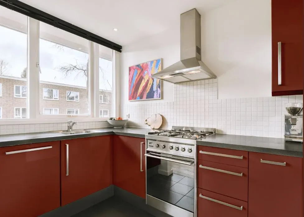
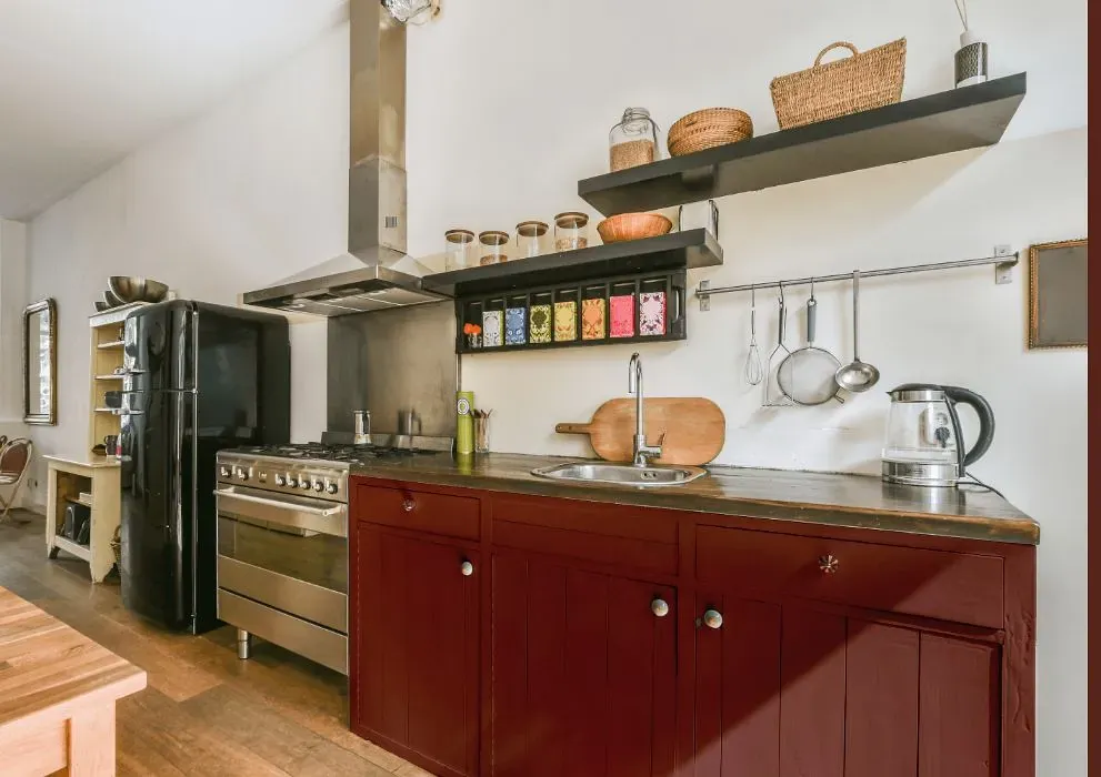
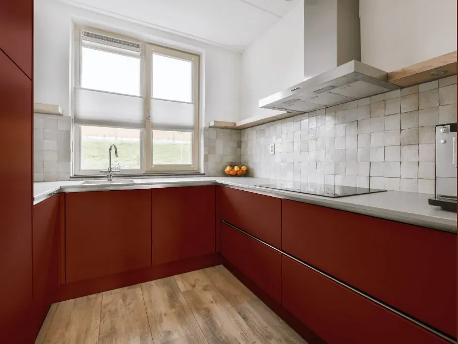
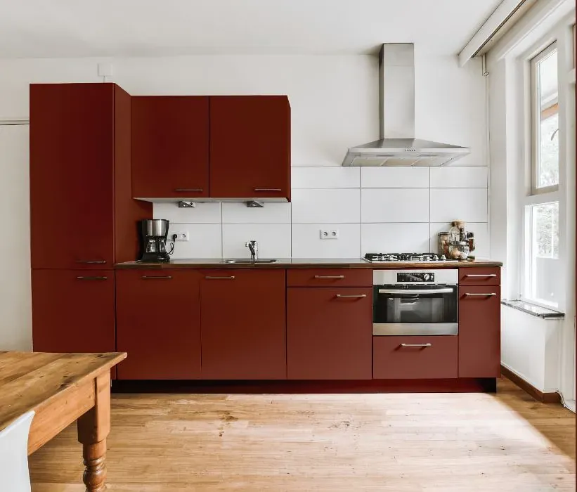
What color is Benjamin Moore Sienna?
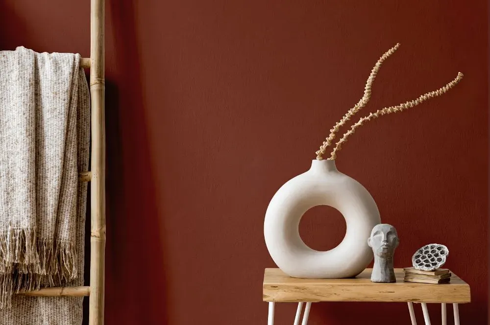
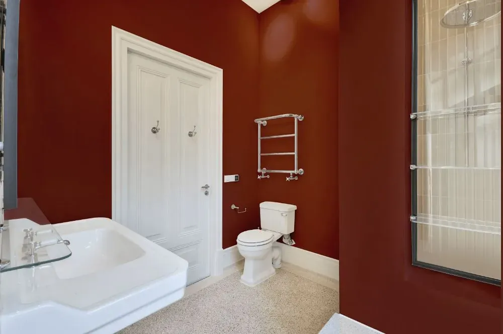
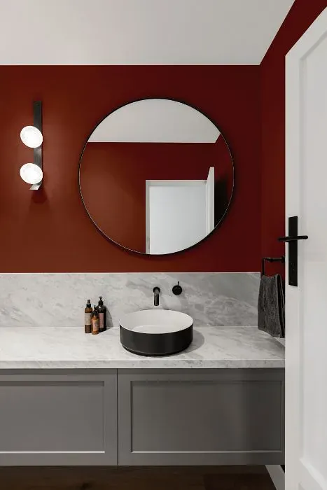
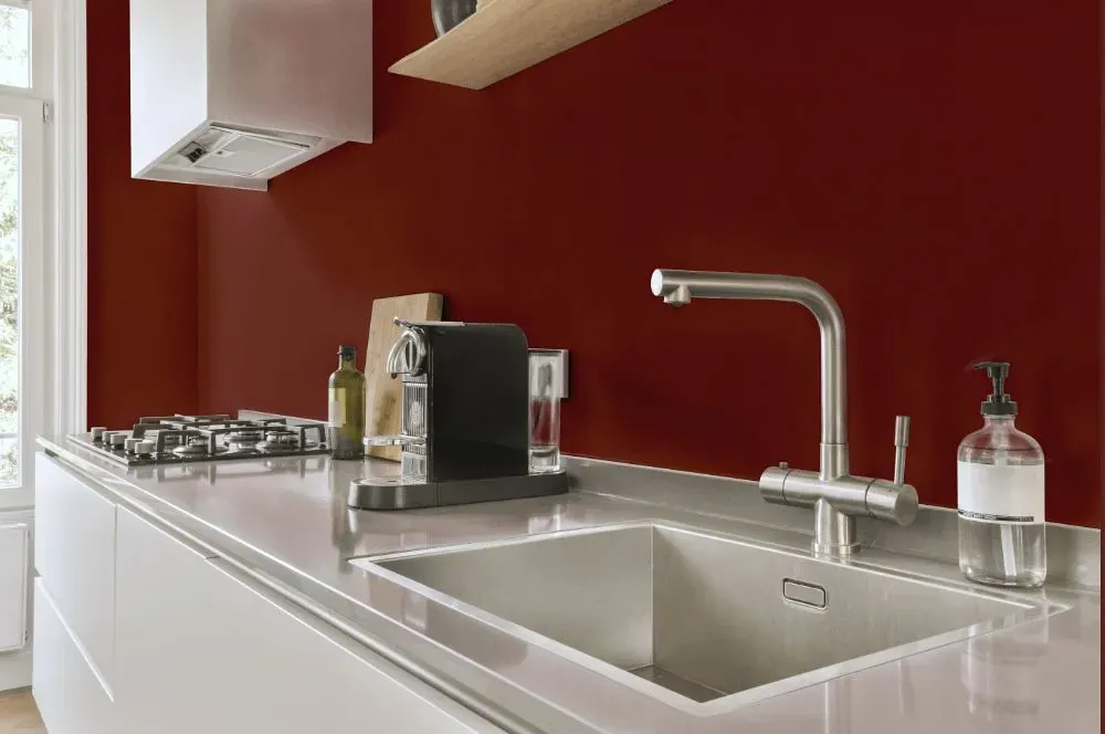
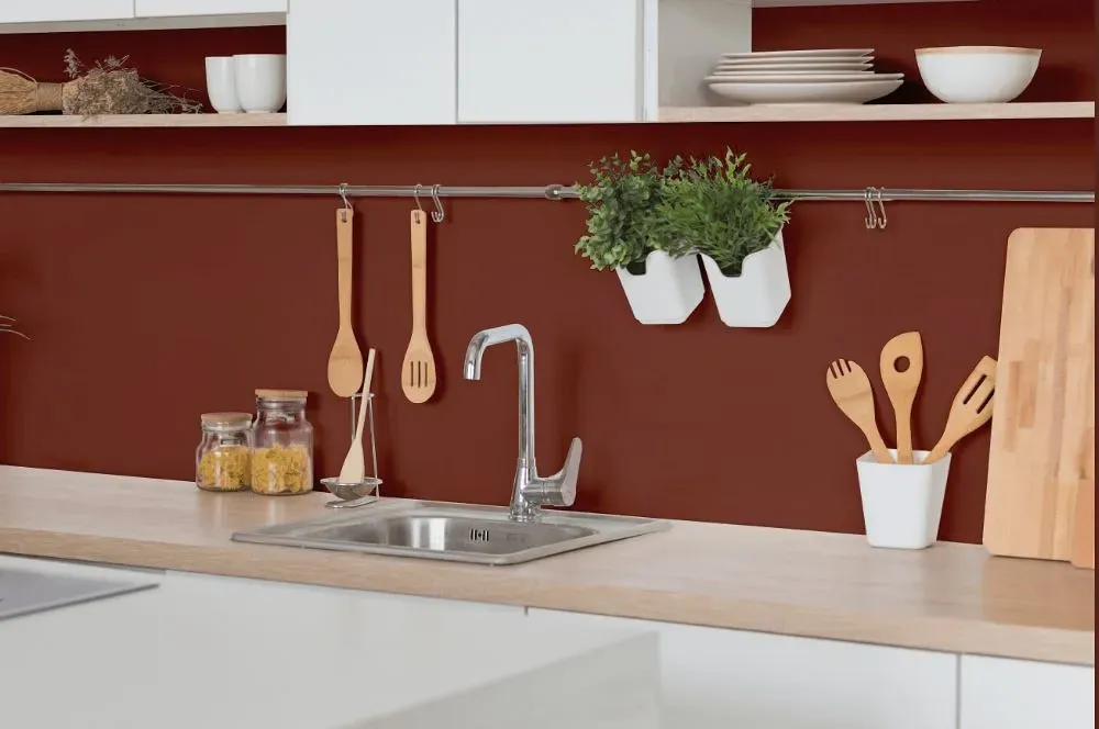
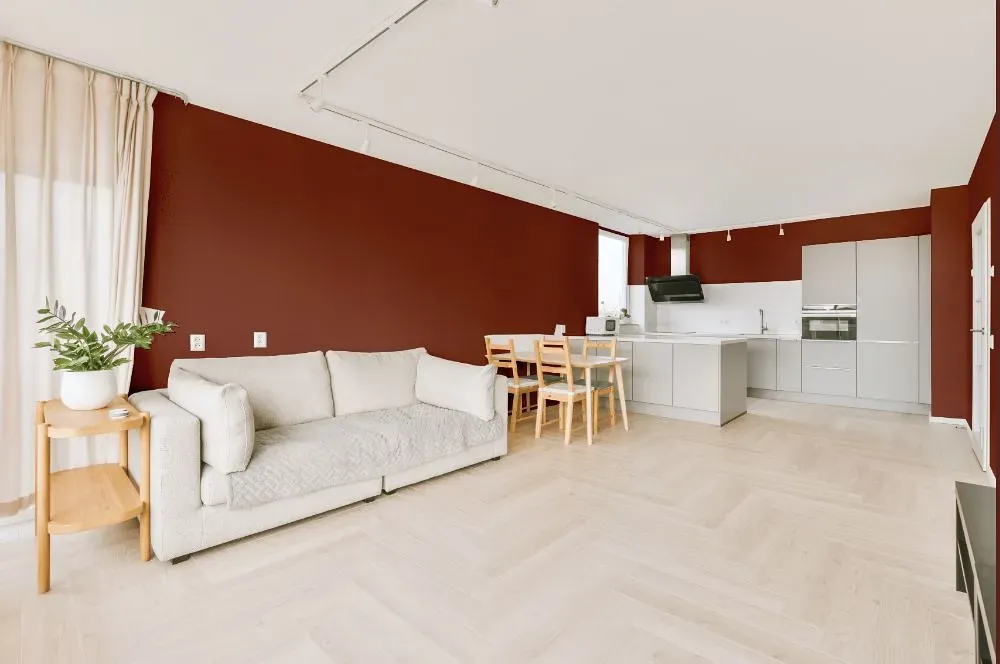
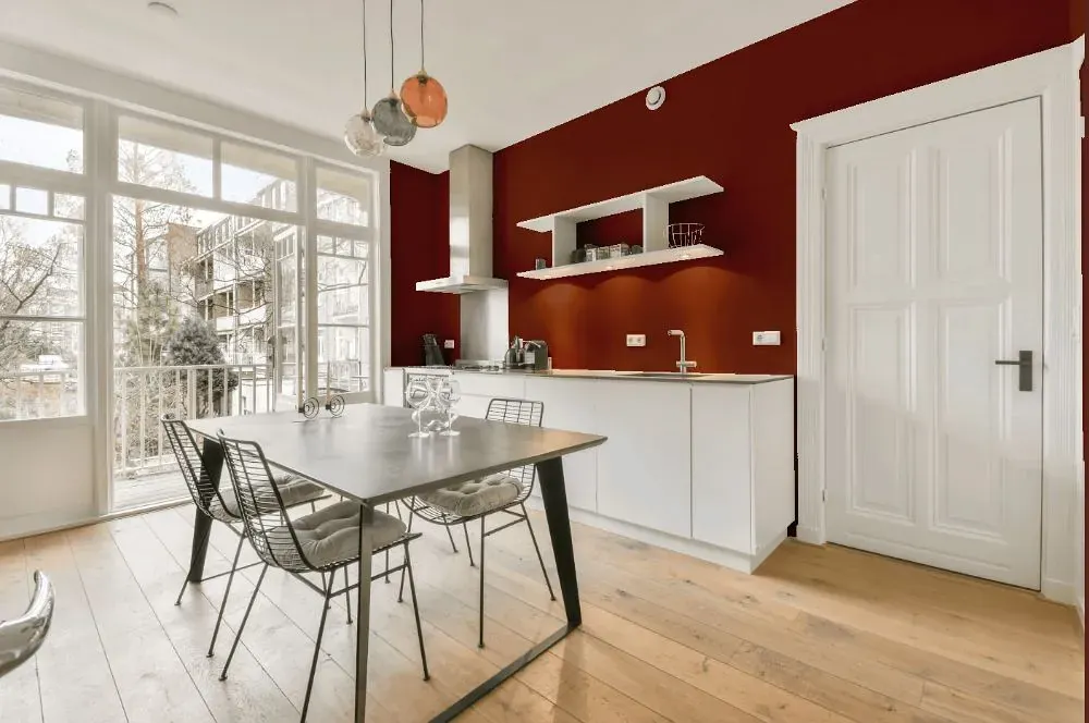
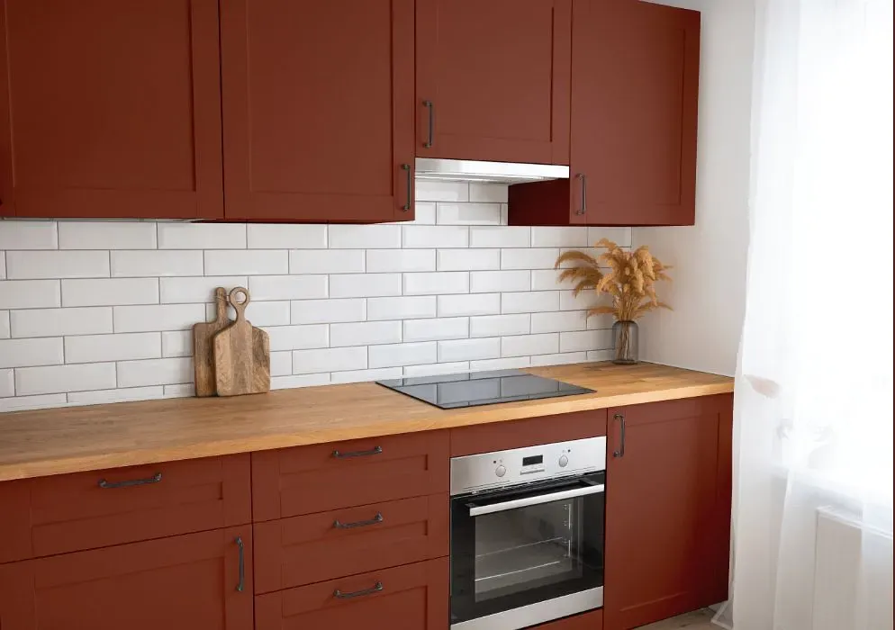
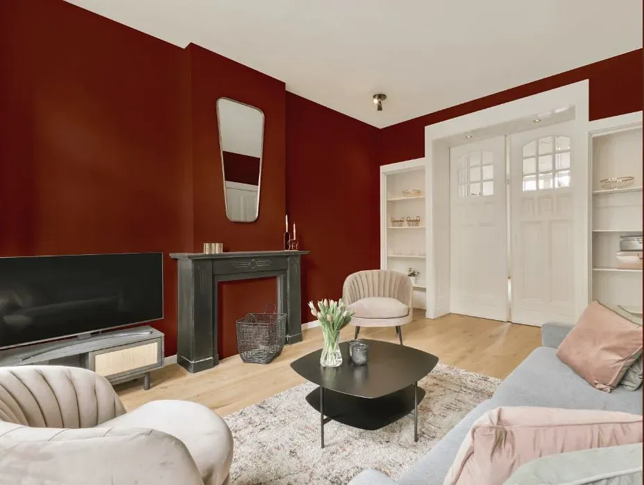
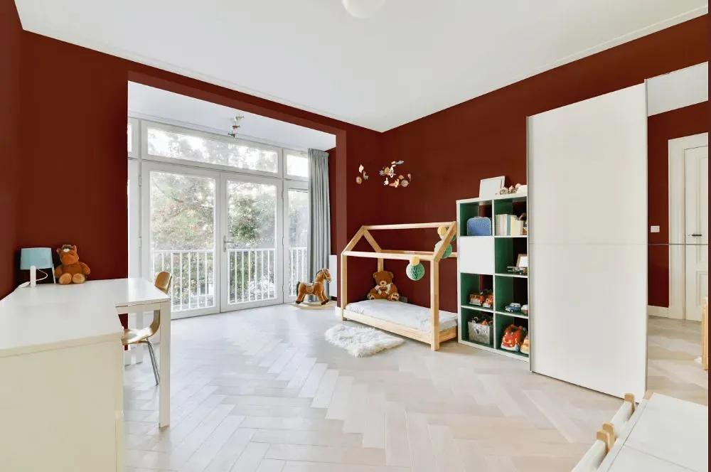
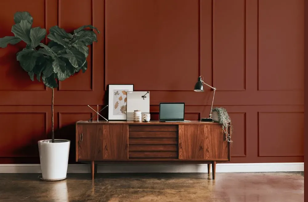
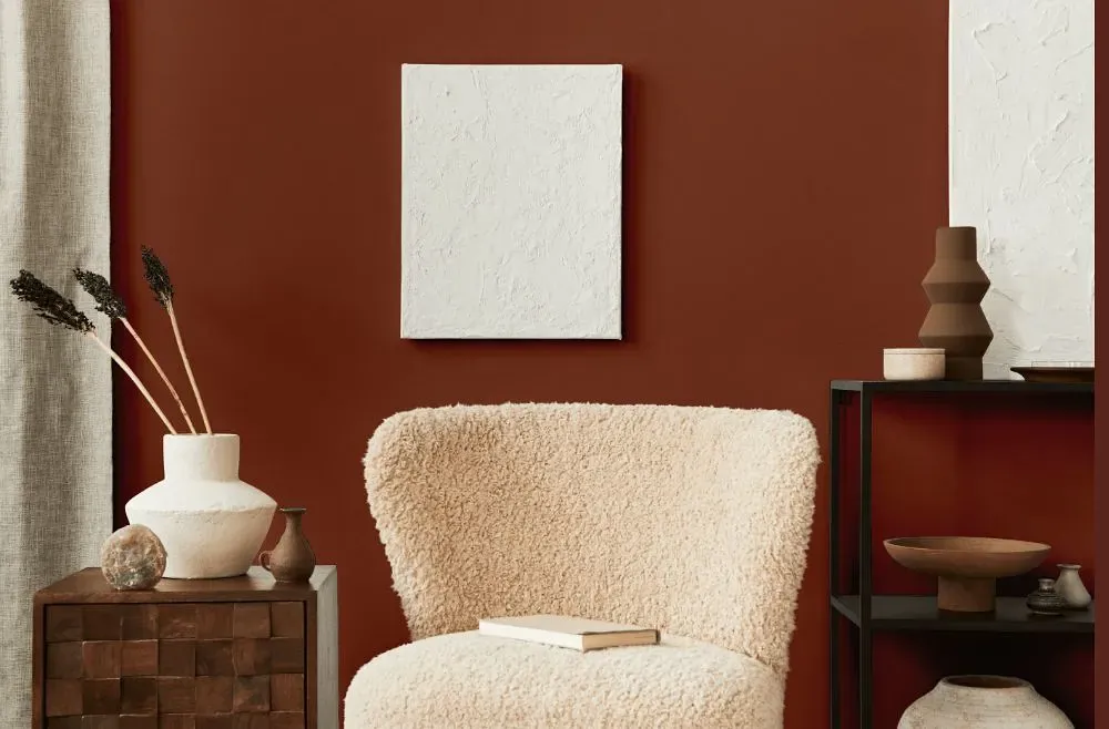
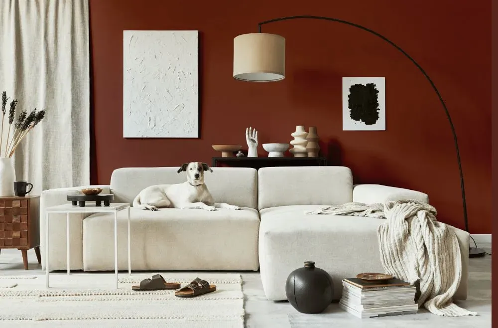
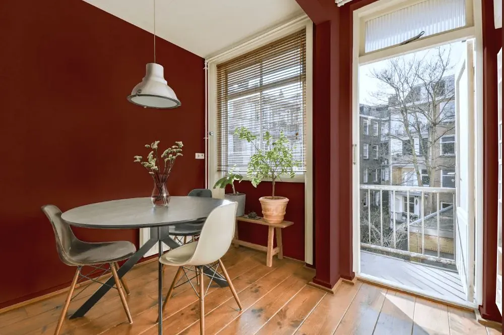
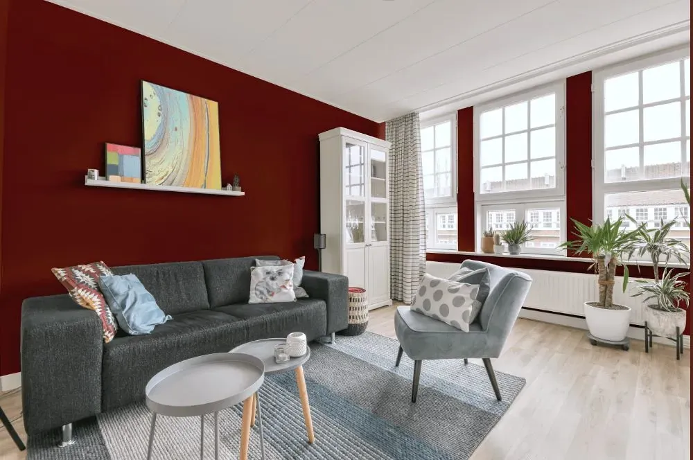
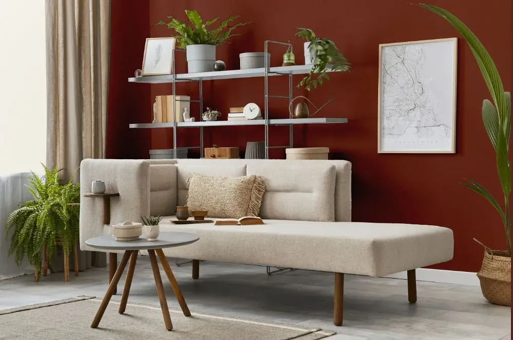
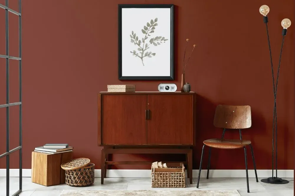
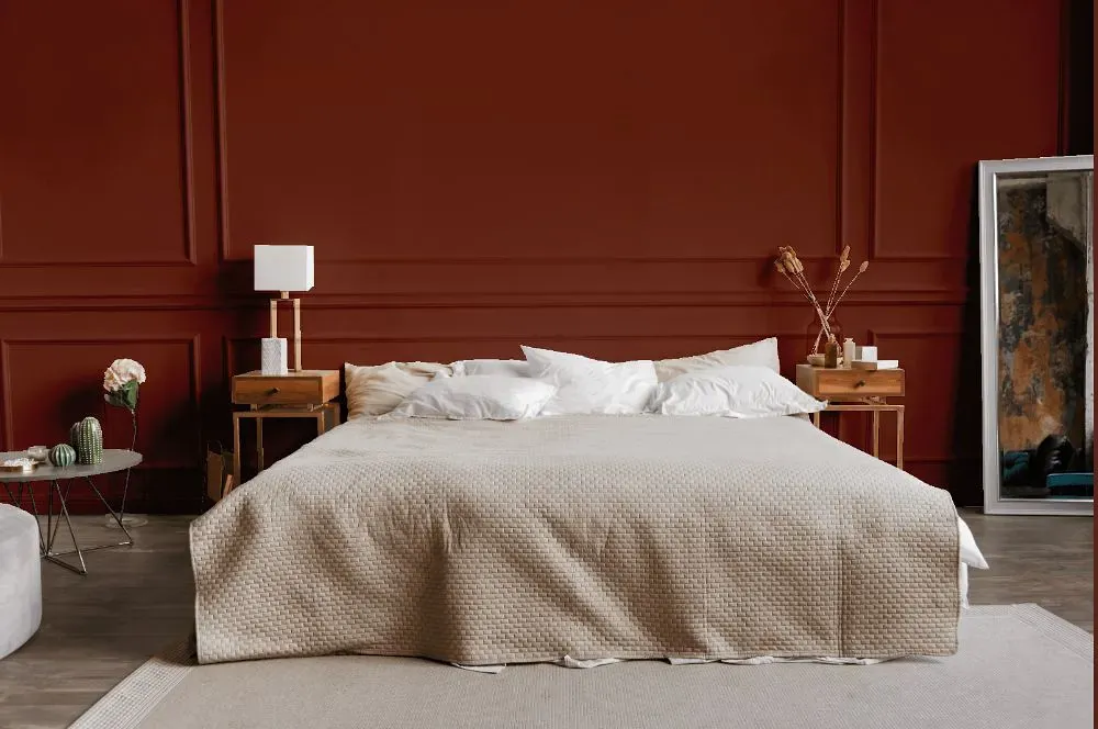
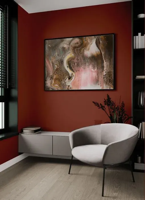
The warm tones of Benjamin Moore 2092-20 Sienna invoke a sense of earthy richness that can enhance any space. Pairing Sienna with shades like crisp white, muted sage, or deep navy can create a cohesive and inviting palette. Its versatility allows it to complement both light and dark colors, making it a great choice for any room in the home. Embracing Sienna in your design scheme can bring a sophisticated and timeless appeal to your interiors.
Loading...
LRV of Sienna
Sienna has an LRV of 9.96% and refers to Dark colors which means that this color almost does not reflect light. Why LRV is important?

Light Reflectance Value measures the amount of visible and usable light that reflects from a painted surface.
Simply put, the higher the LRV of a paint color, the brighter the room you will get.
The scale goes from 0% (absolute black, absorbing all light) to 100% (pure white, reflecting all light).
Act like a pro: When choosing paint with an LRV of 9.96%, pay attention to your bulbs' brightness. Light brightness is measured in lumens. The lower the paint's LRV, the higher lumen level you need. Every square foot of room needs at least 40 lumens. That means for a 200 ft2 living room you'll need about 8000 lumens of light – e.g., eight 1000 lm bulbs.
Color codes
We have collected almost every possible color code you could ever need.
Not sure what the difference between HEX and RGB is? We break down color models in plain language. Understanding color models
| Format | Code |
|---|---|
| HEX | #804638 |
| RGB Decimal | 128, 70, 56 |
| RGB Percent | 50.20%, 27.45%, 21.96% |
| HSV | Hue: 12° Saturation: 56.25% Value: 50.2% |
| HSL | hsl(12, 39, 36) |
| CMYK | Cyan: 0.0 Magenta: 45.31 Yellow: 56.25 Key: 49.8 |
| YIQ | Y: 85.746 I: 39.061 Q: 7.912 |
| XYZ | X: 11.807 Y: 9.256 Z: 4.905 |
| CIE Lab | L:36.473 a:23.303 b:19.307 |
| CIE Luv | L:36.473 u:41.608 v:16.8 |
| Decimal | 8406584 |
| Hunter Lab | 30.424, 16.029, 11.738 |