Farrow and Ball Picture Gallery Red 42
Contentsshow +hide -
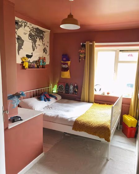
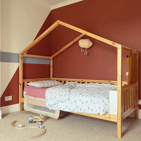
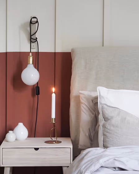
- Picture Gallery Red for bedroom (2 photos)
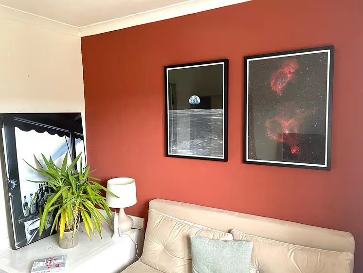
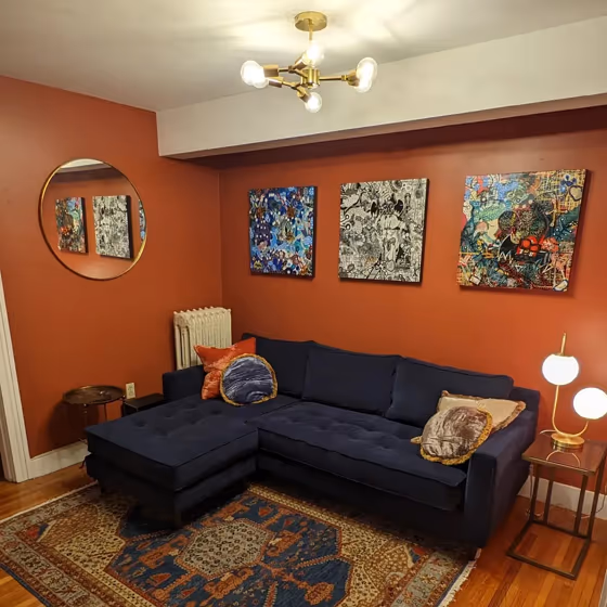
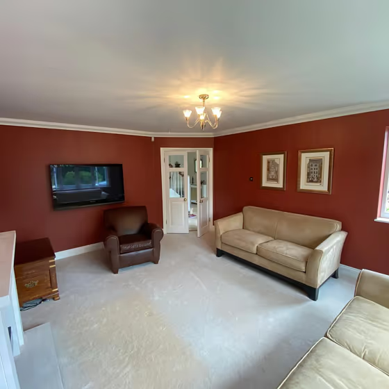
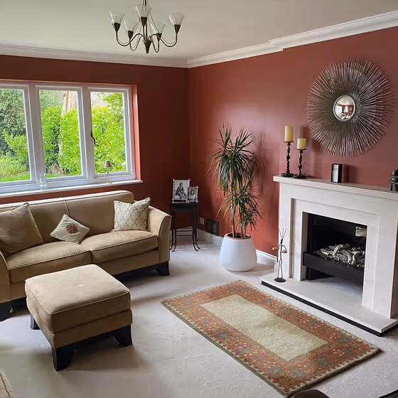
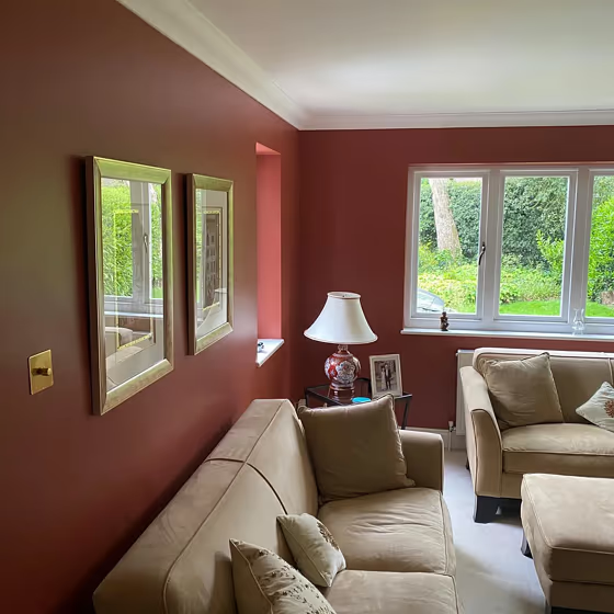
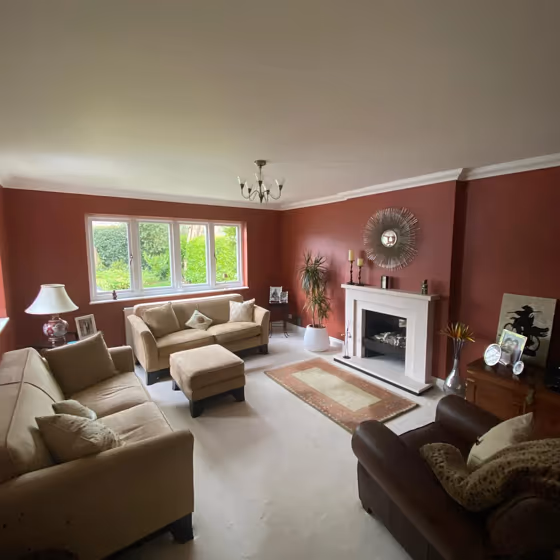
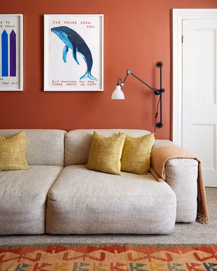
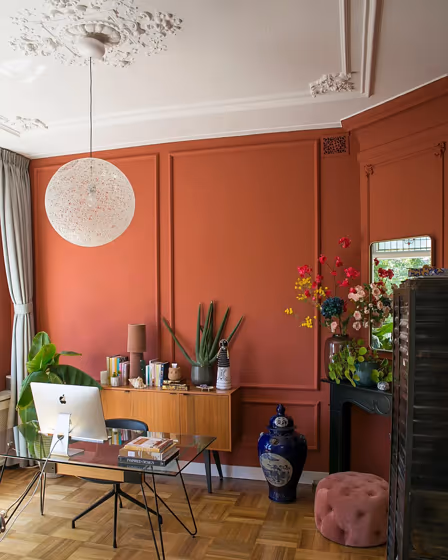
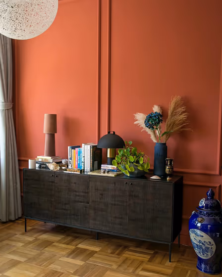
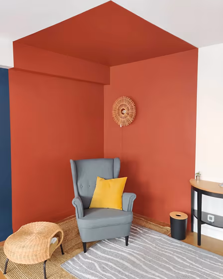
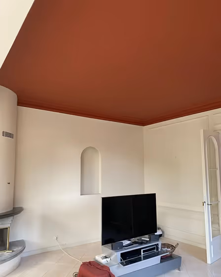
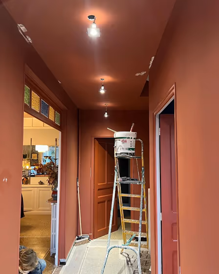
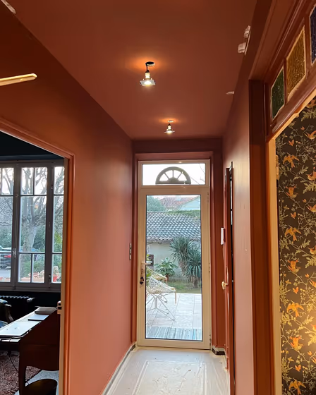
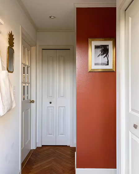
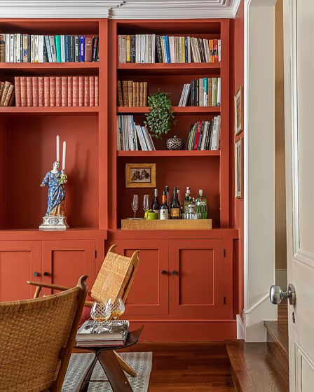
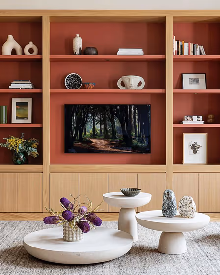
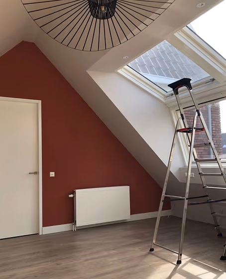
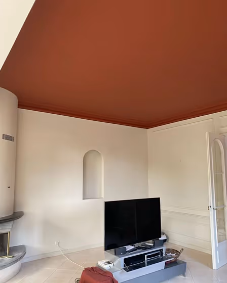
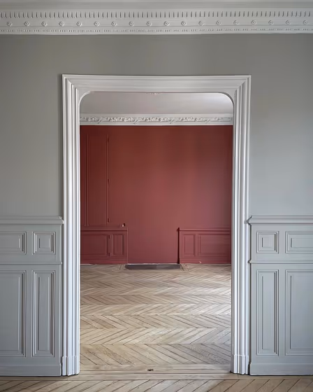
- Picture Gallery Red for living room (6 photos)
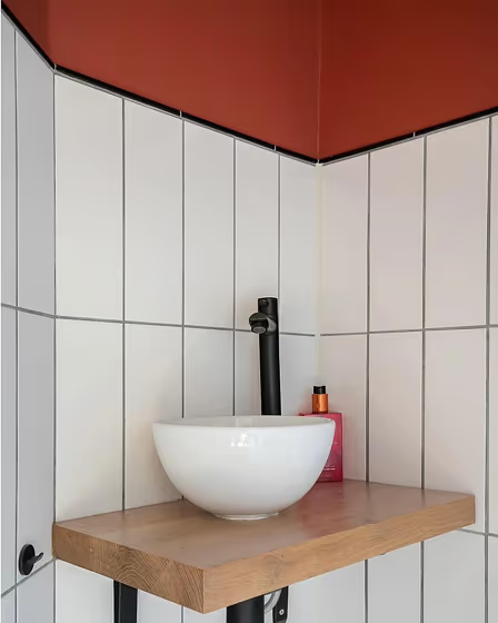
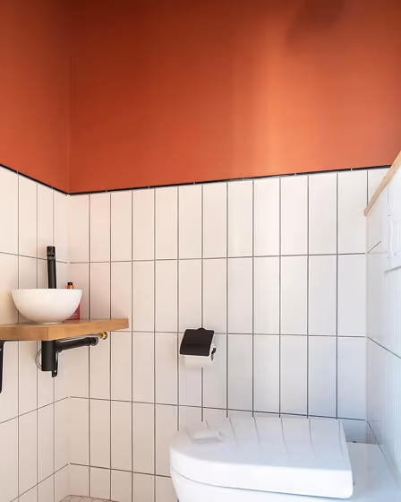
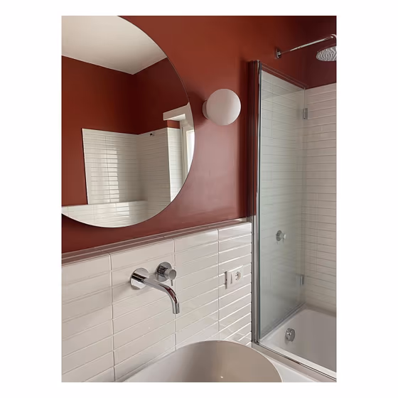
- Farrow and Ball Picture Gallery Red for bathroom (3 photos)
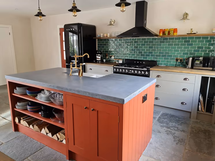
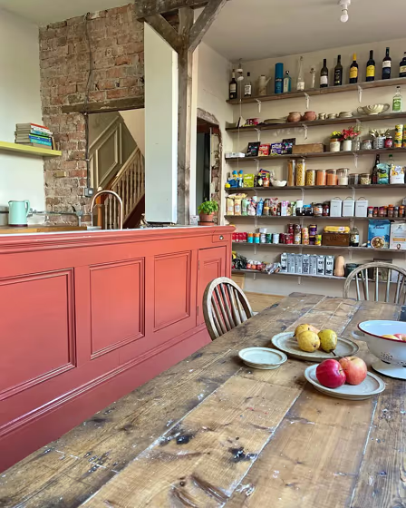
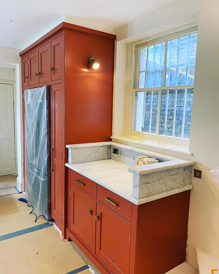
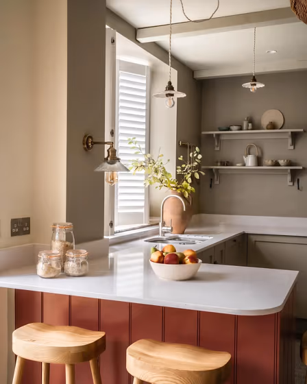
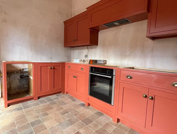
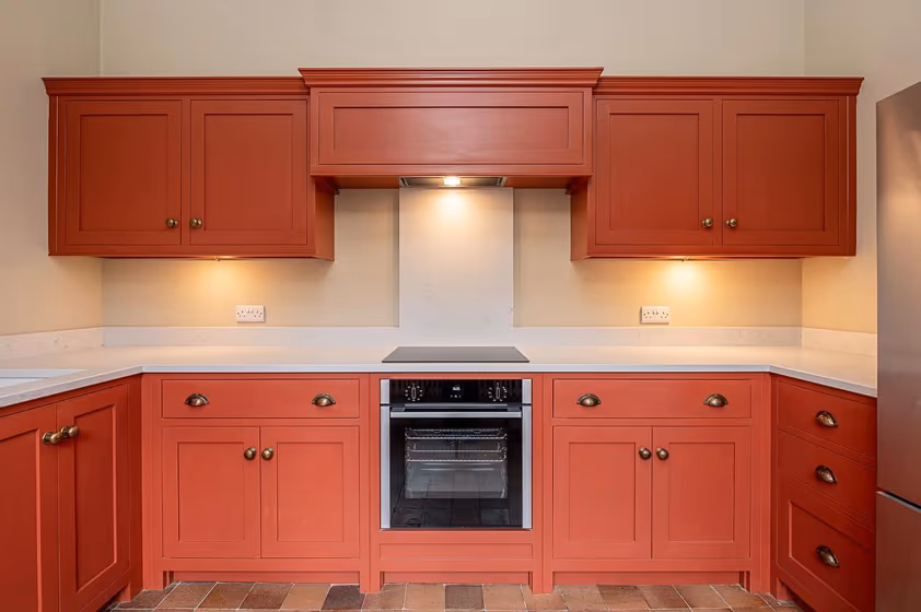
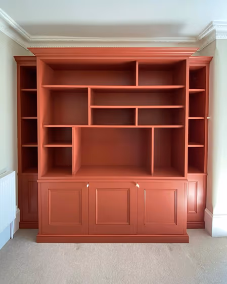
- Farrow and Ball 42 on kitchen cabinets (6 photos)
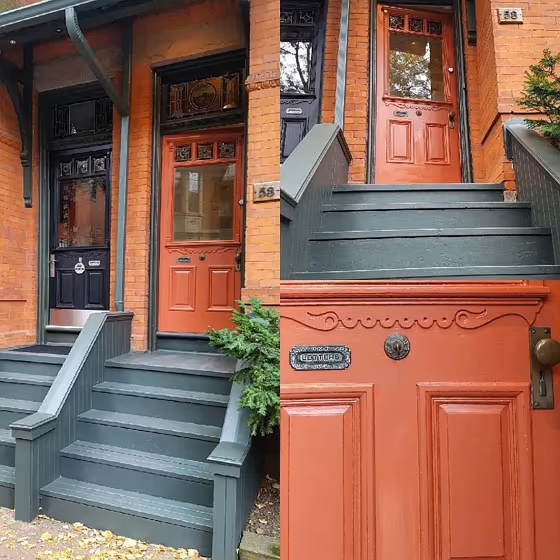
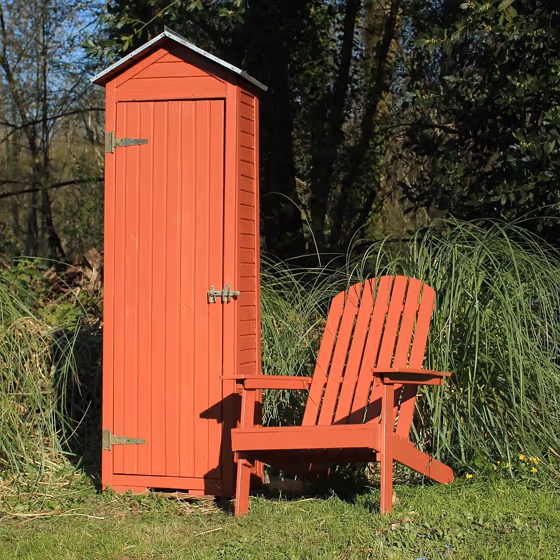
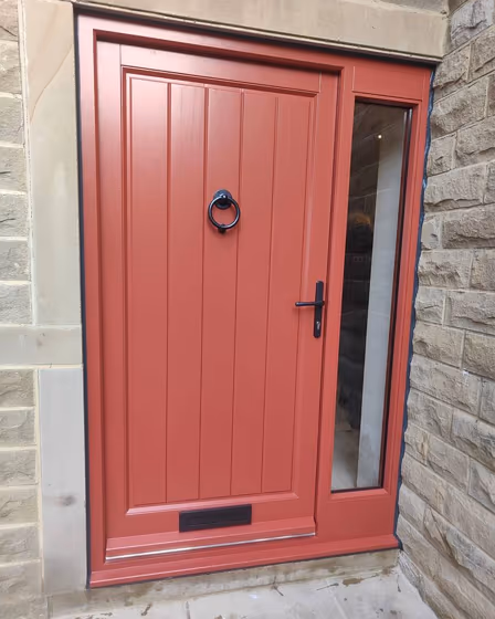
- Picture Gallery Red for exterior (3 photos)
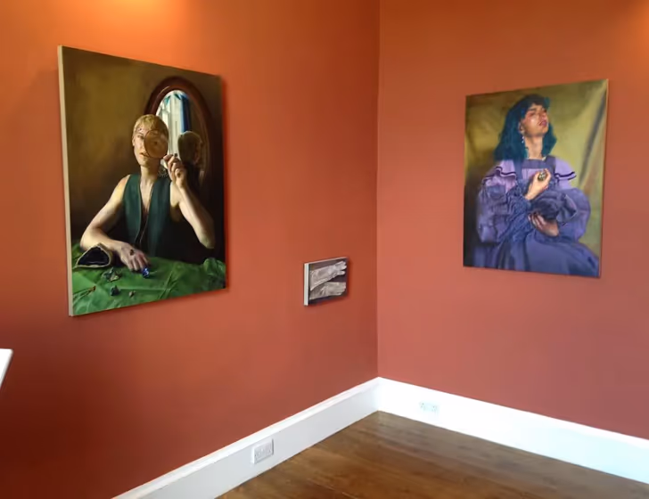
- Farrow and Ball Picture Gallery Red reviews (17 photos)
- What are Farrow and Ball Picture Gallery Red undertones?
- Is Picture Gallery Red 42 cool or warm?
- How light temperature affects on Picture Gallery Red
- Monochromatic color scheme
- Complementary color scheme
- Color comparison and matching
- LRV of Picture Gallery Red 42
- Color codes
- Color equivalents
| Official page: | Picture Gallery Red 42 |
| Code: | 42 |
| Name: | Picture Gallery Red |
| Brand: | Farrow and Ball |
What color is Farrow and Ball Picture Gallery Red?
Picture Gallery Red by Farrow and Ball, color code 42, exudes elegance and sophistication. This rich and bold hue is perfect for creating a statement in a formal dining room or a luxurious living space. The deep tones of 42 add depth and warmth to any room, making it ideal for cozying up a bedroom or study. With its timeless charm, Picture Gallery Red is a versatile color that can bring a touch of drama to a modern kitchen or a classic library. Embrace the allure of color code 42 and transform your space into a captivating haven of style and opulence.
Loading...
LRV of Picture Gallery Red
Picture Gallery Red has an LRV of 15.67% and refers to Medium Dark which means that this color reflects very little light. Why LRV is important?

Light Reflectance Value measures the amount of visible and usable light that reflects from a painted surface.
Simply put, the higher the LRV of a paint color, the brighter the room you will get.
The scale goes from 0% (absolute black, absorbing all light) to 100% (pure white, reflecting all light).
Act like a pro: When choosing paint with an LRV of 15.67%, pay attention to your bulbs' brightness. Light brightness is measured in lumens. The lower the paint's LRV, the higher lumen level you need. Every square foot of room needs at least 40 lumens. That means for a 200 ft2 living room you'll need about 8000 lumens of light – e.g., eight 1000 lm bulbs.
Color codes
We have collected almost every possible color code you could ever need.
Not sure what the difference between HEX and RGB is? We break down color models in plain language. Understanding color models
| Format | Code |
|---|---|
| HEX | #a15a4d |
| RGB Decimal | 161, 90, 77 |
| RGB Percent | 63.14%, 35.29%, 30.20% |
| HSV | Hue: 9° Saturation: 52.17% Value: 63.14% |
| HSL | hsl(9, 35, 47) |
| CMYK | Cyan: 0.0 Magenta: 44.1 Yellow: 52.17 Key: 36.86 |
| YIQ | Y: 109.747 I: 46.486 Q: 10.974 |
| XYZ | X: 19.695 Y: 15.427 Z: 8.96 |
| CIE Lab | L:46.214 a:27.712 b:20.274 |
| CIE Luv | L:46.214 u:51.401 v:18.707 |
| Decimal | 10574413 |
| Hunter Lab | 39.277, 20.77, 13.969 |