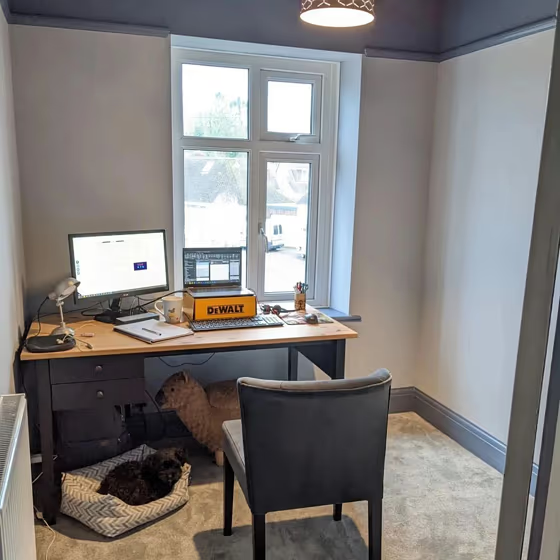
Little Greene Obscura 327
Official page: | Obscura 327 |
Code: | 327 |
Name: | Obscura |
Brand: | Little Greene |
Collections: | Colour Scales |
What color is Little Greene Obscura?
Little Greene 327 Obscura exudes a deep, mysterious atmosphere that captivates the eye with its rich hue. This color pairs impeccably with soft neutrals such as natural taupe and warm ivory tones, creating a sophisticated and harmonious palette. When combined with accents in subtle shades of green and dusky blue, Obscura adds depth and character to any space. Its versatility allows for both bold contrasting schemes and soothing tonal combinations, making it a timeless choice for interior design.
Little Greene Obscura reviews
View the photos of real spaces painted with this that were not included in specific categories.Close-ups, painted furniture, storages and dressers, hallways, stairs and ceilings.
What are Little Greene Obscura undertones?
The undertone of Obscura can be accurately described as a Blue hue, as is apparent from the color space provided. By isolating the pure hue and eliminating any tints, tones, and shades, we were able to precisely determine its undertone. This approach has proven to be more accurate than traditional methods of defining undertones on a white background, which are now considered outdated.
HEX value
HEX value:
#BEC4C7
RGB code:
190, 196, 199
Is Little Greene Obscura 327 cool or warm?
With a hue of 200° this Grey refers cool paint shade according to HSL (Hue, Saturation, Lightness) on the color wheel.
327 Obscura HSL code: 200, 7%, 76%
Hue - degree on a color wheel from 0 to 360. 0 is red, 120 is green, and 240 is blue.
Saturation is expressed as a percentage. At 0%, it appears as a shade of grey, and at 100%, it is in full color..
Lightness is also a percentage value. 0% is black, and 100% is white.
- Cooler hues have a calm and relaxation effect
- Cool grey shades are versatile and provide a neutral canvas for your interior design. They seamlessly complement any style, whether it's Victorian, Scandinavian, or Modern.
- Light, soft colors like pastel blues and greens make a room feel fresh and open. They're great for bathrooms, nurseries, and kitchens, creating a calm and inviting atmosphere. Just avoid using these colors in north-facing rooms, as they might feel too cold.
Act like a pro: Mixing warm and cool shades is a must have to get harmonius interior. Add accents that contrast with the primary color to create visual balance. If your walls are a warm color, don’t forget to add accent in cold colors (furniture, art, décor). A good practice is too use a complementary color scheme.
Coordinating colors.
Colors that go with Little Greene Obscura:
Monochromatic color scheme
This scheme consists of various shades, tints, and tones of a single color. While it offers a perfect combination of hues, without accent decor, it may become monotonous.
Lighter shades
327
Obscura
Complementary color scheme
This color scheme is a combination of two shades that are opposite each other on the color wheel. The high contrast between these colors creates a vibrant and dynamic visual effect.
327
Obscura