Tikkurila K492
| Code: | K492 |
| Name: | |
| Brand: | Tikkurila |
What color is Tikkurila K492?
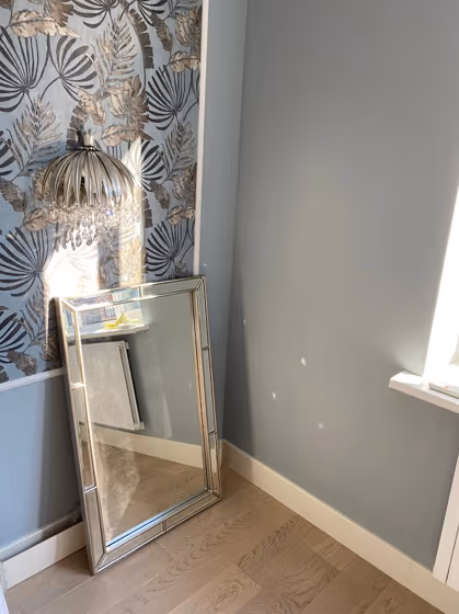
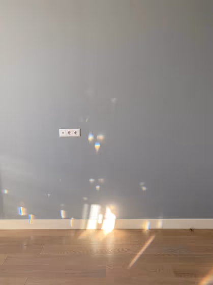
Tikkurila K492 None exudes a serene and elegant charm that effortlessly elevates any space. This sophisticated shade pairs harmoniously with soft neutrals like beige and taupe to create a timeless and calming atmosphere. For a more modern look, consider combining it with crisp whites and pops of metallic accents for a touch of glamour. Whether used as the main color or as an accent, Tikkurila K492 None adds a subtle depth and sophistication to any room, making it a versatile choice for both classic and contemporary interiors.
K492 for bedroom
We’ve hand-picked a beautiful collection of photos of this amazing Beige shade used in real bedrooms. Take a look and imagine how this wonderful cool Mid-tone paint color could transform your own bedroom space.
Tikkurila K492 reviews
View the photos of real spaces painted with this that were not included in specific categories.Close-ups, painted furniture, storages and dressers, hallways, stairs and ceilings.
Try before you buy

100% accurate
reusable paint samples
Peel, stick,
and repeat
Twice painted
with real paint
Next day
delivery
What are Tikkurila K492 undertones?
The undertone of K492 can be accurately described as a Blue hue, as is apparent from the color space provided. By isolating the pure hue and eliminating any tints, tones, and shades, we were able to precisely determine its undertone. This approach has proven to be more accurate than traditional methods of defining undertones on a white background, which are now considered outdated.
HEX value
HEX value:
#B3BDC1
RGB code:
179, 189, 193
Is Tikkurila K492 cool or warm?
With a hue of 197° thisBluerefers cool paint shade according to HSL (Hue, Saturation, Lightness) on the color wheel.
K492 HSL code: 197, 10%, 73%
Hue - degree on a color wheel from 0 to 360. 0 is red, 120 is green, and 240 is blue.
Saturation is expressed as a percentage. At 0%, it appears as a shade of grey, and at 100%, it is in full color..
Lightness is also a percentage value. 0% is black, and 100% is white.
- Cooler hues have a calm and relaxation effect
- Cool blue shades make a room feel sleek, fresh, and modern, perfect for bedrooms, bathrooms, and home offices where a sense of calm and sophistication is desired.
- Using mid-tone cool colors like soft greys and muted blues can help create a calming and modern look in rooms like home offices, bathrooms, and bedrooms. But avoid using these shades in rooms without natural light, as they may look dull.
Act like a pro: Mixing warm and cool shades is a must have to get harmonius interior. Add accents that contrast with the primary color to create visual balance. If your walls are a warm color, don’t forget to add accent in cold colors (furniture, art, décor). A good practice is too use a complementary color scheme.
How light temperature affects K492
Natural Lighting. During the day, natural light shifts from about 2000 K at sunrise/sunset to 5500–6500 K at noon.
In addition, natural‑light temperature depends on its direction:
| Direction of sunlight | Visible temp. | Hue | Duration |
|---|---|---|---|
| North | Cool | Bluish | All day |
| East | Warm | Yellow | Before noon |
| West | Warm | Orange‑red | After noon |
| South | Warm | Orange‑yellow | All day |
Artificial Lighting. When choosing bulbs, pay attention to their color‑temperature (Kelvins).
Use the slider to see how this Blue shade looks under different lighting:


4000K
Coordinating colors.
Colors that go with Tikkurila K492:
Monochromatic color scheme
This scheme consists of various shades, tints, and tones of a single color. While it offers a perfect combination of hues, without accent décor it may become monotonous.
Lighter shades
K492
Darker shades
K492
Complementary color scheme
This color scheme is a combination of two shades that are opposite each other on the color wheel. The high contrast between these colors creates a vibrant and dynamic visual effect. For the color K492 with a green hue, complementary colors are those with a red hue close to 17, such as Tikkurila and Mirage.
LRV of K492
K492 has an LRV of 49.39% and refers to Light Medium colors that reflect half of the incident light. Why LRV is important?
Light Reflectance Value measures the amount of visible and usable light that reflects from a painted surface.
Simply put, the higher the LRV of a paint color, the brighter the room you will get.
The scale goes from 0% (absolute black, absorbing all light) to 100% (pure white, reflecting all light).
Act like a pro: When choosing paint with an LRV of 49.39%, pay attention to your bulbs' brightness. Light brightness is measured in lumens. The lower the paint's LRV, the higher lumen level you need. Every square foot of room needs at least 40 lumens. That means for a 200 ft2 living room you’ll need about 8000 lumens of light – e.g., eight 1000 lm bulbs.
Color codes
We have collected almost every possible color code you could ever need. To copy the code, just click the icon to the right of it.
| Format | Code | |
|---|---|---|
| HEX | #B3BDC1 | |
| RGB Decimal | 179, 189, 193 | |
| RGB Percent | 70.20%, 74.12%, 75.69% | |
| HSV | Hue: 197° Saturation: 7.25% Value: 75.69% | |
| HSL | hsl(197, 10, 73) | |
| CMYK | Cyan: 7.25 Magenta: 2.07 Yellow: 0.0 Key: 24.31 | |
| YIQ | Y: 186.466 I: -7.244 Q: -0.871 | |
| XYZ | X: 46.411 Y: 49.829 Z: 57.61 | |
| CIE Lab | L:75.964 a:-2.668 b:-3.204 | |
| CIE Luv | L:75.964 u:-5.724 v:-4.362 | |
| Decimal | 11779521 | |
| Hunter Lab | 70.589, -6.172, 1.024 |
Color equivalents
27
Parma Gray
Farrow and Ball

Steel Parade
Dulux

K500
Tikkurila

90BG 55/051
Steel Symphony 4
Dulux

X438
Secret
Tikkurila

08GY 32/058
Misty Morning
Dulux
K498
Haven
Tikkurila

Smooth Flint
Dulux
5452
Nordic Breeze
Jotun

10BB 55/065
Niagara Blues 4
Dulux
327
Obscura
Little Greene

5081
Silver Moon
Jotun

J491
Tikkurila

70BG 56/061
Coastal Grey
Dulux

107
Bone China Blue
Little Greene

CC6
Hazy
Farrow and Ball

J493
Topaz
Tikkurila

30BB 45/049
Restful Slumber
Dulux
K496
Tikkurila


