Farrow and Ball Setting Plaster 231
Contentsshow +hide -
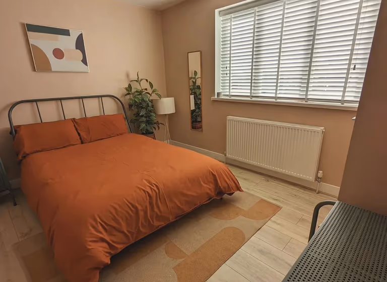
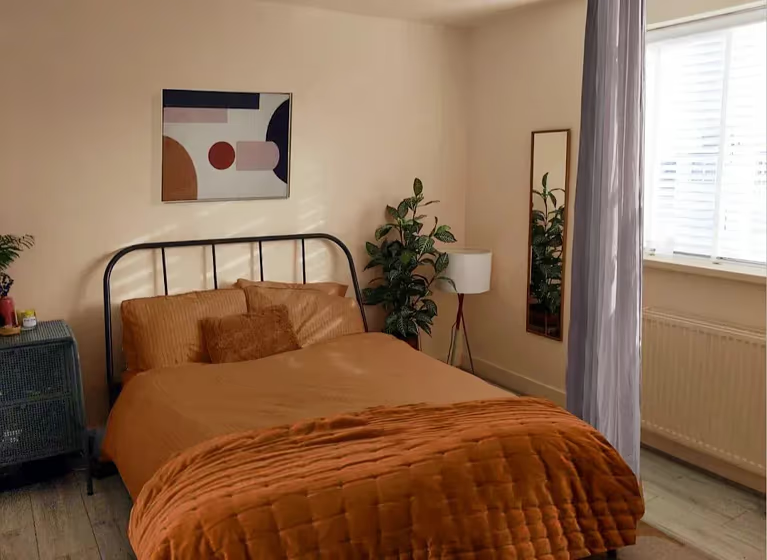
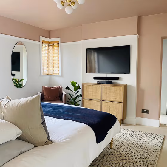
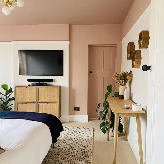
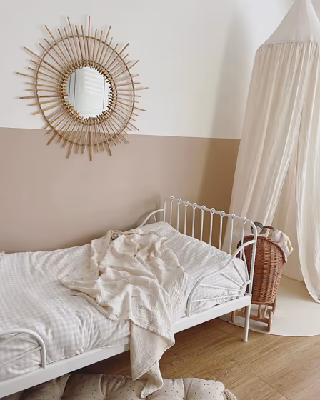
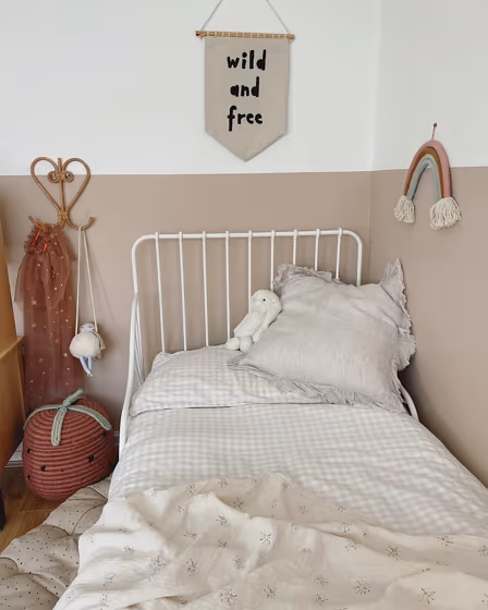
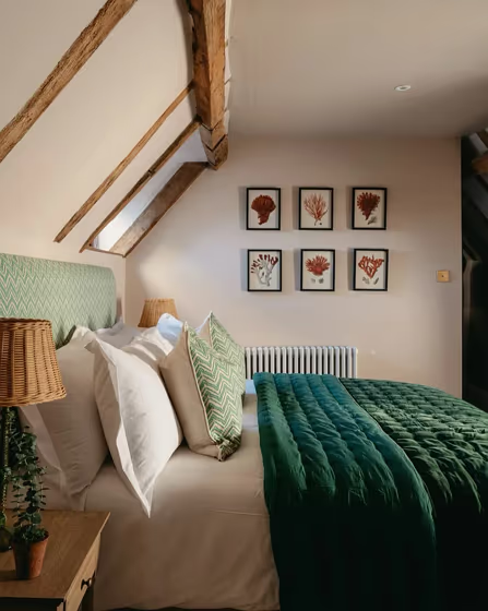
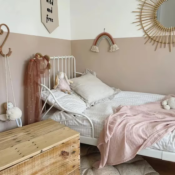
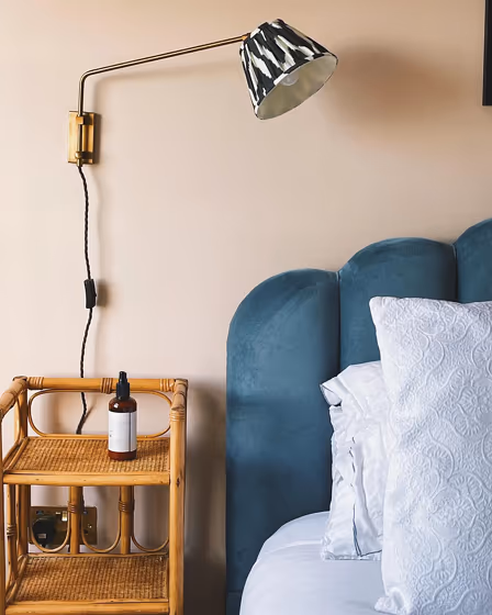
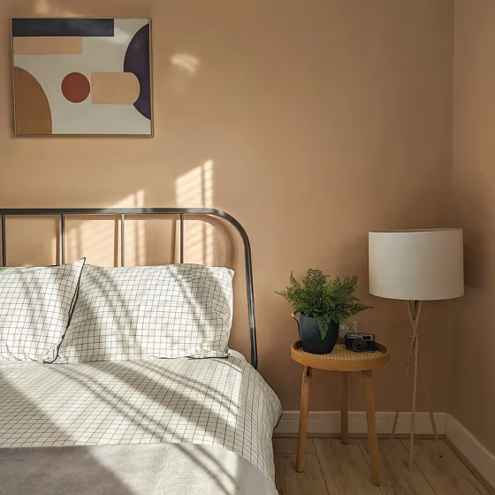
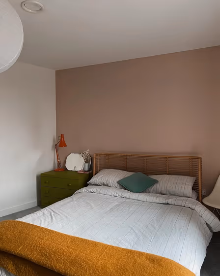
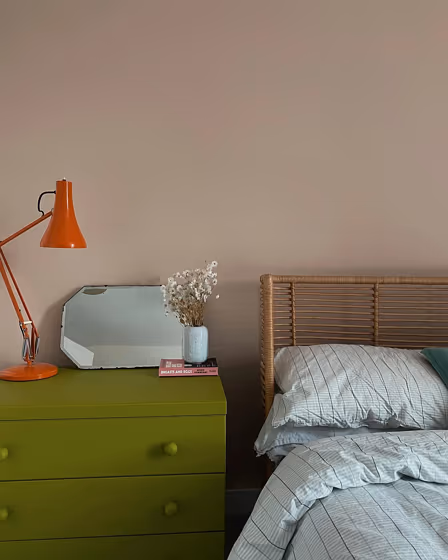
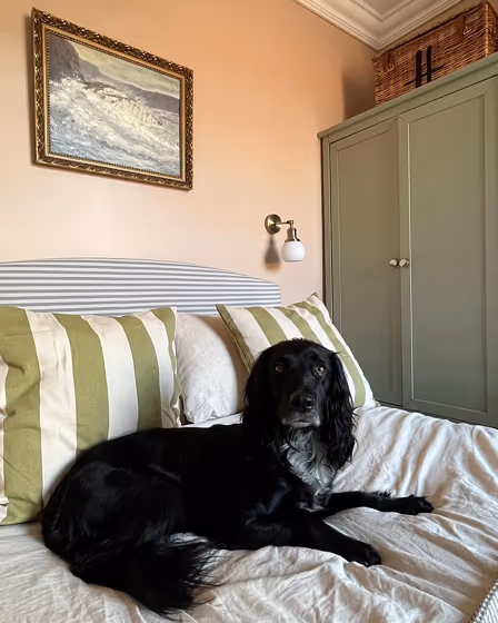
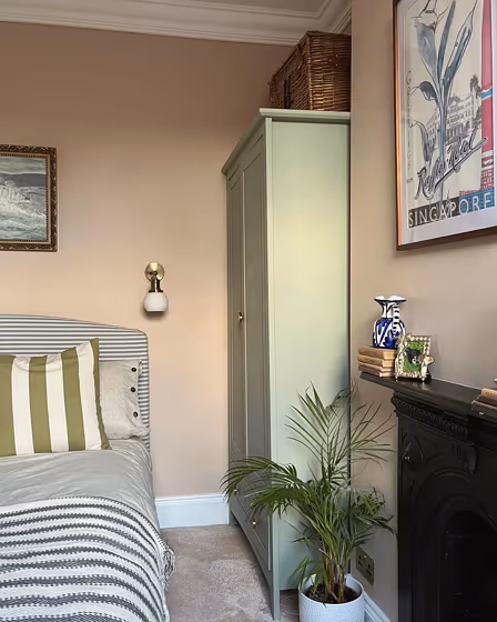
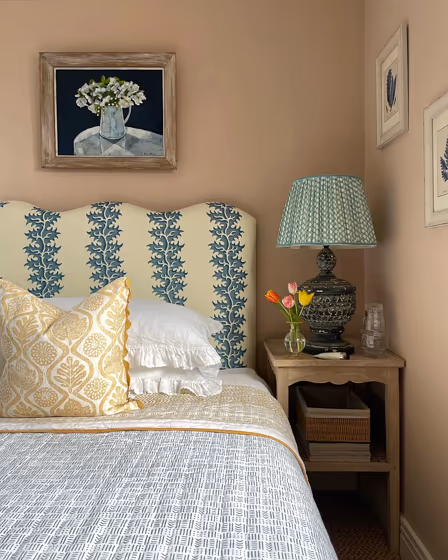
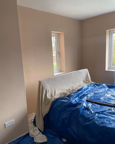
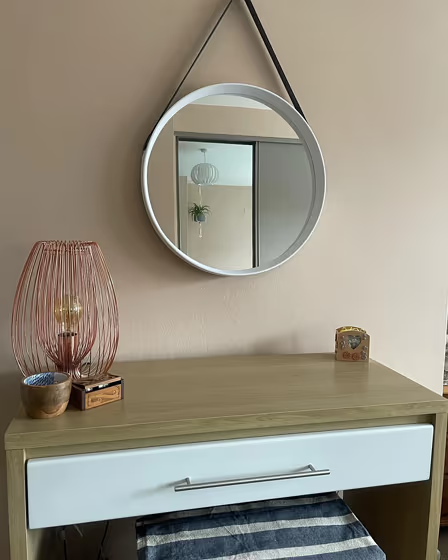
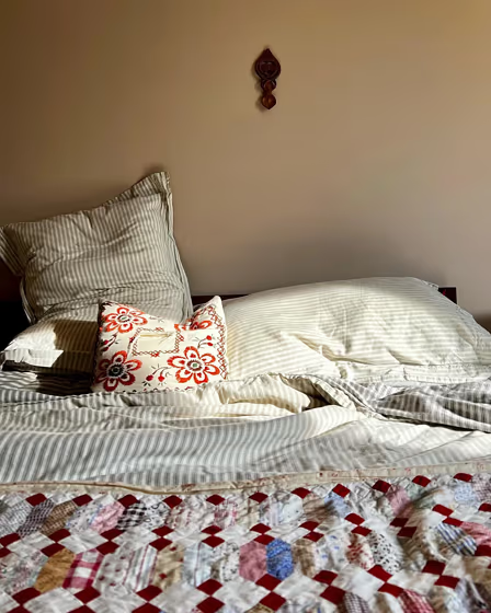
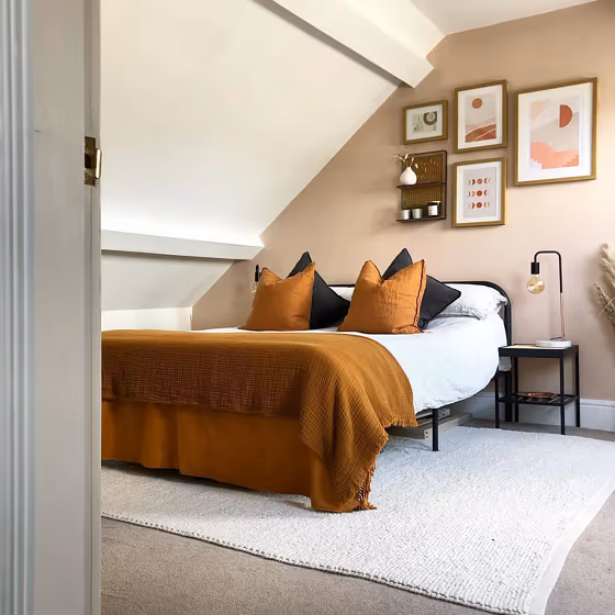
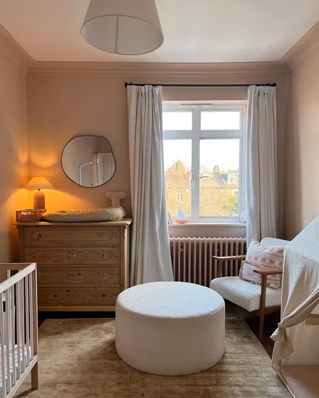
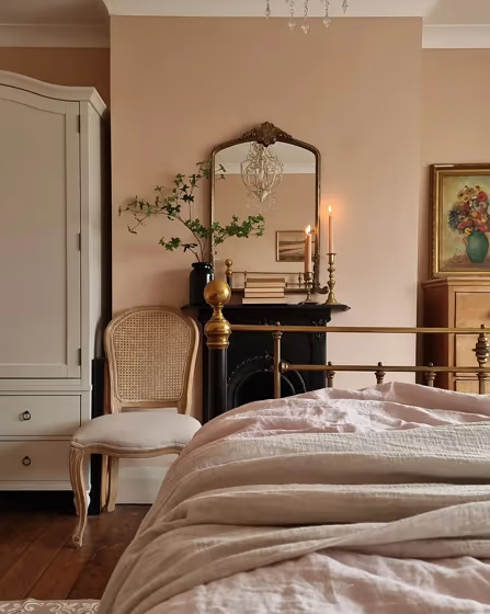
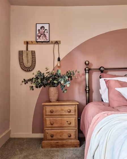
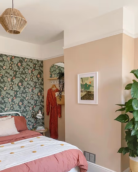
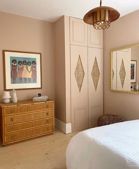
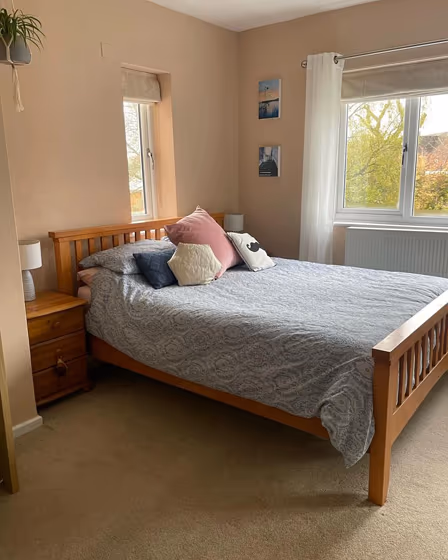
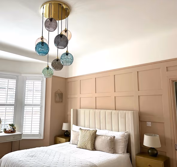
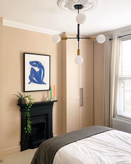
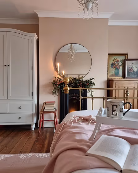
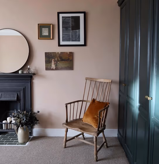
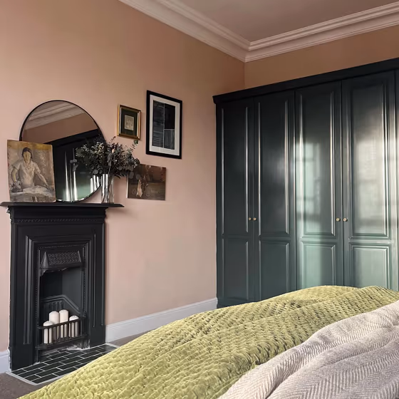
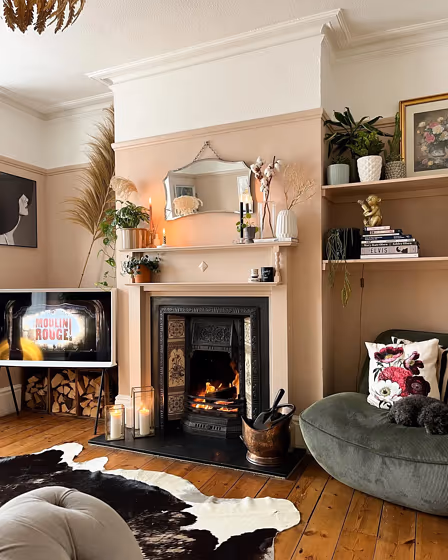
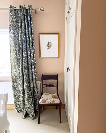
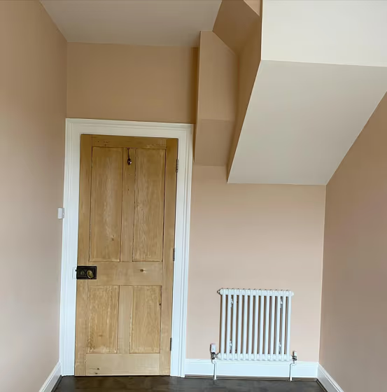
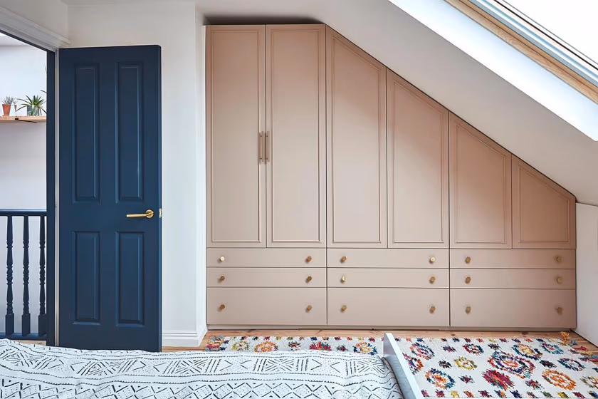
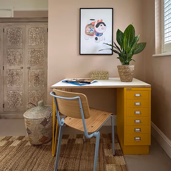
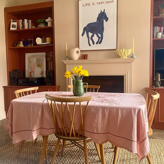
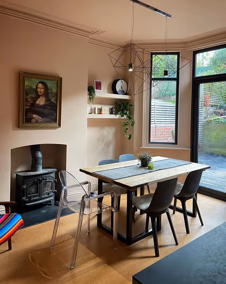
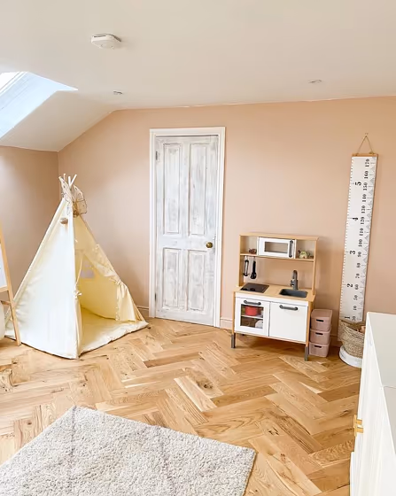
- Setting Plaster for bedroom (33 photos)
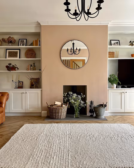
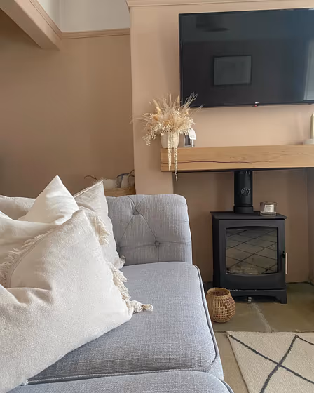
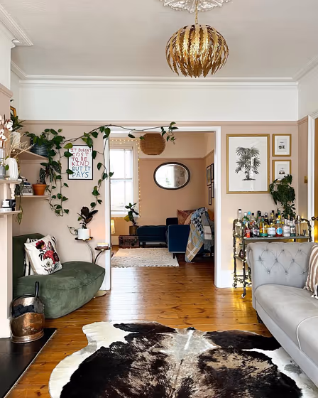
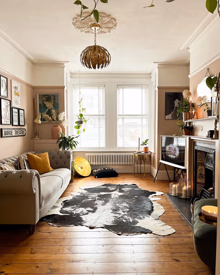
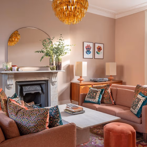
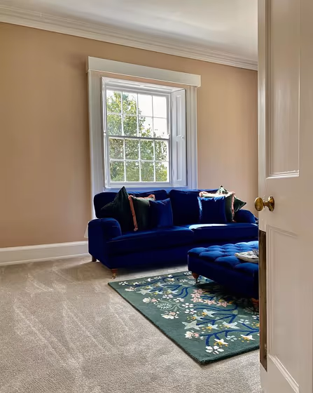
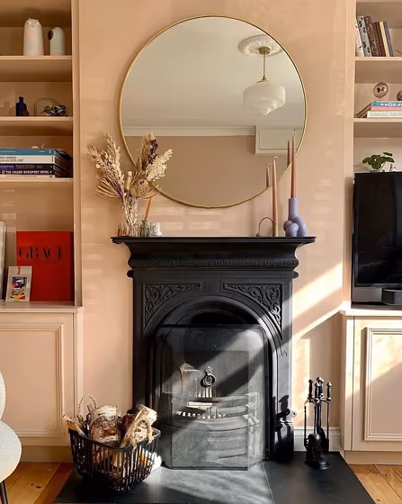
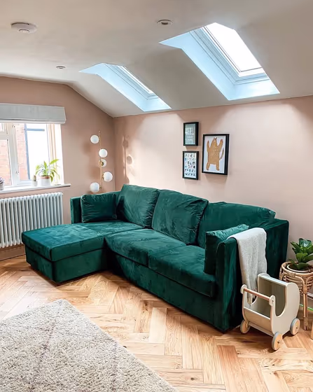
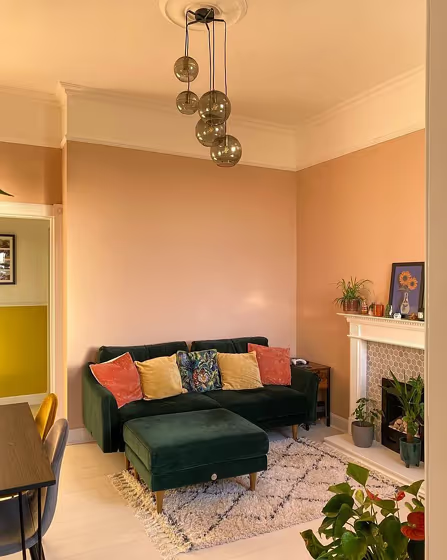
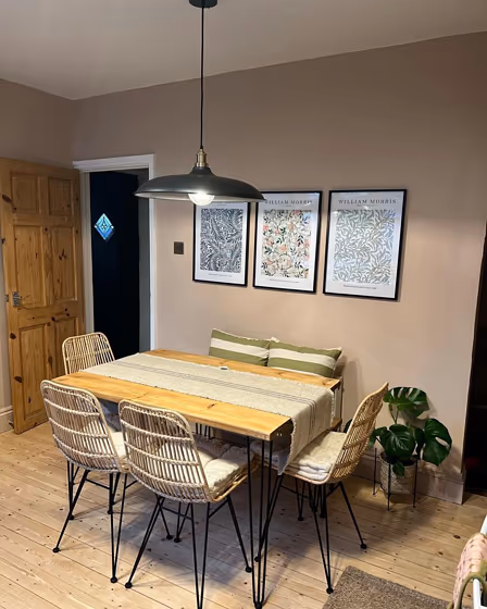
- Setting Plaster for living room (28 photos)
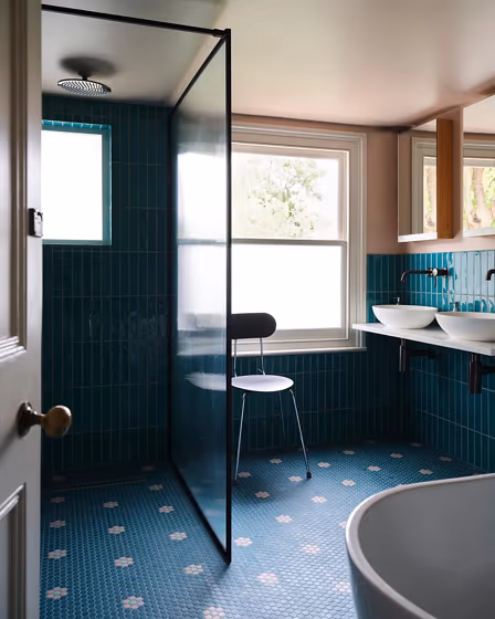
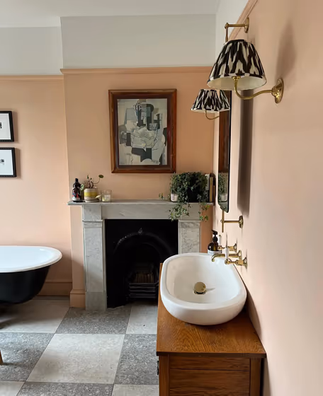
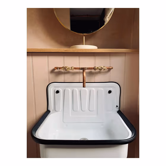
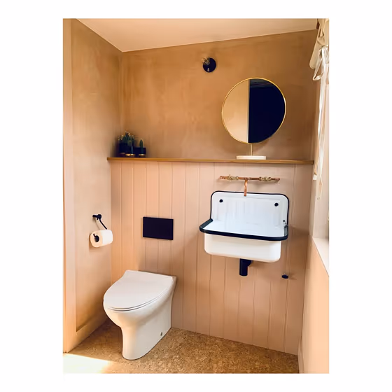
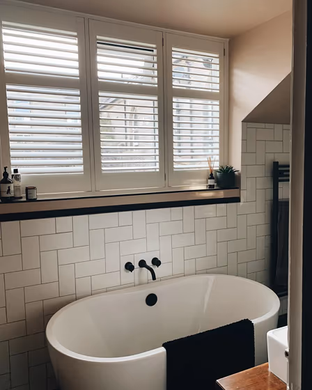
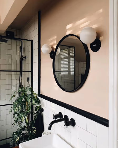
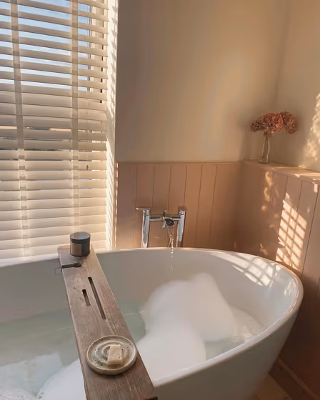
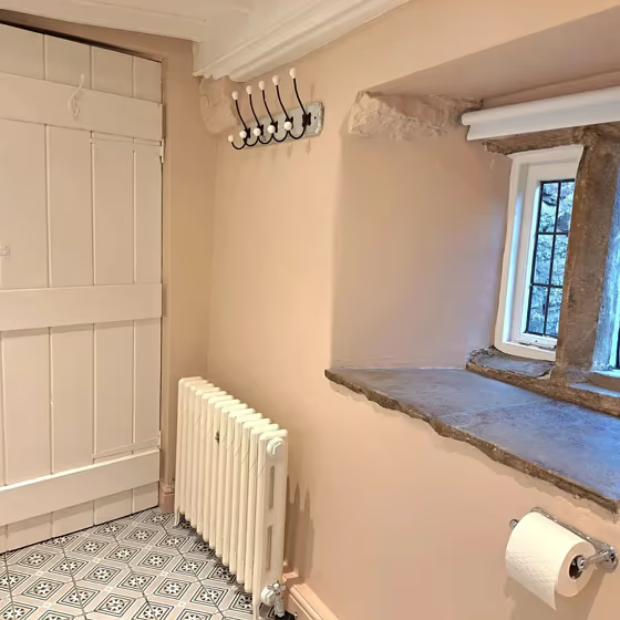
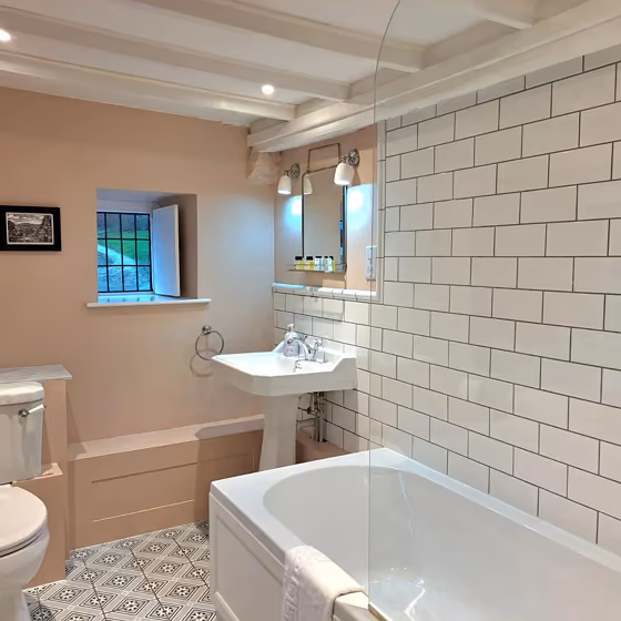
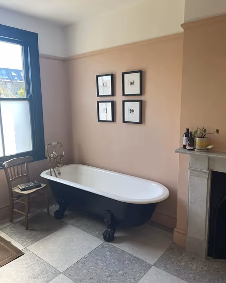
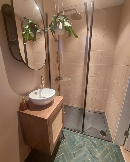
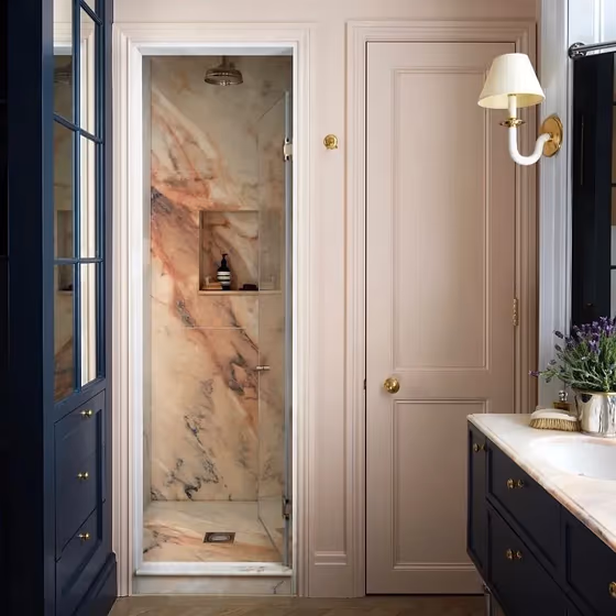
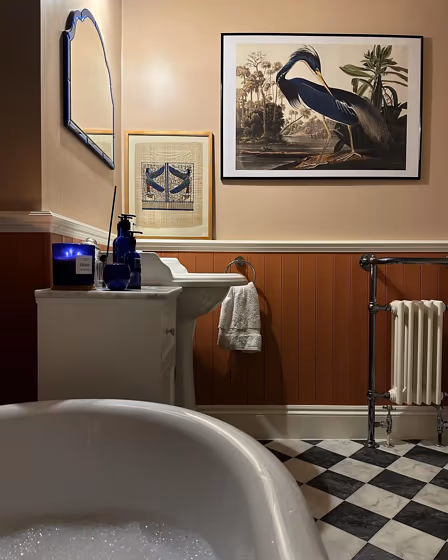
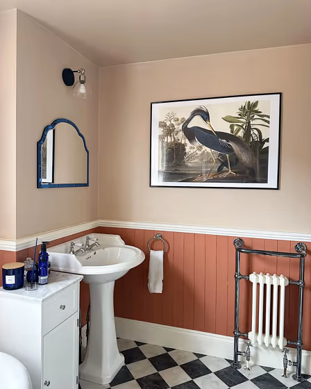
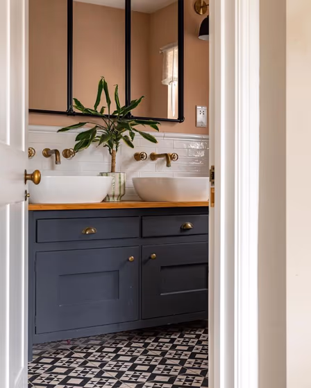
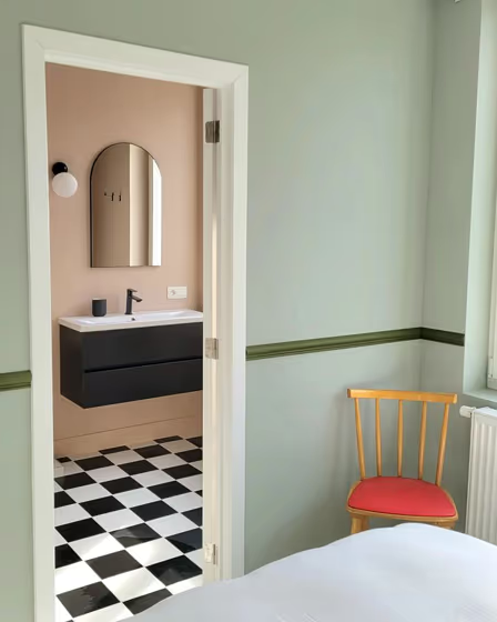
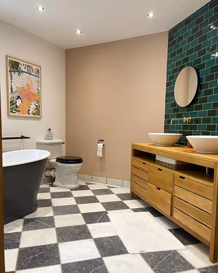
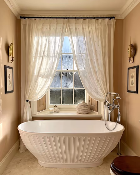
- Farrow and Ball Setting Plaster for bathroom (21 photos)
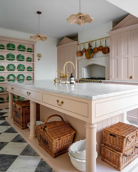
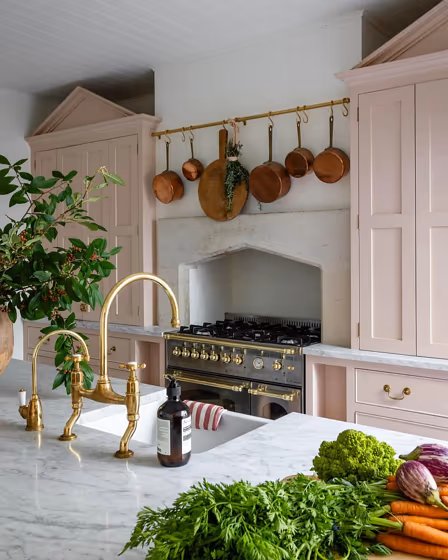
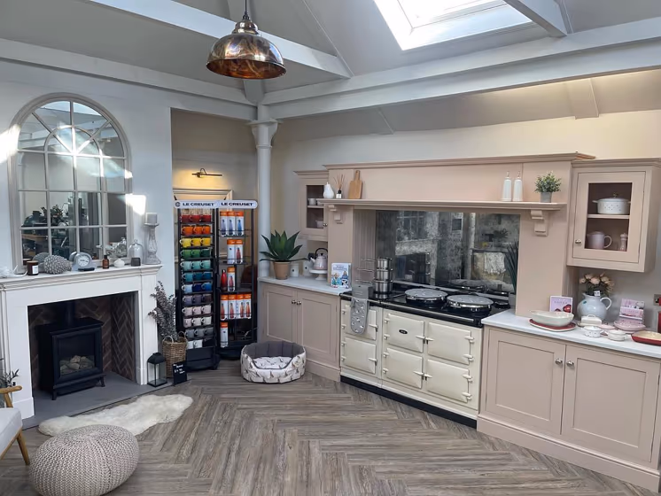
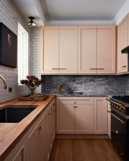
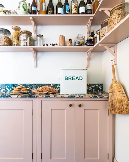
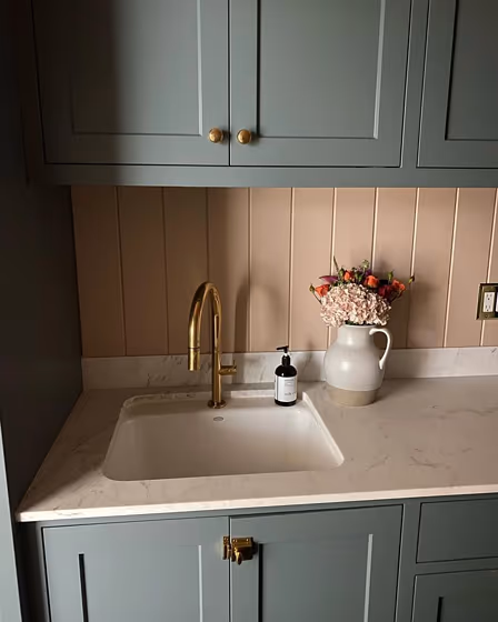
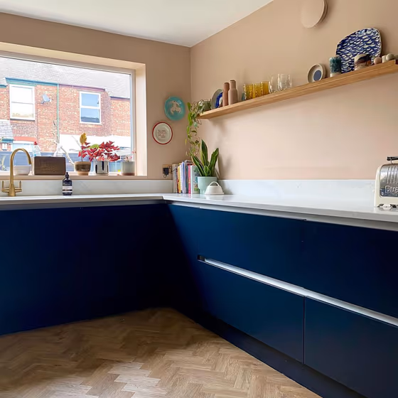
- Farrow and Ball 231 on kitchen cabinets (7 photos)
- Farrow and Ball Setting Plaster reviews (13 photos)
- What are Farrow and Ball Setting Plaster undertones?
- Is Setting Plaster 231 cool or warm?
- How light temperature affects on Setting Plaster
- Complementary color scheme
- Color comparison and matching
- LRV of Setting Plaster 231
- Color codes
- Color equivalents
| Official page: | Setting Plaster 231 |
| Code: | 231 |
| Name: | Setting Plaster |
| Brand: | Farrow and Ball |
What color is Farrow and Ball Setting Plaster?
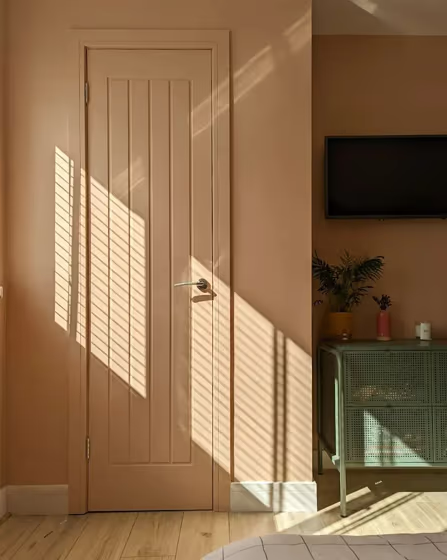
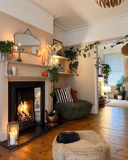
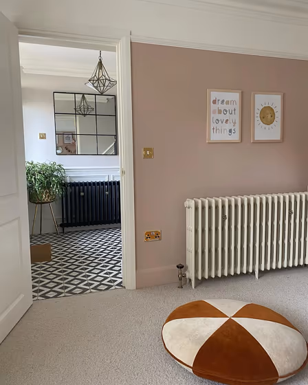
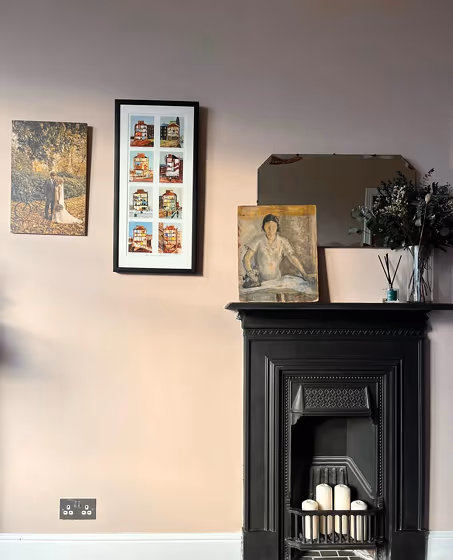
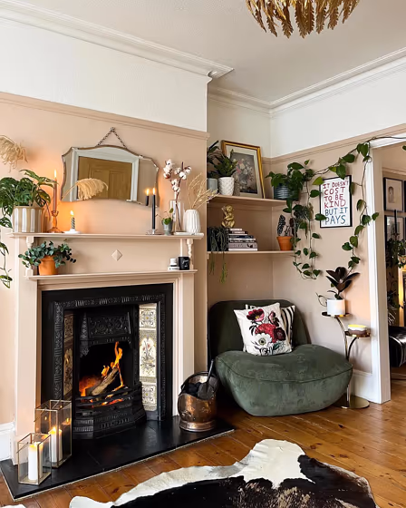
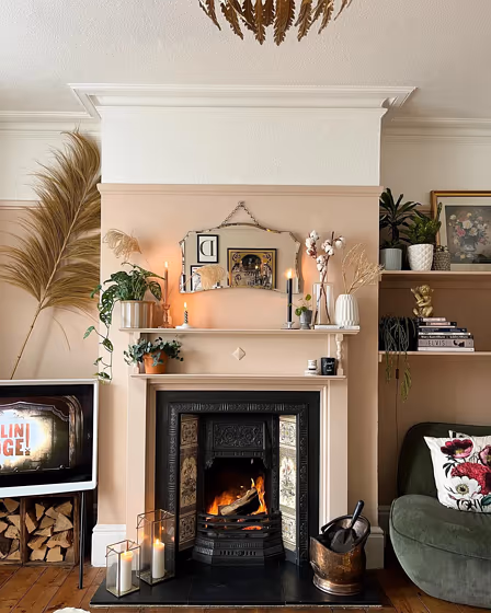
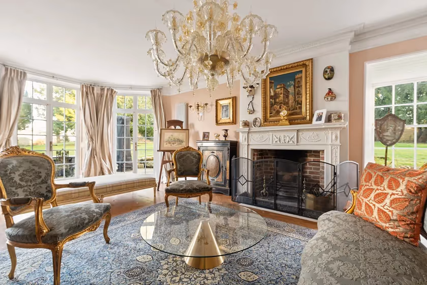
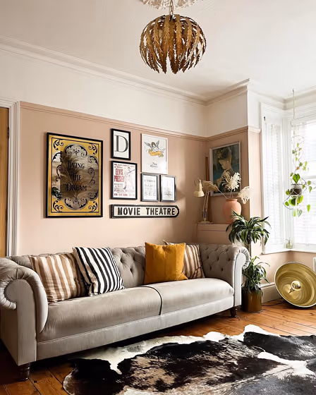
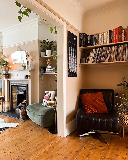
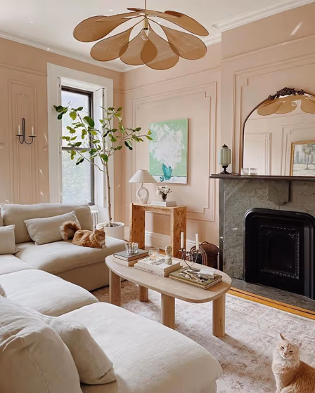
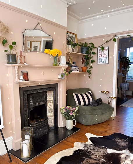
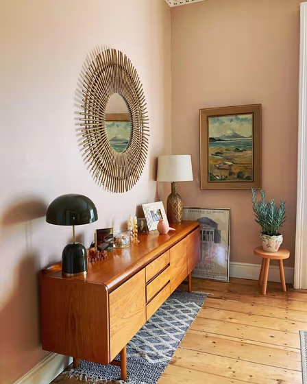
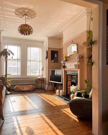
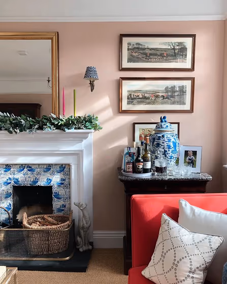
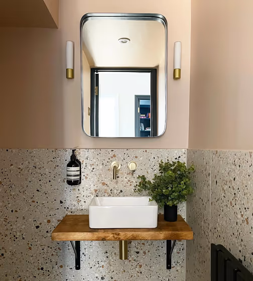
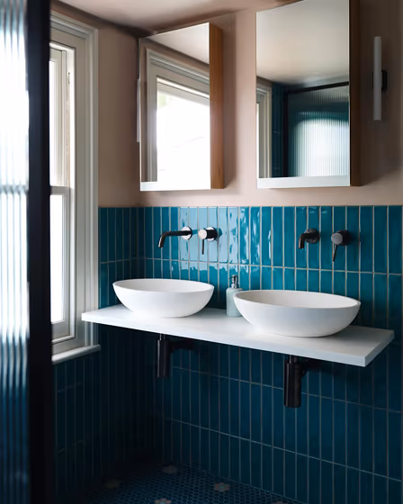
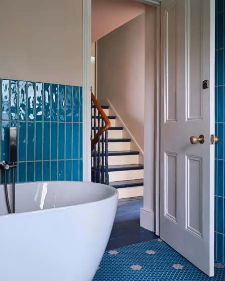
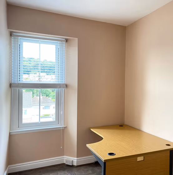
Farrow and Ball Setting Plaster is a warm and soft pink paint color, which has a touch of yellow, creating a subtle peachy tone. It is inspired by the color of plaster used in traditional English interiors, and is often described as a neutral pink. The color is versatile and can be used as a beautiful backdrop to both traditional and contemporary spaces.
How to use Farrow and Ball Setting Plaster?
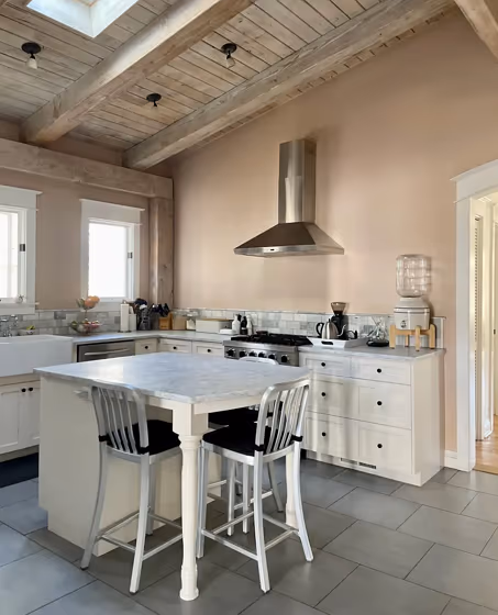
Setting Plaster is a versatile color that can be used in a variety of ways. It works well as a warm neutral on walls, creating a cozy and inviting atmosphere. It pairs well with other warm colors such as browns ( Farrow and Ball London Clay or Mouse's Back ), tans ( Farrow and Ball Stony Ground ), and deep reds ( Picture Gallery Red ), as well as cool grays and blues. It can also be used as an accent color on trim, doors, and furniture to add subtle interest and depth to a space. Additionally, Setting Plaster is a popular choice for creating a vintage or shabby chic aesthetic when paired with distressed or antique furniture.
What colors are similar to Setting Plaster by Farrow and Ball?
There are several dusted pink paint colors that are similar to Farrow and Ball Setting Plaster, including Farrow and Ball Templeton Pink , Little Greene Castell Pink , and Tikkurila Angora . Although they are not an exact match, these paint colors bear a strong resemblance to Setting Plaster.
Loading...
LRV of Setting Plaster
Setting Plaster has an LRV of 58.01% and refers to Light colors that reflect most of the incident light. Why LRV is important?

Light Reflectance Value measures the amount of visible and usable light that reflects from a painted surface.
Simply put, the higher the LRV of a paint color, the brighter the room you will get.
The scale goes from 0% (absolute black, absorbing all light) to 100% (pure white, reflecting all light).
Act like a pro: When choosing paint with an LRV of 58.01%, pay attention to your bulbs' brightness. Light brightness is measured in lumens. The lower the paint's LRV, the higher lumen level you need. Every square foot of room needs at least 40 lumens. That means for a 200 ft2 living room you'll need about 8000 lumens of light – e.g., eight 1000 lm bulbs.
Color codes
We have collected almost every possible color code you could ever need.
Not sure what the difference between HEX and RGB is? We break down color models in plain language. Understanding color models
| Format | Code |
|---|---|
| HEX | #dfc2af |
| RGB Decimal | 223, 194, 175 |
| RGB Percent | 87.45%, 76.08%, 68.63% |
| HSV | Hue: 24° Saturation: 21.52% Value: 87.45% |
| HSL | hsl(24, 43, 78) |
| CMYK | Cyan: 0.0 Magenta: 13.0 Yellow: 21.52 Key: 12.55 |
| YIQ | Y: 200.505 I: 23.387 Q: 0.222 |
| XYZ | X: 57.461 Y: 57.368 Z: 48.592 |
| CIE Lab | L:80.386 a:7.321 b:13.345 |
| CIE Luv | L:80.386 u:19.046 v:17.798 |
| Decimal | 14664367 |
| Hunter Lab | 75.742, 2.868, 14.982 |