Sherwin Williams Splashy SW 6942
| Official page: | Splashy SW 6942 |
| Code: | SW 6942 |
| Name: | Splashy |
| Brand: | Sherwin Williams |
What color is Sherwin Williams Splashy?
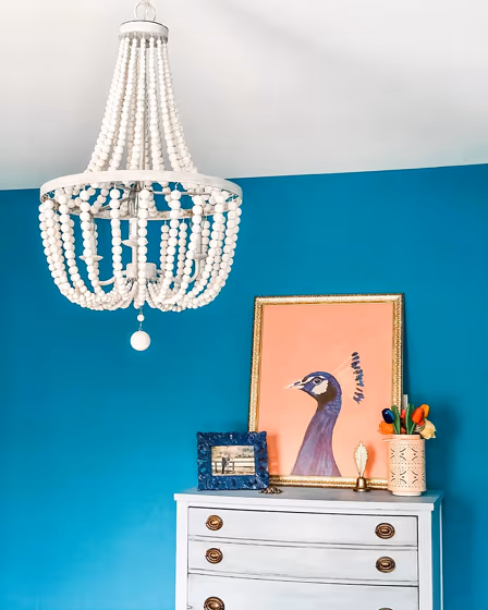
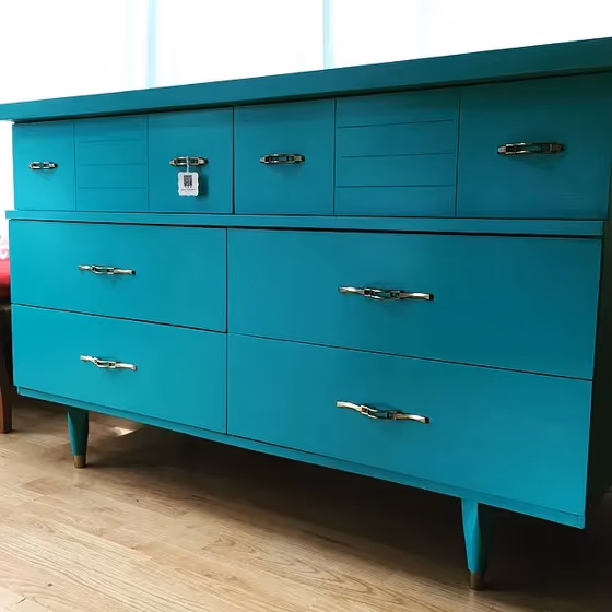
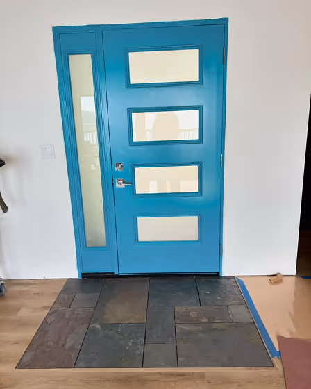
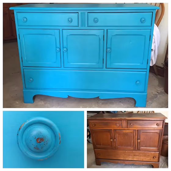
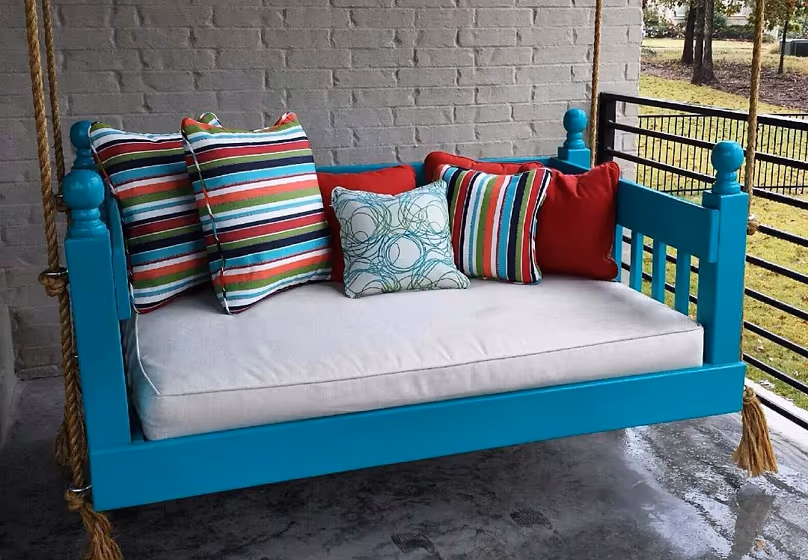
Introduce a bold and vibrant pop of color into any space with Sherwin Williams Splashy (SW 6942). This electrifying shade of aqua blue instantly enlivens a room, creating a modern and dynamic atmosphere. Splashy pairs beautifully with crisp whites, soft neutrals, and natural wood tones to balance its energetic presence. Incorporate accents in coral or sunny yellow for a playful and cheerful contrast against Splashy's invigorating hue. Infuse your interiors with personality and style by incorporating Sherwin Williams Splashy into your color palette.
Sherwin Williams Splashy reviews
View the photos of real spaces painted with this that were not included in specific categories.Close-ups, painted furniture, storages and dressers, hallways, stairs and ceilings.
Try before you buy

100% accurate
reusable paint samples
Peel, stick,
and repeat
Twice painted
with real paint
Next day
delivery
What are Sherwin Williams Splashy undertones?
The undertone of Splashy can be accurately described as a Blue hue, as is apparent from the color space provided. By isolating the pure hue and eliminating any tints, tones, and shades, we were able to precisely determine its undertone. This approach has proven to be more accurate than traditional methods of defining undertones on a white background, which are now considered outdated.
HEX value
HEX value:
#019196
RGB code:
1, 145, 150
Is Sherwin Williams Splashy SW 6942 cool or warm?
With a hue of 182° thisdark bluerefers cool paint shade according to HSL (Hue, Saturation, Lightness) on the color wheel.
SW 6942 Splashy HSL code: 182, 99%, 30%
Hue - degree on a color wheel from 0 to 360. 0 is red, 120 is green, and 240 is blue.
Saturation is expressed as a percentage. At 0%, it appears as a shade of grey, and at 100%, it is in full color..
Lightness is also a percentage value. 0% is black, and 100% is white.
- Cooler hues have a calm and relaxation effect
- Cool blue shades make a room feel sleek, fresh, and modern, perfect for bedrooms, bathrooms, and home offices where a sense of calm and sophistication is desired.
- Dark, cool shades create a dramatic and sophisticated atmosphere, making them a great choice for bedrooms and living rooms when you want to make a bold yet calming statement. However, be cautious about using dark, cool colors in small spaces, as they can make the room feel smaller and more enclosed.
Act like a pro: Mixing warm and cool shades is a must have to get harmonius interior. Add accents that contrast with the primary color to create visual balance. If your walls are a warm color, don’t forget to add accent in cold colors (furniture, art, décor). A good practice is too use a complementary color scheme.
How light temperature affects Splashy
Natural Lighting. During the day, natural light shifts from about 2000 K at sunrise/sunset to 5500–6500 K at noon.
In addition, natural‑light temperature depends on its direction:
| Direction of sunlight | Visible temp. | Hue | Duration |
|---|---|---|---|
| North | Cool | Bluish | All day |
| East | Warm | Yellow | Before noon |
| West | Warm | Orange‑red | After noon |
| South | Warm | Orange‑yellow | All day |
Artificial Lighting. When choosing bulbs, pay attention to their color‑temperature (Kelvins).
Use the slider to see how this dark blue shade looks under different lighting:


4000K
Coordinating colors.
Colors that go with Sherwin Williams Splashy:
Monochromatic color scheme
This scheme consists of various shades, tints, and tones of a single color. While it offers a perfect combination of hues, without accent décor it may become monotonous.
Lighter shades
Darker shades
Complementary color scheme
This color scheme is a combination of two shades that are opposite each other on the color wheel. The high contrast between these colors creates a vibrant and dynamic visual effect. For the color Splashy with a green hue, complementary colors are those with a red hue close to 2, such as Sherwin Williams Raucous Orange and Blushing.
LRV of Splashy
Splashy has an LRV of 21.24% and refers to Medium colors that reflect a lot of light. Why LRV is important?
Light Reflectance Value measures the amount of visible and usable light that reflects from a painted surface.
Simply put, the higher the LRV of a paint color, the brighter the room you will get.
The scale goes from 0% (absolute black, absorbing all light) to 100% (pure white, reflecting all light).
Act like a pro: When choosing paint with an LRV of 21.24%, pay attention to your bulbs' brightness. Light brightness is measured in lumens. The lower the paint's LRV, the higher lumen level you need. Every square foot of room needs at least 40 lumens. That means for a 200 ft2 living room you’ll need about 8000 lumens of light – e.g., eight 1000 lm bulbs.
Color codes
We have collected almost every possible color code you could ever need. To copy the code, just click the icon to the right of it.
| Format | Code | |
|---|---|---|
| HEX | #019196 | |
| RGB Decimal | 1, 145, 150 | |
| RGB Percent | 0.39%, 56.86%, 58.82% | |
| HSV | Hue: 182° Saturation: 99.33% Value: 58.82% | |
| HSL | hsl(182, 99, 30) | |
| CMYK | Cyan: 99.33 Magenta: 3.33 Yellow: 0.0 Key: 41.18 | |
| YIQ | Y: 102.514 I: -87.416 Q: -28.905 | |
| XYZ | X: 15.64 Y: 22.457 Z: 32.356 | |
| CIE Lab | L:54.509 a:-29.926 b:-11.897 | |
| CIE Luv | L:54.509 u:-41.584 v:-13.293 | |
| Decimal | 102806 | |
| Hunter Lab | 47.389, -24.02, -7.31 |
Color equivalents
SW 6947
Tempo Teal
Sherwin Williams
P460-6
Paradise Landscape
Behr
RAL 5018
Turquoise blue
RAL Classic

P470-6
Bella Vista
Behr
734
Tropical Teal
Benjamin Moore
MQ4-20
Island Dream
Behr
741
San Jose Blue
Benjamin Moore
M460-6
Thai Teal
Behr
SW 6768
Gulfstream
Sherwin Williams

665
Gulf Shores
Benjamin Moore
CSP-640
In the Tropics
Benjamin Moore
671
Soft Spruce
Benjamin Moore
SW 6940
Biscay
Sherwin Williams
MQ6-34
Prophetic Sea
Behr
754
Wilmington Spruce
Benjamin Moore


