Benjamin Moore Cinnabar CSP-1165
Contentsshow +hide -
| Official page: | Cinnabar CSP-1165 |
| Code: | CSP-1165 |
| Name: | Cinnabar |
| Brand: | Benjamin Moore |
What color is Benjamin Moore Cinnabar?
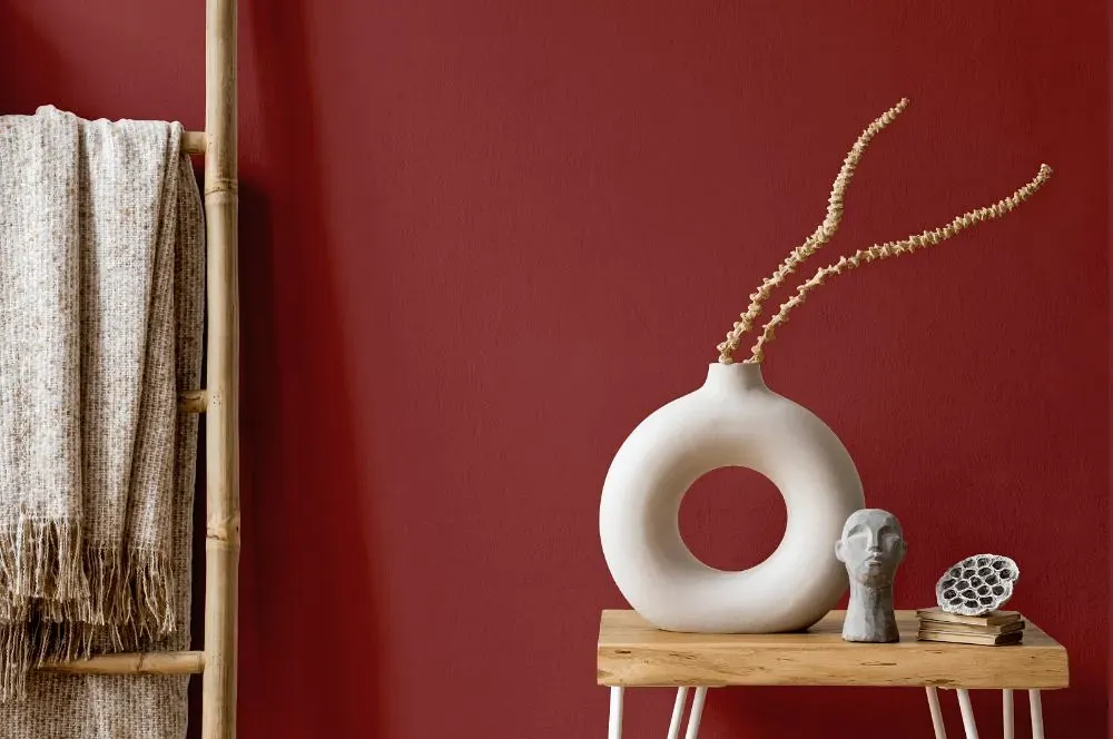
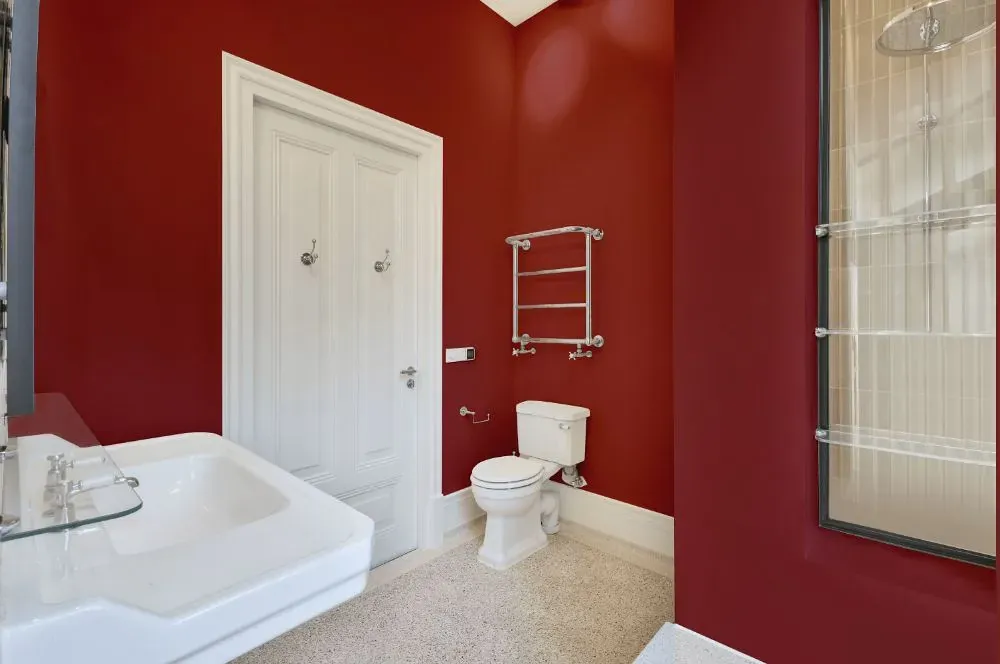
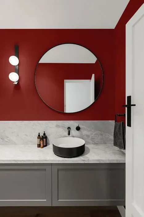
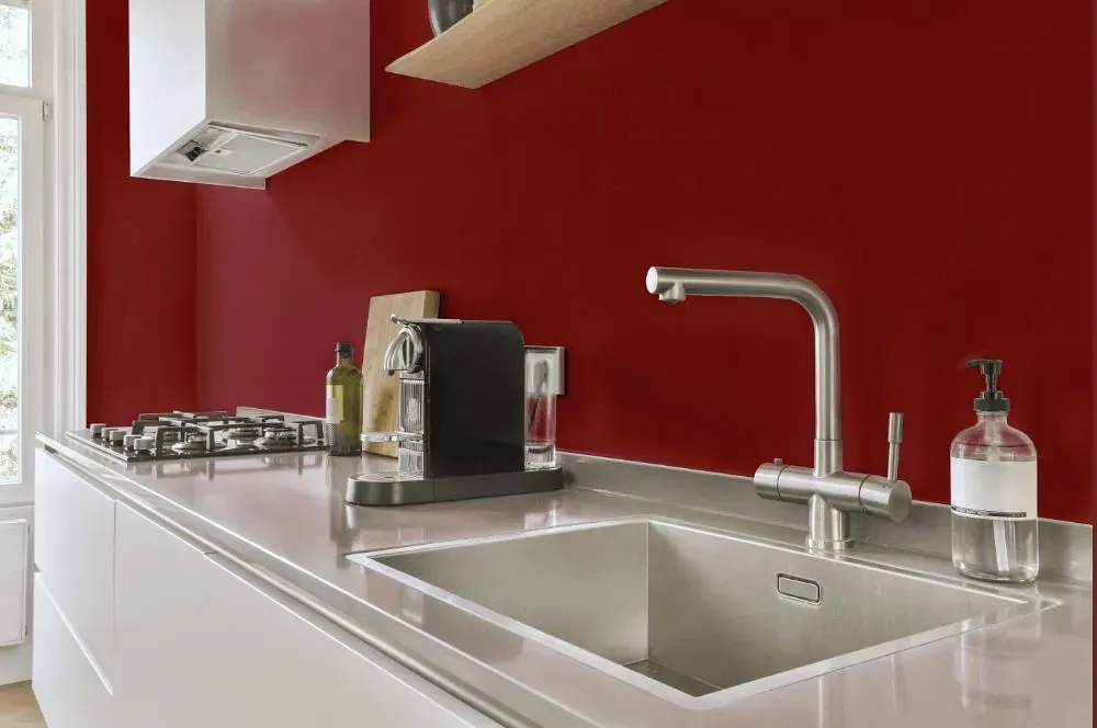
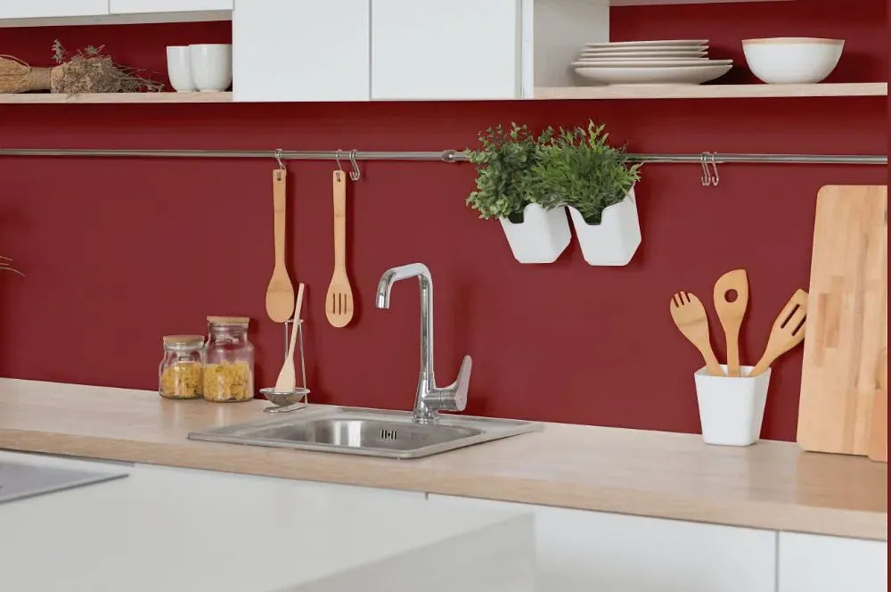
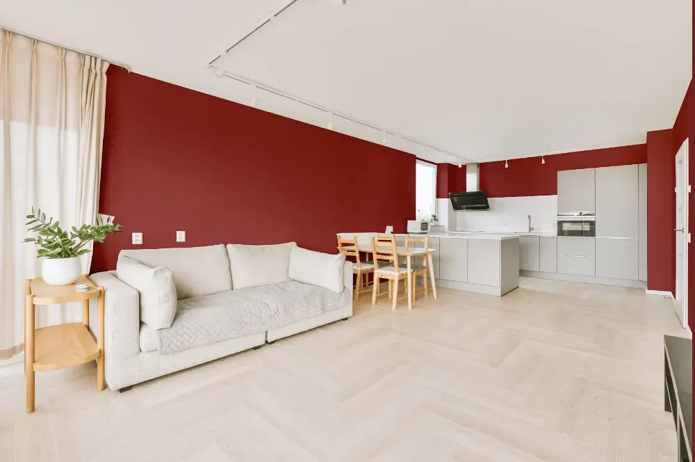
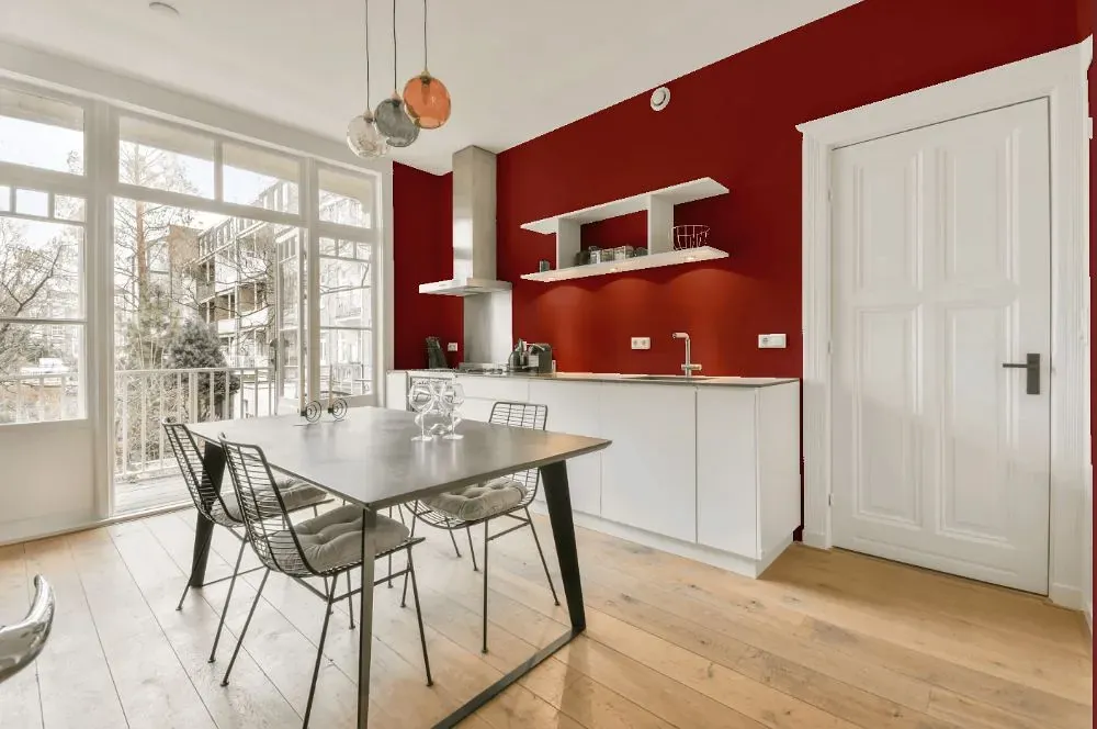
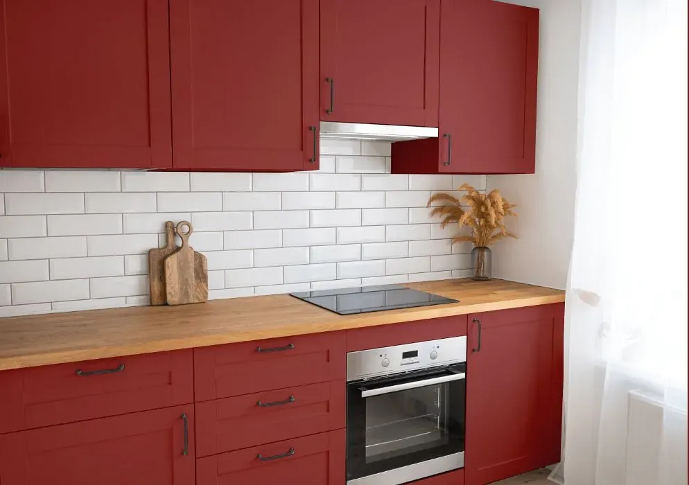
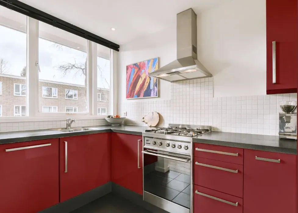
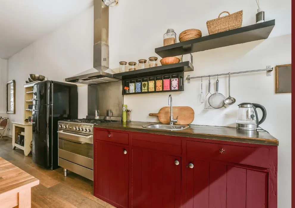
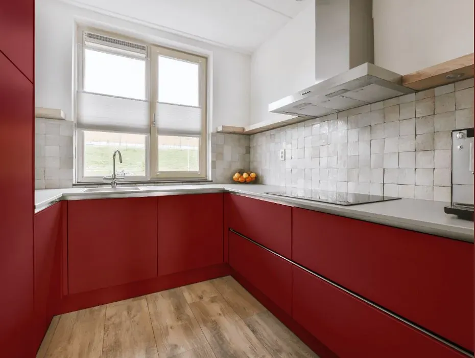
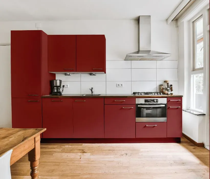
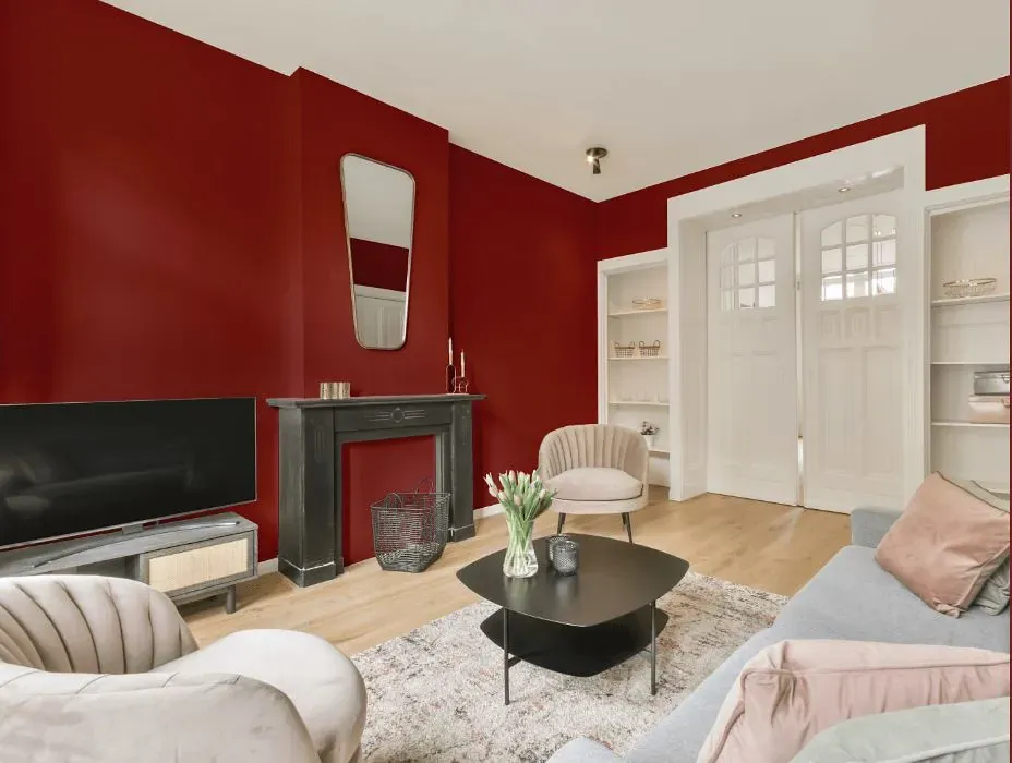
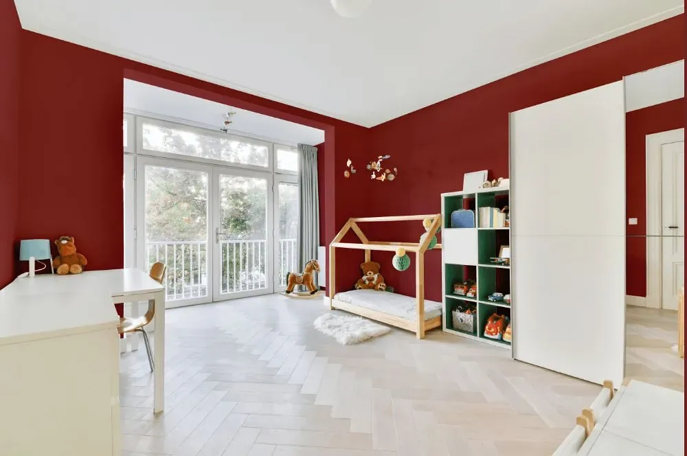
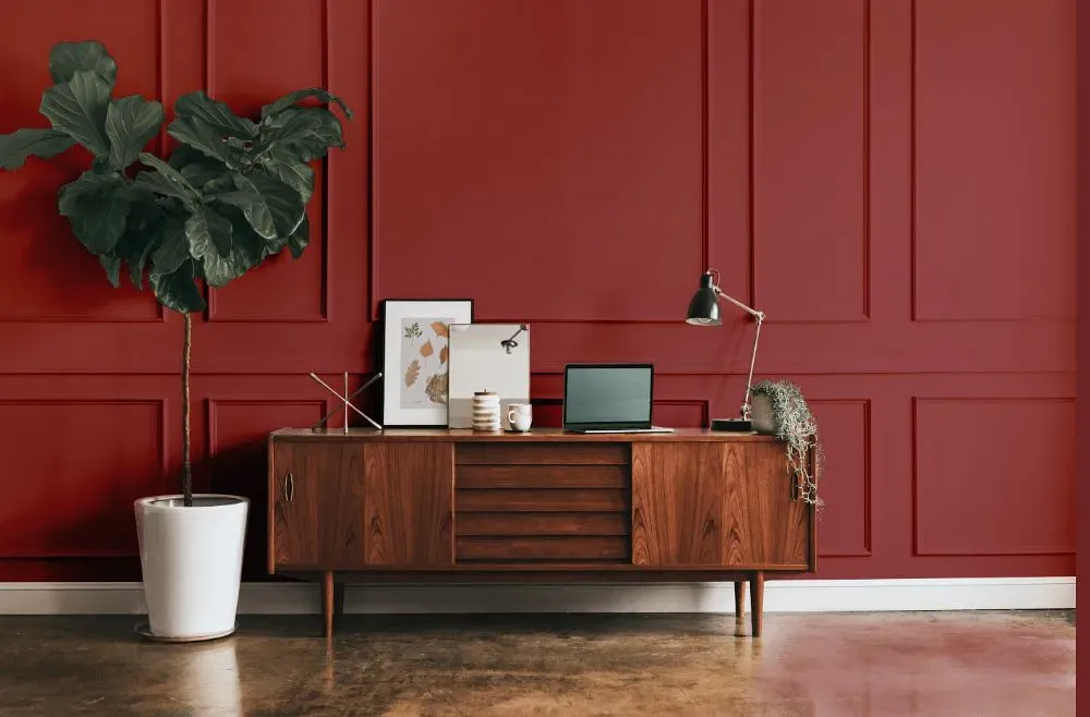
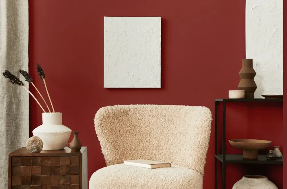
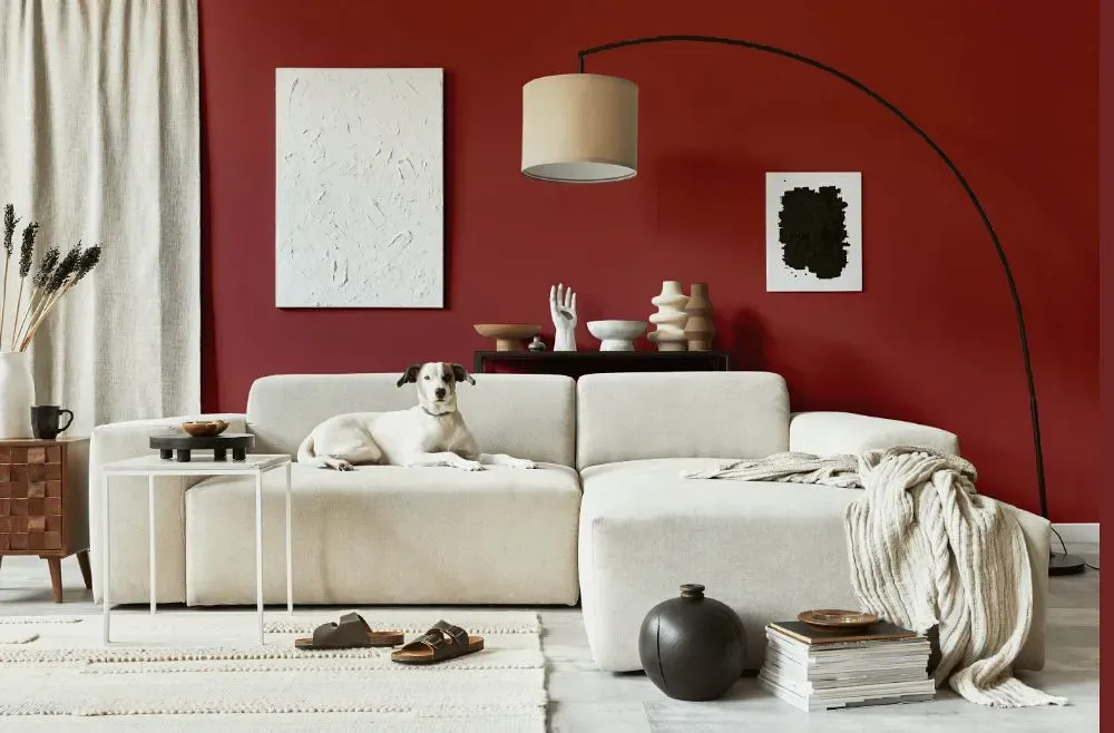
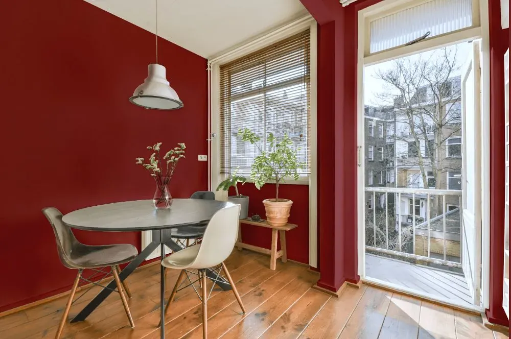
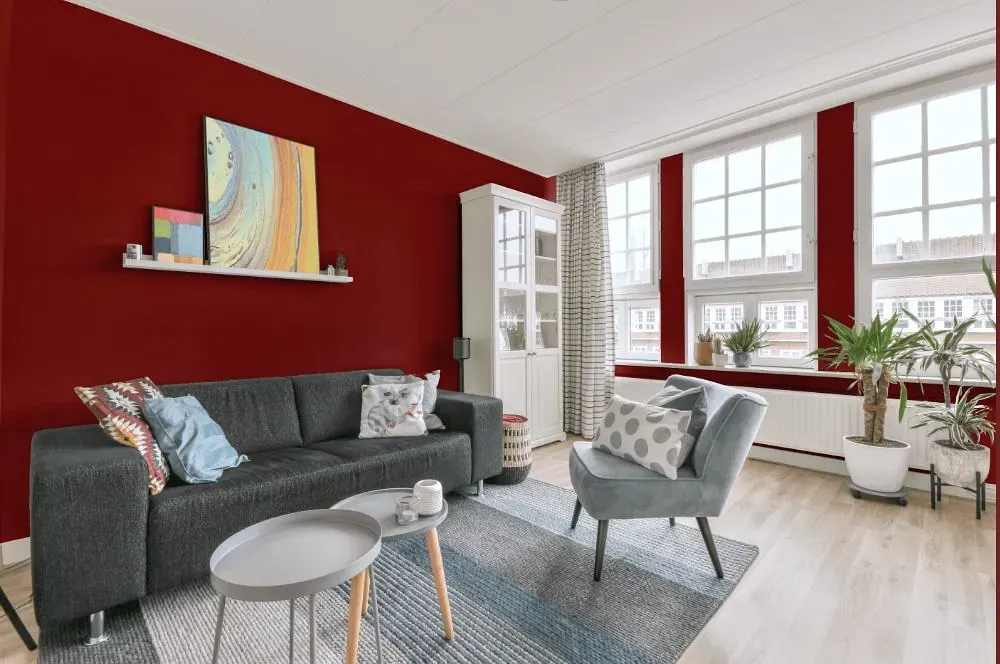
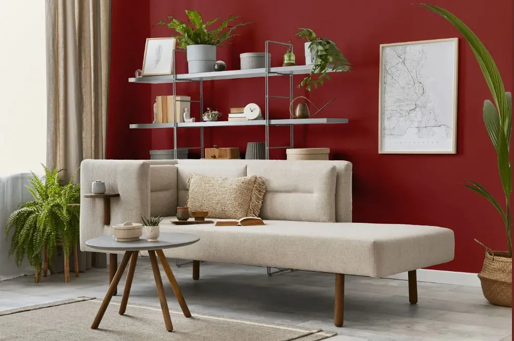
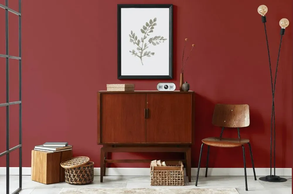
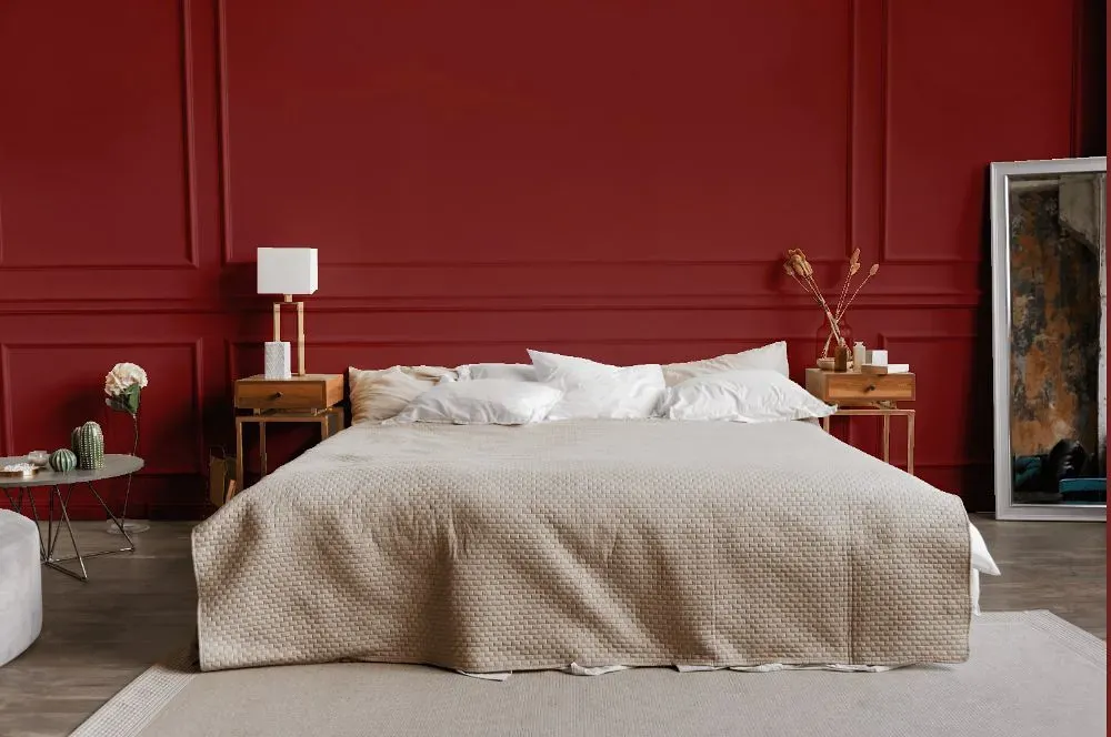
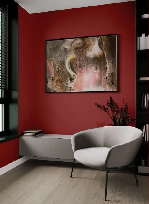
Elevate your space with the warm and sophisticated allure of Benjamin Moore's Cinnabar (CSP-1165). This deep and rich shade infuses any room with a sense of luxury and elegance. Cinnabar pairs beautifully with neutral tones like creamy whites and soft beiges to create a harmonious and inviting atmosphere. For a bolder statement, mix in accents of navy blue or emerald green to complement Cinnabar's depth and intensity. Transform your space with the timeless charm of Cinnabar, a hue that effortlessly exudes both style and substance.
Loading...
LRV of Cinnabar
Cinnabar has an LRV of 12.58% and refers to Medium Dark which means that this color reflects very little light. Why LRV is important?

Light Reflectance Value measures the amount of visible and usable light that reflects from a painted surface.
Simply put, the higher the LRV of a paint color, the brighter the room you will get.
The scale goes from 0% (absolute black, absorbing all light) to 100% (pure white, reflecting all light).
Act like a pro: When choosing paint with an LRV of 12.58%, pay attention to your bulbs' brightness. Light brightness is measured in lumens. The lower the paint's LRV, the higher lumen level you need. Every square foot of room needs at least 40 lumens. That means for a 200 ft2 living room you'll need about 8000 lumens of light – e.g., eight 1000 lm bulbs.
Color codes
We have collected almost every possible color code you could ever need.
Not sure what the difference between HEX and RGB is? We break down color models in plain language. Understanding color models
| Format | Code |
|---|---|
| HEX | #944544 |
| RGB Decimal | 148, 69, 68 |
| RGB Percent | 58.04%, 27.06%, 26.67% |
| HSV | Hue: 1° Saturation: 54.05% Value: 58.04% |
| HSL | hsl(1, 37, 42) |
| CMYK | Cyan: 0.0 Magenta: 53.38 Yellow: 54.05 Key: 41.96 |
| YIQ | Y: 92.507 I: 47.397 Q: 16.4 |
| XYZ | X: 15.385 Y: 10.971 Z: 6.775 |
| CIE Lab | L:39.532 a:33.134 b:16.493 |
| CIE Luv | L:39.532 u:56.243 v:12.685 |
| Decimal | 9717060 |
| Hunter Lab | 33.123, 24.947, 11.059 |