Benjamin Moore Romance 1333
Contentsshow +hide -
| Official page: | Romance 1333 |
| Code: | 1333 |
| Name: | Romance |
| Brand: | Benjamin Moore |
What color is Benjamin Moore Romance?
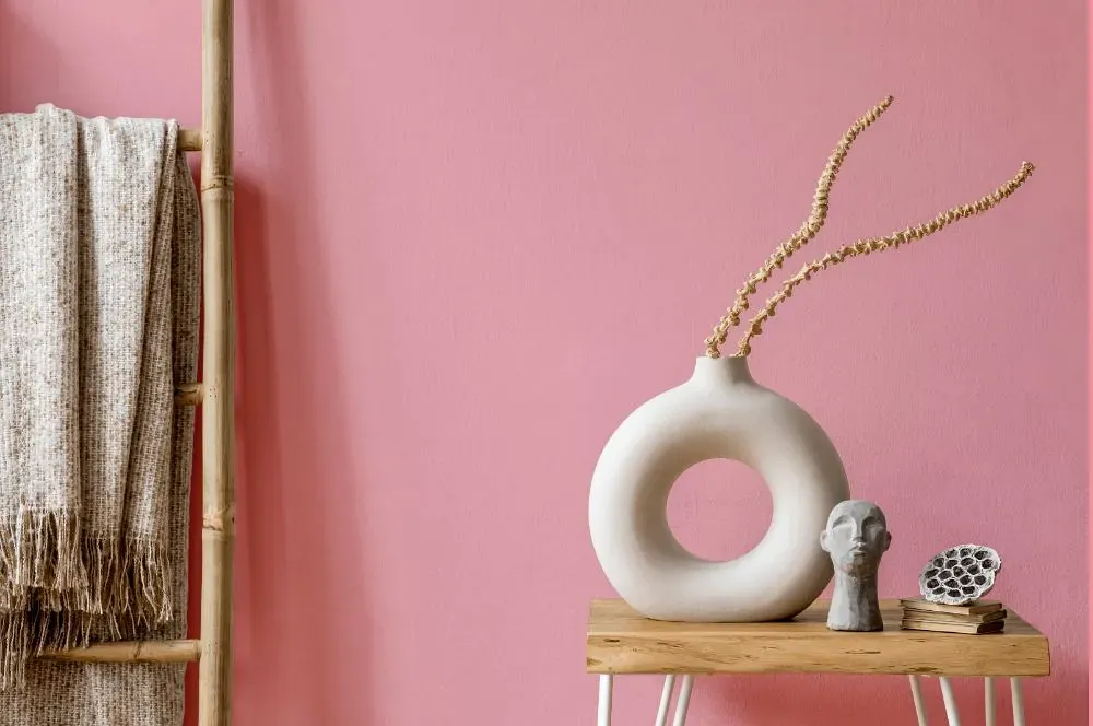
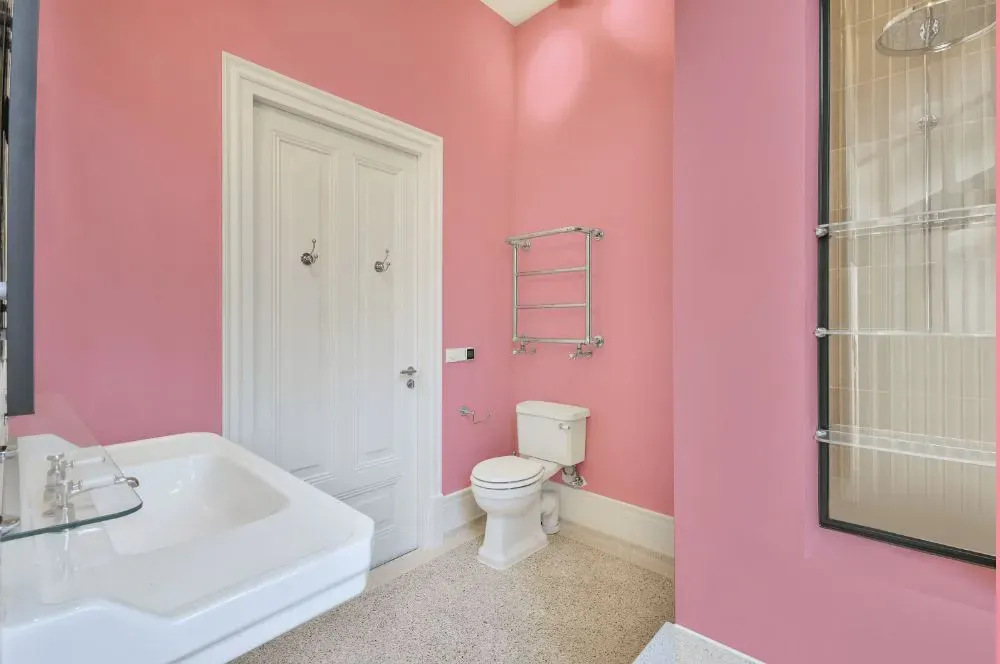
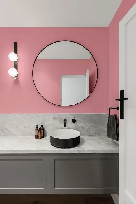
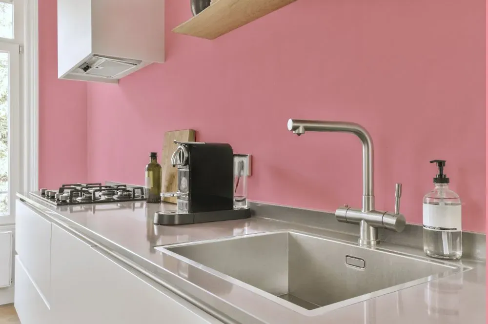
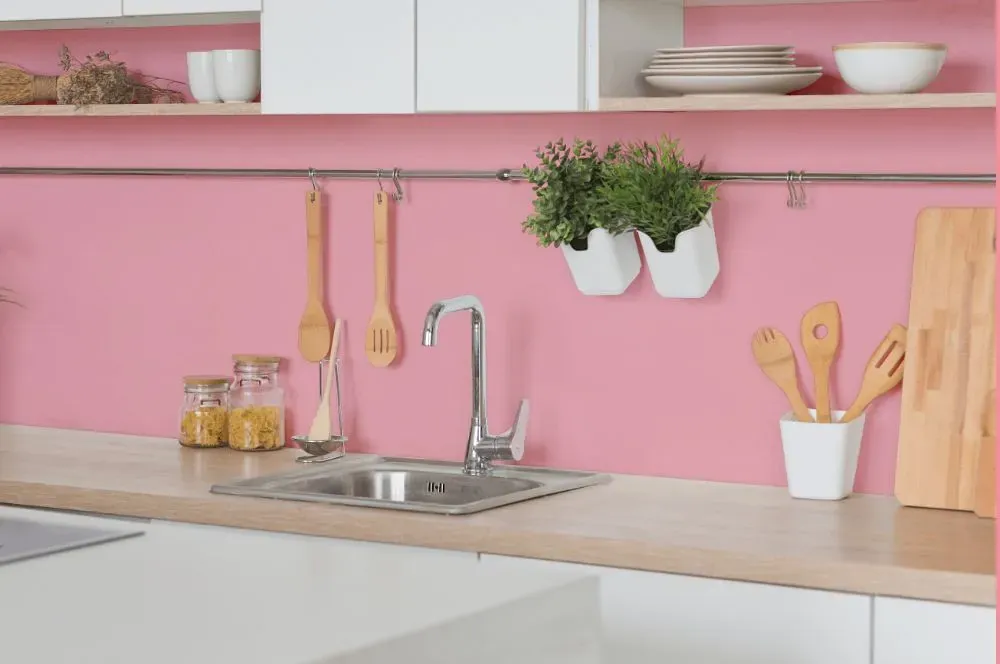
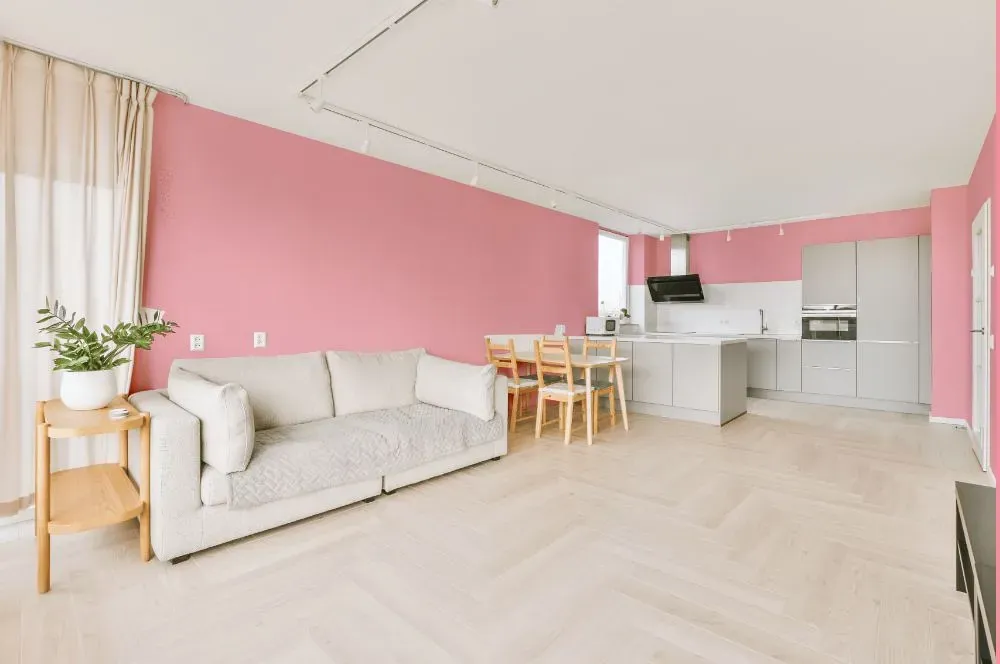
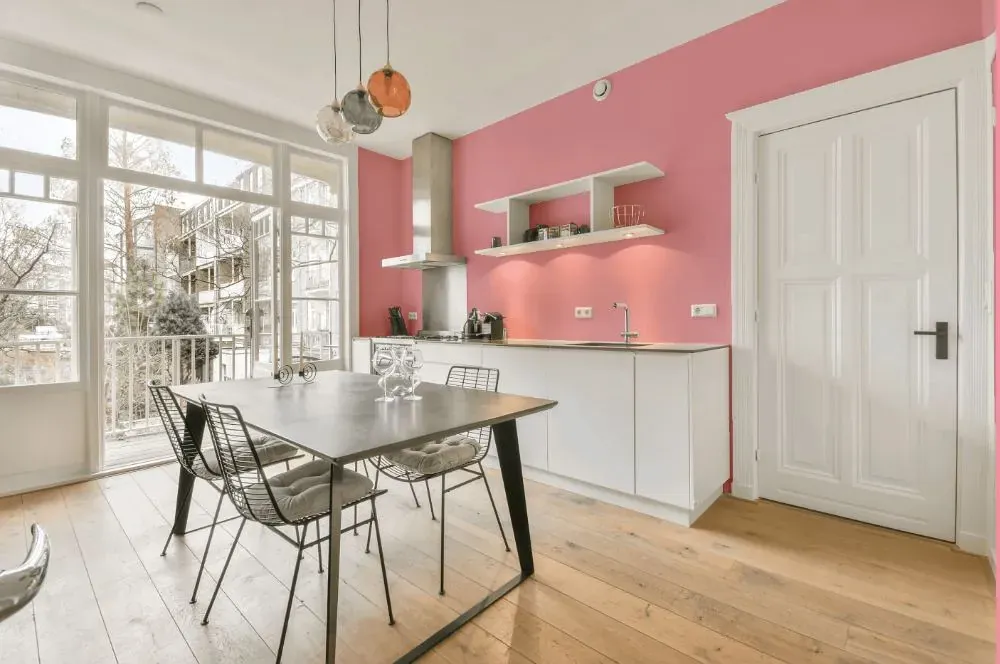
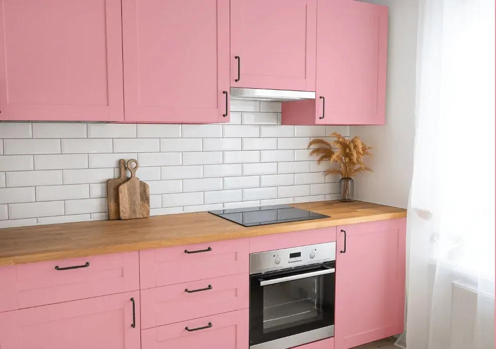
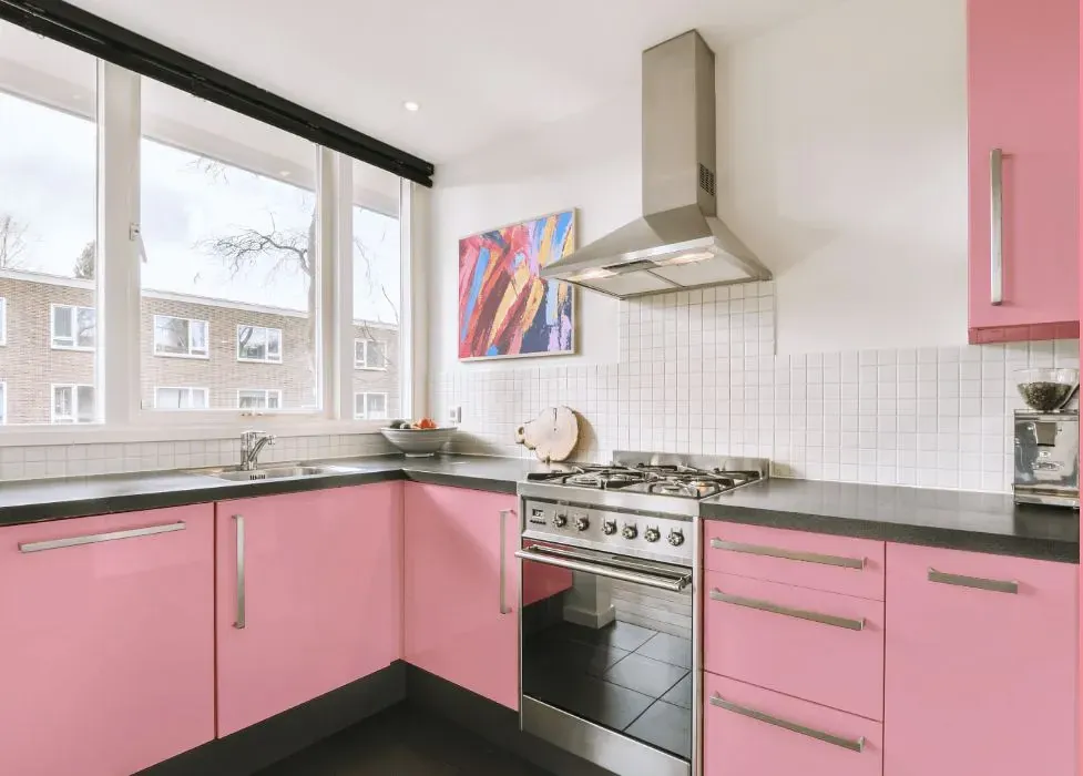
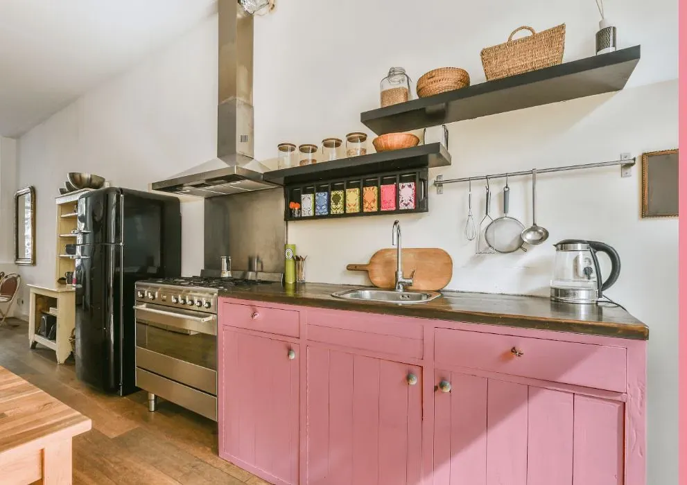
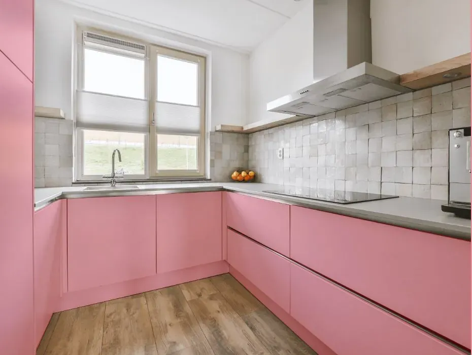
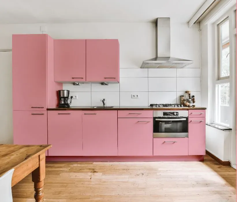
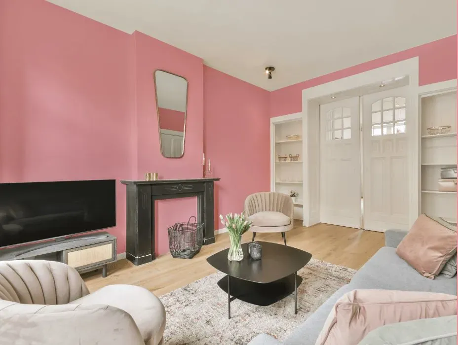
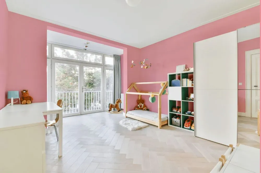
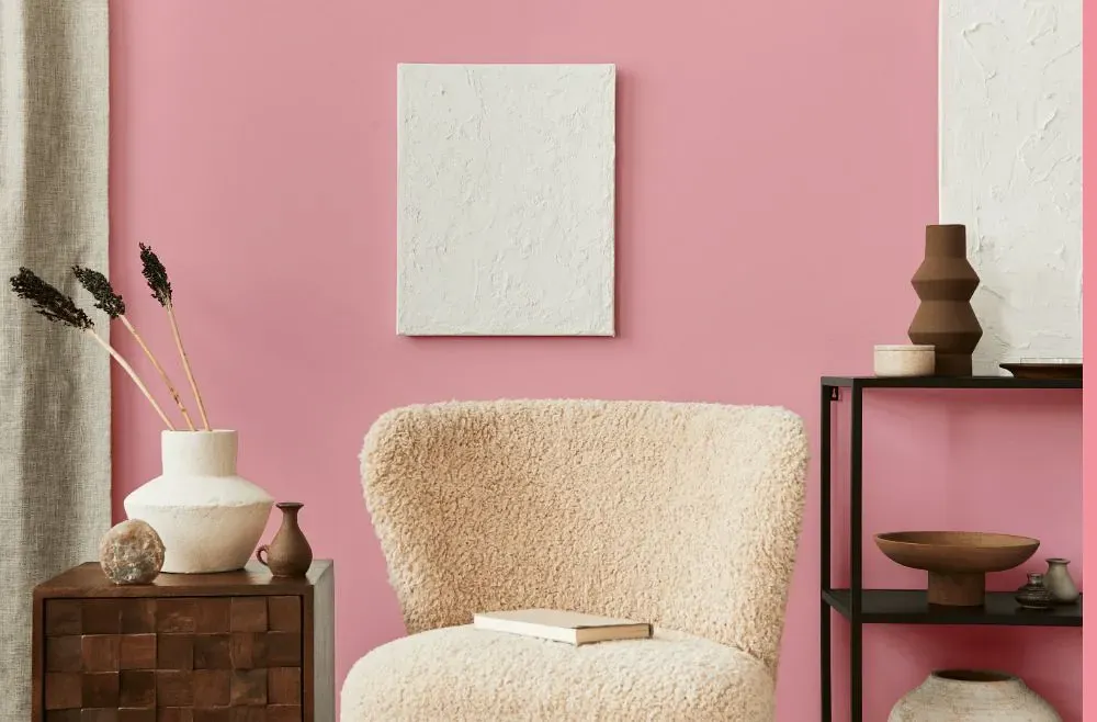
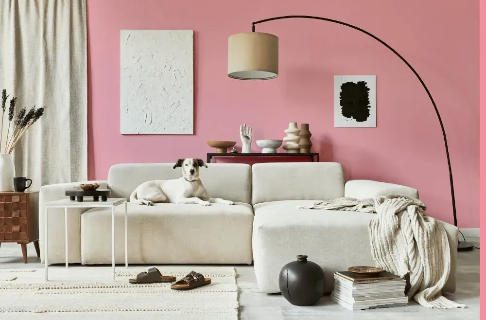
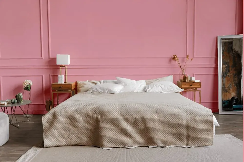
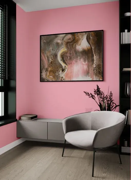
Enhance your space with the soothing allure of Benjamin Moore 1333 Romance. This warm and elegant shade of light pink adds a touch of sophistication to any room. Pair Romance with crisp whites and soft grays for a contemporary look, or complement it with rich jewel tones like sapphire blue or emerald green for a luxurious feel. The versatility of Benjamin Moore 1333 makes it a perfect choice for bedrooms, living rooms, or even nurseries. Elevate your interior design with this timeless and romantic hue that exudes charm and tranquility.
Loading...
LRV of Romance
Romance has an LRV of 53.49% and refers to Light Medium colors that reflect half of the incident light. Why LRV is important?

Light Reflectance Value measures the amount of visible and usable light that reflects from a painted surface.
Simply put, the higher the LRV of a paint color, the brighter the room you will get.
The scale goes from 0% (absolute black, absorbing all light) to 100% (pure white, reflecting all light).
Act like a pro: When choosing paint with an LRV of 53.49%, pay attention to your bulbs' brightness. Light brightness is measured in lumens. The lower the paint's LRV, the higher lumen level you need. Every square foot of room needs at least 40 lumens. That means for a 200 ft2 living room you'll need about 8000 lumens of light – e.g., eight 1000 lm bulbs.
Color codes
We have collected almost every possible color code you could ever need.
Not sure what the difference between HEX and RGB is? We break down color models in plain language. Understanding color models
| Format | Code |
|---|---|
| HEX | #F5B1BB |
| RGB Decimal | 245, 177, 187 |
| RGB Percent | 96.08%, 69.41%, 73.33% |
| HSV | Hue: 351° Saturation: 27.76% Value: 96.08% |
| HSL | hsl(351, 77, 83) |
| CMYK | Cyan: 0.0 Magenta: 27.76 Yellow: 23.67 Key: 3.92 |
| YIQ | Y: 198.472 I: 37.308 Q: 17.496 |
| XYZ | X: 62.348 Y: 54.448 Z: 54.226 |
| CIE Lab | L:78.722 a:26.157 b:4.784 |
| CIE Luv | L:78.722 u:42.532 v:2.107 |
| Decimal | 16101819 |
| Hunter Lab | 73.789, 21.694, 8.081 |