Tikkurila Mistral K491
| Code: | K491 |
| Name: | Mistral |
| Brand: | Tikkurila |
What color is Tikkurila Mistral?
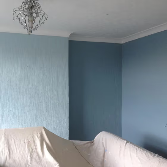
Tikkurila K491 Mistral is a versatile light gray with a hint of blue undertones, evoking a sense of tranquility and sophistication. This serene hue complements shades like Tikkurila Y358 Sun Ray and Tikkurila G485 Enchanted Forest, creating a harmonious color palette. Pairing Mistral with neutral tones like Tikkurila S150 True White or Tikkurila L494 Dolphin Fin can enhance its calming effect, while adding pops of vibrant colors like Tikkurila R209 Coral Reef can create a bold contrast that enlivens the space. With its gentle elegance, Mistral is a timeless choice for any interior design scheme.
Tikkurila Mistral reviews
View the photos of real spaces painted with this that were not included in specific categories.Close-ups, painted furniture, storages and dressers, hallways, stairs and ceilings.
Try before you buy

100% accurate
reusable paint samples
Peel, stick,
and repeat
Twice painted
with real paint
Next day
delivery
What are Tikkurila Mistral undertones?
The undertone of Mistral can be accurately described as a Blue hue, as is apparent from the color space provided. By isolating the pure hue and eliminating any tints, tones, and shades, we were able to precisely determine its undertone. This approach has proven to be more accurate than traditional methods of defining undertones on a white background, which are now considered outdated.
HEX value
HEX value:
#A2B6BD
RGB code:
162, 182, 189
Is Tikkurila Mistral K491 cool or warm?
With a hue of 196° thisBluerefers cool paint shade according to HSL (Hue, Saturation, Lightness) on the color wheel.
K491 Mistral HSL code: 196, 17%, 69%
Hue - degree on a color wheel from 0 to 360. 0 is red, 120 is green, and 240 is blue.
Saturation is expressed as a percentage. At 0%, it appears as a shade of grey, and at 100%, it is in full color..
Lightness is also a percentage value. 0% is black, and 100% is white.
- Cooler hues have a calm and relaxation effect
- Cool blue shades make a room feel sleek, fresh, and modern, perfect for bedrooms, bathrooms, and home offices where a sense of calm and sophistication is desired.
- Using mid-tone cool colors like soft greys and muted blues can help create a calming and modern look in rooms like home offices, bathrooms, and bedrooms. But avoid using these shades in rooms without natural light, as they may look dull.
Act like a pro: Mixing warm and cool shades is a must have to get harmonius interior. Add accents that contrast with the primary color to create visual balance. If your walls are a warm color, don’t forget to add accent in cold colors (furniture, art, décor). A good practice is too use a complementary color scheme.
How light temperature affects Mistral
Natural Lighting. During the day, natural light shifts from about 2000 K at sunrise/sunset to 5500–6500 K at noon.
In addition, natural‑light temperature depends on its direction:
| Direction of sunlight | Visible temp. | Hue | Duration |
|---|---|---|---|
| North | Cool | Bluish | All day |
| East | Warm | Yellow | Before noon |
| West | Warm | Orange‑red | After noon |
| South | Warm | Orange‑yellow | All day |
Artificial Lighting. When choosing bulbs, pay attention to their color‑temperature (Kelvins).
Use the slider to see how this Blue shade looks under different lighting:


4000K
Coordinating colors.
Colors that go with Tikkurila Mistral:
Monochromatic color scheme
This scheme consists of various shades, tints, and tones of a single color. While it offers a perfect combination of hues, without accent décor it may become monotonous.
Lighter shades
Darker shades
K491
Mistral
Complementary color scheme
This color scheme is a combination of two shades that are opposite each other on the color wheel. The high contrast between these colors creates a vibrant and dynamic visual effect. For the color Mistral with a green hue, complementary colors are those with a red hue close to 16, such as Tikkurila Stonehenge and N473.
K491
Mistral
LRV of Mistral
Mistral has an LRV of 43.94% and refers to Light Medium colors that reflect half of the incident light. Why LRV is important?
Light Reflectance Value measures the amount of visible and usable light that reflects from a painted surface.
Simply put, the higher the LRV of a paint color, the brighter the room you will get.
The scale goes from 0% (absolute black, absorbing all light) to 100% (pure white, reflecting all light).
Act like a pro: When choosing paint with an LRV of 43.94%, pay attention to your bulbs' brightness. Light brightness is measured in lumens. The lower the paint's LRV, the higher lumen level you need. Every square foot of room needs at least 40 lumens. That means for a 200 ft2 living room you’ll need about 8000 lumens of light – e.g., eight 1000 lm bulbs.
Color codes
We have collected almost every possible color code you could ever need. To copy the code, just click the icon to the right of it.
| Format | Code | |
|---|---|---|
| HEX | #A2B6BD | |
| RGB Decimal | 162, 182, 189 | |
| RGB Percent | 63.53%, 71.37%, 74.12% | |
| HSV | Hue: 196° Saturation: 14.29% Value: 74.12% | |
| HSL | hsl(196, 17, 69) | |
| CMYK | Cyan: 14.29 Magenta: 3.7 Yellow: 0.0 Key: 25.88 | |
| YIQ | Y: 176.818 I: -14.167 Q: -2.052 | |
| XYZ | X: 40.811 Y: 44.811 Z: 54.629 | |
| CIE Lab | L:72.767 a:-5.408 b:-5.876 | |
| CIE Luv | L:72.767 u:-11.041 v:-7.95 | |
| Decimal | 10663613 | |
| Hunter Lab | 66.941, -8.323, -1.527 |
Color equivalents
J438
Tikkurila

107
Bone China Blue
Little Greene

4423
Teal Zen
Jotun

50BG 44/094
River Valley
Dulux

70BG 43/103
Winter Teal 3
Dulux
Steel Parade
Dulux

CC6
Hazy
Farrow and Ball

90BG 42/106
Ocean Stone
Dulux
27
Parma Gray
Farrow and Ball

J491
Tikkurila

307
Kittiwake
Farrow and Ball

K492
Tikkurila

V438
Tikkurila

10BB 40/090
Niagara Blues 3
Dulux
Amazon Beat 4
Dulux
89
Lulworth Blue
Farrow and Ball

Misty Sky
Dulux
276
Grey Stone
Little Greene

X438
Secret
Tikkurila

4109
Gustavian Blue
Jotun


