Tikkurila J491
| Code: | J491 |
| Name: | |
| Brand: | Tikkurila |
What color is Tikkurila J491?
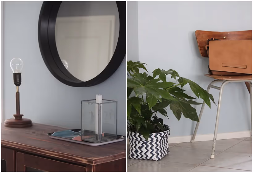
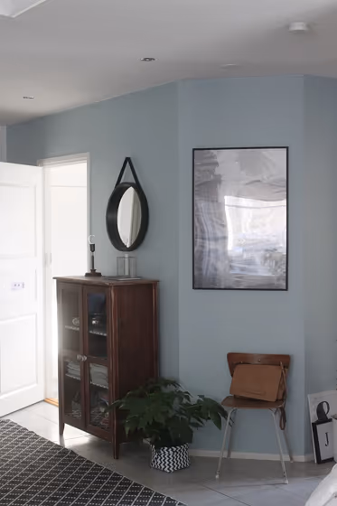
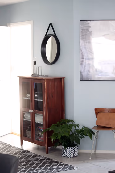
Step into a world of timeless elegance with Tikkurila Silver Sage. This exquisite shade, with the code J491, encapsulates a sense of sophistication and tranquility. Ideal for creating a serene atmosphere, Silver Sage is particularly well-suited for bedrooms, living rooms, and home offices. Its soft, muted tones bring a touch of understated luxury to any space, making it the perfect choice for those seeking a harmonious and refined interior aesthetic. Embrace the calming beauty of Tikkurila J491 and transform your home into a sanctuary of style and serenity.
Tikkurila J491 reviews
View the photos of real spaces painted with this that were not included in specific categories.Close-ups, painted furniture, storages and dressers, hallways, stairs and ceilings.
Try before you buy

100% accurate
reusable paint samples
Peel, stick,
and repeat
Twice painted
with real paint
Next day
delivery
What are Tikkurila J491 undertones?
The undertone of J491 can be accurately described as a Blue hue, as is apparent from the color space provided. By isolating the pure hue and eliminating any tints, tones, and shades, we were able to precisely determine its undertone. This approach has proven to be more accurate than traditional methods of defining undertones on a white background, which are now considered outdated.
HEX value
HEX value:
#B4C4C8
RGB code:
180, 196, 200
Is Tikkurila J491 cool or warm?
With a hue of 192° thisBluerefers cool paint shade according to HSL (Hue, Saturation, Lightness) on the color wheel.
J491 HSL code: 192, 15%, 75%
Hue - degree on a color wheel from 0 to 360. 0 is red, 120 is green, and 240 is blue.
Saturation is expressed as a percentage. At 0%, it appears as a shade of grey, and at 100%, it is in full color..
Lightness is also a percentage value. 0% is black, and 100% is white.
- Cooler hues have a calm and relaxation effect
- Cool blue shades make a room feel sleek, fresh, and modern, perfect for bedrooms, bathrooms, and home offices where a sense of calm and sophistication is desired.
- Light, soft colors like pastel blues and greens make a room feel fresh and open. They're great for bathrooms, nurseries, and kitchens, creating a calm and inviting atmosphere. Just avoid using these colors in north-facing rooms, as they might feel too cold.
Act like a pro: Mixing warm and cool shades is a must have to get harmonius interior. Add accents that contrast with the primary color to create visual balance. If your walls are a warm color, don’t forget to add accent in cold colors (furniture, art, décor). A good practice is too use a complementary color scheme.
How light temperature affects J491
Natural Lighting. During the day, natural light shifts from about 2000 K at sunrise/sunset to 5500–6500 K at noon.
In addition, natural‑light temperature depends on its direction:
| Direction of sunlight | Visible temp. | Hue | Duration |
|---|---|---|---|
| North | Cool | Bluish | All day |
| East | Warm | Yellow | Before noon |
| West | Warm | Orange‑red | After noon |
| South | Warm | Orange‑yellow | All day |
Artificial Lighting. When choosing bulbs, pay attention to their color‑temperature (Kelvins).
Use the slider to see how this Blue shade looks under different lighting:


4000K
Coordinating colors.
Colors that go with Tikkurila J491:
Monochromatic color scheme
This scheme consists of various shades, tints, and tones of a single color. While it offers a perfect combination of hues, without accent décor it may become monotonous.
Lighter shades
J491
Darker shades
Complementary color scheme
This color scheme is a combination of two shades that are opposite each other on the color wheel. The high contrast between these colors creates a vibrant and dynamic visual effect. For the color J491 with a green hue, complementary colors are those with a red hue close to 12, such as Tikkurila and Empress.
J491
LRV of J491
J491 has an LRV of 52.49% and refers to Light Medium colors that reflect half of the incident light. Why LRV is important?
Light Reflectance Value measures the amount of visible and usable light that reflects from a painted surface.
Simply put, the higher the LRV of a paint color, the brighter the room you will get.
The scale goes from 0% (absolute black, absorbing all light) to 100% (pure white, reflecting all light).
Act like a pro: When choosing paint with an LRV of 52.49%, pay attention to your bulbs' brightness. Light brightness is measured in lumens. The lower the paint's LRV, the higher lumen level you need. Every square foot of room needs at least 40 lumens. That means for a 200 ft2 living room you’ll need about 8000 lumens of light – e.g., eight 1000 lm bulbs.
Color codes
We have collected almost every possible color code you could ever need. To copy the code, just click the icon to the right of it.
| Format | Code | |
|---|---|---|
| HEX | #B4C4C8 | |
| RGB Decimal | 180, 196, 200 | |
| RGB Percent | 70.59%, 76.86%, 78.43% | |
| HSV | Hue: 192° Saturation: 10.0% Value: 78.43% | |
| HSL | hsl(192, 15, 75) | |
| CMYK | Cyan: 10.0 Magenta: 2.0 Yellow: 0.0 Key: 21.57 | |
| YIQ | Y: 191.672 I: -10.82 Q: -2.14 | |
| XYZ | X: 48.985 Y: 53.353 Z: 62.345 | |
| CIE Lab | L:78.083 a:-4.653 b:-3.866 | |
| CIE Luv | L:78.083 u:-8.899 v:-5.062 | |
| Decimal | 11846856 | |
| Hunter Lab | 73.043, -8.118, 0.523 |
Color equivalents
70BG 56/061
Coastal Grey
Dulux

08GY 32/058
Misty Morning
Dulux
X438
Secret
Tikkurila

CC6
Hazy
Farrow and Ball

Misty Sky
Dulux
5452
Nordic Breeze
Jotun

27
Parma Gray
Farrow and Ball

90BG 55/051
Steel Symphony 4
Dulux

90BG 56/088
Pebble Drift 4
Dulux

K492
Tikkurila

107
Bone China Blue
Little Greene

10BB 55/065
Niagara Blues 4
Dulux
325
Bone China Blue - Faint
Little Greene

J493
Topaz
Tikkurila

4423
Teal Zen
Jotun

Steel Parade
Dulux

4468
Alladin
Jotun

30BG 64/072
Jewelled Creek 5
Dulux
J438
Tikkurila


