Tikkurila Y436
Contentsshow +hide -
| Code: | Y436 |
| Name: | |
| Brand: | Tikkurila |
What color is Tikkurila Y436?
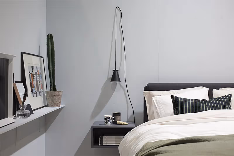
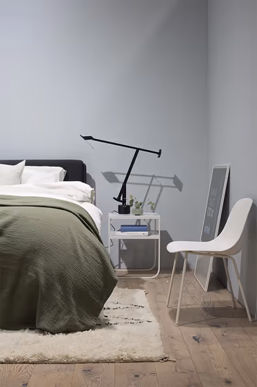
Elevate your space with Tikkurila's Y436, a stunning shade that blends elegance with a modern flair. This versatile color pairs effortlessly with crisp white tones, adding a touch of brightness to any room. For a sophisticated contrast, consider combining it with a deep navy blue, such as Tikkurila's G345. Embrace a contemporary aesthetic by incorporating accents in warm earth tones like Tikkurila's R217 or cool greys like S489, creating a harmonious and inviting environment. Transform your space with Tikkurila's Y436 for a timeless and chic color palette.
Loading...
LRV of Y436
Y436 has an LRV of 64.66% and refers to Light colors that reflect most of the incident light. Why LRV is important?

Light Reflectance Value measures the amount of visible and usable light that reflects from a painted surface.
Simply put, the higher the LRV of a paint color, the brighter the room you will get.
The scale goes from 0% (absolute black, absorbing all light) to 100% (pure white, reflecting all light).
Act like a pro: When choosing paint with an LRV of 64.66%, pay attention to your bulbs' brightness. Light brightness is measured in lumens. The lower the paint's LRV, the higher lumen level you need. Every square foot of room needs at least 40 lumens. That means for a 200 ft2 living room you'll need about 8000 lumens of light – e.g., eight 1000 lm bulbs.
Color codes
We have collected almost every possible color code you could ever need.
Not sure what the difference between HEX and RGB is? We break down color models in plain language. Understanding color models
| Format | Code |
|---|---|
| HEX | #CBD5D9 |
| RGB Decimal | 203, 213, 217 |
| RGB Percent | 79.61%, 83.53%, 85.10% |
| HSV | Hue: 197° Saturation: 6.45% Value: 85.1% |
| HSL | hsl(197, 16, 82) |
| CMYK | Cyan: 6.45 Magenta: 1.84 Yellow: 0.0 Key: 14.9 |
| YIQ | Y: 210.466 I: -7.244 Q: -0.871 |
| XYZ | X: 60.944 Y: 65.294 Z: 75.019 |
| CIE Lab | L:84.635 a:-2.617 b:-3.136 |
| CIE Luv | L:84.635 u:-5.716 v:-4.34 |
| Decimal | 13358553 |
| Hunter Lab | 80.805, -6.782, 1.519 |