
Tikkurila V438
| Code: | V438 |
| Name: | |
| Brand: | Tikkurila |
What color is Tikkurila V438?
The deep and rich V438 by Tikkurila adds a sense of elegance and sophistication to any space. Pair this color with soft cream tones to create a warm and inviting atmosphere, or combine it with shades of teal for a modern and vibrant look. The versatility of V438 allows it to work well in both traditional and contemporary interiors. Consider accentuating V438 with metallic accents or natural wood textures for a complementary aesthetic. This color's depth and complexity make it a timeless choice for a variety of design styles.
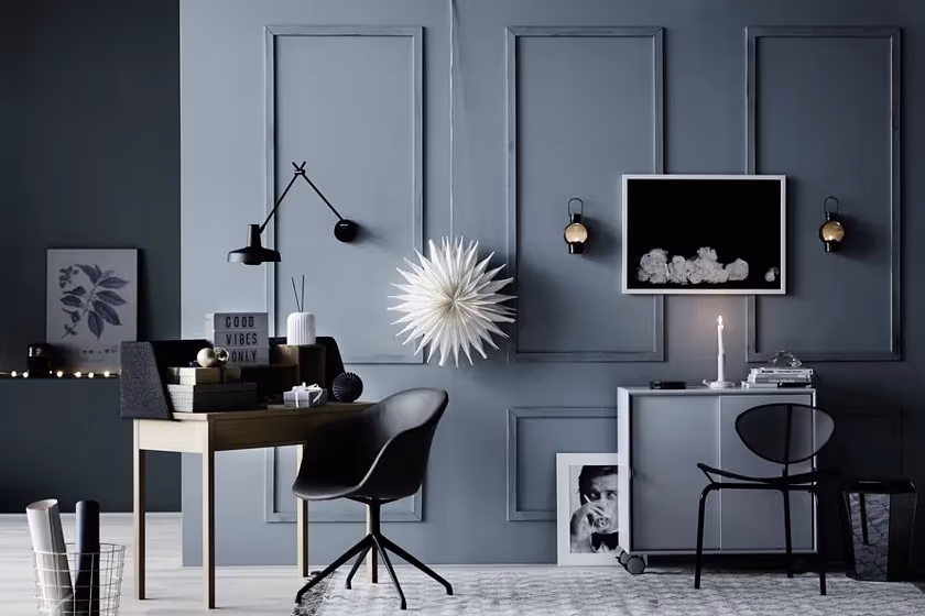
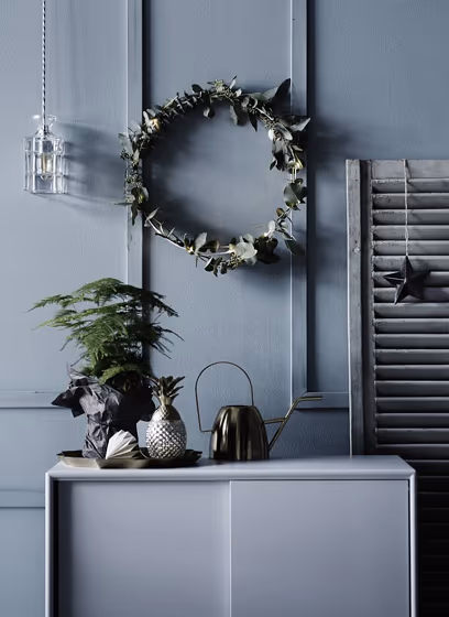
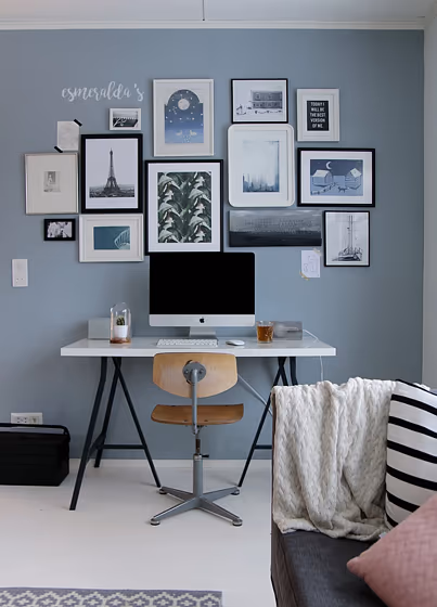
Tikkurila V438 reviews (3 photos)
View the photos of real spaces painted with this blue that were not included in specific categories.Close-ups, painted furniture, storages and dressers, hallways, stairs and ceilings.
Source is not active
Try before you buy
100% accurate
reusable paint samples

Peel, stick,
and repeat

Twice painted
with real paint

Next day
delivery
What are Tikkurila V438 undertones?
V438 has a clear blue undertone based on its position in the color space. We identify undertones by isolating the pure hue (separating it from lightness and saturation), which avoids distortions caused by tints, tones, and shades.
This method is generally more reliable than judging undertones on a white background.
HEX value:
#98A7AD
RGB code:
152, 167, 173
Is Tikkurila V438 cool or warm?
warm
cool

With a hue of 197°, this Blue reads cool based on its HSL hue position.
V438 HSL code: 197, 11%, 64%
Hue - degree on a color wheel from 0 to 360. 0 is red, 120 is green, and 240 is blue.
Saturation is expressed as a percentage. At 0%, it appears as a shade of grey, and at 100%, it is in full color.
Lightness is also a percentage value. 0% is black, and 100% is white.
How light temperature affects V438
Natural Lighting. During the day, natural light shifts from about 2000 K at sunrise/sunset to 5500–6500 K at noon.
In addition, natural‑light temperature depends on its direction:
| Direction of sunlight | Visible temp. | Hue | Duration |
|---|---|---|---|
| North | Cool | Bluish | All day |
| East | Warm | Yellow | Before noon |
| West | Warm | Orange‑red | After noon |
| South | Warm | Orange‑yellow | All day |
Artificial Lighting. When choosing bulbs, pay attention to their color‑temperature (Kelvins).
Use the slider to see how this Blue shade looks under different lighting:
4000K
Coordinating colors.
Colors that go with Tikkurila V438:
Monochromatic color scheme

This scheme consists of various shades, tints, and tones of a single color. While it offers a perfect combination of hues, without accent décor it may become monotonous.
Lighter shades
V438
Darker shades
V438
Complementary color scheme

This color scheme is a combination of two shades that are opposite each other on the color wheel. The high contrast between these colors creates a vibrant and dynamic visual effect. For the color V438 with a green hue, complementary colors are those with a red hue close to 17, such as Tikkurila and Mirage.
LRV of V438
V438 has an LRV of 36.86% and refers to Medium colors that reflect a lot of light. Why LRV is important?

Light Reflectance Value measures the amount of visible and usable light that reflects from a painted surface.
Simply put, the higher the LRV of a paint color, the brighter the room you will get.
The scale goes from 0% (absolute black, absorbing all light) to 100% (pure white, reflecting all light).
Act like a pro: When choosing paint with an LRV of 36.86%, pay attention to your bulbs' brightness. Light brightness is measured in lumens. The lower the paint's LRV, the higher lumen level you need. Every square foot of room needs at least 40 lumens. That means for a 200 ft2 living room you’ll need about 8000 lumens of light – e.g., eight 1000 lm bulbs.
Color codes
We have collected almost every possible color code you could ever need. To copy the code, just click the icon to the right of it.
| Format | Code | |
|---|---|---|
| HEX | #98A7AD | |
| RGB Decimal | 152, 167, 173 | |
| RGB Percent | 59.61%, 65.49%, 67.84% | |
| HSV | Hue: 197° Saturation: 12.14% Value: 67.84% | |
| HSL | hsl(197, 11, 64) | |
| CMYK | Cyan: 12.14 Magenta: 3.47 Yellow: 0.0 Key: 32.16 | |
| YIQ | Y: 163.199 I: -10.867 Q: -1.306 | |
| XYZ | X: 34.308 Y: 37.329 Z: 44.922 | |
| CIE Lab | L:67.523 a:-4.01 b:-4.883 | |
| CIE Luv | L:67.523 u:-8.423 v:-6.573 | |
| Decimal | 10004397 | |
| Hunter Lab | 61.098, -6.688, -0.824 |
Tikkurila V438
Copy color code
Color equivalents
4109
Gustavian Blue
Jotun

90BG 41/040
Earl Blue
Dulux

90BG 35/068
Steel Symphony 3
Dulux

10BB 40/090
Niagara Blues 3
Dulux
5249
Arctic Grey
Jotun

307
Kittiwake
Farrow and Ball

90BG 42/106
Ocean Stone
Dulux
70BG 43/103
Winter Teal 3
Dulux
L493
Tikkurila

276
Grey Stone
Little Greene

RAL 7040
Window grey
RAL Classic

K491
Mistral
Tikkurila

L491
Tide
Tikkurila

30BB 45/049
Restful Slumber
Dulux
50BG 38/011
Warm Pewter
Dulux

50BG 44/094
River Valley
Dulux

RAL 7001
Silver grey
RAL Classic

107
Bone China Blue
Little Greene

J438
Tikkurila

Steel Parade
Dulux
